Miami Dade College Student Center and Classroom Complex
Concrete Solution: An imposing building anchors the edge of an expanding campus and acts as a social hub for students.


Architects & Firms
Miami
Adapting Modernism to local cultures and climates has been a driving force behind the work of Pat Bosch. The design principal of Perkins+Will's Miami office, Bosch studied 'critical regionalism' with Kenneth Frampton at Columbia University, then attended the ETH in Zurich when Jacques Herzog and Pierre de Meuron were teaching assistants, and went on to work for Richard Meier on projects in France and Germany in the 1990s. Such training helped when Miami Dade College (MDC) asked her to design a 130,000-square-foot student center and classroom complex for its Kendall Campus, the first and largest of the school's seven hubs.
Asked what she thinks critical regionalism means, Bosch says, 'It's the abstraction of references,' both in terms of formal building elements and social context. At Perkins+Will, she has applied her ideas on the topic to a research headquarters for L'Oreal in Brazil, a hospital in Ghana, and an enormous women's university campus in Saudi Arabia. Bosch inherited her design gene from her parents. Her father, who was born in Spain and raised in Cuba, worked for Vittorio Garatti in the 1960s on two of Cuba's National Art Schools, which represented a radical fusion of Modern design, Catalan brick vaults, and Latin American exuberance. Her mother was an architect too.
The MDC project began not with a building but an investigation into how the college should move forward. 'We were hired to look at the big questions, such as, 'How do we build the future?'' says Bosch. Because the school wants to keep growing, while keeping costs low, Perkins+Will developed a thick set of standards and a kit-of-parts approach to be applied to future buildings. The research identified everything from the dimensions of different types of classrooms, prototypes for various spaces, and ways for all the pieces to come together. By using prototypes, the college could build faster and cheaper, while bringing coherence to seven campuses that had each developed in its own quirky fashion.
Having put together the rule book, Perkins+Will got the chance to test it out on the Kendall student center. According to the firm, the project took 18 months to build and cost $23 million, or $177 per square foot.
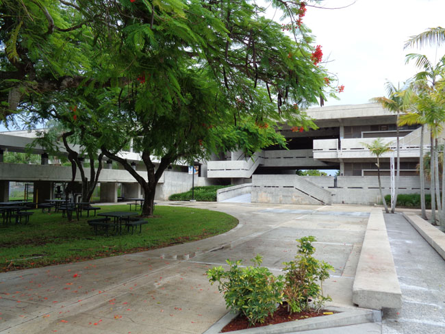
The building serves as a new gateway on the east side of the campus and will anchor future growth there. To the west, the school's original low-slung buildings spread out around a series of plazas connected by covered walkways. Designed by Hilario Candela and built in the 1960s, the exposed-concrete structures provide lots of shaded outdoor spaces and show how Brutalism could work with the southern Florida climate.
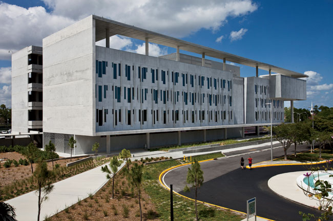
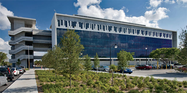
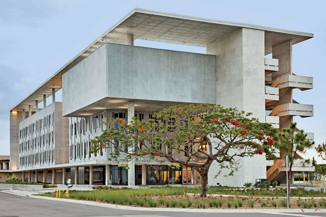
At five stories, the new student center is much taller than its neighbors. But like its predecessors, it flaunts concrete as both a structural element and a means of expression. Bosch emphasized the material by literally framing each of the long elevations in poured concrete and recessing the non-load-bearing facades, mostly precast-concrete panels on the south and glass on the north. An impressive concrete roof hovers above the south portion, sitting on slender columns and turning what could have been a heavy plane into something that almost appears to float. Flat-plate concrete construction allows floors to rest directly on columns, eliminating the need for beams and simplifying the building's visual expression.
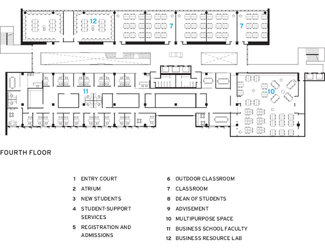
Driven by the project's main programmatic components, the architects designed the building as a sandwich: a long wing on the south containing spaces for student services (such as registration, financial aid, and counseling), a similar wing on the north with classrooms, and a long atrium in between. Bosch treated additional functions'such as a vertical circulation tower on the east and a double-height multipurpose space emerging from the upper part of the southeast corner'as sculptural elements within the larger composition.
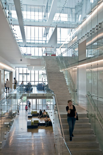
Most people approach the building from the south and enter on the east near the circulation tower. Inside, they find a five-story atrium glazed at its east and west ends and animated by a grand stair connected to landings and bridges that act as social hubs. Students hang out there and at the clusters of colorful furniture on each floor. Queuing for registration and other services is electronic, so students get a number and can relax until a text tells them it's their turn.
Flexibility was a critical concern for the university, so most internal partitions are nonstructural and can be moved when needed. In fact, as the project moved forward, its uses kept changing, with the business school and other programs moving in after design had been done. So the architects' kit-of-parts strategy was tested, and it passed, says Vicky Owles, the college's dean of students. The building has changed patterns of behavior, she says, with students lounging here instead of dispersing around the campus.
Bigger than MDC's original buildings, the new student center seems a bit out of scale right now. Future buildings nearby, though, will temper that impression. And its heroic brand of Modernism connects it to Candela's tropical Brutalism, while striking out in its own direction.
People
Owner:
Architect:
Personnel in architect's firm who should receive special credit:
Team:
Architect of record:
Interior designer
Engineers: MEP-FP Engineers: Johnson, Avedano, Lopez, Rodriguez & Walewski Engineering Group, Inc. Civil and Landscape: Miller, Legg & Associates, Inc.
Consultant(s): Lighting: Johnson, Avedano, Lopez, Rodriguez & Walewski Engineering Group, Inc. General contractor: Kaufman Lynn Construction
Photographer(s): Construction cost: $23 million Project cost: $32 million Size: 130,000 square feet Completion date: January 2013 |
Products
Structural system Manufacturer of any structural components unique to this project: Baker Concrete
Exterior cladding Precast concrete: Metromont Corporation Moisture barrier: Dow Corning
Roofing
Windows
Glazing
Doors Metal doors: Ingersoll-Rand Wood doors: Lambton Doors Operable Partitions: Hufcor
Hardware Closers: LCN Exit devices: Von Duprin Pulls: Burns
Interior finishes Suspension grid: Armstrong Demountable partitions: Teknion Cabinetwork and custom woodwork: Watson Woodworking Inc. Paints and stains: PPG Wall coverings: Maharam Plastic laminate: Formica Resilient flooring: The Mohawk Group Carpet: Tandus Raised flooring: Irvine Access Flooring, Inc. Wall Tile: Betona Toilet Partitions: Global
Furnishings Reception furniture: Teknion Fixed seating: Teknion Chairs: Teknion Tables: Teknion Upholstery: Teknion
Lighting Downlights: Cooper Lighting Exterior: Cooper Lighting, McGraw-Edison, Luminarc, Beacon, Spectrum Dimming System or other lighting controls: Lutron
Conveyance
Plumbing
Energy
Other unique products that contribute to sustainability: |


