Philadelphia
Although located in dense West Philadelphia, the University of Pennsylvania has a genuine campus—one organized around a series of green spaces and landscaped quadrangles carved out of the surrounding urban fabric. But the spot for the school's just-completed Krishna P. Singh Center for Nanotechnology is another story. The site, at the university's northeastern fringe, sits next to a six-story concrete and glass tower for materials research separated from its context by an off-putting brick plinth. And until construction of the new 78,000-square-foot Singh, its 1.7-acres had been home to a surface parking lot and Edison Laboratory—a one-story, nearly windowless box containing high-powered microscopes and other scientific instruments. “It was a part of campus where engineering was central but landscape was not,” says Marion Weiss, founder, with Michael Manfredi, of the New York City–based architecture practice Weiss/Manfredi.
The university has been expanding eastward, toward the Schuylkill River, but for the time being, Singh is the first academic building encountered by anyone approaching the campus from the Walnut Street Bridge—one of the main pedestrian and automobile links to Center City Philadelphia. This prominent position, along with the building's muscular cantilever and the new green space, transforms a typically hermetic building type into something with much more public reach. It also provides visibility for the rapidly developing field of nanotechnology, which involves the study of structure and materials at the molecular level and has a wide array of applications that range from medicine to consumer products. “The dean wanted the scientists' great work to be seen,” says Weiss, explaining the goals of Eduardo Glandt, head of Penn's engineering school and a key champion of the project. “And he wanted a building with dynamism and buzz.”
The $91.5-million Singh, named after the founder of the energy-technology company Holtec International, who contributed $20 million, naturally contains state-of-the-art research facilities. But the building also encompasses a series of vibrant public spaces often lacking in university science centers. The most obvious of these areas is the new lawn, which functions as the building's entry court, drawing people from the street, past a sculpted knoll and a monumental and sober sculpture by Tony Smith that once had a home on Penn's main college green.
When they step inside Singh, visitors and users encounter another public space: a daylight-filled galleria, narrow but three stories tall, around which almost all of the above-ground rooms are arranged. An elegant 60-foot-long stair, with granite treads and glass balustrades and no intermediary supports, leads to second-floor labs and offices. It exerts an almost magnetic pull, enticing people with its gentle slope and expansive landings, which the architects see as indoor extensions of the landscape. These generous landings, which they call “topographical social spaces,” include tables and chairs for relaxing, impromptu meetings, or group study.
The upward spatial sequence spirals around the galleria and the edge of the landscaped court and culminates with the forum—a room contained within the cantilever for lectures, receptions, and meetings. It has an accordian-like oak ceiling and is surrounded by glass on three sides. Here the prime spot is the room's foyer, at the prow of the cantilever, which offers a perch for taking in the view toward the west and almost the whole Penn campus.
Weiss describes the building's ascending route as one that “unfurls around the crystalline boundary of the courtyard.” Key to this crisp and folded effect is the curtain wall's white pinstripes, created by combining an acid-etched pattern on the insulated glazing units' outside lites and a ceramic frit on their inside lites. Along with a low-E coating, the pattern helps reduce heat gain and glare. But because the inside and outside stripes are intentionally ever-so-slightly out of register with each other, they also subtly reinforce the impression that the building's skin is made of layers that can be peeled away.
Some structural gymnastics not so readily apparent also help achieve the effect of overlapping layers on Singh's entry elevation. “There are three lines of vertical structure, but none are continuous,” says Brian Falconer, a principal at Severud Associates, the project's structural engineer. The facade's setbacks are horizontal trusses suspended from the cantilevered galleria roof by hangers, which look like columns but are in tension. The cantilevered forum, which is the more obvious example of structural bravura, is supported by a pair of inverted trusses that in turn are tied to concrete shear walls.
This skillful integration of form and structure was realized in spite of some rather severe programmatic constraints. One of the more potentially burdensome project requirements was that Edison, which occupied the site's southwest quadrant, remain standing and accessible to researchers until Singh was complete, forcing the project team to plan around the lab even though it was eventually to be demolished. But the new building's placement also needed to take into account electromagnetic interference (EMI), including that caused by its own elevators, and vibration and noise from sources such as traffic and a nearby subway. These so-called “environmental contaminants” could hamper the operation of Singh's atomic and electron microscopes.
In order to optimally place the new building, consultants documented the sources of EMI and vibration, took measurements on site and analyzed soil conditions. They eventually identified a slightly off-center “sweet spot”—a roughly 50-foot-by-85-foot below-grade zone where the laboratories with the most sensitive equipment should be located. Most vibration waves are at ground level and become smaller below the surface, explains Michael Gendreau, president of Colin Gordon Associates, the project's vibration-isolation specialist. Many of the rooms containing the powerful microscopes still include shielding, but the equipment's reliability has been improved with good placement, adds John Busch, the director of science and research facilities at M+W Group. The firm served as both the project's lab planning consultant and its mechanical engineer.
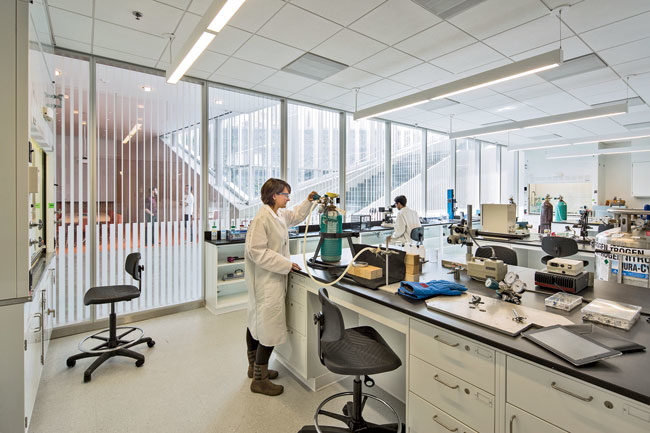
Although the characterization labs that depend on sophisticated microscopy are by necessity tucked away in the basement, the designers located the 10,000-square-foot clean room front and center. It sits directly adjacent to the entry galleria, separated from the soaring space by an almost 160-foot-long wall of orange laminated glass. The arrangement allows the building's users and visitors to see scientists clad in their protective caps and suits at work, performing a number of tasks, including the fabrication of wafers and chips used in microelectronic devices.
The tint of the glazed wall prevents ultraviolet light, as well as some light with wavelengths in the visible spectrum, from interfering with photosensitive nanofabrication processes. Weiss/Manfredi made an opportunity out of the functional requirement by strategically placing saffron accents throughout Singh—in the seating and tables of the grand stair's study landings, on the conference rooms' walls and floors, and the upholstery of the two custom-designed armchairs placed in the cantilever's prow. Under certain conditions the vibrant hue can be seen from the street, especially at night, when the building is illuminated from within. “Luckily, it is a good color,” jokes Weiss.
The orange wall affords a view not only of the scientists, but also of the clean room's organization into bays (the clean areas where air that is free of dust, microbes, and other environmental pollutants) and intervening chases (the areas for routing utilities and return-air ducts). This compartmentalized organization, an alternative to a wide-open clean room layout (referred to as a ballroom), allows for separate chambers for various types of research and manufacturing processes that require different levels of cleanliness. Singh has bays rated as class 100 and class 1,000—designations that refer to the number of particles of a certain size permitted in a cubic foot of air. The lower the number, the more highly filtered the air.
In addition to the need for the filtering of particulates, the clean room also has tight humidity and temperature requirements: it is kept at 68 degrees Fahrenheit (plus or minus 2 degrees), with relative humidity between 45 and 50 percent year-round. In contrast, the building's general laboratory spaces are kept in the range of 70 to 74 degrees Fahrenheit (plus or minus 2 degrees), with a relative humidity that can vary from 20 to 60 percent.
Not surprisingly, maintaining such clean room conditions requires a considerable amount of space for HVAC equipment. Stacked directly above the clean room is a fan deck, roughly the same size and footprint as the clean room, housing air-handling units, almost all of them dedicated to the space below. A roof areaway above that contains intake ducts, exhaust stacks, and chillers. But even though such a sizeable chunk of the building is devoted to mechanical systems, it still feels spacious and open—one indication of the design team's skill.
One m/e/p strategy that cuts down on the amount of air-handling equipment is a radiant heating and cooling system, embedded in the galleria floor and relying on water rather than forced air. It should save energy by conditioning only the occupied portion of the 54-foot-tall space.
Other features aimed at conserving resources include a system that recovers heat from exhaust air, a high-efficiency envelope that lets daylight into public spaces but reduces heat gain, and automated lighting controls. These are among the many integrated strategies that have put the building on track for LEED Gold certification. But the project's most important sustainable feature is arguably not even within its walls. Singh's expansive green courtyard, along with two planted roof areas and rainwater cisterns, plays a critical role in helping the university comply with Philadelphia's tough storm-water regulations. Their objective is to keep runoff out of the city's already overtaxed combined-sewer system.
The planted courtyard's significance extends well beyond its environmental benefits, however. At Singh, Manfredi and Weiss have thoroughly melded landscape and building, integrating the project into Penn's campus, and making it difficult to tell where nature ends and architecture begins.
People
Owner:
Architect & Site Design:
Personnel in architect's firm who should receive special credit:
Todd Hoehn, Project Manager Kim Nun, AIA, Project Architect, Ina Ko, AIA, Project Architect; Bryan Kelley, Michael Steiner, AIA, LEED-AP (Core Team Members) Jina Kim, Cheryl Baxter, Patrick Armacost, Michael Blasberg, RA, Beth Eckels, Jocelyn Froimovich, Patrick Hazari, Justin Kwok, Andrew Ruggles, Joe Vessell, and Joe Vidich (Supporting Team Members)
Interior designer:
Engineer(s):
Structural Engineer:
Civil Engineer:
Consultant(s):
Sustainability:
Curtain Wall:
Green Roof:
Vibration Isolation:
Acoustical/Audio Visual:
Elevator:
Food Service:
Lighting:
EMI:
Cost Estimator:
Construction Manager & General Contractor:
Renderer(s): CAD system, project management, or other software used: AutoCad, Revit, Rhinoceros Size: 78,000 square feet Cost: $91.5 million Completion date: October 2013 |
Products
Structural system
Exterior cladding
Metal/glass curtain wall and entrances:
Site Precast concrete:
Exterior Glass:
Roofing
Roofing:
Metal:
Glazing
Interior finishes
Resilient flooring:
Stone stairs / flooring:
Wood paneling:
Special interior finishes unique to this project:
Suspension grid:
Paints and stains:
Plastic laminate:
Floor and wall tile:
Carpet:
Furnishings
Chairs:
Tables:
Upholstery:
Lighting
Exterior:
Landscape
Plumbing |


