Golkin Hall, Penn Law School
Legal Threshold: Kennedy & Violich lighten up traditional materials in a new building for the University of Pennsylvania's law school.


Architects & Firms
Philadelphia, Pennsylvania
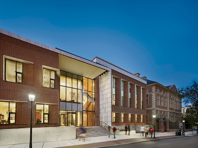
Golkin Hall, the latest addition to the University of Pennsylvania's law school, announces itself with a contradiction. On a narrow Philadelphia street, opposite a row of historic townhouses and sidewalk cafés, a two-story marble curtain marks the entrance to the new building. The material looks heavy, but as it nears the ground, the individual fixed-in-place plates that make up the form begin to twist away from one another, allowing light to pass through and creating a feeling of weightlessness.
Part sunshade and part sculpture, this 'threshold object,' as Sheila Kennedy of Boston-based Kennedy & Violich Architecture (KVA) calls it, not only introduces the new hall but was also designed to signify the school's approach to legal education. While KVA employed traditional 'law school' materials — marble, wood, masonry — they appear in ways that confound their typical severity and heft with a sense of lightness and transparency. In contrast to its neighbor, Silverman Hall, an august neo-Georgian building by Cope and Stewardson completed in 1900 and ornamented with a similar palette, Golkin Hall appears permeable and approachable. Silverman is 'this big forbidding thing, and that's what law was,' says Penn Law's dean of students, Gary Clinton. 'Legal education used to be what occurred within those walls, but it's now about what's going on in the city and on the rest of campus.'
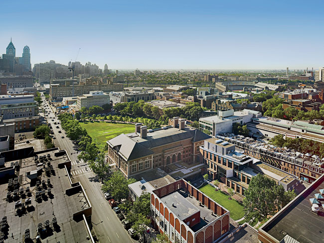
A four-level steel-framed structure, Golkin completes Penn Law's ring of buildings, which grew throughout the 20th century to wrap an entire city block, eventually enclosing a central courtyard. The school's expanding programs and growing faculty prompted officials to replace a one-story 1960s building with a new facility that would house faculty and administration offices, as well as a 350-seat auditorium, a moot-court room, and a student center. The school held an invited competition and selected KVA, challenging the firm to design a building that would accommodate the substantial program but wouldn't dominate the courtyard or the townhouses across the street. 'To add 38,200 square feet where there had been just 14,000 without losing the character of the school was a burden,' says partner Frano Violich. 'It's really a ship in a bottle.'
To maintain a narrow footprint, the firm buried the largest components of the program — the auditorium, courtroom, and student center — and placed offices and meeting spaces on the upper floors. And to keep the building from becoming a monolithic presence on the street, KVA separated it into two distinct volumes — one rising to just beneath Cope and Stewardson's cornice. They placed the primary vertical circulation in the fissure between the forms, stacking two double-height spaces into a four-story, glass-enclosed atrium that is now the school's entrance. 'As you walk along the sidewalk, you see light and a trickle of green from the courtyard breaking up a pretty substantial facade,' says Violich.
At the entry, the angles of the plates that make up the marble curtain are calibrated to the arc of the sun (see sidebar, below) to regulate daylight entering the atrium while allowing it to reach all the way down to the below-grade student center. To admit even more sun, the designers made the rear of the building nearly 50 percent glass and removed several trees from the courtyard to bring light into the lower levels. A series of light wells also pull daylight into the building's upper floors and the submerged moot-court room. 'At every penetration, from the front door to the windows, there is a gesture made to how light might enter,' says Violich. The most unusual instance happens on the building's front facade, where the brick tapers into the east side of the window frames to admit morning light, while surprisingly thin marble sheets act as sunshades on the west side. With these strategies and other energy-saving measures, the project team is pursuing a LEED Silver certification.
Inside the atrium, sightlines to the offices above, the student center below, and the buildings across the courtyard quickly orient visitors and connect them to the activities of the school. 'Twelve years ago, people's laptops were pulling them away from the school — everyone's kitchen table became their library,' says dean of students Clinton. 'But because so much of legal education is about the interactions between people, we needed to start providing opportunities for that.' Students on the school's building committee suggested the café-style banquettes in the student center, and KVA, recognizing the demand for meeting places with varying degrees of privacy and formality, inserted small conference rooms immediately adjacent to this seating. Upstairs, gathering areas range from a typical glass-enclosed conference room to a terrace set among the building's green roofs and a slightly surreal lounge, where you can sit in a leather armchair perched very close to the roofline of the townhouses across the narrow street.
While embracing its neighbors, Golkin Hall transforms the Penn Law complex from a cloister into a hub befitting a school where students spend much of their time out working in the city. The heavy materials look a bit strained in their delicate applications, but they succeed in connecting the traditional to the contemporary and expressing a new pedagogical ideal. 'The law can be so grave sometimes, so heavy and ponderous,' says Violich. 'Our facade tried to be pretty serious, but there are moments — such as when the brick starts to soften as it becomes a window, and the marble entrance becomes a curtain — that we hope add a lyrical quality to it.'
|
Light and Craft Kennedy & Violich designed Golkin Hall's marble curtain starting with pairs of panels — laser-water-cut to 1.25 inches thick — attached to a metal armature in a 5-by-12-unit grid. Then the firm positioned the panels using a software script based on extensive solar modeling that accounted for the arc of the sun at different times of year. Pairs begin parallel to one another at the top of the form (Figure 1). As they move down, the panels rotate and tilt toward one another (Figure 2) until those lowest and closest to the facade (Figure 3) point 90 degrees away from their counterparts at the top. Though the panels are fixed in place, the tracking of light across the form is designed to create the illusion of movement. Tapered masonry on the east side of the window frames also conforms to the movement of the sun. Using the same flemish bond as the majority of the facade, digitally modeled courses of brick on the east side of the windows curve toward the jambs to allow morning light in. (The conventionally built brickwork shows impressive craftsmanship.) In the afternoon, 1-inch gaps between the beveled edges of marble sunshades cast sharp rays of light back onto the brick. 'We were inspired by Cope and Stewardson's law-school building, its excess of craft, and the light effects on its facade,' says Violich. 'The materiality of masonry and stone express a new craft of digital design and digital fabrication.' W. H.
|
Completion Date: January 2012
Gross square footage: 38,200
Total construction cost: $33.5 million
PeopleOwner: University Of Pennsylvania / Penn Law School
Architect:
Kenney & Violich Architecture, Ltd
Designers:
Interior designer:
Engineer(s):
General contractor: Photographer(s): Halkin Photography LLC CAD system, project management, or other software used: AutoCad, Rhino, Adobe Suite |
Products
Structural system
Exterior cladding
Roofing
Glazing
Doors
Hardware
Interior finishes
Special surfacing:
Furnishings
Lighting
Conveyance |


