The Museum, Clark Art Institute
A Classic Remastered: A sensitive restoration and renovation of an art museum intensifies its original aura.


Williamstown, Massachusetts
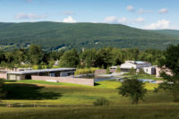
Annabelle Selldorf was an obvious choice to renovate the venerated museum of the Sterling and Francine Clark Art Institute in Williamstown, Massachusetts, home to a stellar collection of European and American paintings. Long esteemed by the art world for her minimalist approach, the German-born, New York–based architect designed the Neue Galerie New York (2001), the Stanze del Vetro glass museum in Venice (2012), and several high-profile Manhattan galleries, including David Zwirner’s most recent space in Chelsea (RECORD, June 2013, page 168). Michael Conforti, the Clark’s director, hired Selldorf in 2007, six years after he commissioned Tadao Ando to design a new visitor center and conservation laboratory. But the two architects, both renowned for museum work, did not collaborate. “Ando and I met after I was hired,” Selldorf recalls. “He said, ’I’ll do my thing, and you do yours.’ ” That was the only discussion.
Selldorf had to rethink the entire visitor experience, since it had already been decided to switch the museum entrance from the columned, formal front to the back. (In 2001, Conforti had adopted a Cooper Robertson master plan that suggested expanding the Clark to the west, behind the museum.) The first move was to change the original circulation pattern, basically a one-way procession around the periphery that ended in the skylit Renoir Room at the center. “I wanted a route of circulation that was not coercive,” Selldorf says. By eliminating the corridors, she could ensure that “every space is used for looking at art.”
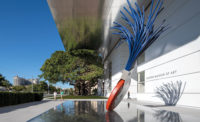
Selldorf also transformed the former white-marble lobby of the original entrance into a well-proportioned winter garden, complete with a new skylight, to display sculpture. By doing so, and by converting former offices into new galleries, the architect gained 2,200 more square feet of exhibition space for a total of 43,770 square feet. “The greatest challenge was making the spaces coherent,” she says.
Selldorf is proudest of replacing the putty-colored walls with a muted but varied palette of tones: pearl gray, pale lilac, mauve, and aubergine. “I started looking at where paintings were to be placed and developed a family of colors that is very specific to the art,” she says. She adds, with a laugh: “The curators assumed, because I am a modern architect, I’d want white. But I was thinking about colors from the beginning. The day I presented my color scheme was the most anxious one for me. Michael warned me he would battle with me over the colors.” They did fight, but now Conforti concedes, “I’m glad she won.”
The task at hand involved more than coming up with a sophisticated color scheme. Selldorf had to take the walls down to the studs to replace the electrical, plumbing, lighting, and HVAC systems. And she cleaned and updated the laylight for the enormous ceiling in the Renoir room, enhancing the natural light that evenly saturates it.
Most striking, perhaps, are the new galleries for the decorative arts, for which Selldorf designed casework, vitrines, lighting, and furniture. Now the Meissen porcelain and antique Augsburg and English silver glow in their subdued eggplant-colored setting.
Selldorf is modest about her contribution. “The permanent art collection is the jewel in the crown,” she says. “My goal was to make the museum look better without anyone noticing anything had been done.”
The architect also insisted on retaining the museum’s “domestic” character—the small galleries with windows looking out at the expansive panorama of nature, to “create a relationship between the art and the landscape,” she says.
The one thing Selldorf was not permitted to do was design the new entrance to the west, which faces Ando’s visitor center: Ando had already done it before she got there. It’s a 2,000- square-foot glassed-in porch that is both lobby and sculpture court, a perfunctory modernist appendage to the white temple. Asked about it, Selldorf says, “Don’t get me started . . .”
Nevertheless, now, as soon as you enter the first gallery, you are immersed in the museum’s Old World atmosphere. What’s great is that, while the interior may feel historic, it’s not. It’s all Selldorf.
People
Owner:
Architect:
Architect of Record/Executive Architect:
Personnel in architect's firm who should receive special credit:
Project Team Base Building:
Project Team Furniture:
Architect of record/Executive architect:
Landscape architect:
Project leadership (Clark):
Owner's representative:
Project manager:
Engineer(s):
MEPFP engineer:
Civil engineer:
Consultant(s):
Code consultant:
Waterproofing consultant:
Security consultant:
Program consultant:
Client attorney:
Elevator consultant:
Graphic design:
Cost estimator:
General Contractor:
Sub Contractors: Size: 43,770 square feet Total project cost: $145 million Completion date: July 2014 |
Products
Structural system
Exterior cladding
Glazing
Type2 (At Interior wood and glass doors: 3 doors at east gallery)
Insulated-panel or plastic glazing:
TYPE2 (At West Entrance door between glass box and west gallery)
Translucent composite skylight (roof):
Doors
Metal doors:
Wood doors:
Hardware
Closers:
Exit devices:
Pulls:
Security devices:
Interior finishes
Suspension grid:
Cabinetwork and custom woodwork:
Paints and stains:
Elevator Finishes: Wall Panels ' Rigidized Metal Corps, Pattern: 6-HC, Material: Muntz, Finish: Satin
Vitrines:
Solid surfacing:
Special surfacing:
Floor and wall tile:
Resilient flooring:
Window Shade:
Furnishings
Gallery Benches (custom design by Selldorf Architects)
Conservancy Chair: Karl Friedrich Schinkel Garden Chair
Conservancy Stools (custom design by Selldorf Architects)
Collection Storage special equipment:
Other:
Lighting
Downlights:
Pendant mounted lighting:
Surface Mounted lighting:
Exterior:
Conveyance
Plumbing
Toilet:
Urinal:
Add any additional building components or special equipment that made a significant contribution to this project:
Visual Graphics Systems, Inc |


