Kimbell Art Museum Addition
With his expansion, Renzo Piano speaks softly to Louis Kahn's masterpiece.


Architects & Firms
Fort Worth
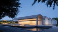
For the general public, the Kimbell Art Museum’s exalted reputation rests on the extraordinarily high quality of its small collection, with hundreds of firstrate pieces by Western painters and sculptors, and a growing cache of Asian and pre-Columbian work. For architects, the building housing that collection is its crown jewel: Louis Kahn’s cycloid-vaulted concrete and travertine oasis in silver and creamy white ranks as one of modern architecture’s greatest monuments, perhaps his most sublime building, the one he called his favorite child.
In 1990, 16 years after Kahn’s death, the museum announced an expansion, designed by Mitchell/Giurgola Architects. Its principal, Romaldo Giurgola, who had been close to Kahn, proposed replicating Kahn’s modular bays and appending them at both ends, thereby altering the original building’s proportions and scale. A truly nasty public outcry ensued. Kahn’s normally reticent daughter Sue Ann Kahn publicly condemned the design. Famous people, including Frank Gehry, Philip Johnson, and Phyllis Lambert, signed a petition. The Kimbell, humiliated, retracted the misguided scheme. But their space problem remained.
How to add to the sublime? Several years ago, the leaders of the Kimbell Art Foundation approached Sue Ann Kahn, hoping to avoid any hint of a reprise of the Giurgola debacle. What would she think about a separate building, connected underground, across the way from her father’s celebrated masterpiece? Kahn responded well. And whom to enlist? The Kimbell says that only one firm was ever considered: the Renzo Piano Building Workshop (RPBW).
Renzo Piano and his office have completed 21 museums and museum additions to date. Curators like the firm’s work because it “lets the art speak,” as one current client recently explained. Simple loftlike spaces acquire their refined elegance and placemaking character not through theatrical gestures that could upstage the art but through subtle moves: delicate compositions combining manufactured and natural materials, lavishly considered construction details, and abundant filtered natural light. Three of the firm’s very best projects are museums (two in Texas): the Menil Collection in Houston (1987), the Nasher Sculpture Center in Dallas (2003), and the Foundation Beyeler near Basel (1997). And RPBW’s museums are never bad; at worst, they are dignified, if somewhat tepid.
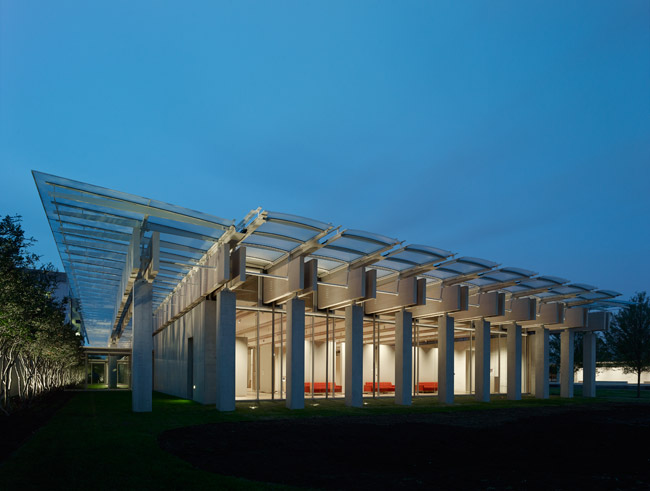
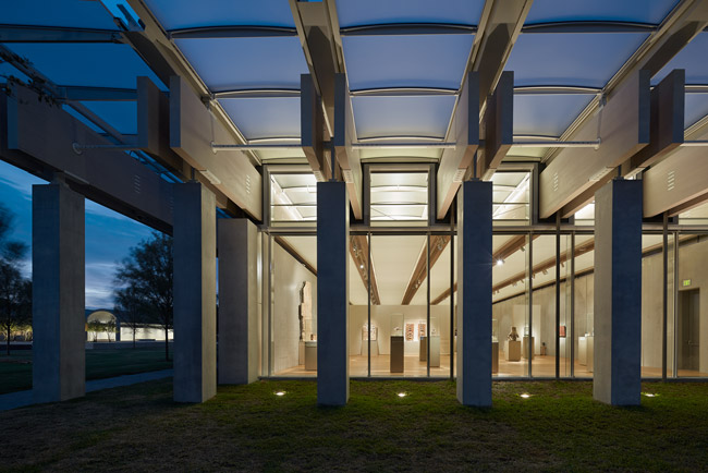
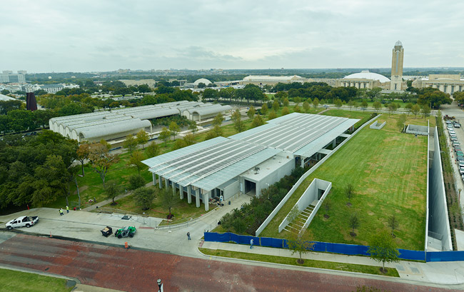
The one-story-high addition, located a civil 160 feet from the Kahn building, is about its size, adding three large new galleries as well as a 295-seat auditorium, library, classrooms, and event space, with underground parking connecting old and new. Everything about the project drips “R-E-S-P-E-C-T”—quite frankly, it looks as though Piano designed it with a straightjacket on. Hoping to start what he calls “a conversation” between old and new, Piano kept the basic organization of Kahn’s building: a 324-foot-long horizontally slung shed divided lengthwise into three equal bays with the entrance on center. Kahn’s building is concrete, travertine, and glass with oak floors; RPBW’s is concrete and glass with oak floors. (Mock-ups suggested that travertine would mimic the older building too closely.) In both, the structural conceit is the 100-foot-long-span beam landing on concrete columns. Inside both, top-lit galleries and fine detailing—from smooth concrete to shadow joints to polished metal hardware—dominate.
The addition’s entrance axis extends from the lobby to a glazed passageway through an outdoor courtyard, terminating in a buried, auditorium wing. A 19,200-square-foot grass roof covers this underground extension, which also includes classrooms and another gallery. Behind the auditorium’s stage—in a direct quote of the basement level of the Kahn building—a monumental glass wall faces a concrete retaining wall, where a linear troughlike lightwell edges the addition on the west. If this is a conversation, it is not between equals—Kahn sets the terms, and Piano offers polite comments about sustainability with such features as photovoltaic panels on the louvered skylights, 140 geothermal wells, and an under-floor air-distribution system.
Refinements abound. For the galleries’ concrete walls, on which art will be directly hung, RPBW poured dozens of samples before hitting upon a silvery-gray shade mixed with titanium. The tint holds its own without overpowering the visually delicate Old Master paintings that form the core of the collection. (The opening show is devoted to the permanent collection; after that, traveling exhibitions will be housed in Piano’s galleries.) The architectural team devised a construction system of birch plywood forms for a 30-foot pour without tie-holes that creates super-smooth walls resembling spun silk. The 29 pairs of 100-foot-long-by-52-inch-deep laminated Douglas fir beams are, regrettably, almost invisible inside the two top-lit galleries owing to the scrim stretched between the beams. But their exposed surfaces help infuse the interior with a soft yellow light.
Muscularity trumps obsequiousness twice, once outside, once in. On the north and south elevations, closely spaced concrete columns support paired wood beams and a glass skylight above, creating a pounding tempo. And inside, north-south axes of paired courtyards and monumental staircases generate a strong rhythm.
More often than not, though, the docile acquiescence of the RPBW building highlights why Kahn’s architecture is so compelling. RPBW’s straightforwardness lacks the spatial nuance Kahn achieved with his more complex composition: the low-slung cycloid vaults pull the roofline closer to the user and help, along with the tartan grid plan, to disaggregate the building into smaller cells related to the scale of the human body. Galleries in both the original and the new building may be top-lit, but Kahn’s long, dramatic swaths of daylight, cast from slots running down the center of vault-like cantilevered beams, change all day long. Piano’s glazed ceilings may be a curator’s dream but add none of the temporal complexity to the experience of being indoors that Kahn’s cycloid vaults and skylights do. And although the buildings seem so similar, a sense of nature suffuses only Kahn’s, owing to the more highly textured materiality of his wood, travertine, and concrete, along with his more vigorous sculpting of natural light. The domestic feel of Kahn’s more dynamic, roomlike spaces is absent in the addition’s institutional Miesian interiors. For these reasons and more, only the Kahn portion brings about a deeply personal connection between user and building.
Kahn often said that a building is a struggle, not a miracle. It’s too bad that Piano didn’t engage in a more intense conversation with Kahn. Reportedly Piano proposed design features that would have more strongly differentiated the two buildings, such as wood siding and taller proportions, but these suggestions were rebuffed by clients wary of public outcry. That RPBW successfully solved the Kimbell Art Museum’s space crunch without ruining, or even particularly changing, the original building is an accomplishment worth applauding. In the case of beloved monuments, even this outcome is never preordained.
Architect: Renzo Piano Building Workshop—Renzo Piano, principal; Mark Carroll, partner in charge; Onur Teke, associate in charge; Shunji Ishida, partner
Executive Architect: Kendall/Heaton Associates
Engineer: Guy Nordenson & Associates (structure), Brockett/Davis/Drake (structural consultant to construction manager); Arup, Summit Consultants (m/e/p)
Client: Kimbell Art Foundation
Size: 101,130 square feet
Cost: $135 million
Completion date: November 2013
Curtainwall, skylight: Seele
Sarah Williams Goldhagen, the architecture critic for The New Republic, wrote Louis Kahn’s Situated Modernism (2001).
People |
Products |


