Rome, Italy
For the hordes of tourists stuck in lines for the Colosseum or queuing up to enter the Sistine Chapel, Rome’s 2,000-year history acts as a powerful magnet. But for contemporary architects working in the city, this same history can be a heavy weight. Purveyors of the new quickly feel hamstrung and defeated, with old battles between modernity and tradition waging on forever.
Odile Decq & Benoit Cornette’s extension of the Museo d’Arte Contemporanea di Roma (MACRO), one of the city’s two contemporary art museums (along with Zaha Hadid’s MAXXI [record, October 2010, page 82]), enters this conversation very much on the side of the modernists.
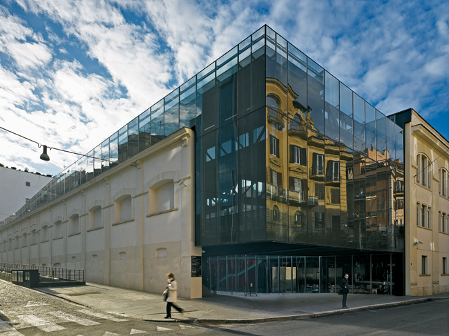
Set in a converted 19th-century Peroni brewery in the Via Nomentana area, MACRO occupies a significant piece of the city’s industrial archaeology. (Part of Decq’s mandate was to leave the exterior walls untouched.) But once inside the building, Decq turns her back on history, not deeply engaging the past nor the specific context of the conserved structure.
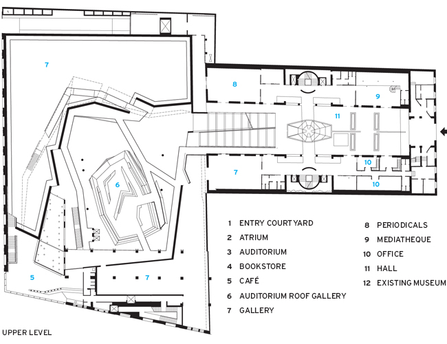
From the street, the museum addition appears as a glass box suspended within the old industrial building and set one story above ground. Visitors enter under a raised glass corner, through a small outdoor courtyard, then into a grand atrium sheathed in glass and black-painted masonry and framed by an elevated walkway that zigzags through the building on its way to the roof. Decq’s main move was carving out a series of twisting voids in the center of the building, having gutted the old interior and cleaned and stabilized the corner facades. “We did tests with gray during construction but chose black [for the interior walls],” says Decq. “For a museum you always think of white. But black is truly neutral.”
In the middle of the atrium, a bright red (nearly orange) polygon houses a small auditorium. With its lacquered-wood envelope cut into large facets and a red entry ramp extended like a tongue, this structure within a structure has a kinetic quality that animates the entire project. Decq admits to literalism: The color of blood, the auditorium is the pulsing heart of the building.
Despite the focus on unusual geometries and modern forms, Decq displays an interest in Rome and its architectural traditions. Her use of basalt pavers on the walkway through the structure refers obviously to the cobblestones, called san pietrini (little Saint Peter’s), that define the cityscape of Rome. But it’s the roof, an elevated piazza accessible to visitors, that truly connects to the city. Here we find the archetypal Italian space, wrought in hardscape and arranged around a fountain. Decq’s fountain is, in theory, an interpretation of this Roman symbol: a slightly inclined plane of glass over which a thin sheath of water runs — reflecting the sky, the light, and the surrounding buildings. The glass is also a skylight for the cavernous atrium below and refracts daylight into this large, black space. Unfortunately, after half a year, the water doesn’t run, much to the chagrin of the architect. The horizontal glazing is left to gather the red dust of Rome’s scirroco winds.
Inside the 108,000-square-foot addition, the architects surrounded the atrium with a ring of rooms, beginning with a café and proceeding through a series of orthogonal galleries that were renovated from the original 19th-century structure. These spaces connect visually and conceptually with the areas that were restored when the museum first opened in the 1990s in an adjacent building. However, while those spaces work as generic galleries, Decq kept the industrial remnants of the old brewery in place. Exposed concrete beams and pillars in the 31,000 square feet of new galleries establish a stronger connection to the past, though the white walls and ceilings bring us back to the modern era. The gallery expansion provides much-needed space for the museum’s collection of postwar Italian art.Perhaps the most exciting part of the entire building — save the fountain should it ever run again — is the walkway that hangs from the atrium roof. Critics have mused about the similarity with Hadid’s design for MAXXI, which opened shortly before MACRO and also features myriad elevated walkways.
But Decq’s scheme holds a surprise: visitors zigzag through the foyer, catching views of artwork and the red auditorium from different perspectives, until stepping around a sharp corner and through a massive door into a giant back room, which is actually the main exhibition space for major installations. Though large, the space defies regularity as it wraps around the outside of the foyer, giving us the impression we’ve discovered something hidden.
Decq’s expansion of MACRO is the latest in a string of major projects that the government of Rome hopes will breathe new life into the Eternal City. The trend began a decade ago with Richard Meier’s Jubilee Church built for the millennium, and continues now with Rem Koolhaas’s plan for the Mercati Generali, Massimilliano Fuksas’s Congress Center Rome-EUR, and Renzo Piano’s EUR housing. With Rome launching an active bid for the 2020 Olympics, these projects represent a desire for big-name, big-budget works to make a statement about Rome in the 21st century.
Decq’s work is certainly big and important. But its budget was modest: about $34 million. In fact, a proletarian element runs through the project and grounds it. Nearly half of the new structure is open space that, although architecturally part of the museum, is accessible to the public and belongs to the city. Symbolically, at the entry courtyard we thread between a grove of scraggly trees. These are paradise trees, an invasive weed that crowds Rome’s abandoned spaces, but arrayed here in a grid and given pride of place. They’re a gesture to the everyday and the public and they stabilize an otherwise soaring work.
Total construction cost: $34 million
Size: 108,000 square feet (addition); 42,000 square feet (existing)
Completion date: December 2010
PeopleOwner: City of Rome
Architect Personnel in architect's firm who should receive special credit: Architect of record: Odile Decq Project architect: Giuseppe Savarese Interior designer: ODBC
Consultant(s)
General contractor
2 : CLM, Centro Lavorazioni Metalli ( Roma Italy)
Photographer(s)
Renderer(s) |
Products
Glazing
Doors
Interior finishes
Furnishings Tables: Poltrona Frau Upholstery: Gum floor : Dalsouple
Other furniture: Wash Bassin : Ronchetti Plumbing Fixtures: Franke Special Lighting: Luce Plan
Lighting Exterior: Luceplan |


