Musashino Art University Museum & Library




Architects & Firms
Tokyo, Japan
Built in 1962, Musashino Art University’s combined gallery-library is one of the school’s treasured original buildings. Designed by architect Yoshinobu Ashihara, the Modernist concrete edifice occupies a prominent position amid the school’s 27-acre campus, a checkerboard of solids and voids 25 miles west of central Tokyo. But even treasured architectural gems have a shelf life. And after 40-plus years, the building had become cramped and outdated.
Abutting the existing building, whose renovation will finish this spring, the new, 69,000-square-foot library fills what was one of the only open plots left on the now-congested campus. Though the site is surrounded by a variety of academic buildings and the main cafeteria, it had few constraints, since many of these older structures are slated for redevelopment in the near future. The broad pedestrian thoroughfare to the north, lined with flowering cherry trees, was the logical place to enter the building and start the spiral wall.
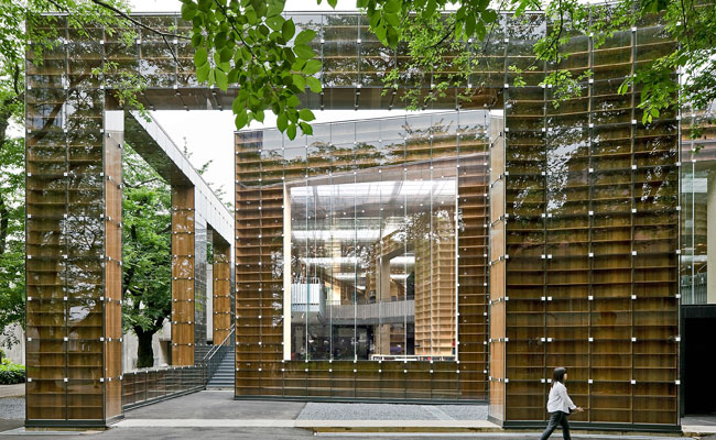
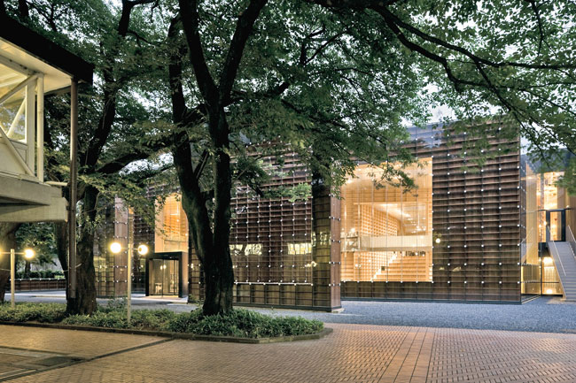
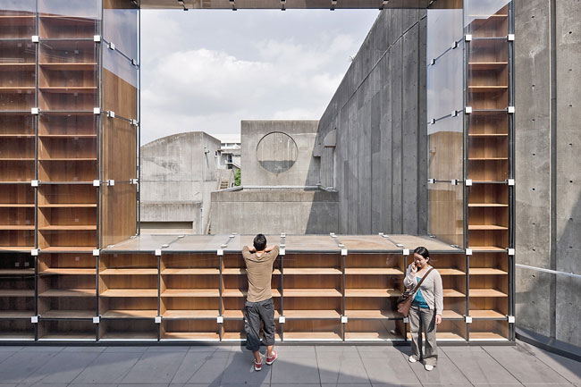
Composed of wooden bookshelves enclosed with glass, the spiral begins as a freestanding, 28-foot-high wall that rings the building perimeter and then curls in to define concentric layers of space inside. Visible from multiple directions on the campus, this wall immediately identifies the building’s function as a place of books. Students enter through a large opening in the wall into a small vestibule that serves as the three-story library’s primary entrance. Nestled between the new and existing buildings, exterior stairs ascend to the second floor, where an ancillary entrance connects the two structures and leads to a covered terrace at the rear of the library.
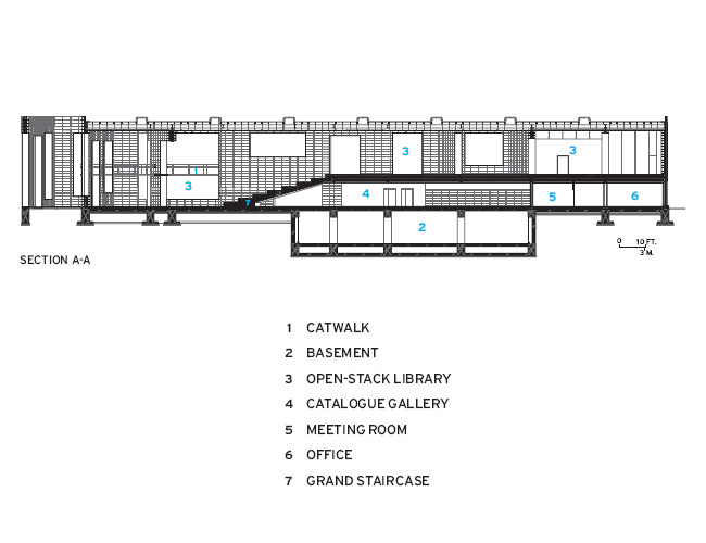
Back at grade, the tunnel-like vestibule opens onto a dramatic, double-height periodicals section followed by a circulation desk, rare book room, catalogue gallery, and offices on the ground floor. While private study carrels line one wall, rooms for meetings, research, and exhibits separate the secured book-storage area. Upstairs, a reading room and open stacks fill almost the entire upper floor. Additional shelving and storage occupy the basement. With room for 300,000 volumes, the new facility has over twice the capacity of the old library.
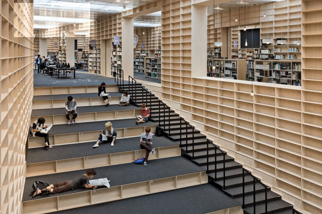
“The whole space is continuous but on two levels,” says Fujimoto of the library’s main floors. In the spirit of a fantastic Piranesi etching, the architect blurred the boundary between upper and lower levels with tiers of stepped shelves big enough for sitting, vast void spaces puncturing the second floor, and a web of narrow catwalks winding their way among the colossal shelves. And while a run of gentle risers graciously leads up to the reading room, elevators and enclosed staircases offer alternate routes at either end of the building.
Though the enclosed programmatic elements partially obscure the spiral downstairs, it is clearly legible upstairs, where the floor-to-ceiling bookshelf winds repeatedly around the reference desk in the middle of the room.
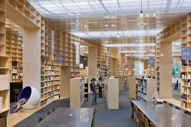
Between the spiral’s 16-foot-high shelves, furniture and lighting designate functional zones. Carefully positioned for easy access, low bookcases fill the layered rings of space, while communal tables, individual desks, computer-lined counters, and select designer chairs from the school’s substantial collection clearly define seating and study areas.
The lighting scheme also helps orient library users as they navigate the mazelike space. Rows of task lights dot the balconies, and a cluster of pendant fixtures hovers above the reference desk. “It is like walking through a forest,” explains Fujimoto. “Bright lights invite you to go here or there.” During the day, sunshine boosts the installed ambient light, gently illuminating the entire room.
In addition to expansive picture windows, skylights interspersed with opaque panels stripe the roof and fill the room with muted rays. Directly beneath, a dropped ceiling made with double panels of polycarbonate honeycomb disguises the overhead ducts and beams while diffusing the daylight from above. Mirroring the shelves below, the surface of the glossy panels reflects the rows of books, making them appear to go on forever.
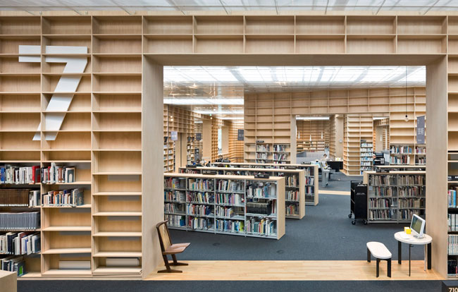
Cutting across the three-foot-thick bookshelf walls are sequences of rectangular openings of varying proportions and sizes, each one determined by multiple model studies. They alleviate the concentric geometry, framing views within views and creating a sense of depth in the space. At the same time, these breaks in the walls facilitate the library’s book classification system. Physically, this system is manifest with wedge-shaped
sections that radiate out from the reference desk. These sections correspond to different numbered subject categories. White, plastic supersize graphics affixed laterally to the shelves identify each section.
Made of lightly stained, laminated basswood, the double-loaded interior shelves straddle the line between architecture and furniture. Their partitions and backing boards conceal and are pinned to the library’s steel structure: a rigid frame system of beams and oblong columns supporting a fire-rated substrate. “The columns are really more like small braces,” explains Fujimoto. Due to the walls’ quirky shape and irregularly spaced openings, the columns could not stand in grid formation. But the voluminous bookcase wall provided plenty of room for alternative positioning, and extra beams ensured stability.
At the building’s exterior, the shelves are stained dark brown and have been chemically treated for fire protection. Moreover, along with concealing the insulation, these shelves hide the steel hardware that secures the exterior glazing. Though the 3-foot-square panes appear to float in front of the wood cases, square metal fasteners affix the 0.3-inch-thick glass sheets together and anchor them to the building’s structural frame.
Beyond reinvigorating Musashino Art University’s aging campus, Sou Fujimoto’s library champions books — an especially noble achievement at a time when the printed word is facing an uncertain future. “Anyone can read at McDonald’s,” says the architect. “But enjoying, concentrating, and relaxing in a library surrounded by books is a special experience.”
Yet the building is curiously longing for books. Both inside and out there is an abundance of empty shelf space. Initially Fujimoto envisioned walls of books filled up high to the ceiling. But in the end only the first seven rows are actually in use, since shelves above six feet require extra measures for earthquake protection and stepladders for access. “After completion, I found that emptiness is better,” reasons the architect. “If you fill up all the shelves, it is just a bookcase. But if you leave it part empty, it is full of potential.”
Lined with towering bookshelf walls — whose empty shelves represent the library’s potential as a place to use and house books for years to come — an integrated cascading stair and series of stepped shelves serve as a connection between the two main levels and provide plenty of room for students to sit or recline as they read, sketch, or catch up on text messages and e-mail.
People
Owner:
Architect:
Personnel in architect's firm who should receive special credit:
Project Team: Koji Aoki, Naganobu Matsumura, Shintaro Homma, Tomoko Kosami, Takahiro Hata,
Architect of record:
Interior designer:
Engineer(s): MEP: Kankyo Engineering--Takafumi Wada, Kazunari Ohishima, Hiroshi Takayama
Consultant(s):
Lighting:
Other: Furniture: Inoue Industries--Takafumi Inoue, Azusa Jin, Yosuke Goto, Hideki Yamazaki
General contractor:
Photographer(s): Location: Tokyo, Japan Gross square footage: 69,095 sq ft. Completion date: June 2010 |
Products
Structural system
Exterior cladding
Wood:
Curtain wall:
Roofing
Skylight:
Windows
Interior finishes
Furnishings Signage and Furniture Fabrication: INOUE-INDUSTRIES |


.jpg?height=200&t=1692184429&width=200)


