Valentino
Fashion Forward: An Italian sense of craft and detail is brought to New York City's major shopping street by David Chipperfield's design for Valentino.








Architects & Firms
New York City
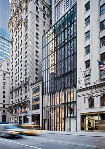
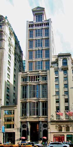
New York City's ever-changing landscape is particularly fast-paced when it comes to retail shops. Where once a fancy facade of columns, capitals, and cornices heralded Takashimaya New York on Fifth Avenue between 54th and 55th streets, a discreetly linear, glass-and-steel facade signals the new Valentino flagship store. When the high-end Japanese emporium closed in 2010, the original facade, with black granite engaged columns, paired red granite colonnettes, and bowed windows, already looked out of fashion. While you can still catch a glimpse of the upper floors of the 21-story tower designed by John Burgee Architects in 1993 (two years after Burgee and Philip Johnson had dissolved their partnership), its eight-story base now reflects the austerely modern approach of David Chipperfield Architects. (Few have lamented the loss of Burgee's flourishes: no DocoPomo conservation group has sprung up in the tracks of Docomomo.)
Valentino commissioned Chipperfield to design the three-story flagship store (with the five floors above to be leased out) in 2008 after the founder of the Italian fashion house, Valentino Garavani, decided to pass the red velvet cape, so to speak, to the creative directors Maria Grazia Chiuri and Pierpaolo Piccioli. Since Garavani had left, the company took the opportunity to reestablish its identity for the future, and architecture was to be part of it. While Chipperfield may be best known for the rigor and clarity of his museum and gallery design, impressively displayed in the Neues Museum in Berlin that he renovated with Julian Harrup, as the British architect points out, he has long worked with fashion designers such as Issey Miyake, Joseph, and Dolce & Gabbana: 'Without the Miyake shop on Sloane Street in London [1985], I would not have started my own firm,' he says. Chipperfield's Milan office, established in 2006, has already executed a handful of projects for Valentino and has many more on the boards.
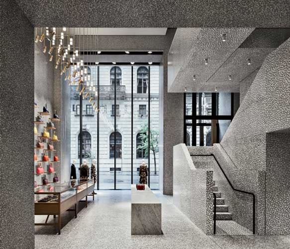
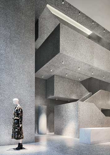
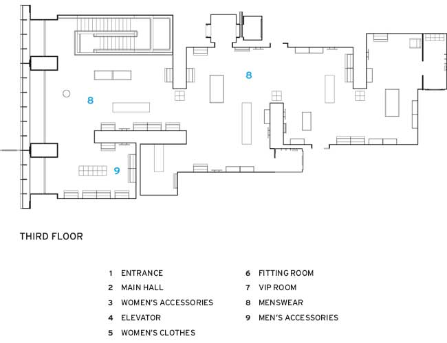
Entering the Fifth Avenue shop, the visitor finds a powerful interplay of spaces and solid planes that highlights the clothing on display. Originally a 42-foot-high atrium cut through Takashimaya's first three floors, with its grandeur pumped up by interior designer Larry Lazlo using black metal Doric columns, a gold-leaf ceiling, onyx, and marble. Chipperfield, with New Jersey'based associate architects Tricarico, brought the atrium height down to 27' feet for a ground-floor space devoted to women's accessories; a second floor for women's clothes overlooks it. The team filled in the third floor for the men's department and pulled it back from the facade so that it seems to float in space. They also linked the three levels with an open stair, cantilevering its steel frame from the north wall of the building and off the second-floor slab.
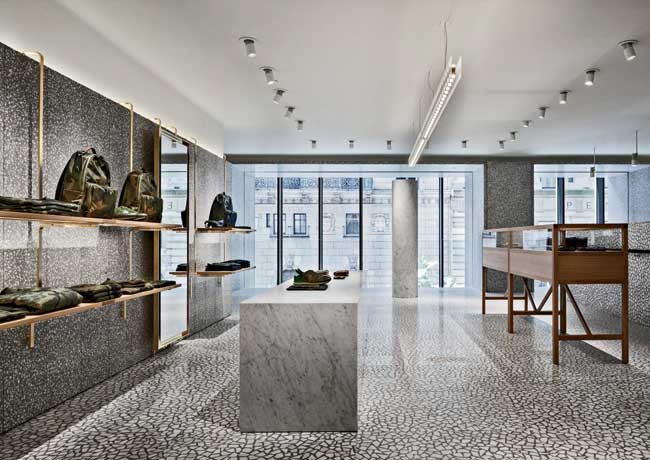
The stair's enclosing planes of palladiana (where large pieces of marble are embedded in panels of cement and marble dust) turn this circulation device into a rectilinear, sculptural entity slightly reminiscent of Adolf Loos's veined marble-wall sequence of steps in the Villa M'ller in Prague (1930). Employing palladiana in the stair and other strategic locations was not all that easy: panels and tiles were cast in Italy and assembled on-site, where they had to be lifted into place by crane and then screwed, glued, and even welded in some places. Offsetting the palladiana are light- and dark-gray terrazzo floors and walls with secondary, more diminutive marble chips. The contrapuntal play of the two differently scaled stone patterns creates a mesmerizing backdrop without overwhelming the clothes and accessories on view.
Furnishings include massive white Carrara marble counters and plinths, and oak and leather seating, combined with rectilinear vitrines of brass, and carbon fiber racks. On the second floor an unexpected softness is created by white gypsum board cast in vertical ripples resembling the folds of curtains; gray padded-leather walls for the fitting rooms add to the low-key luxe ambience. Custom LED lighting keeps up the glitter without glitz and provides accurate color rendering throughout the store.
Facing west, visitors have views of Fifth Avenue through the expansive glass facade. The architects wanted to keep the steel profiles minimal for the sight lines, explains Karen Brant, partner of Heintges, the curtain wall consultants. To create the extremely high glass wall with the narrowest mullions possible, she adds, 'We had to distill, distill, distill.' The system'fabricated in Germany'and the elegance of the Miesian detailing make it easy to see why Chipperfield was chosen to renovate and restore Mies's New National Gallery in Berlin.
The architectural counterpoint of three-dimensional solidity and mass with two-dimensional surfaces and pattern creates an arresting environment in which to show Valentino's often bold and dramatic attire. The mastery of materials and craft further enhances a sense of timelessness so alluring for a venue where fashion reigns in all its ephemerality. It helps to have the money for the means (no one will reveal the construction budget), but fortunately the architects have used the opportunity to investigate design ideas that could be applied in situations with less lavish budgets'even museums or galleries.
PeopleClient: Valentino USA, 11 West 42nd Street, New York (NY) USA Owner: Thor Equities, 25 West 39th Street, New York (NY) USA
Architect:
Personnel in architect's firm who should receive special credit: *not registered architects Architect of record: Tricarico Architecture and Design PC, Wayne (NJ), USA
Engineers: MEP: Rosini Engineering, New York (NY), USA Façade: Seele, Gersthofen, Germany
Consultants: Site survey: Milano Rilievi, Milan, Italy Site supervisor: Studio 3 Architetti Associati, Milan, Italy Code consultant: Outsource, New York (NY), USA Security consultant: DGA Security Systems, New York (NY), USA General contractor: Michilli Construction and Consulting, New York (NY), USA
Photographer(s): Size: 13,450 square feet Cost: Withheld Completion Date: August 2014 |
Products
Structural system Steel structure (staircase): Brendolini scale srl, Vighizzolo di Cantù (CO) Italy1 Steel structure (external facade): Seele, Gersthofen, Germany
Exterior cladding
Glazing:
DGU 6+6 mm Ipasol ultraselect 62/29+ 16 mm spacer+ 8 mm ESG Low iron (from level 4 to 8): Seele, Gersthofen, Germany
Other cladding unique to this project:
Doors Offices entrance: White painted steel: Seele, Gersthofen, Germany
Interior finishes
Walls:
Staircase:
Furnishings
Seatings:
Tables:
Lighting
Conveyance Dumbwaiter: Matot, Inc. 2501 Van Buren Bellwood, Illinois, USA
1 Supply; Installation in collaboration with Michilli Construction and Consulting, New York (NY),USA |


