The Hague
In the hands of Dutch architect Hans van Heeswijk, the Mauritshuis, a 17th-century mansion in The Hague that later became the Netherlands' first museum, has undergone an impressive expansion.
Toward the end of the last century, the Mauritshuis's popularity grew rapidly and quarters became cramped, both for visitors and staff, who had to be housed in a nearby building. The museum was able to rent space across the street at Plein 26, a brick Art Deco addition to a private club, but connecting the two buildings in the dense historic center of The Hague'right next to Parliament and the prime minister's office'was not a slam dunk.
Van Heeswijk, who is known for his conversion of a home for the elderly into the Hermitage, among other projects, won the commission for the Mauritshuis with his plan to double the floor space to 73,000 square feet while stitching the two pieces together by digging down. 'This project was all about logistics,' he says. 'It is more about organizing and cleaning up than about design'it is important that visitors immediately understand where they are and where they're going.'
To connect the mansion to Plein 26, the team excavated below the forecourt, expanding the basement to create a new lobby, which extends beneath the street, creating a seamless and inviting new public space. Since the last renovation, in 1987, visitors had to enter a cramped lower level, arriving through a service entrance. Now they pass through the mansion's gates'a privilege long reserved for royalty and visiting dignitaries'and descend to the lobby through an opening carved out of the forecourt. They can take a cylindrical glass elevator or an elegant winding stair to a sunken courtyard, from which they enter the building through a full-height glass wall.
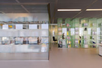
Subterranean though it is, there is nothing gloomy about the new lobby. Daylight streams in through the glazed wall as well as through glass panels in the forecourt's paving. Clerestory windows also admit light and serve as an orienting device, providing views of passersby on the sidewalk above. An elevator and stairs at the lobby's west end lead into the mansion and its opulent, renovated galleries. Beyond updating mechanical systems, lighting, and finishes, the architect's main intervention in the actual museum is the ingenious elevator, which emerges just beyond the mansion's front door. Here, van Heeswijk replaced the vestibule with a glass elevator box, providing accessibility to the galleries while opening up sight lines to the art. To the lobby's east, circulation carries visitors up into Plein 26, now called the Royal Dutch Shell Wing, which houses temporary exhibitions as well as a brasserie, library, children's education area, meeting rooms, and offices.
The biggest challenge in expanding the Mauritshuis, says van Heeswijk, was to logically link the old and the new spaces while reconciling different floor levels. For example, four feet of soil had to be excavated from under Plein 26 to bring the new wing's floor down to the same level as the lobby. The excavation process was particularly arduous. To counterbalance the pressure from the surrounding earth and groundwater, the team let the excavation pit for the lobby fill with water as they continued to dig, so divers had to build the formwork and pour the concrete for the 4-foot-thick steel-fiber-reinforced floor. Beyond this, three other foundation-construction techniques were employed because of the highly varied site, with its 17th- and early 20th-century structures, as well as the new excavation below the street'which, because protests occur in this precinct (the country's seat of government) had to be able to support the weight of a tank. Excavating for the elevator beneath the mansion also required special preparation. Before digging the 30-foot-deep shaft, which extends below groundwater level, the team had to inject the surrounding earth with gel to prevent the void from caving in, as well as make it watertight.
But all the high-tech engineering and complex construction maneuvers that made this project possible have now faded behind the scenes. In the end, it is the minimalist 21st-century design and its restrained palette of stainless steel, glass, and stone that shape the visitor experience and join two disparate historical landmarks into a logical, gracious whole.
People
Client:
Architect
Personnel in architect's firm who should receive special credit: Project manager: Stephanie Haumann, architect MSc
Interior designer: Stephanie Gieles
Engineers: M&E-Installation consultants: Arup, Amsterdam Building physics consultants: DPA Cauberg-Huygen, Den Bosch
Consultant(s): General contractor: Royal Woudenberg, Ameide
Photographer(s):
Christian van der Kooy Size:
38,000 square feet (renovation); Cost: $36 million Completion Date: June 2014 |
ProductsElevators: Mitsubishi Glass elevator shaft: Octatube |


