M/S Maritime Museum of Denmark
Ghost Ship: In the shadow of a 16th-century UNESCO-listed castle, a museum steps into the footprint of Denmark’s maritime industry.


Architects & Firms
Helsingør, Denmark
Over the past decade, Bjarke Ingels’s firm BIG has made its reputation primarily by designing some of the most ambitious residential buildings anywhere today. First in Copenhagen and now in New York, Beijing, and other cities, the office has gained international attention by finding opportunities for architectural invention within the tight practical demands of speculative residential development. Over the last six years, as many of those projects have risen, the office has been working to realize an earlier big win: a 2006 competition for the M/S Maritime Museum on the coast of Ingels’s native Denmark. With the project now complete, BIG adds to its burgeoning portfolio an impressive public building that negotiates formal and technical constraints to create a public landmark in a footprint of the nation’s historic shipbuilding industry.
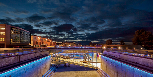
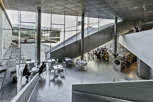
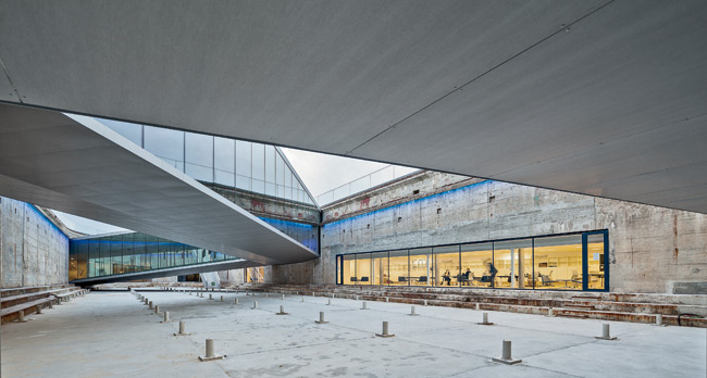
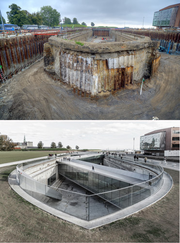
While the solution was mostly effective, the practical demands imposed by such a unique site were not easy to resolve. Galleries and exhibition spaces could be placed in the dock and lit from above, but working spaces and staff offices would require light, views, and circulation that could not be accommodated in the narrow footprint of the sunken space. Recognizing these constraints, the competition brief for the new museum called for over 60,000 square feet of exhibition halls, offices, and conservation facilities to be located partly in the dock and partly in existing structures nearby, effectively dividing the museum into separate buildings. BIG’s winning entry radically reconfigured that program by embedding the building around the perimeter of the void rather than within it. This arrangement allowed the dock to be used as an entry and circulation space as well as a sunken courtyard that would provide light to the surrounding galleries, café, and offices 26 feet below grade. More important, it increased the available program area so that all public and administrative functions could remain together in a single structure.
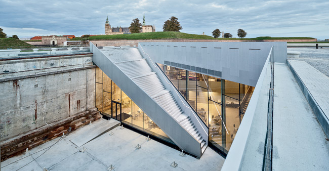
After nearly six years of extensive design and engineering, the building that has emerged from that winning proposal is a subtle yet surprising addition to the historic waterfront. Walking north from the train station, the silhouette of the castle dominates the horizon, and the only visible portion of the museum is a handrail floating above the surrounding wharf. As visitors near the edge of the low glass perimeter wall, they confront the immense boat-shaped void that serves as the public facade. The museum appears not as a monument so much as an inhabited ruin, an archaeological site undergoing excavation beneath the public promenade. A series of cuts in the walls of the dock allow light and access to the spaces below while providing a hint of the extensive facilities. The battered concrete has been cut with the careful precision of a Gordon Matta-Clark operation to sharpen the contrast between old and new and to reveal the raw beauty of the 5-foot-thick structure. The sharp lines of the aluminum-clad bridges, which guide visitors into and across the sunken pit, heighten the drama of the negative space and provide additional room for exhibitions and events.
In a move characteristic of BIG’s design approach, the entire program is organized around a unifying gesture—an elongated ramp–that extends throughout the length of the building. Halfway along the southern edge of the site, the ramp begins its descent into the dock and turns before proceeding through the concrete wall and entry doors. Continuing past the ticket counter, the ramp moves gradually down through the exhibition galleries and around the perimeter of the void until it reaches the dock floor. The return journey is completed via a less elaborate, though slightly dizzying, ascent up an angled staircase.
This continuously flowing route is a familiar motif for museums. Many architects have experimented with sloping exhibition spaces, but here the gesture is executed with remarkable restraint. The gentle descent is at times barely noticeable as it lulls visitors through the continuous exhibition hall. Along the way, the width of the ramp slowly shifts in accordance with the oblique geometries of the plan, altering the scale and proportions of this elongated room. It alternately compresses and expands, creating moments of intensity and providing a variety of spaces for the museum’s diverse collection of paintings, posters, artifacts, and scale models of ships from a wide range of historical periods.
The impressive feats of engineering, requiring Danish firm Rambøll to bury a museum deep underground on the shores of the Baltic Sea, have inspired a book documenting the project that will be published later this year. However, most visitors will happily overlook the technical achievements of the project as they become absorbed in the gently shifting rhythm of the galleries and the captivating views from within the sunken void. As in sailing across the open sea, planning is important, but most of us just enjoy the ride.
People
Client:
Owner:
Architect:
BIG NYC
Personnel in architect's firm who should receive special credit:
Engineers:
Consultant(s):
Lighting:
Fire consultant:
Client Consultant:
Exhibition Design:
General contractor:
Photographer(s): Size: 77,500 square feet Cost: $54 million Completion date: October 2013 |
Products
Glazing
Flooring
Concrete flooring:
Interior Finishes
Aluminium Ceilings:
Interior glass walls:
Stairs:
Wall painting:
Granite:
Resurfacing of the dock bottom:
Linoleum:
Ventilation:
Inventory:
Doors
Fire doors:
Furnishings
Curtains:
Lighting
Conveyance
Plumbing
Plumbing:
Sprinkler System: |

