Claire T. Carney Library Renovation and Addition
Wrestling with Rudolph: Changing an important complex by a major (but difficult) architect poses both dangers and the chance to keep his work alive.

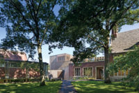
The east side of the addition encloses Rudolph’s “link” between the library (left in photo) and a science-and-engineering building.

The east side of the addition under construction.

On the west side of the link, designLAB excavated around Rudolph’s bulbous columns (slide #5) and tucked the new facade under his projecting eaves (left). Stainless-steel screens help shade the glass addition.

The campus in 1985.
Photo courtesy University of Massachusetts, Dartmouth Archives

On the west side of the link, designLAB excavated around Rudolph’s bulbous columns (left) and tucked the new facade under his projecting eaves. Stainless-steel screens help shade the glass addition.

A large meeting room in the library proper has walnut paneling and gridded windows that would probably have been anathema to Rudolph.

On the east side of the link, the architects created a new light-filled gallery.

On the west side of the link, designLAB introduced new seating and colors in a space that had been outdoors, while on the east side the firm created a new light-filled gallery.

Old photo showing the link.
Photograph courtesy of designLab

View of the link in the area that is now the east gallery.
Photograph courtesy of designLab

Old view of the library in what is now the browsing area.
Photograph courtesy of designLab

The library renovation under construction.

The link in the evening.

Interior of the library.


Original site rendering, 1966.


Diagram courtesy of designLab


Architects & Firms
University of Massachusetts, Dartmouth
Last fall, the artist Tatzu Nishi created a fully furnished living room around the statue at the center of New York's Columbus Circle. The installation, Discovering Columbus, upended the relationship between the sculpture, 75 feet above the street, and its setting; meant to be seen from a distance, it was now encountered, somewhat unsettlingly, at point-blank range. Provocative and controversial, the piece was also temporary.
Something similar is happening in Dartmouth, Massachusetts, except it isn't temporary. A section of the campus of the University of Massachusetts, Dartmouth, designed by Paul Rudolph in 1960, is being engulfed in a new living room. That room, complete with fireplaces and walnut-paneled nooks, is meant to make part of the campus more usable; like Discovering Columbus, it has the effect of bringing visitors in close proximity to sculpture—in this case, Rudolph's evocative concrete forms.
To the university, it is a way of making an admired, but often unloved, facility more practical. And if the renovation succeeds, it may point the way toward saving other Rudolph buildings from the wrecking ball. As the project was nearing completion, one of its masterminds, Robert Miklos of the Boston firm designLAB, reached out to the government of Orange County, New York, which has been threatening to demolish its Rudolph-designed administration building. Just before the new year, officials responded, hiring designLAB and Clark Patterson Lee to study the viability of renovating, rather than tearing down, the building.
But what works in one case may not work in another. Rudolph's complex for UMass Dartmouth (on which he worked with Boston architects Desmond and Lord) consists of two vast academic buildings, each more than 300 feet long, bracketing a large college green. At the end of one of the long buildings is the five-story Claire T. Carney Library, with large boxes projecting from its upper floors. Like the rest of the campus, the building was constructed of board-formed concrete, with Rudolph's trademark “corduroy concrete” bricks for non-structural walls. The sprawling campus was completed in phases from the mid-'60s to mid-'70s, when it was known as Southeastern Massachusetts Technological Institute.
Connecting the library to the rest of the campus was a link consisting of an enclosed hallway raised on bulbous concrete piers. Almost entirely windowless, the hallway was grim but at least provided shelter; the open spaces below, according to library director Catherine A. Fortier-Barnes, were useful only to skateboarders and students playing the live-action game Humans Versus Zombies.
After decades of study, the university decided to make the library and the link more usable. In the library itself, designLAB (working with Austin Architects) undertook a series of renovations that included creating large, glass-enclosed reading and meeting rooms from smaller, oddly proportioned spaces. That strategy necessitated removing old corduroy bricks in some places and adding new ones (made from original Rudolph molds) in other places. The changes are visible from the exterior, with some rooms extending beyond the old building line, their new windows larger and more conventionally gridded than those used by Rudolph. There is one other large change to the exterior: the installation on the roof of modern heating and cooling equipment, replacing the 53 individual fan-coil units that Rudolph secreted in closets around the building. This move essentially added a sixth floor hidden behind stainless-steel screens.
Inside the library, spaces have been reconfigured, a job that included providing ramps to create universal access—almost an oxymoron in a building that could have been designed by M.C. Escher. New lighting not only relieves the building's former gloominess but allows the richly textured concrete of ceilings and upper walls to be appreciated as never before, putting Rudolph's artistry (and that of the carpenters who built his formwork) on display. New furniture and carpets—in a palette of reds, oranges, and purples that Jennifer McGrory, associate project manager for Austin Architects, calls “op art meets Josef Albers”—was employed throughout the 150,000-square-foot renovation.
If the changes to the library itself had been the end of the project, it would be considered a success. Most of Rudolph's key features were retained, and librarian Fortier-Barnes is bursting with statistics about how popular the building has become since it reopened last September. But the more visible part of the $34.5 million UMass project involves enclosing the link in a 24,000-square-foot “atrium” between a pair of 120-foot-long, sheer glass walls, a task just completed in January.
Downstairs, the new link serves as a large reading room and caf' (complete with fireplaces). Upstairs, the hallway, having had much of its corduroy-concrete enclosure removed, is now a kind of bridge overlooking the space below (as well as the entire campus, through the new 30-foot-high window wall). So, in addition to bringing students into close proximity with Rudolph's béton brut, it gives them sweeping views of the rest of his startling ensemble. Indeed, in and from the new atrium, Rudolph's architecture will be seen more clearly, and more comprehensively, than at any time in the last half century. But at what cost? Like the statue of Columbus, Rudolph's work, once exterior and public, is now, for all intents and purposes, encased in a vitrine.
And the result is visible from almost everywhere on campus, since a large part of Rudolph's concrete palisade has been preempted by glass walls (which, in a wan echo of the original buildings, are shaded by vertical fins of stainless-steel mesh). Luckily, the plain new surfaces bring Rudolph's architecture into high relief—in that sense, giving Brutalism a boost. Moreover, Rudolph designed the campus as a city, and a city can absorb changes to a facade or two—indeed, it may benefit from a bit of contrast on a repetitive streetscape. Let's just hope the university knows when to stop—that it doesn't make further alterations to Rudolph's rhapsody in gray.
The situation is different at the Orange County Government Center, which is not a campus but a single building meant to be appreciated from every direction. There an extensive renovation could make Rudolph's basic form unrecognizable. If the Orange County building is to be revamped, the work should be more like the rejuvenation of the Carney library, whose changes were incremental and in some cases invisible, and less like the wholesale transformation of the link. Even Nishi didn't lay a finger on that statue of Columbus.
People
Architect:
Associate Architect:
Engineers:
Consultants: Lighting: Sladen Feinstein Integrated Lighting
Construction Manager:
Size:
Cost:
Completion: |
Products
Metal panels:
Curtain wall:
Storefront:
Acoustical Ceilings:
Carpet:
Interior Ambient Lighting:
Downlights: |


