GL Events Headquarters
A Steely Gaze: Odile Decq draws from Lyon’s industrial context to project the waterfront’s new identity.


Architects & Firms
Lyon, France
From Oslo and Lisbon to Hamburg and Amsterdam, the last 20 years have seen many of Europe’s redundant urban dockyards transformed into architectural zoos, peppered with signature structures by top-tier architects, often with greater regard for novelty than for the particularities of history or place. In Lyon—France’s affluent second city—derelict wharves on a narrow peninsula between the Rhône and Saône rivers are rapidly metamorphosing into a residential, cultural, and business district called Confluence. Among the renovated warehouses at its southern tip, new offices in eye-watering colors and a self-consciously iconic museum vie for attention.
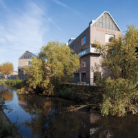
With its decorative envelope and gravity-defying form, GL Events might at first glance appear to share the exhibitionist tendencies of its newer neighbors, which include the zesty Orange Cube by Jakob + MacFarlane and the Musée des Confluences by Coop Himmelb(l)au, but a closer look reveals a building attuned to its setting. Reasoning that the presence of a new structure erases an existing view, Varini photographed the site from all four sides and applied the ghostly prospect of roads, railway lines, and bridges to the facades. Likewise, the heroic projection is a conscious echo of the gantry cranes that still dot the quayside, and the nonorthogonal arrangement of the two volumes in plan—they are at 86 rather than 90 degrees—also draws on the character of the place. “We didn’t want the building to appear completely static,” says project leader Peter Baalman. “When you walk in a harbor, cranes are always moving. The play of volumes reflects that.”
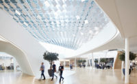
Once inside the building you find its debt to the imagery of industry unmistakable. Beyond the double-height foyer, a 90-foot-high atrium rises through the middle of the plan, overlooked by glass-balustraded offices. This lofty space is dominated by three exposed steel pylons incorporating stairs and elevators, from which aerial walkways extend to the offices. Crowning the close-spaced and heavily cross-braced towers is a dense matrix of superscaled steelwork: 16-foot-deep trusses diagonally span the atrium and gird the perimeter, acting as a giant box beam from which the floors below are suspended.
You can’t go by first impressions: the great weight of steel overhead is immediately evident, but at its edges the building appears to rest on nothing more substantial than glass. Ascending to the upper floors provides further disconcerting experiences; it takes a moment to process the scene from a fourth-floor walkway, for example, where an oblique view through a glazed panel in the bottom of the cantilevered volume seems to show the river flowing beneath three tiers of open-plan workspace. At the top, where glass-walled directors’ offices are inserted into the interstices between steel members, the scale of the structure makes the occupants seem like Lilliputians.
Though this results in an unorthodox office building, the design has a rational basis, since the cantilever provides more usable floor space than could otherwise be achieved on the plot. The plan and section are also closely tailored to the client’s requirements, notably in allowing managers to take in at a glance what is happening throughout the building. This was complicated by fire regulations that usually preclude offices’ opening directly onto atria, but the architects were able negotiate a workable combination of measures, including discreet glass skirts on each floor edge that limit the spread of smoke. “That is characteristic of many of our projects,” says Baalman. “The concepts look simple, but technically they are very sophisticated.”
Further evidence of this refinement is found in the facade. In winter the gap between the double-glazed inner skin and outer rainscreen is used to warm incoming air, while in summer the large-scale images laminated into the glass rainscreen help to alleviate glare.
From within the building, this photographic interlayer acts like a diaphanous veil; it is possible to see out, but attention is subtly directed inward to an interior more akin to a sybaritic nightclub than a conventional cubicle farm. Black carpet amplifies the darkness of the silver-gray steelwork. Soft light bounces off crystalline glass partitions and balustrades. Bespoke seating and storage units are in vivid red, which by happy coincidence is both GL Events’ corporate color and a hallmark of Decq’s work.
The architects’ well-honed aesthetic is all-pervasive— indeed, the scheme incorporates numerous Decq-designed products, from aluminum stair profiles to purpose-made hardware and amoebic light fittings, whose soft forms counterpoint the hardness of steel, just as the spiky javelin-shaped door-handles find their obverse in amorphous blobs containing refreshment counters. The building slips easily between two identities, the somber and the sensuous.
Another kind of mutability is represented in the photographic facades’ RECORD of the neighborhood at a particular moment in time. As the surroundings are further overwritten by new development—a process already under way—the connection of Decq’s building to its place will perhaps seem stronger still.
People
Owner:
Architect:
Personnel in architect's firm who should receive special credit:
Project Principal & Manager:
Lead Project Designer:
Project Assistants:
Interior designer:
Engineer(s):
Mechanical, Electric, and Plumbing:
Consultant(s):
Acoustical:
Other:
Contractors:
Photographer(s):
Renderer(s):
CAD system, project management, or other software used: Size: 89,300 square feet Construction cost: $33 million Completion date: January 2014 |
Products
Structural system
Exterior cladding
Curtain wall:
Built-up roofing:
Doors
Glass Doors:
Metal doors:
Wood doors:
Hardware
Closers:
Pulls:
Interior finishes
Paints:
Paneling:
Solid surfacing:
Carpet:
Raised flooring:
Furnishings
Reception furniture:
Chairs:
Tables:
Other furniture:
Lighting
Conveyance
Plumbing
Energy |


