Santa Monica, California
Affordable housing in Santa Monica sounds like an oxymoron. In 2013, the city's average monthly rent of $2,328 was the priciest in Los Angeles County. Adding insult to injury are local homeowners who fear that buildings for lower-earning households will be eyesores that drive down property values. But that doesn't stop nonprofit developer Community Corporation of Santa Monica from finding places to construct them and tapping good architects to design them. The latest project to refute NIMBYism's premise is Brooks + Scarpa's Pico Place. The attractive complex animates a nondescript block near the city's civic core and provides apartments for families of low to moderate income, earning from 30 to 60 percent less than the area median income (AMI).
This approach paid dividends here, where the location complicated a straightforward program. The firm was asked to design a 32-unit complex of affordable family apartments, with a laundry room, community room, and code-mandated underground parking. The area has a 35-foot height restriction, and the long, narrow, sloped site (once five contiguous, down-at-the-heels lots) is ringed by a hodgepodge of structures: a high-rise hotel; single-family houses; a low-rise 1940s office building; and, across Pico Boulevard, the fenced-in campus of Santa Monica High School. The beach is a few blocks to the west. It's a hectic place, both visually and literally.
Brooks and Scarpa's scheme mediates these eclectic surroundings, providing privacy and mitigating street noise. The architects arranged two three-story buildings'one rectangular, one L-shaped'to form an interior courtyard. Three-bedroom units occupy the corners, while the two-bedroom units sit within the legs of the L adjacent to the hotel and the site's southern edge. 'This layout uses the footprint efficiently and allows for stacking similar or identical floor plans,' says Brooks. A single-story volume that fills out the main elevation along Pico Boulevard houses the community and laundry rooms. Walking into the complex, one feels a logical transition from chaos to calm. The entrance and public spaces face and engage the street, while the courtyard beyond offers a sheltered gathering spot. The hubbub finally fades as residents enter their private quarters.
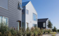
Brooks calls the hefty frame that ties together the facades along Pico Boulevard 'our big design gesture,' its scale and weight a nod to the adjacent hotel. It forms balconies and a planted roof on the second level and a protective 'eyebrow' on the third. The glazed community room and white stucco cladding with bright accent panels add a beachy vibe'we're definitely in SoCal'while recycled fiber-cement siding underscores the site's horizontal, linear nature. The interplay of these surfaces, and siding of different widths, orientations, and spacing, echo the ebb and flow of foot and street traffic. Varied parts form a pleasing whole, a sentiment reflected in the surrounding area's diversity.
Within the complex, thoughtfully designed circulation creates a collegial atmosphere that encourages interaction. Walkways, bridges, and stairs knit together buildings and floors, and the open courtyard permits long sight lines across the property. Because Community Corporation's projects are built without air-conditioning, the architects took advantage of the temperate climate by allowing access to units from outdoors instead of a sealed, double-loaded corridor. Floor plans allow daylight and ocean breezes to pass through; many apartments have private balconies too.
Even the parking area encourages neighborliness. The architects opened it up to the courtyard and added a staircase, a move that, as they learned on an earlier project, eliminated the need for pricey ductwork in the garage. 'People skip the elevator, because they're drawn to the light that spills down from above. It just feels easier to take the stairs,' says Brooks.
Within walking distance of bus stops, prime employment, and commercial centers'civic and corporate office buildings, the Third Street Promenade retail district, the Santa Monica Pier'and the new $48.3 million Tongva Park, Pico Place's location is enviable, but eminently practical for low-income families in particular. Since many of them can't afford a car, living near work, public transit, and services offers them more opportunities and improves their quality of life dramatically. The astute design here makes the case that high-quality housing can and should be accessible to everybody'not just those who can pay a premium for it.
RECORD,
People
Client/Owner:
Architect:
Project Team: Landscape: PEG Office of Landscape + Architecture
Engineering: Acoustics: Veneklasen Associates Specifications: Phil Easton General Contractor: Benchmark Contractors Inc.
Photographers: Size: 41,000 square feet Project cost: $10 million Completion date: August 2013 |
ProductsStructural system: Type V-A wood frame over Type I reinforced concrete.
Exterior Metal: KLA Sheet Metal, Inc. Concrete: Catalina Pacific and Benchmark Contractors, Inc. Wood: Open web wood truss joists by BMC Building Materials and Construction Services. Exterior: Exterior Cement Plaster with integral finish color by Omega. Exterior Cement Board by James Hardie Siding. Windows: Milgard Aluminum. Storefront by CRL/US Aluminum. Glazing: LowE, argon-filled by Westcoast Insulated Glass Products and LowE PPG Solarban 60. Doors: Fleetwood multi-slider, Total Door Systems, Haley Architectural Doors. Hardware: Schlage. Roofing: Johns Manville built-up roofing with SRI 93 glass cap. Deck Coating: Pacific Polymers Elasto-Deck 5000x2 Courtyard Shades: SARK Custom Awnings Green Roof: Greengrid Roof Modules/Weston Solutions.
Interior finishes
Plumbing Appliances: Frigidaire and GE.
Other: |


