Venice Dispatch: U.S. Architecture as American Export—The Story Expertly Told


The Venice Architecture Biennale is a polyglot affair. Some countries use their pavilions as conventional galleries, displaying photographs of finished buildings. Others create architecture-based installations. A smaller number take an intellectual approach, posing and then answering questions derived from architectural theory or practice. And a very few—and these may be the ones taking the greatest risks—pose questions to which the answers are allowed to emerge, through real-time investigation, over the course of the Biennale’s six-month run.
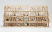
The U.S. pavilion, incredibly, does all these things and more, with a jaw-dropping and eye-opening study of architecture as a 20th-century American export. One of the project’s virtues is that it follows, but isn’t limited by, Rem Koolhaas’s directive that each participating country analyze the rise of modernism over the last 100 years. Another is that it is beautiful, thanks to the installation by brothers Dominic and Christopher Leong, of the Manhattan firm Leong Leong. For the brothers, who started their firm in a recession and haven’t really had the chance to show what they can do, the pavilion is a breakout project, outfitted with diabolically clever, wood-and-acrylic desks that double as vitrines.
The pavilion is also a breakout project for its three curators: Eva Franch i Gilabert of the Storefront for Art and Architecture, Ana Miljački, an architecture professor at the Massachusetts Institute of Technology (MIT); and Ashley Schafer, editor of the Boston-based architecture journal Praxis. First they enlisted students at MIT and Ohio Statue University to compile dossiers on some 700 projects designed by U.S. architects for sites outside the U.S. since 1914. (These include the pavilion itself, designed by Delano and Aldrich in 1930.) The dossiers, handsomely designed by Pentagram and displayed against the outer walls of the pavilion’s four main galleries, contain everything from client correspondence to newspaper reviews. Taken together, the dossiers present a compelling history of U.S. architecture abroad, as inflected by political developments, such as the Cold War, and architectural developments, such as post-modernism. Visitors are likely to spend hours perusing them. That alone—given how quickly visitors move through most Biennale pavilions—is a signal achievement.
But the research, depicting architecture as a major American export, like Coke and Mickey Mouse, is only one aspect of the ambitious project. The curators also selected eight young designers, several of them architects, to spend the next 25 weeks working under the name OfficeUS. Seated at tables designed by Leong Leong (or lying on a round bed in the pavilion’s rotunda), they will analyze the mostly-20th-century projects through 21st century lenses. Those lenses have already been determined and given cleverly vague names like “Trojan Horses” and “Profit Margin.” Invited experts and visitors to the pavilion will be able to comment on the work. (And there are other aspects of their task, including studying the organization of U.S. architecture firms, with a focus on everything from salaries to the placement of water coolers.)
It’s impossible not to be struck by the curators’ bravery. First example: After they had a list of the 700 or so projects they wanted to include, they asked the responsible firms (those that still exist) for additional information. Occasionally, firms asked that a project not be included; the curators, attempting to create as complete a historical record as possible, brushed off the requests. Second example: Some of the lenses through which the partners will analyze the 700 projects are implicitly critical of U.S. “architectural imperialism,” a potential sore point for the State Department (which selects Biennale curators). Third example: Many of the architects whose projects will be analyzed and critiqued are alive and well, and a few have already visited the Biennale. Will some of them be offended by the way their buildings are treated? Probably, but the curators say they’re ready.
Compiling reams of information on 700 projects, which together form an invaluable record of American architecture by firms with the wherewithal to work abroad, is an accomplishment. Presenting those 700 projects in a beautifully outfitted, futuristic but inviting office, is another. The three curators could have stopped there. But what happens in the next 25 weeks has the potential to bring important ideas to the fore. (Luckily, the curators already have four books planned.) And it has the potential to bring the OfficeUS partners and the architects whose projects they are looking at into a rich, multigenerational discussion of what architecture was, is, and could be.


