Venice Dispatch: Elements of Architecture at the Biennale


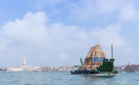
When Rem Koolhaas announced what the theme for the 14th Venice Architecture Biennale would be, he went with a characteristic provocation. Fundamentals would forgo the typical, temperature-taking displays of contemporary architecture and focus on historical exhibitions. The Biennale, which began previews yesterday and opens to the public on Saturday, hinges on two major shows: Monditalia, a long-form survey of Italian culture (more on that in a later post), and Elements of Architecture, a show in the main pavilion in the Giardini, among the national exhibitions, that beats at the heart of the back-to-basics theme.
Elements focuses narrowly on 15 building components—ranging from windows to corridors to toilets. Each component is given its own gallery, where the organizers—Koolhaas’ team included a large group from Harvard’s Graduate School of Design—draw narrative connections between historical examples and contemporary iterations of each part.
Some galleries emphasize the disconnect between historical and contemporary uses. In the “Window” section, for example, a modern device used to stress-test mechanical components does its methodical worst to destroy a contemporary window directly in front of a collection of comparatively delicate, but arguably more beautiful, frames from 17-19th-century England. The “Fireplace” gallery emphasizes its obsolescence with a series of overhead heating devices, developed by a group from MIT, that target heat to individuals, rather than the entire room, based on signals from their mobile phones.
Other sections show materials embodying political systems. Most notably “Facade” presents a series of 12 examples, ranging from precast concrete to a ceramic-tile rainscreen, and surrounds them with news clippings that relate them to 20th-century events. The “Door” section holds a series of walk-through 1:1 scale drawings of entries from around the world that culminates in a working airport security metal detector. Some galleries relate architectural components to the body, as exemplified by the two parallel ideas of the “Ramp”: one focuses on accessibility, while the other shows Claude Parent’s 1970s experiments with living on an incline. The “Toilet” section explores “The fundamental interaction—on the most intimate level—between humans and architecture,” as the wall text reads, and it does so with a collection of commodes that range from a Roman latrine to a Baroque urinal to contemporary models.
Despite the title's claim to a definitive accounting of architecture's lowest common denominators, the objects in the show seem selected mostly for their strangeness. The show deliberately lacks much commentary on the cumulative significance of these architectural elements in contemporary design, making the selected objects, as well as the exhibition design, feel somewhat arbitrary. But that’s not necessarily a bad thing. The show is a cabinet of architectural curiosities, a fragmented but fascinating series of social histories told with an amazing, if esoteric, collection of objects.


