New York Public Library Unveils Foster + Partners' Renovation Designs


Architects & Firms
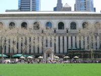
The Beaux Arts architecture of the New York Public Library’s main building sends a strong message about decorum—boisterous tourists adopt hushed tones, and even journalists who normally wear jeans to press conferences wear suits and ties when summoned to the Carerre and Hastings masterpiece. But it is precisely because of the 1911 building’s association with refinement and scholarly research that a plan to insert a 100,000-square-foot circulating library into its guts has been called sacrilegious.
So it’s surprising that the library has released renderings of the new circulating branch, by Foster + Partners, that seem likely to exacerbate the criticism. Norman Foster has created spectacular spaces within neoclassical buildings—the Great Court of the British Museum and the Reichstag dome in Berlin come to mind. But the library renderings show bland spaces cantilevered over an atrium that could be in a mall or even on a cruise ship. The new rooms couldn’t be as handsomely detailed as those by Carerre and Hastings, of course, but the project demands something more than generic, blandly commercial architecture. Worse, the renderers at dbox chose to populate the new rooms with 20-somethings bearing MacBooks (rather than real books), suggesting precisely the kind of populism that has defenders of the building up in arms. The library is in the midst of a hard-fought public relations campaign, and the new renderings don’t help its case.
Foster, speaking at Wednesday’s press conference, made a stronger case. Asked whether removing the book stacks—cast iron modules that support the incomparable main reading room—would endanger that space, he answered that “the reading room is currently at risk.” He explained: “It is probably the only major public space in this city that sits on an un-fire-protected structure.” (Library president and CEO Anthony Marx further asserted that the vast catacombs of shelves cannot be made fireproof.)
Even more convincing is the contention that, as beautiful as the stacks are, almost no one gets to see them; the Central Library Plan would open the seven-story space to the public, offering views of the building’s rear facade and, through its vertical slit windows, of Bryant Park. Most of the books from the existing stacks would be stored beneath the park. And the bookshelves themselves would be reused in the new spaces. The new circulating library will be filled with books from two other branches, which the library will close when Foster’s plan is complete in 2018. Altogether, the plan would take the portion of the building now open to the public from 30 to 66 percent, which will encourage encounters with its architecture, both classical and modern. As Foster said in defense of the plan, “The history of important public buildings is a history of change over time.”
But “you don't ‘update’ a masterpiece,” retorted Ada Louise Huxtable, the Wall Street Journal’s architecture critic, who wrote that the library is “about to undertake its own destruction.” (She recommended that the library let Foster loose on the existing Mid-Manhattan library across the street.) It’s also true that the library has converted large swaths of its 42nd Street building to offices, which could be moved off-site, freeing up space for a circulating library without endangering the stacks. As Foster noted at the press conference, “a lot of important spaces are currently labeled ‘staff only’”—but what he didn’t say is that it shouldn’t take a $300 million “grand projet” to fix that. Construction is expected begin next year.


