Clad in Terra-Cotta Fins, UPenn’s Expanded Graduate School of Education Fits in with Its Neighbors

Architects & Firms
“It’s a terra-cotta precinct,” says architect Josh Aisenberg. For sheer concision, the two-word description of the rough, ruddy campus architecture of the University of Pennsylvania seems right on the money—and it should be, given the source. Aisenberg, a senior associate at Boston-based Annum Architects (formerly Ann Beha Architects), heard the phrase, by way of a third party, from no less an authority than Amy Gutmann, Penn’s longest-serving president and a supporter of Annum’s new project at Penn when it first got underway some six years ago.
1
2
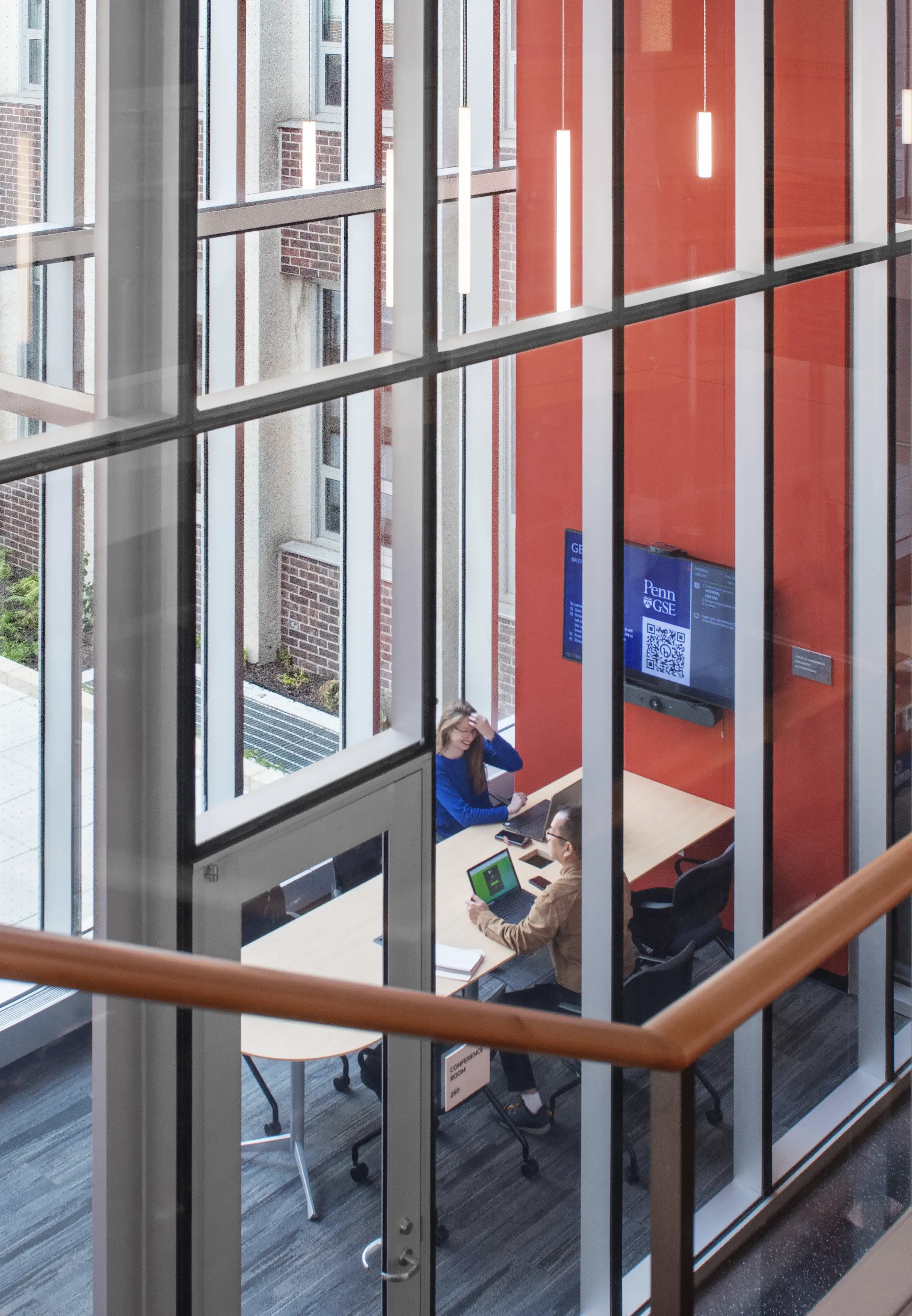
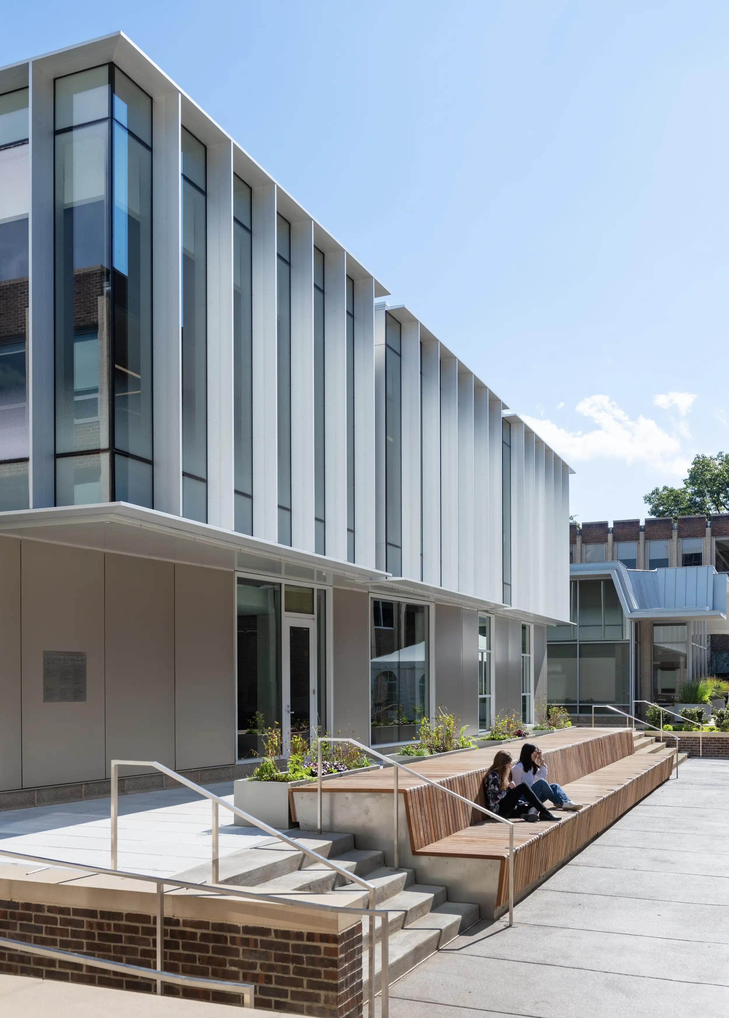
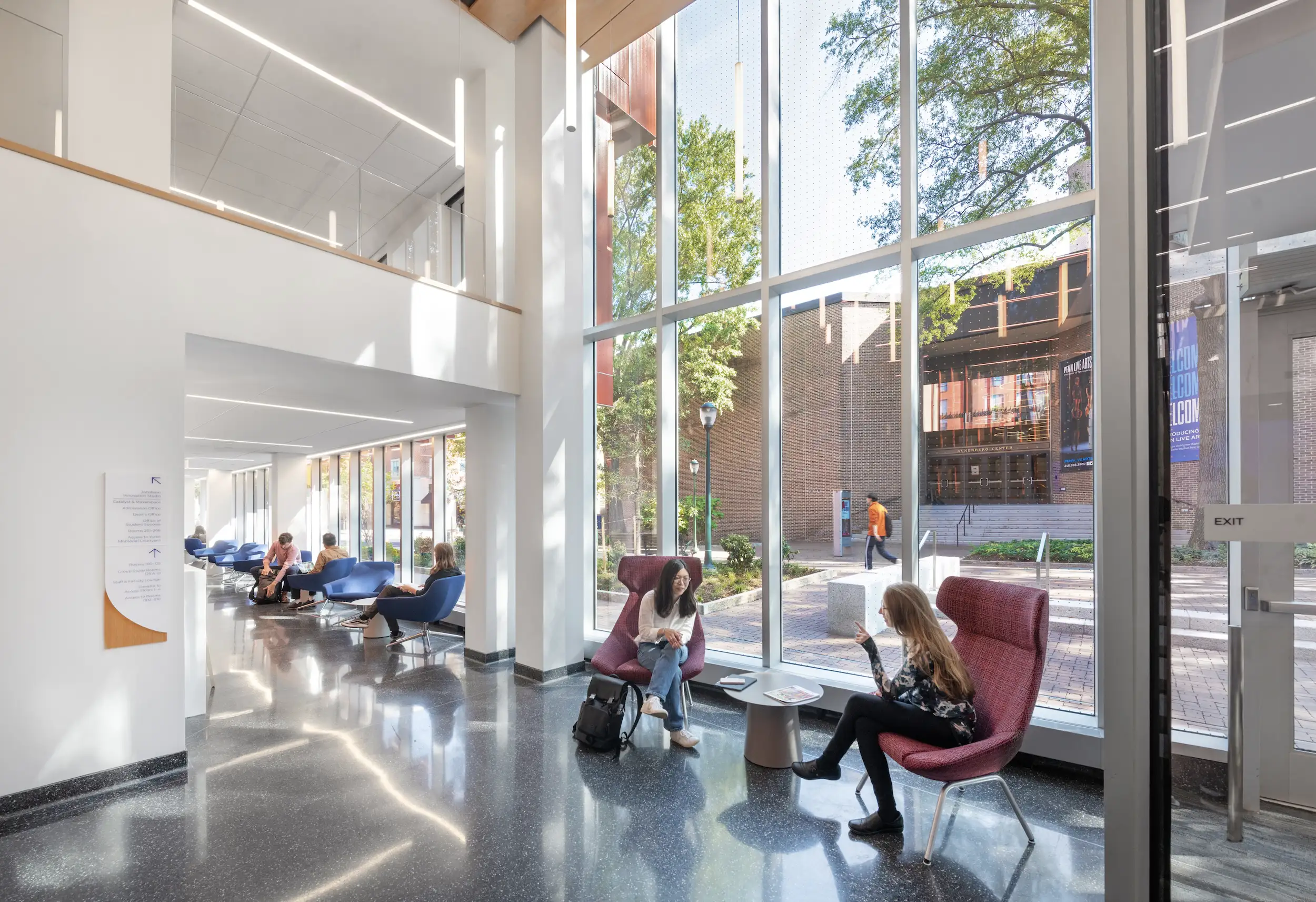
Common areas extend to the light-filled interior (1) to a courtyard (2). Photos © Chuck Choi
Now complete, Annum’s renovation and expansion of the University of Pennsylvania Graduate School of Education (GSE) adds yet another paean to red earthenware to West Philadelphia. Connecting a pair of 1960s buildings at the southwest corner of Walnut and 37th Streets, the new volume provides additional classroom space, enhanced accessibility, and a degree of visual consistency to the school, which had formerly been spread out across multiple sites. Annum president and principal Philip Chen quotes another Penn administrator—the GSE’s own dean, Pam Grossman—when he says the objective was to create “one GSE,” forging a distinct architectural identity for a program that had long lacked it.
The $35.6 million expansion and renovation project unites a once-scattered school in multiple newly connected academic buildings, including two existing ones built in 1962 and 1966. Photo © Chuck Choi
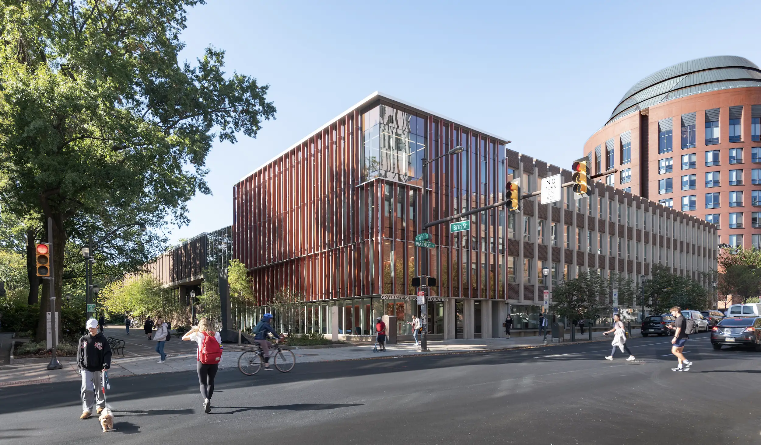
View of the four-story GSE addition as seen from Walnut and East 37 Streets. The Wharton School can be seen in the background. Photo © Chuck Choi
“Our overall design approach was to complete the corner,” says Chen: running just over a 100 feet south along a pedestrian stretch of 37th Street, and with a 37-foot-wide northern street frontage, the new four-story building is faced in terra-cotta baguettes that provide a little shading and a good deal of contextual appeal, complementing its similarly brownish-red neighbors. A broad top-floor window and glazed entryway add a requisite degree of transparency, welcoming visitors into the new 16,200-square-foot interior as well as the 16,900 square feet of renovated space in the adjacent buildings.
Once past the door, the relationship between the project’s various parts—and indeed between the inside of the building and the courtyard just beyond—becomes rather complicated. While forming a bridge between the two existing structures (each of them with floors at slightly different levels), Annum’s addition also furnishes a wheelchair-friendly path to the Social Sciences Quad to the west, visible immediately on entering through an expansive, glassed-in gathering space that protrudes into the rear of the site. Visitors can then ascend through the classrooms and meeting rooms above, with nothing to distinguish the renovated spaces from the new ones save a glimpse of the old building’s facades in the lobby.
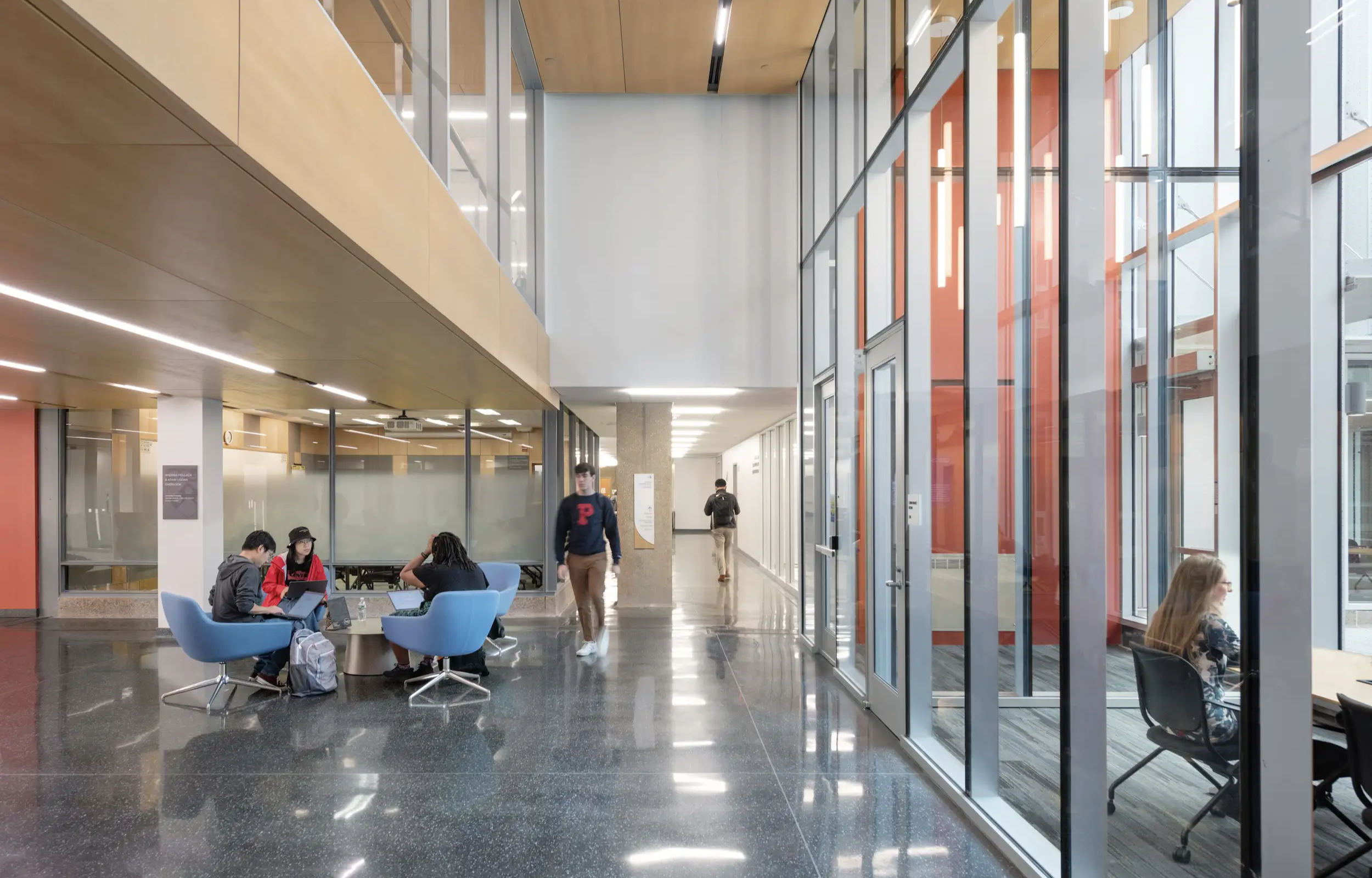
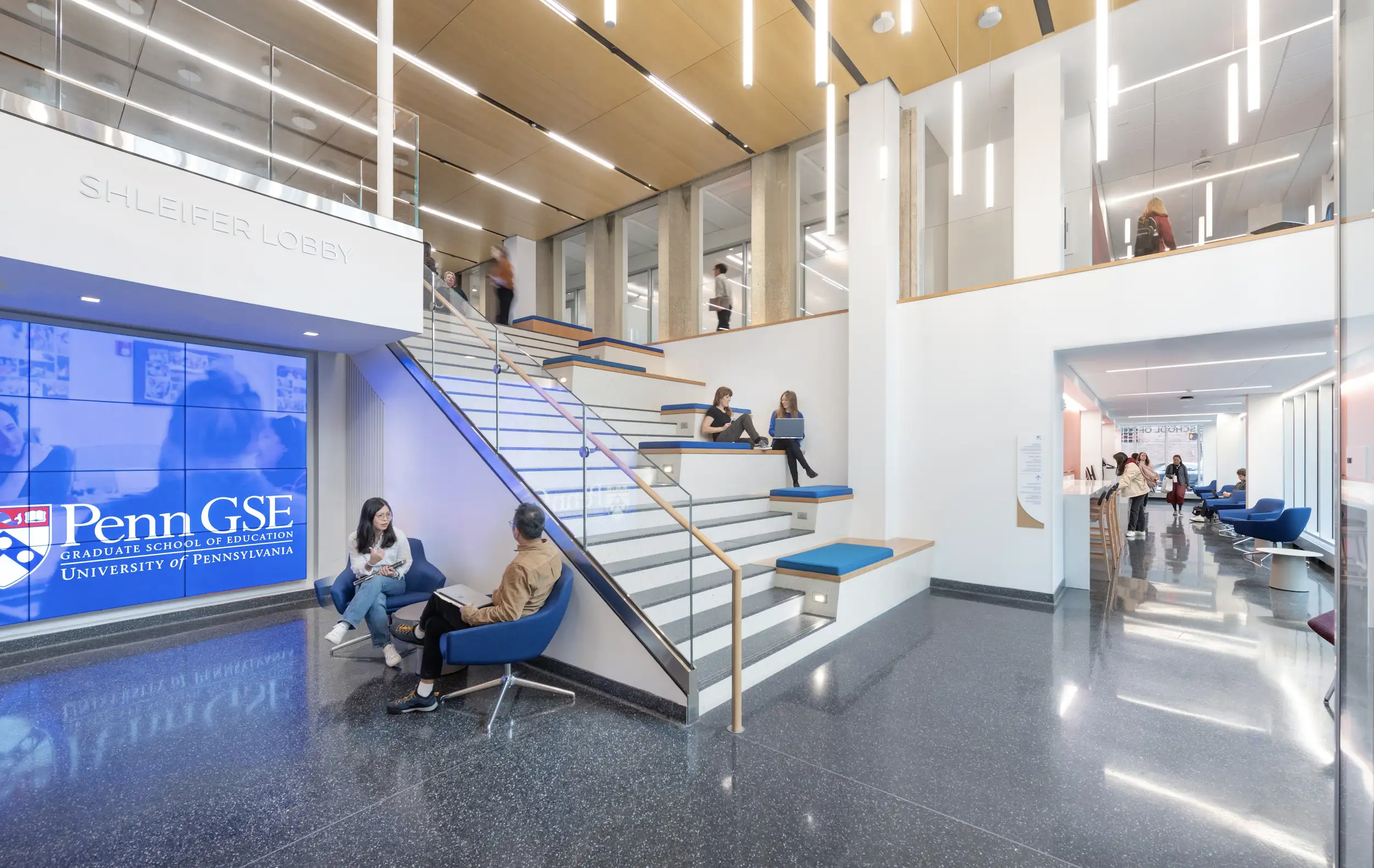
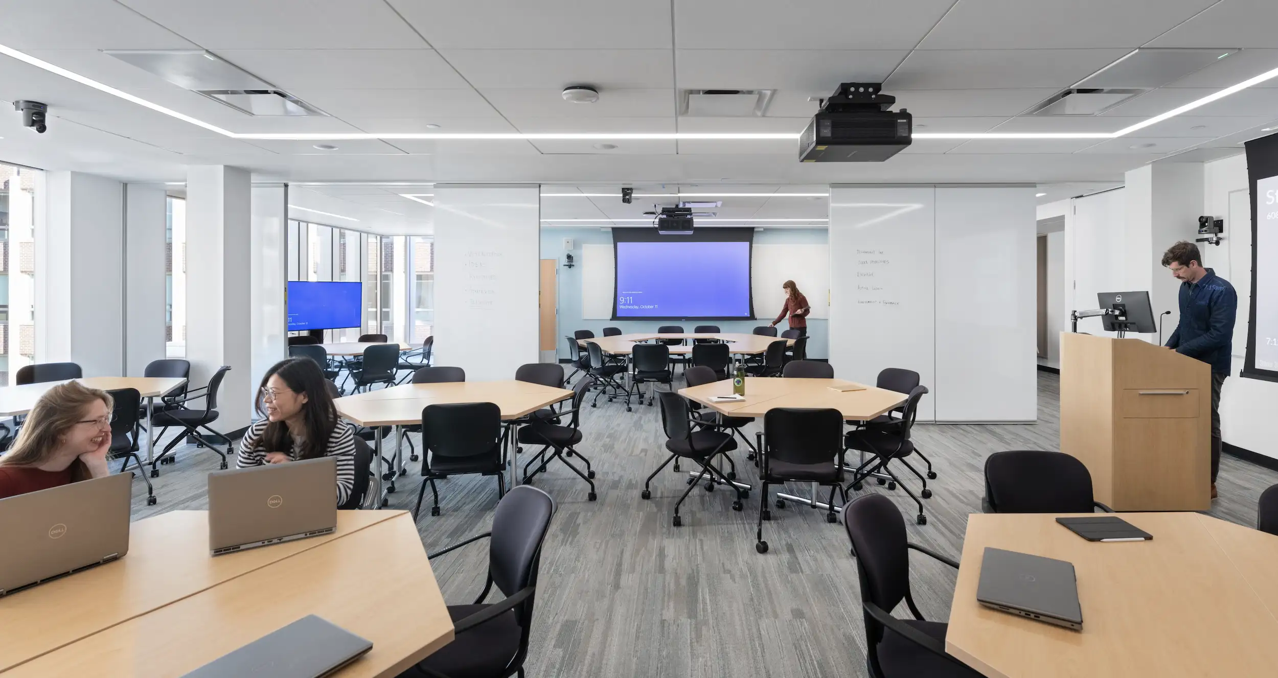
Classrooms and commons areas, including students lounges and a double-height lobby, recieve ample daylight thanks to an extensive glazing strategy. Photos © Chuck Choi
Again echoing Gutmann, Aisenberg refers to the Annum building as “a gateway” between the school, the campus, and Philadelphia at large. For the long-neglected GSE its former digs so unremarkable that, according to Chen, trustees would fail to notice them even when standing across the street—the project is a landmark moment.
“It’s a once-in-a-lifetime building for them,” says Aisenberg.
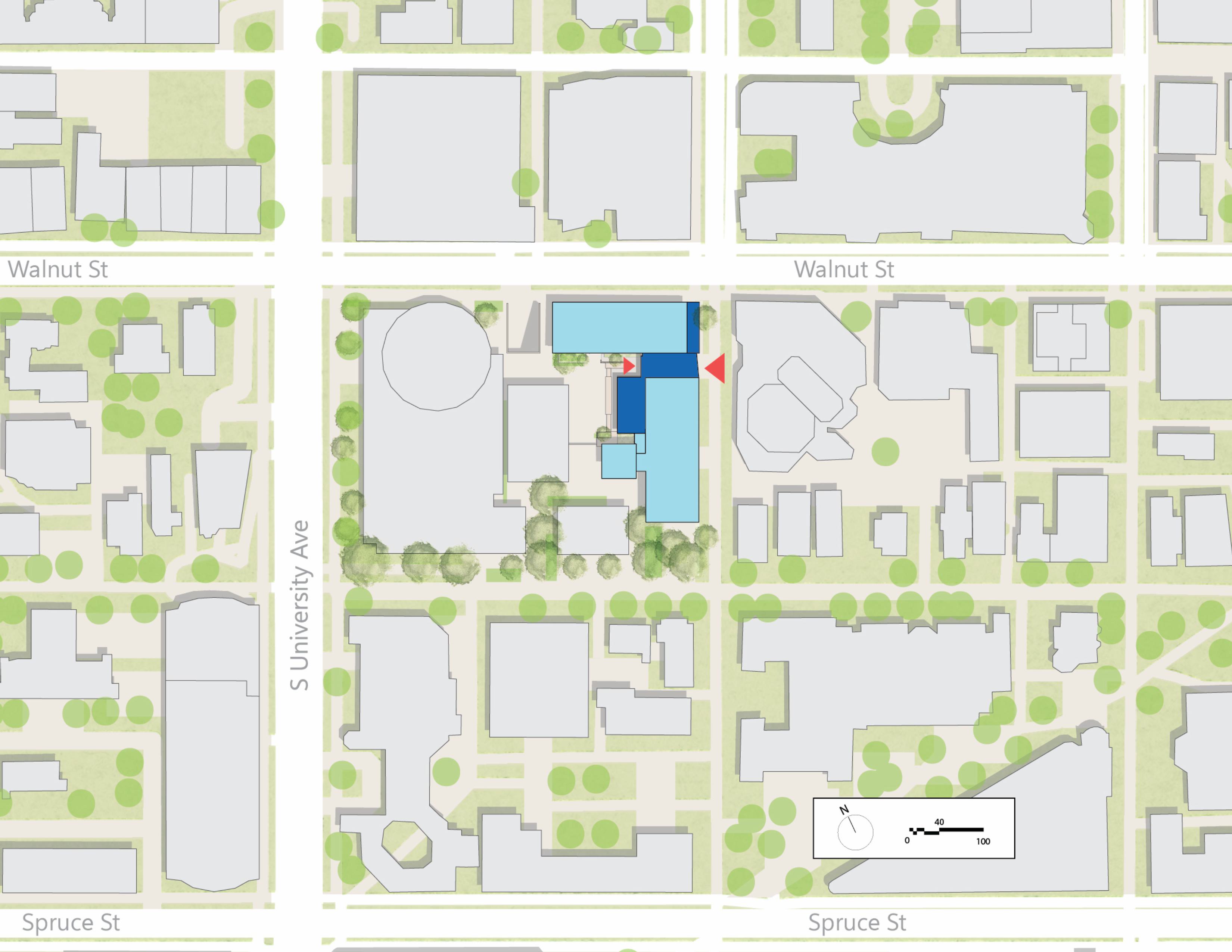
Click site plan to enlarge
Click section drawing to enlarge


