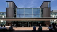
Anyone who has studied Midcentury Modernism—or has interacted with a pile of Lego bricks or the 3D-pixel-based video game Minecraft, for that matter—knows the satisfying versatility of rectilinear shapes. Wesleyan University’s Center for the Arts (CFA), a complex of 11 buildings designed by Kevin Roche and John Dinkeloo and opened in 1973, is a master class in expressing its programs with cubic volumes.
Located at the northern edge of the Middletown, Connecticut, campus, a wall and doorway of Indiana limestone marks the border of the interdisciplinary cluster, setting it apart from the rest of the 360-acre university. These arts buildings, with load-bearing-block construction and expansive iron windows, house programs for the fine arts, performing arts, and film.
This part of campus has fostered its own inter-arts ecosystem for decades. But the CFA feels somewhat cloistered from other university departments, and there’s the functional shortcoming in how it handled—or didn’t—Wesleyan’s extensive collection of artworks on paper. One of the most important held by an American university, the 25,000-piece Davidson Art Collection includes historic prints by Albrecht Dürer and Rembrandt and contemporary photography by Duane Michals and Cindy Sherman. The collection was housed both off campus and in a historic house near the CFA, which neither met the climatic requirements for paper storage nor was it physically accessible to most researchers.
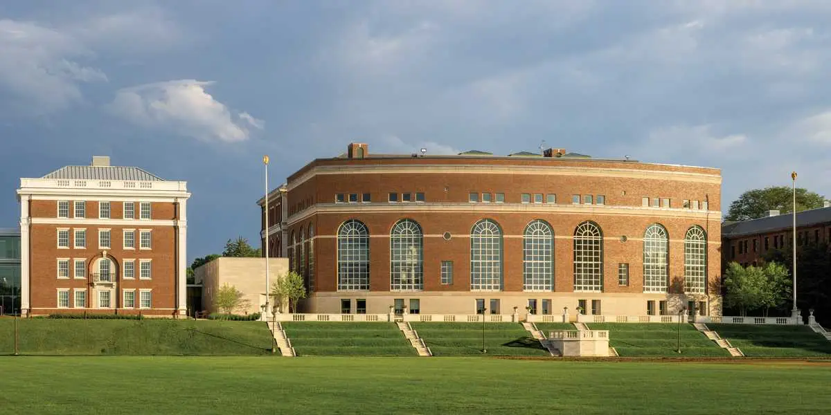
Sandwiched between two McKim, Mead & White buildings (above) is 1,260 square feet of versatile multifunction gallery space (top of page). Photo © Rafael Gamo, click to enlarge.
Growing calls from faculty and students to make the collection more available led to a series of internal discussions, followed by meetings with a Metropolitan Museum of Art consultant. The university eventually selected a narrow site between Olin Library and Harriman Hall, a pair of McKim, Mead & White–designed buildings at the heart of campus, as the home of a new works-on-paper gallery. Besides honoring the Davidson Collection, the move declared that visual arts belonged at Wesleyan’s core, not just in Roche and Dinkeloo’s complex. In 2018, the university launched an invited competition to select the architects of what would become the Pruzan Art Center, ultimately choosing Peterson Rich Office (PRO), a firm with Wesleyan roots—leads Miriam Peterson and Nathan Rich had taught and attended as an undergraduate at the school, respectively.
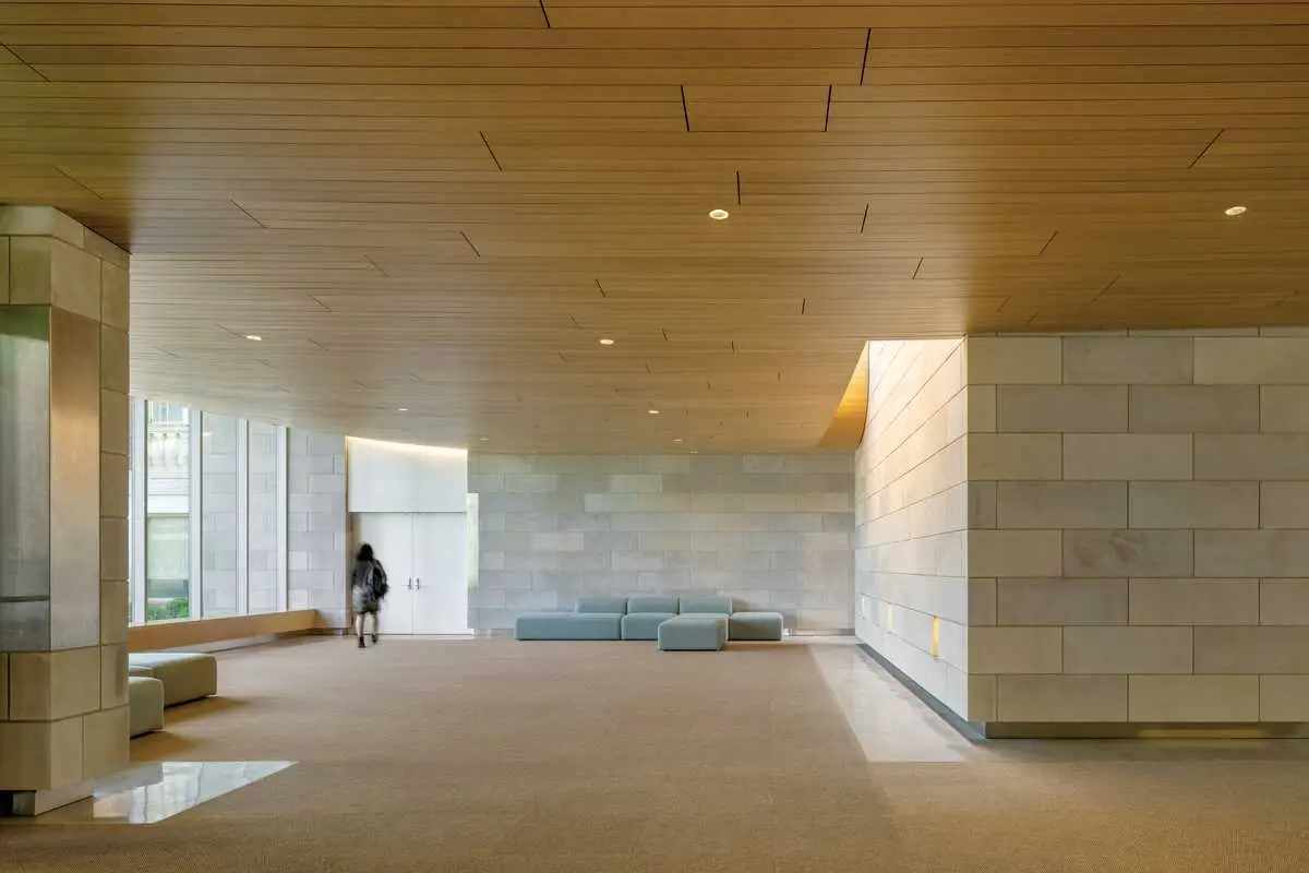
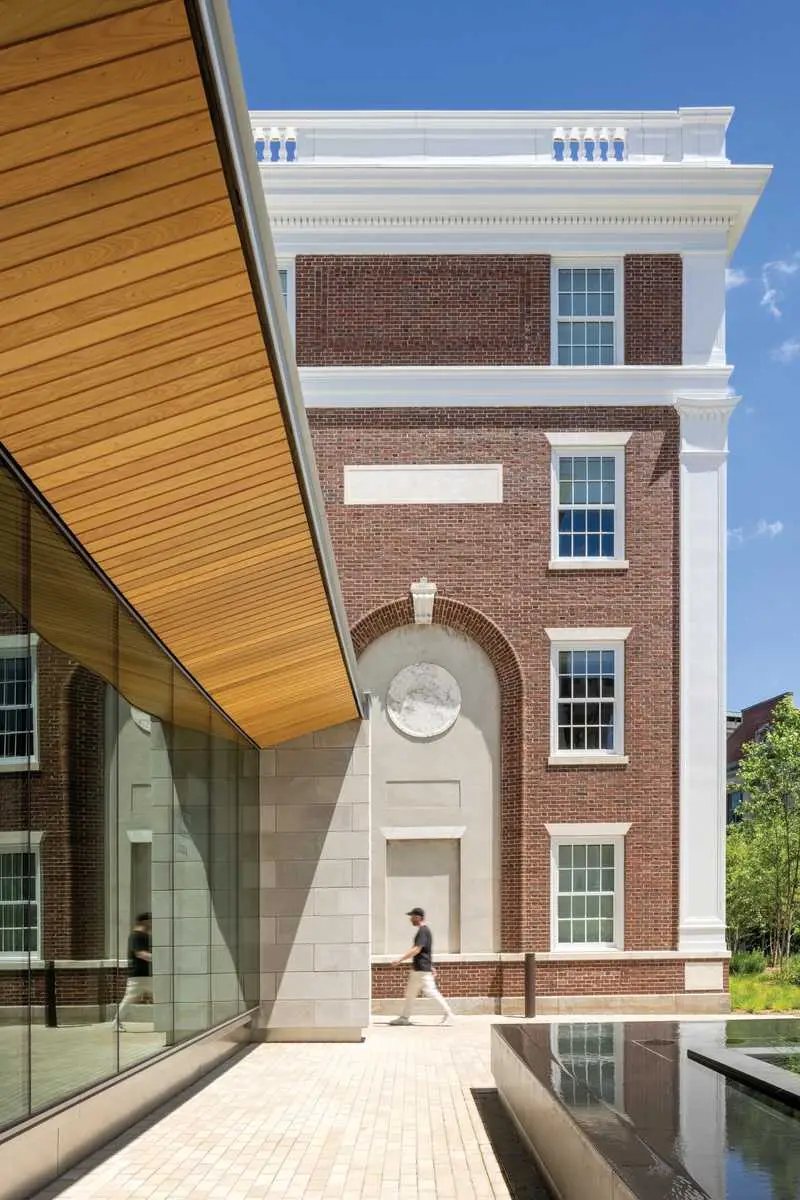
The architects began the Pruzan project by studying the building’s potential not only to center the art collection but enhance the connective tissue of the campus. They wanted to nod to the CFA’s forms and materials while expanding its language to respond to the Pruzan’s purpose as an entryway to the university. Because of the highly controlled environment required for exhibiting the delicate collection, PRO used solid Indiana limestone for a gallery box that protects the materials inside by blocking all light. The building’s non-gallery spaces, meanwhile, are treated as connectors, with glass-walled entries and a swooping oak-soffited ceiling that extends through the south facade to create an overhang calibrated to provide shade at noon on the summer solstice, preventing direct sunlight from coming into the lobby on the hottest days of the year. Conversely, a rectangular fountain just below the overhang bounces indirect light onto the lobby ceiling, creating a dappled effect. The fountain, says Rich, acts as a “catchment of energy, something that could draw people in.”
1
Oak ceilings in non-gallery spaces (1) extend to the south facade (2), creating continuity with the surrounding campus. Photo © Rafael Gamo
2
“It’s a building that doesn’t have a front or a back,” adds Peterson. “How it announces itself on the quad is as important as how it addresses the street on the other side, because it’s really about drawing students to that part of campus in a fluid way.”
Elijah Huge, director of Wesleyan’s College of Design and Engineering Studies, was a member of the Pruzan project committee. He remembers that PRO’s preliminary designs offered elegant solutions to what might be considered “mundane” problems, like how to bring daylight to a narrow 60-foot-wide site sandwiched by two much larger buildings. Huge points to PRO’s addition of a window behind a gallery desk that does the job while providing a view of one of the Olin library’s entry stairs. The lobby skylight and windows brighten the main gathering space, while Pruzan’s solid gallery walls meet the lighting requirements for conserving sensitive artwork on paper.
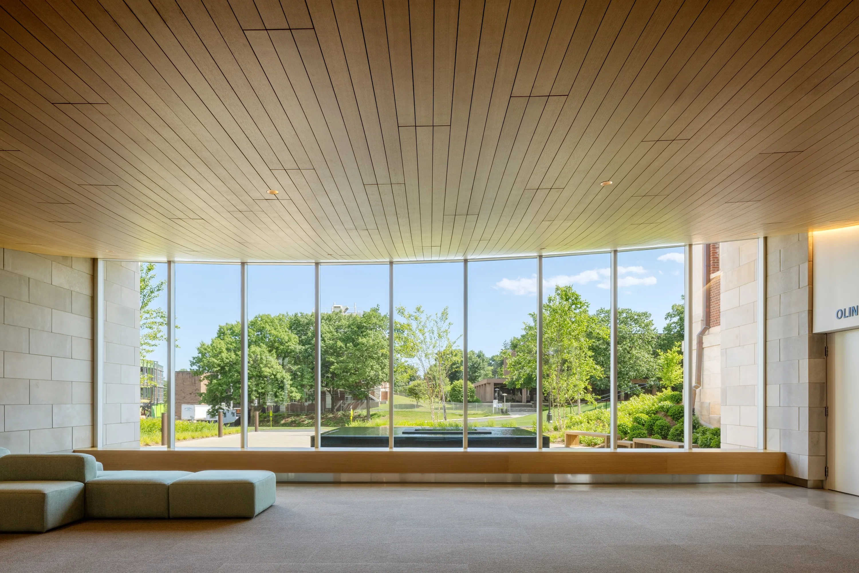
Photo © Rafael Gamo
PRO also took a creative approach to solving the site’s primary accessibility issue: an 18-inch east-to-west grade change between the Harriman and Olin buildings. A single ramp bisecting the Pruzan would have required railings, interrupting the experience of the space. “We looked at the plans and figured that we could split the ramp roughly in two, and then the lobby of our small building could be just what it needed to be and nothing else,” says Peterson. Now smaller ramps within the Harriman and Olin corridors connect with Pruzan, its position between the older buildings allowing it to be a gathering place for students instead of a solely transitional space.
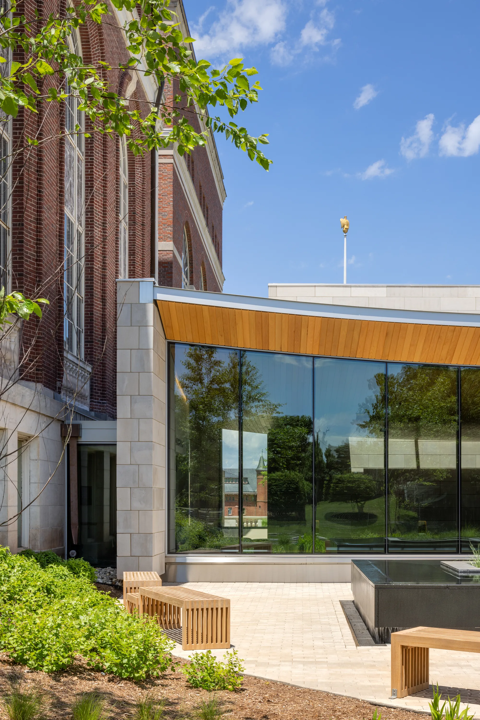
3
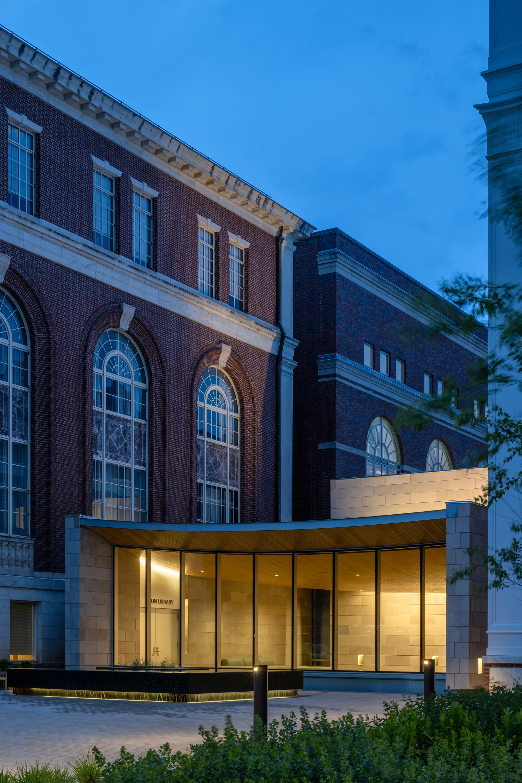
4
Photos © Rafel Gamo, click to enlarge
The Pruzan project allowed PRO to enhance accessibility to the Olin library, as well, through a reconfigured lower level. In the past, visitors with mobility limitations were shunted down a warren of halls to reach the library’s elevator. Now the building provides a direct and daylit route. Olin’s lower-level spaces were also reconfigured to accommodate storage and increased study of the works on paper collection.
This improved research access is part of a larger shift on the Wesleyan campus, and others, to harness the benefits of interdisciplinary work. Universities increasingly recognize that fostering public access to and interest in their collections is a valuable way to involve their communities in campus life. “There is a broader movement to bring the arts and, specifically, design and the sciences closer together in conversation,” Huge says. The Pruzan’s lively spaces are proof that long-hidden—or long-neglected—archives have relevance for students and the wider public, not only for their historical value but as means for inspiring creativity and a long-term connection to the school.
Click plan to enlarge

Credits
Architect:
Peterson Rich Office — Miriam Peterson, Nathan Rich, Alex Bodkin, Ben Hochberg, Bryson Wood, Sarah Kasper, Charles Beckendorf, Sixuan Chen, Martin Carrillo Bueno
Architect of Record:
Newman Architects
Engineers:
Michael Horton Associates (structural); Van Zelm Heywood & Shadford (m/e/p)
Consultants:
Philip R. Sherman P.E. (code); Fisher Marantz Stone (lighting); Leavitt Associate (building envelope); Langan Engineering (civil and landscape); Aqua Design International (water feature)
General Contractor:
FIP Construction
Client:
Wesleyan University
Size:
7,500 square feet
Cost:
Withheld
Completion Date:
February 2024
Sources
Masonry:
Polycor Indiana Limestone
Glass:
Kawneer
Metal Doors:
Ellison Doors
Acoustical Ceilings:
Rulon
Lighting:
Ecosense (interior ambient lighting); Edison Price (gallery track lighting); LED Linear (wall sconces)


