Continuing Education: Trauma-Informed Design

A child may survive violence, homelessness, or other profoundly distressing circumstance, but that doesn’t mean it’s over. The stress-response system that trauma activates in the body can have long-term effects, especially for children, whose incipient development makes them extra vulnerable. With an estimated 25 percent of children in the U.S. experiencing such conditions, trauma-informed design (TID) for youth-centered environments can play an important role in helping kids heal.
According to the Substance Abuse and Mental Health Services Administration, individual trauma can be defined in terms of “three E’s:” it results from an event, series of events, or set of circumstances that the individual experiences as physically or emotionally harmful or life-threatening, with lasting adverse effects on the individual’s functioning and mental, physical, social, emotional, or spiritual well-being. Trauma-induced effects can include impaired concentration, organization, and/or emotional regulation; hyper-arousal to a constant state of tension, suspicion, or panic; disengagement; and difficulty relaxing, sleeping, digesting food, or finding enjoyment in life.
The experience of the environment, however, is also somatic: the body registers its surroundings before the conscious mind does. So, through careful attention to the user’s experience, architecture can help to mitigate trauma’s effects.
The practice of trauma-informed design—or designing for dignity, as those who prefer a strength-based term are calling it—draws on evidence-based multidisciplinary research, including brain science, biology, social work, and architecture, to identify and minimize potential trauma triggers and to design buildings that promote self-esteem and healing. At its core, trauma-informed design entails fostering a sense of safety, through comfort, connection, and choice. Fundamentally, says Chad Holtzinger, founder of Denver-based Shopworks Architecture, a firm that has produced a forthcoming book on the practice, “when you walk through the door, you should feel that the place is affirming and safe.”
Four recent projects showcase trauma-informed design in youth-centered settings. The Boys Town Education Center, completed in 2023 by DLR Group, serves troubled youth (no longer boys only) in grades four through 12, on a nonprofit residential campus near Omaha, Nebraska. The Mothership (2024), by Shopworks Architecture, shelters 12- to 24-year-olds experiencing homelessness in Denver. Montage Health Ohana Center for Child and Adolescent Behavioral Health (2023), by NBBJ, provides mental-health treatment in Monterey, California. And the Parrott Creek Child and Family Services expansion (under construction), by El Dorado, is an 80-acre retreat for highly traumatized youth in Clackamas County, Oregon.
Typically referred by clinical professionals, caseworkers, the juvenile justice system, or parents seeking help, a significant number of the students at Boys Town Education Center face behavioral-health and/or academic challenges. “You can’t learn if you don’t feel safe,” says Vanessa Schutte, principal and K–12 education leader in DLR Group’s Omaha office, on the decision to prioritize trauma-informed design for the new building.
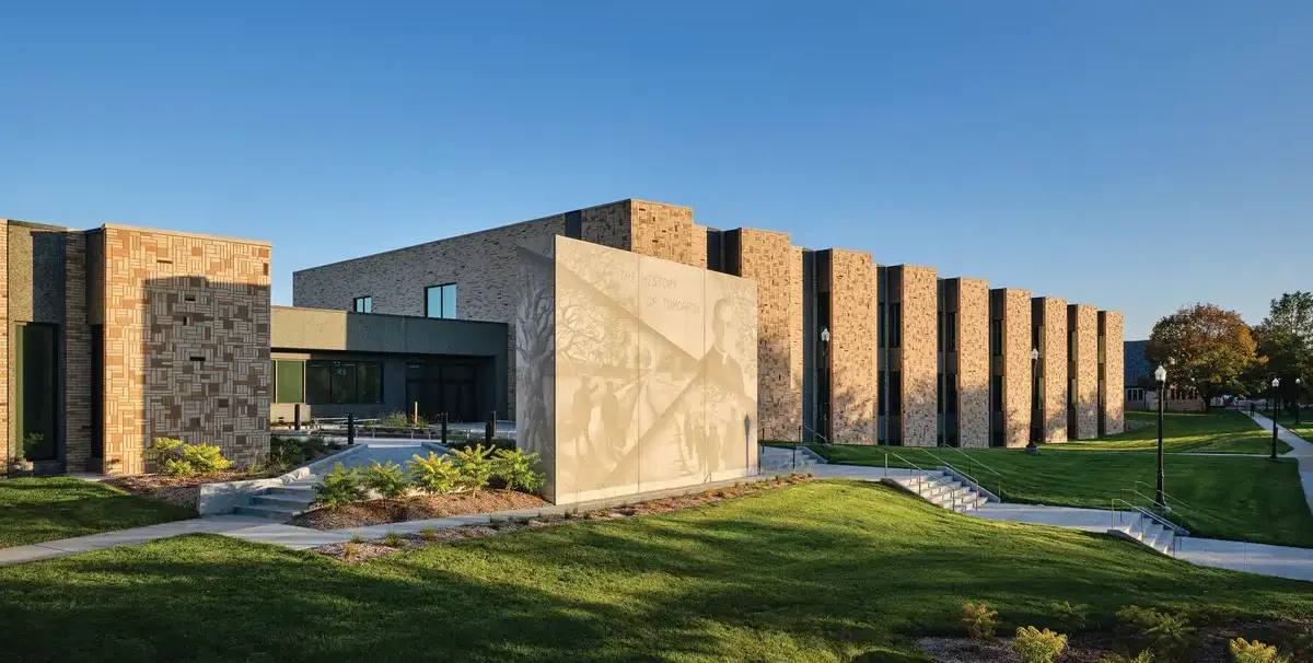
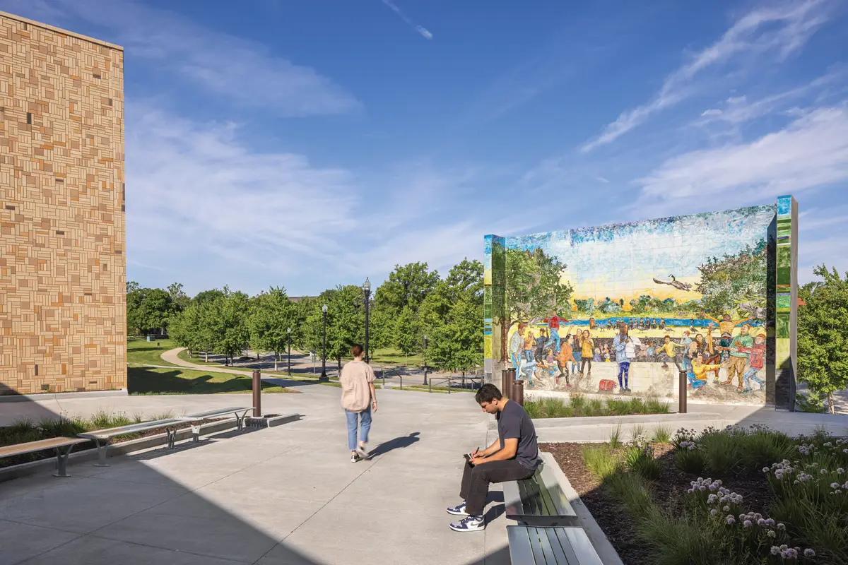
An initial challenge in promoting a sense of security through design was the fact that the project is located on the main drive of the Boys Town campus, which, as a National Historic Landmark, is something of a tourist destination. The architect’s first move was to configure the three-story, 110,000-square-foot school so that students wouldn’t feel gawked at. Along the drive-facing facade, a series of bays project from the building, one per classroom; these allow large windows to be positioned perpendicular to the exterior wall so that students enjoy daylight and views out, but tour-bus passengers don’t see in. The main entrance courtyard is screened by a monumental wall, created in collaboration with the artist Watie White, with the drive-facing side depicting elements from Boys Town’s history and the school-facing side celebrating aspects of student life in a bright mural for which students themselves were consulted.
1
Murals on a freestanding wall at Boys Town, in Omaha, depict the institution’s history on one side (1) and aspects of student life on the other (2). Photos © Michael Robinson (1), Daniel Patrick Muller(2), click to enlarge.
2
In addition to fostering privacy from the outside, the projecting bays work spatially inside. For each classroom, they provide an alcove that serves both as a small-group breakout area and as a respite spot where a student who needs a bit of space can pull aside without having to leave the class. “Many of the students have boundary issues,” Schutte says, “so classrooms allow for more square footage per student [55 rather than the more typical 35] to help with that comfort level.”
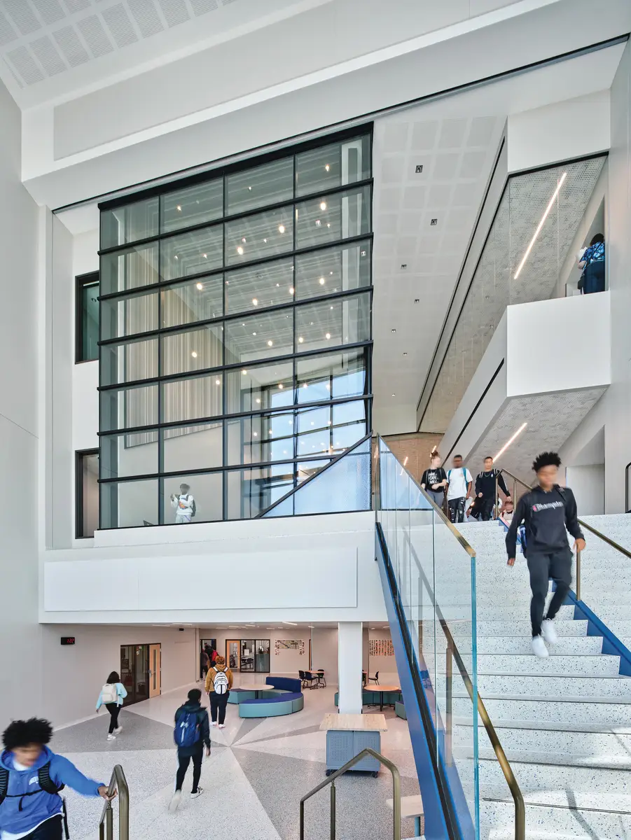
Another key strategy for reducing anxiety makes use of transparency to let students preview spaces before entering. The glazed enclosure of Spirit Hall, a nondenominational two-story volume for prayer and contemplation that forms the heart of the school, lets potential visitors see in advance whether the hall is occupied, even as texturing of the lower portions of the glass conceals the particular identity of those within. Along the corridor wall of each classroom, a 12-foot stretch of glazing provides views in and out. Further enhancing security, careful analysis of sight lines has ensured that there are also places of refuge, concealed from the corridor and defined by a change in finishes. Transparent walls on small-group and meeting rooms express openness and connectivity, but when occupants want privacy, a swipe of a teacher’s card lowers a blind. And, for a mental reset during class changes, corridors end with windows providing a view to nature.
3

4
The Boys Town Spirit Hall (3 & 4) is enclosed in both clear and textured glass. Photos © Michael Robinson
As with the entry mural, a particular focus for the design was the integration of art and the engagement of students in its creation. Examples include the three-dimensional installations of student-painted butterflies, also created in collaboration with Watie White, and tile patterns that originated as student-group endeavors. The art projects offer “the ability for students to see themselves within the facility,” Schutte says. As “stories of coming together to help each other and to create something beautiful,” she adds, they epitomize Boys Town’s mission.
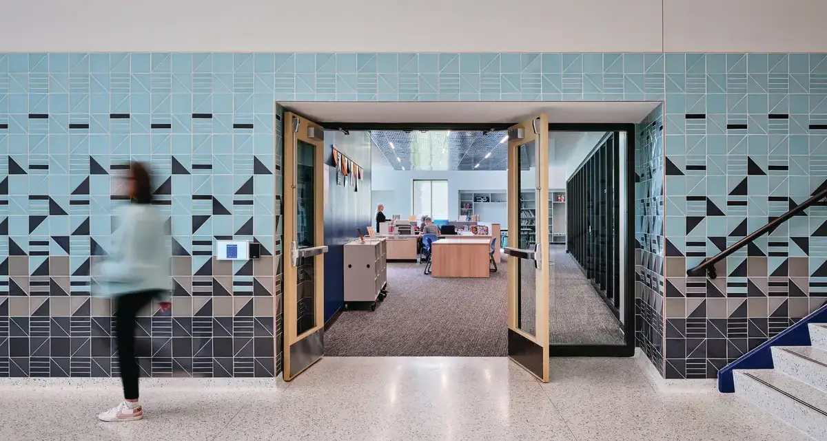
A tile pattern at Boys Town originated as a student group project. Photo © Michael Robinson
Art, quality materials, and well lit, welcoming spaces are examples of what Holtzinger calls “visual cues of worth.” As at Boys Town, such cues play a significant role in Shopworks’ design for the Mothership, a 66,600-square-foot, four-story shelter for up to 135 previously homeless children and young people. Features such as a bright, comforting lobby; a skylit common room with a choice of alcoves or central space, of tables or lounge seating; dignified materials including wood, concrete, and ceramics; good ventilation and acoustics to avoid sensory overload; and amenities such as a music studio, art room, and outdoor terraces all contribute to a place that tells residents they’re valued. “Kids don’t choose to be homeless. They happen to be homeless,” Holtzinger says. “We want to destigmatize that.”
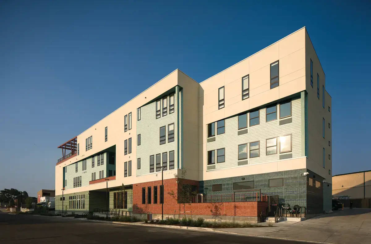
5
Mothership (5), a shelter for previously homeless youth in Denver, has a skylit common room (6) and outdoor terraces (7). Photos © Matt Staver
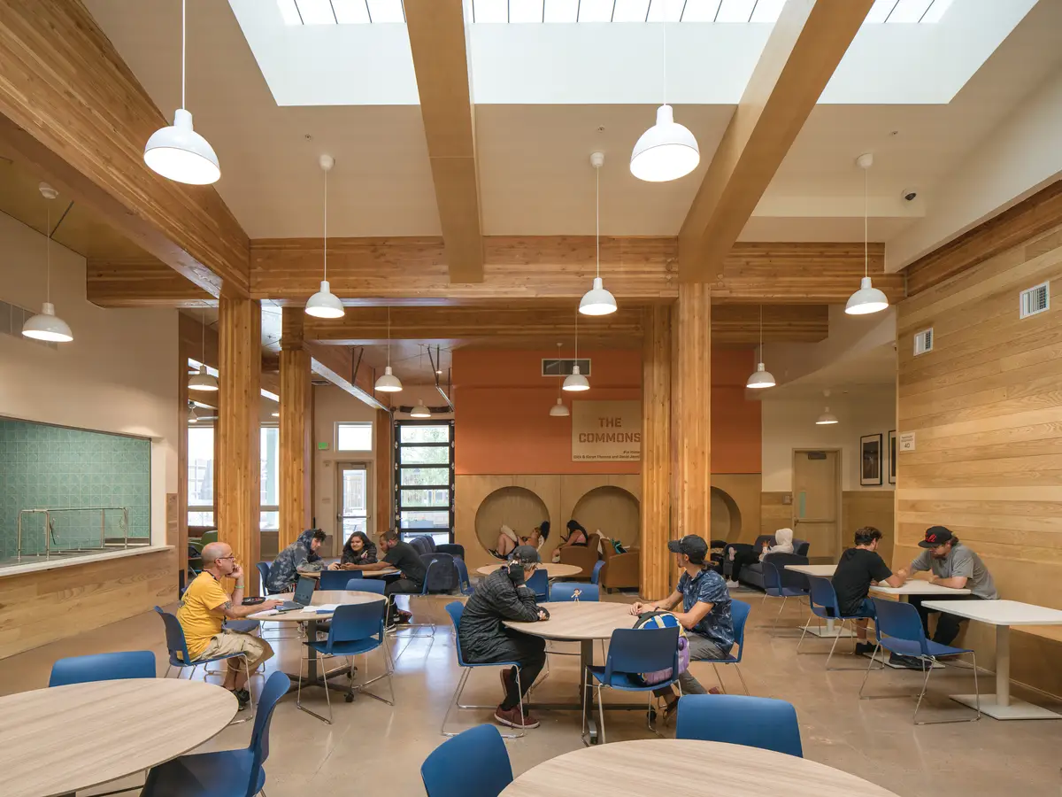
6
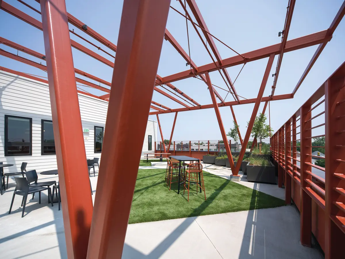
7
Tripling the capacity of the site’s previous, dormitory-style building (dark and smelling of mildew and socks, as Holtzinger describes it), the Mothership represents a significant innovation in the typology of shelter. Unlike existing models in Denver’s youth system—“We’ve got 20 years of data that says the outcomes aren’t great,” Holtzinger says—the building is configured into seven co-housing-like “neighborhoods.” Each one accommodates 12 to 18 residents and consists of a shared kitchen, living/dining room, bathing facilities, and double rooms with beds, desks, and a sofa. Transparency and carefully considered sight lines allow for previewing one space from another; the design also minimizes dead ends and provides a choice of routes through the building, further helping to reduce anxiety.
The neighborhoods are intended as transitional housing that supports residents until they feel ready to move out on their own (or reach the maximum age). They are places where residents can build self-worth, practical skills like cooking, doing laundry, paying rent on time, and maintaining a credit score, and a social network that could continue to support them after they leave. “We’re trying to set kids up to experience life in a salutogenic, life-affirming way,” Holtzinger says. Even in the building’s emergency dormitory, to which new arrivals are admitted before moving to a neighborhood, each bed has a phone shelf, lamp, coat hook, and locker, details meant to offer occupants a sense of personal space and control over their environment right from the start.
The Mothership is the result of years of pre-design effort, with Shopworks supporting its nonprofit client, Urban Peak, in grappling with questions from unfamiliar perspectives, such as those involving real estate, finance, zoning, building code, and trauma-informed design, that ultimately led to the neighborhood paradigm. “Architects play an outsized role in developing projects like this,” Holtzinger says. “Our role was more of being a partner in figuring out what the project needed to be.”
When people are treated with dignity, their stress—evidenced by heart-rate variability and cortisol levels—drops. Architecture’s ability to contribute to this through design for dignity is especially relevant in therapeutic environments such as the Ohana Center for Child and Adolescent Behavioral Health. “The building itself becomes an element of our prevention program,” Ohana’s physician in chief and medical director, Susan Swick, has said. “It creates a sense of possibility and hope.”
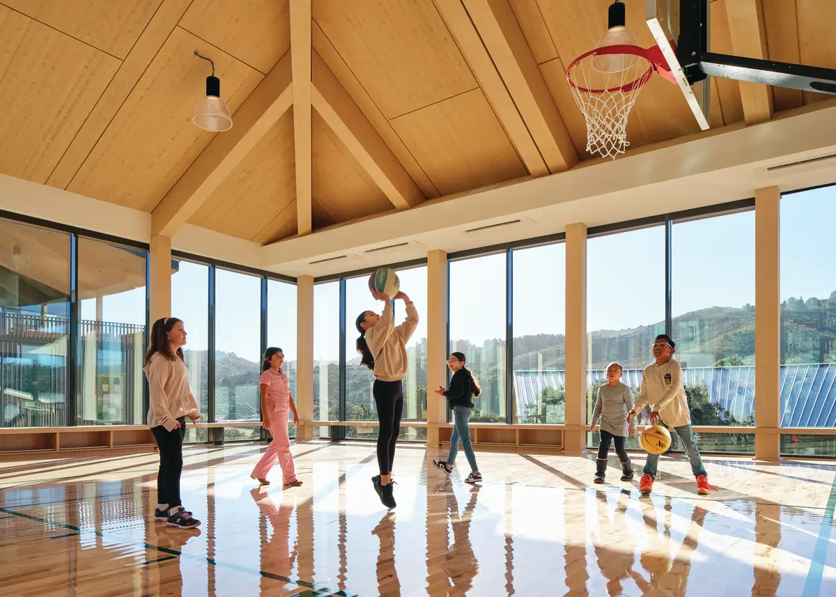
The gym was placed at the center of Ohana to take advantage of the benefits of movement on mental health. Photo © Ty Cole / OTTO
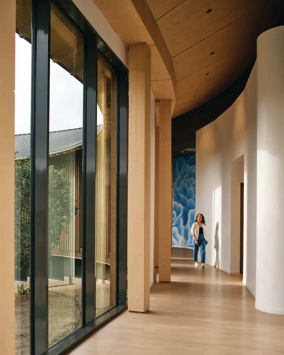
Ohana’s design incorporates curves at multiple scales, including that of a hallway. Photo © Ty Cole / OTTO
The 55,600-square-foot mental health facility comprises an outpatient-treatment wing, inpatient rooms, classrooms, a variety of therapeutic spaces, and places for informal gathering, all designed to ensure occupants’ sense of comfort, choice, and control over their circumstances. Supported by research suggesting that soft lines are more soothing than sharp angles, the design incorporates gentle curves at multiple levels of scale, from a winding plan to filleted millwork corners. The proven benefits of movement on mental health informed the decision to position the gymnasium prominently, at the center of the facility. The building also incorporates transparency for previewing what’s ahead, art to enrich and engage, and materials that convey dignity and worth (Ohana is one of the country’s largest health-care buildings to use mass timber, for example).
Throughout the design process, a primary goal was to maximize occupants’ connections to the landscape, “so that nature can become part of the healing process,” says Jonathan Ward, a partner at NBBJ. With a hillside site that looks out over Coastal live oak–studded hills, openings—from glazed walls to window nooks—provide panoramic or focused views from every part of the facility. Outside, the curves of the building define three enclosures designed around stands of oak. Stepping down the site from more public to more private zones, the upper courtyard is associated with the outpatient area, the central one with the dining room and gym, and the lower with the inpatient rooms. And because working with troubled children and youth can be stressful for front-line staff—with turnover at such facilities typically as high as 40 percent a year—staff break spaces are designed to provide refreshment and help reduce burnout, with outdoor terraces and splendid views.
Additional strategies for a salutogenic building include the installation of certain fragrant plants throughout the facility, particularly ones that release pinenes, compounds which have been shown to boost immune function. Outside, a fruit and vegetable garden provides enjoyable and productive tasks that can help children to recover their sense of personal agency. “What we’ve done is create a model for how architecture and design is part of the healing environment,” Ward says. “Beyond technology and efficiency, it’s about the human experience. It’s about understanding how humans are best adapted to their environment to be productive, healthy, and happy.”
As at Ohana, connection to nature is a vital aspect of trauma-informed design at the expanded facilities of Parrott Creek Child and Family Services, an 80-acre retreat that provides restorative programming for traumatized teens. Inspired by a vernacular farmhouse on the site, the project takes for its parti the concept of the porch: a safe, sheltered, transitional space that offers users the option to connect with others or find solitude in relationship with the landscape. “The porch concept resonates across cultures,” says Elisandra Garcia, director of engagement at El Dorado. “It provides an intimate place for a difficult conversation or a moment of decompression during a hard day, but also a warm place where we welcome loved ones.” The design interprets the porch in various versions throughout the compound, using the element to wrap around, cut through, or open up simple building forms, define circulation paths, link or buffer adjacent uses, and focus each structure on a creek or woodland view.
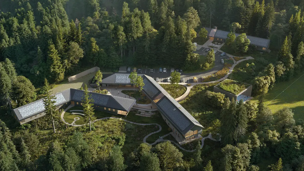
At Parrott Creek, a retreat in Oregon for traumatized teens, a network of porches provides transitions from public to private. Image courtesy El Dorado
A full set of trauma-responsive strategies deployed at Parrott Creek ranges from clarity of wayfinding to a special finish on bedside walls that’s comforting for kids to touch if they’re anxious in the night. Even a photovoltaic array with battery backup contributes, guarding against surprise power outages that could trigger kids’ trauma and cause chaos. “Sustainability is a measure of trauma-informed design,” Garcia says.

Image courtesy El Dorado
In addition to its specific strategies and solutions, Parrott Creek exemplifies TID as a process. Extensive engagement began with identifying the priorities of the developer, Adre—to let kids be kids was No. 1—and then expanded to include the facility’s wider community: parents, grandparents, probation officers, therapists, teachers, staff, and, especially, the kids. The architects used a variety of formats for eliciting the children’s input: asking about their days, what they did on a Monday morning or a Saturday; issuing them with disposable cameras to document aspects of the site that they particularly enjoyed; and distributing magazines for making collages of their ideas about the best place to sleep (open skylights and windows) or the best place for therapy (soft furniture and monochromatic materials). In workshops, a 3D site model helped the kids to visualize ideas, and tracing paper got them sketching them like pros. “As architects, we have spatial and technical expertise,” Garcia says, “but the community, the user, is the expert in their own needs.”
As these four projects show, trauma-informed design offers ways to create environments that engender trust and healing among distressed children and youth, wherever they are. The lessons from Boys Town, for example, will become a part of every project Schutte’s team is involved with going forward, she says, “because every school in America has kids who have experienced trauma.” Whether in education, housing, or health care, “if we design through the lens of dignity, for the kids and for the staff,” Holtzinger says, “we can create enriched environments that make a real difference in people’s lives.”
Continuing Education

To earn one AIA learning unit (LU), including one hour of health, safety, and welfare (HSW) credit, read the article above and Architectural Principles in the Service of Trauma-Informed Design (through page 24), Grabowska, Sam, Shopworks Architecture, Center for Housing and Homelessness Research at the University of Denver, and Group 14 Engineering. Then complete the quiz.
Upon passing the quiz, you will receive a certificate of completion, and your credit will be automatically reported to the AIA. Additional information regarding credit-reporting and continuing-education requirements can be found at continuingeducation.bnpmedia.com.
Learning Objectives
- Define “trauma-informed design,” or TID.
- Discuss which disciplines TID draws upon.
- Explain the relevance of TID, particularly in youthcentered settings.
- Describe how the tenets of TID can be deployed in educational, residential, and health-care environments.
AIA/CES Course #K2410A


