In 1987, architect Lorcan O’Herlihy—still in his 20s, with no official firm of his own—published his first solo project, a house for his parents, in Malibu, California. This obscure work had been chosen as a Record House that year. And its cluster of white, rectilinear forms on a high, hilly site overlooking the Pacific Ocean remained his parents’ beloved home for two decades. But after his father, actor Dan O’Herlihy, died, in 2005, his mother, Elsie, sold the property. Then, in late 2018—about 32 years after the project’s completion—Lorcan received a phone call out of the blue. The couple on the line said, “You don’t know us, but we bought your parents’ house several years ago, and loved it. But, sadly, we lost it in the Woolsey Fire—and would like you to design a new house for us on the same site.”
For the architect, who’d established Lorcan O’Herlihy Architects (LOHA) in Los Angeles in 1994, it was an emotional moment. His personal connection to the house ran deep, but he also wanted to raise its successor from the ashes. He already knew that the Woolsey wildfire, which tore through almost 97,000 acres in November 2018, had claimed this and numerous other houses in Malibu’s Trancas Canyon—and now, clearly, fire protection would be a top priority.

1
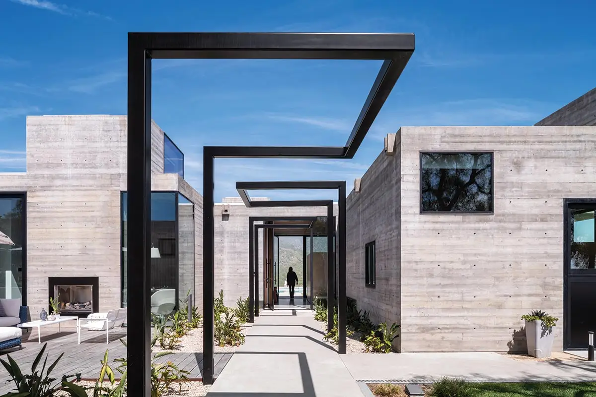
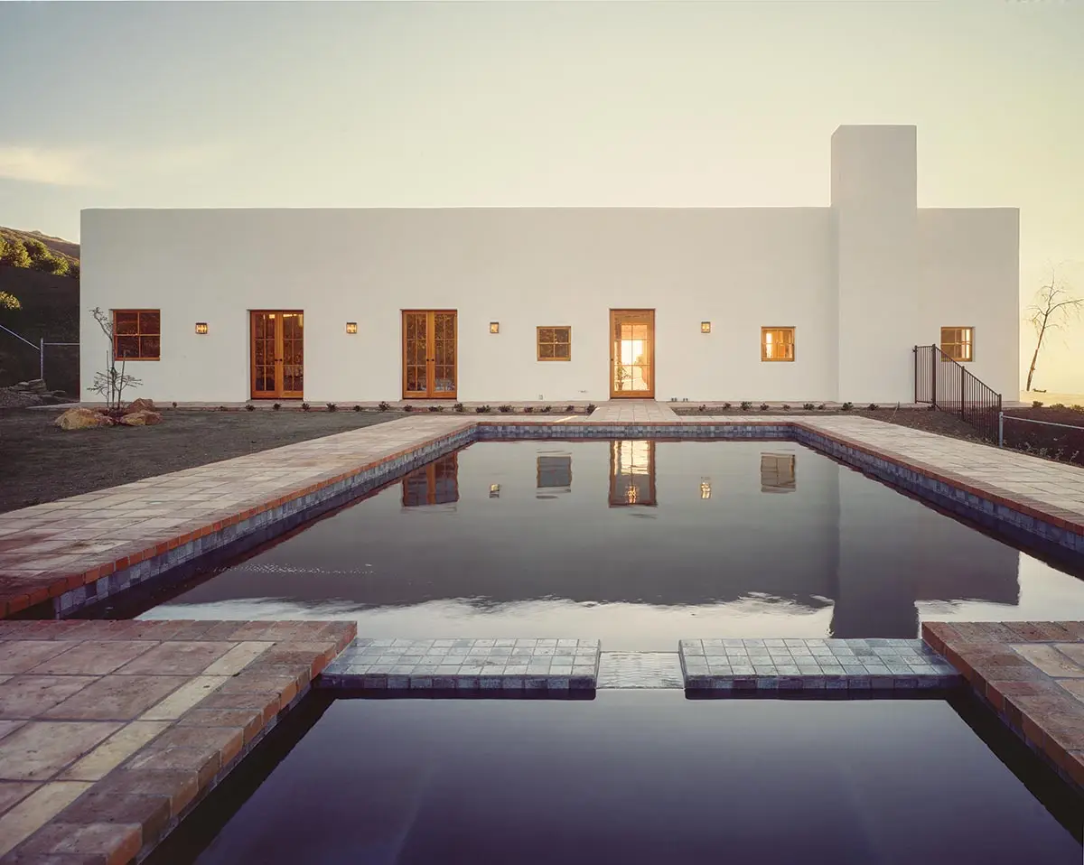
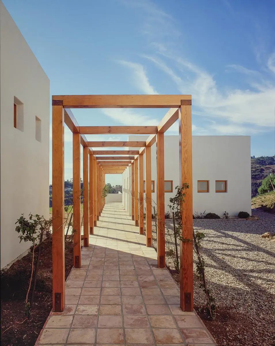
The visually taut skin of Trancas 2.0 is made of board-formed concrete (1 & 2), while its predecessor’s deep-walled forms were realized in stucco and wood framing (3 & 4). Photos © Paul Vu (1 & 2), Paul Warchol (3 & 4), click to enlarge.
2
3
4
Fortunately, Malibu offered expedited permitting for post-Woolsey rebuilding: Eligible homeowners could obtain permits relatively quickly—here, in just a few months—if the redesign exceeded the existing footprint by no more than 10 percent. That suited the clients, who’d cherished the way the house sat on the land and captured panoramic views.
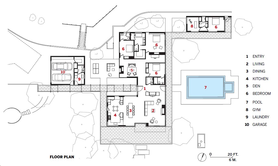
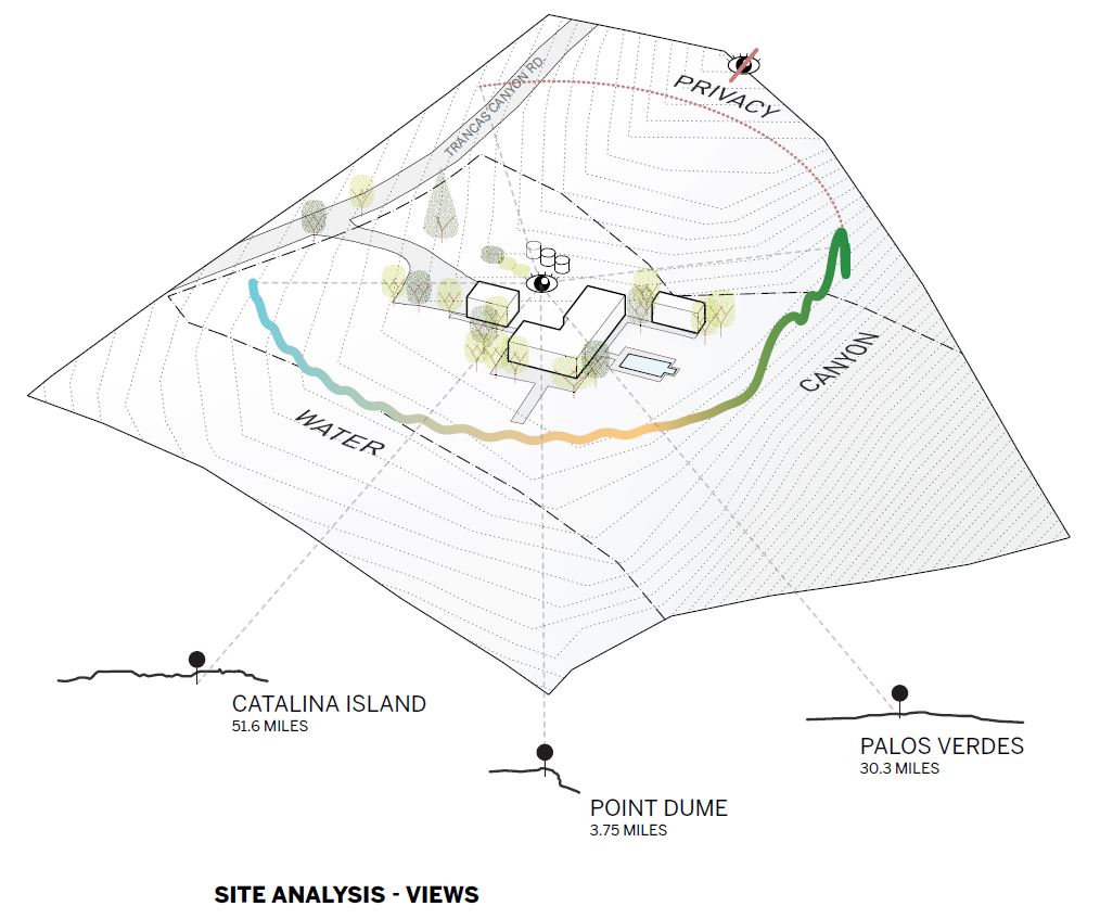
On this 9.9-acre site (with only 1.5 buildable acres, due to steep slopes), O’Herlihy’s original “Trancas House” was organized along two perpendicular axes that intersected in the entry foyer: the main axis—of sight and movement—extended eastward from the parking area, through a long pergola, over the house’s threshold, and, at the far end of that space, drew the eye through glass doors, down the center of an outdoor swimming pool, and out to the canyon’s edge. The cross-axis had bedrooms on its north end and, to the south, culminated in a “great room” with a 10-foot-square window to the landscape, ocean below, and horizon beyond.
The glazed entry (above) is on axis with the pool. Photo © Paul Vu
The house came into being when Postmodernism reigned and Modernism was passé—but O’Herlihy had always rejected PoMo, embracing instead a clean-lined Miesian aesthetic. So his design was spare and unadorned—a “commentary,” as he puts it, on the ornate architecture, rife with manipulated historical references, that dominated the period. The house’s restraint and pure geometries—its boxy, stuccoed, deep-walled forms—married minimalist Modernism to the California Spanish style his parents favored. But its stick-frame construction burned to the ground.
In response, O’Herlihy and the current owners decided to rebuild primarily with concrete, using the noncombustible material for roofs, floors, and all exterior and most interior walls. Expanding the existing footprint by about 16 percent (the expedited-permitting allowance, plus a property-specific bonus), the reimagined house shares much DNA with its predecessor. The new cross-axial composition of single-story, flat-roofed volumes carries forward most of the previous functions in the same locations. Yet LOHA was also free to reinterpret, probing the potential of space, light, and materiality. “It helped enormously,” recalls O’Herlihy, “that the owners [a couple that divides its time between Canada and Malibu] really understood and appreciated architecture. They were very open to re-envisioning the original design, but also wanted to keep what they loved most about it.”
So, “Trancas House 2.0,” like its predecessor, has an almost choreographed arrival sequence—but with a more playful and sculptural entry pergola, replacing the sober post-and-beam wood one with a lively cadence of orthogonal steel loops, painted black and cantilevered overhead.
The compound’s three freestanding volumes—a garage/studio alongside the trellis; the main building, at the entry path’s eastern end; and a poolside guest pavilion, just east of the house—are also transformed. They are more open, with varied window sizes and rhythms, in contrast to the stricter alignments and repetitions—the “studied simplicity”—portrayed in RECORD’s 1987 article. In place of expressively massive exterior walls with deep openings, Trancas House 2.0 has a skin of rich gray board-formed concrete with flush glazing, framed in black, producing a surface that’s visually taut. Now seven light wells—like big, rectilinear periscopes—plus a chimney, project upward from the elevations. The interior space spans 4,800 square feet (versus 4,150 originally, including the circa-1988 guest pavilion), and the main building’s plan has gone from L- to U-shaped, with the addition of a den, or sitting room, and extra bedroom.
But the sense of procession amid unfurling views remains—now even heightened. Beyond the glazed front door, the long entry axis still draws the eye straight outside again, down the center of the pool (the same shape and size as before) and into the landscape. Now, however, the overall spatial fluidity and indoor-outdoor flow are enhanced. The kitchen is more integral to the great room, and floor-to-ceiling sliding glass doors, to the south and east, open that grand space—including its entire southeast corner—to the vistas.
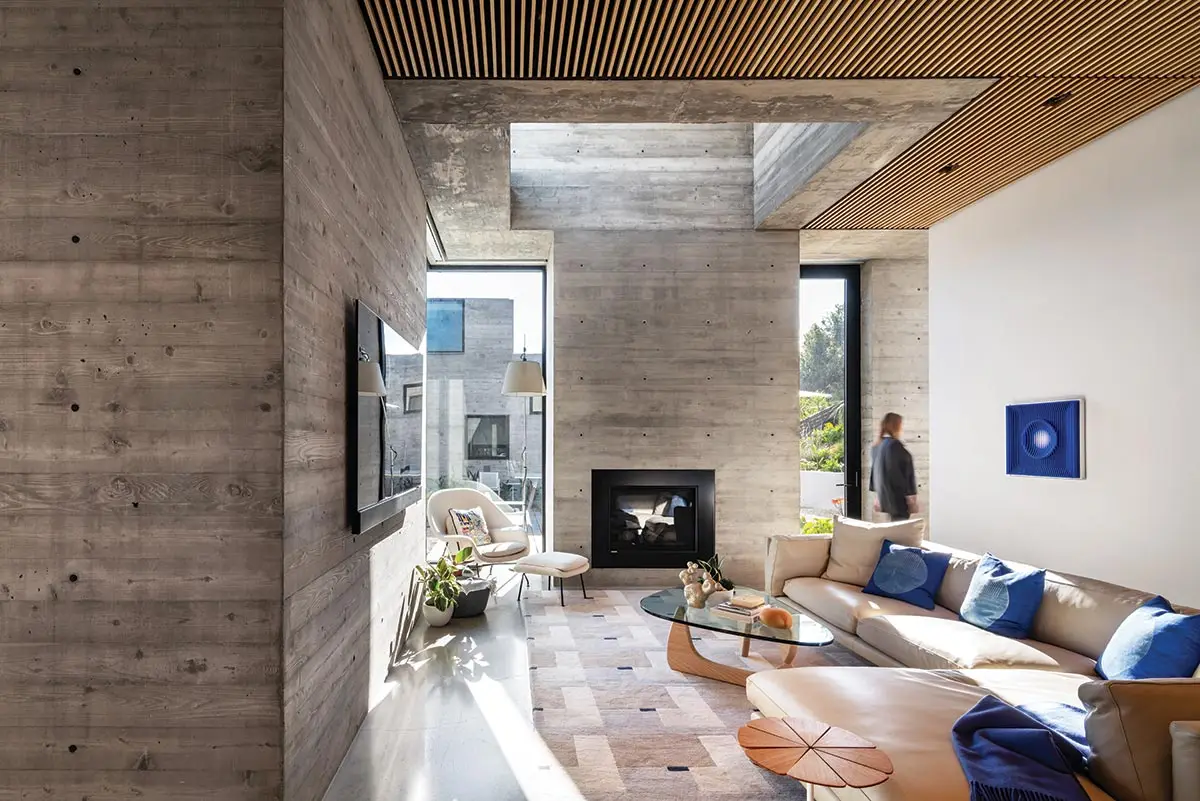
5
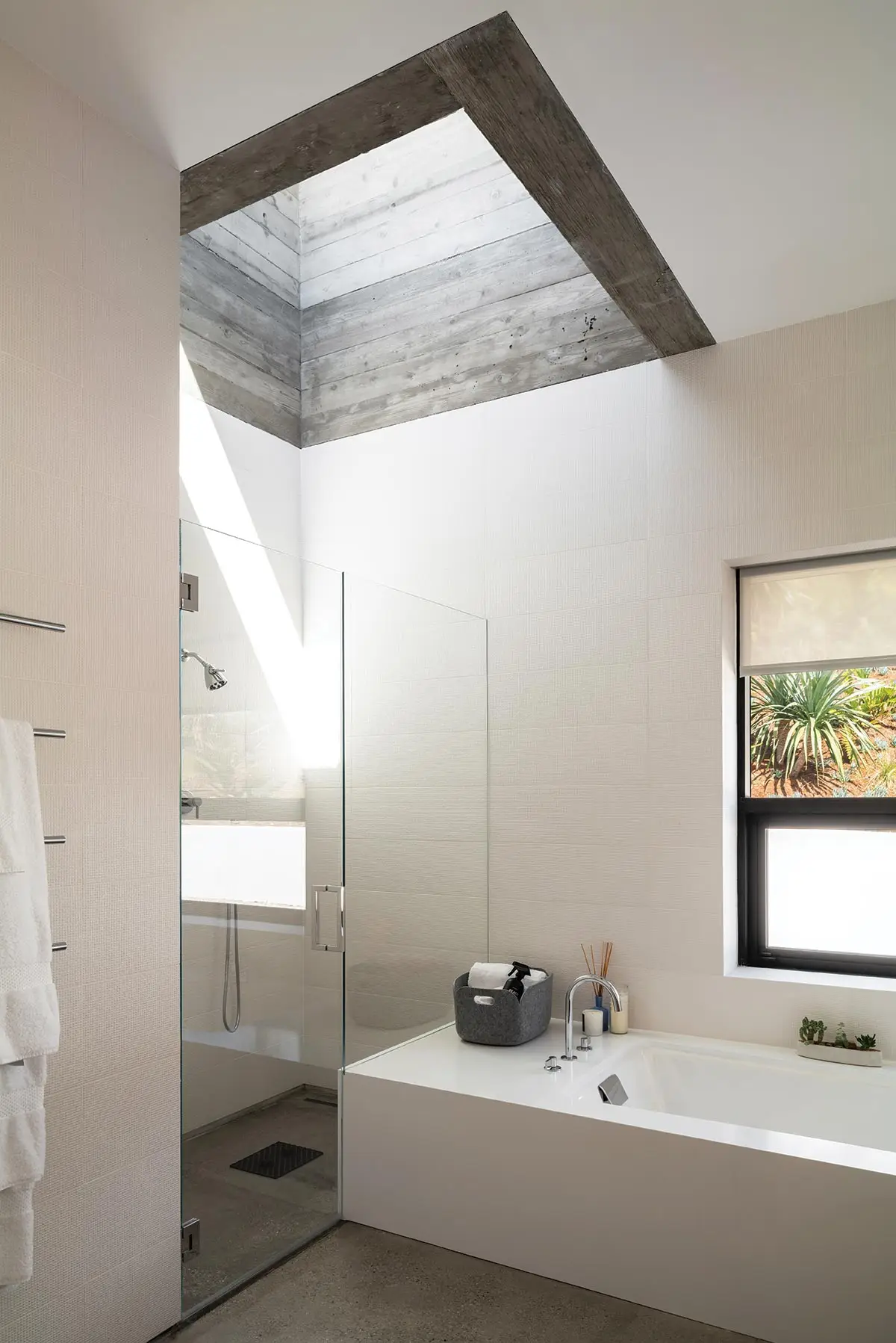
6
Nearly every room has a light well, including the den (5), a bath (6), and the primary bedroom (7). Photos © Paul Vu
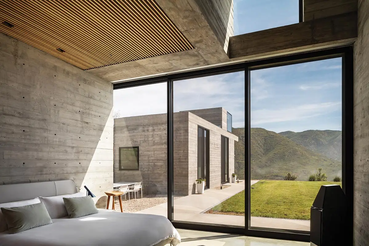
7
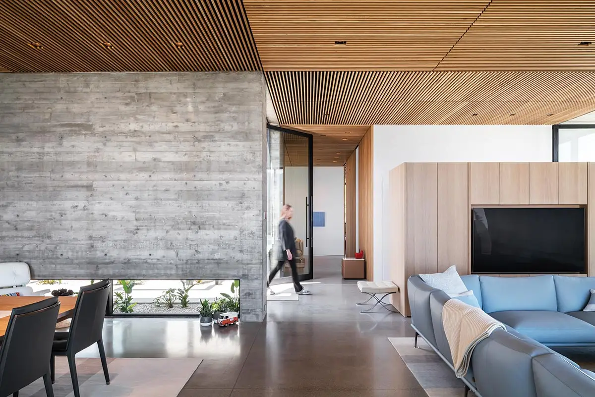
Where the 1980s living/dining room had Mexican tile underfoot and rustic timber beams overhead, the new house has smooth polished-concrete floors throughout, with wood playing more nuanced roles. Freestanding cabinets, veneered in oak, double as low partitions beneath the 12-foot ceilings, creating intimate zones without diminishing spatial continuity. And narrow, finely milled slats of white oak line the great room’s ceiling, extending vertically down key walls in the transition to the bedrooms. Nearby, the den addition—with a two-faced fireplace that also opens to an outdoor patio—replaces an enclosed corridor. Throughout, imprints from the concrete formwork—the stratified rhythm and pronounced grain of boards—add a tactile quality, as well as finer-scaled continuity. Catching the play of light, the concrete’s wood texture becomes particularly animated within the light wells (one in nearly every room), breaking luminously from the horizontal ceiling datum.
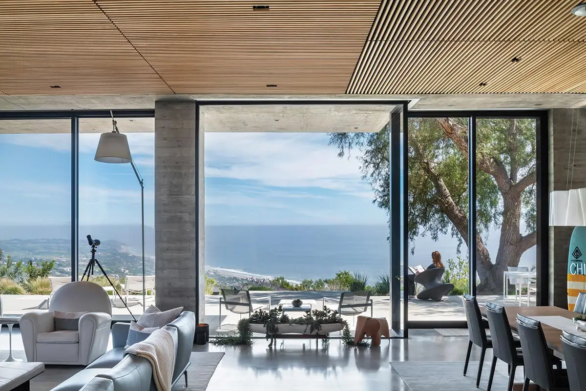
The living area opens to vistas to the south and the east through floor-to-ceiling glass. Photo © Paul Vu
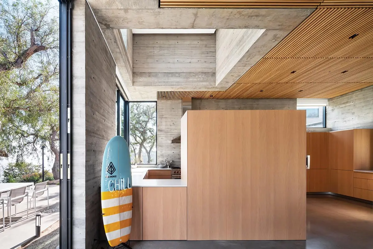
Freestanding cabinets double as low partitions. Photo © Paul Vu
LOHA oversaw the landscape scheme, working with designer Michael Boyd to achieve a dialogue between the house and its immediate surroundings (including painterly compositions of hillside plantings, framed by specific windows). The landscaping, like the architecture, met—and, in places, exceeded—Malibu’s stringent fire regulations, influencing, for example, irrigation systems and plant selection, density, and distance from the buildings. The redesign also enhanced fire truck access and turnarounds, while eschewing such ember-vulnerable elements as attics and flammable eaves. Other measures include interior sprinklers—along with the ubiquitous concrete.
The project’s seemingly effortless complexity and subtle detailing might not have been possible without a mature architect’s experience and confidence (liberated by the demise of Postmodernism). “Also, with both houses,” O’Herlihy hastens to add, “I got lucky with an essential ingredient: great clients.”
But how might his parents have reacted to Trancas House 2.0, were they still alive? “Actually, my father studied architecture seriously before acting, quite unexpectedly, became his life’s work,” says O’Herlihy. “He and my mother were drawn to design and were really proud parents—I think they would have loved the new house.”
Click plan to enlarge
Click drawings to enlarge
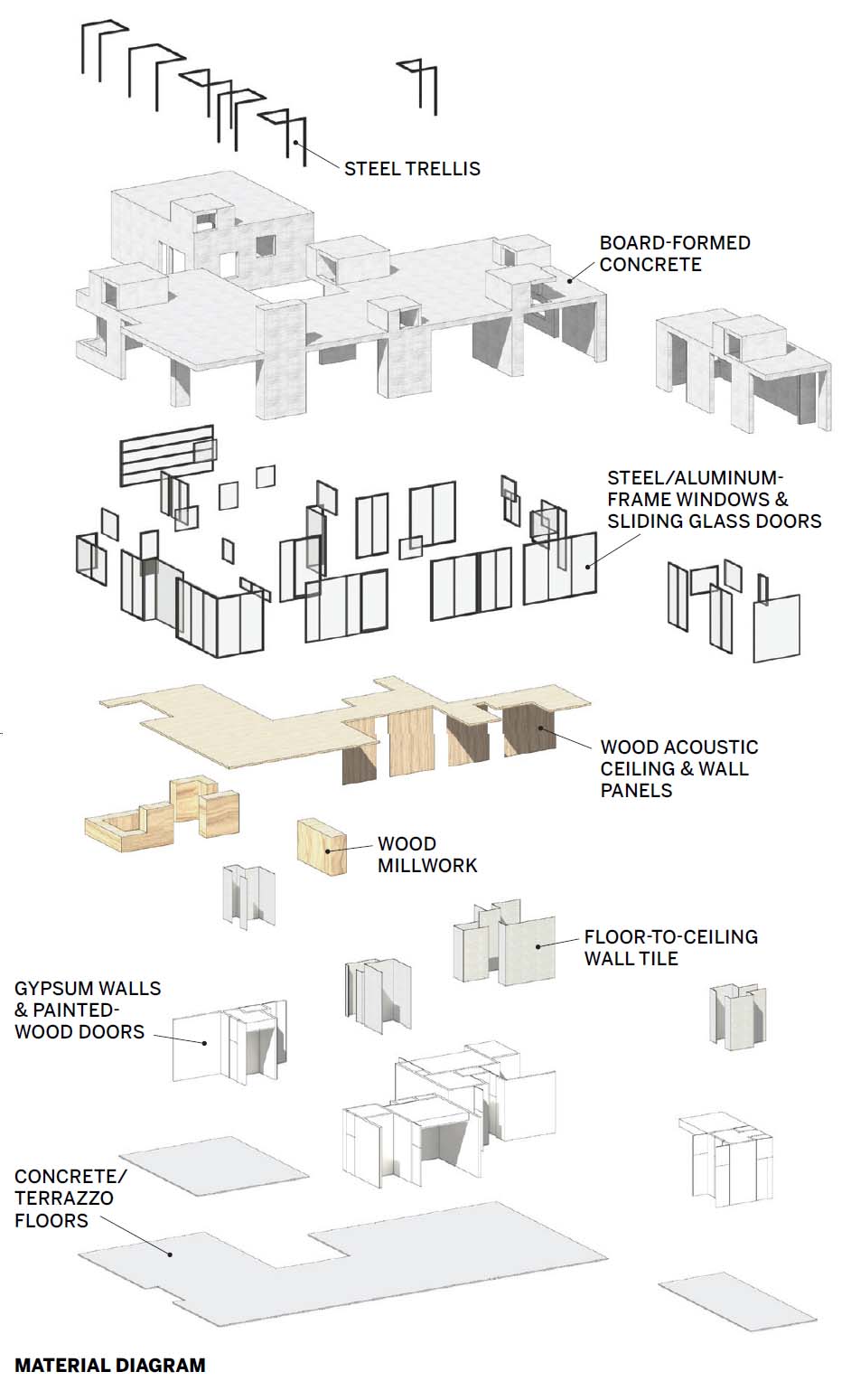
Credits
Architect:
Lorcan O’Herlihy Architects — Lorcan O’Herlihy, principal-in-charge; Brian Adolph, director; Judson Buttner, Kayla Manning, project leads; Ryan Leifield, design team
Consultants:
Kurt Fischer Structural Engineering (structural); Green MEO (m/e/p); LCE Group (civil); Simpson Gumpertz & Heger (fire protection); KGM Lighting (lighting); Michael Boyd (landscape)
General Contractor:
RJC Builders
Client:
Helen Braithwaite and Patrick Phillips
Size:
4,800 square feet
Cost:
Withheld
Completion Date:
July 2023
Sources
Windows:
Fleetwood Windows & Doors
Architectural Concrete:
Donald J. Scheffler’s Construction
Paints:
Dunn Edwards
Plumbing Fixtures/Fittings:
Kohler, Mekal
Solid Surfacing:
Corian
Ceiling Panels:
Conwed


