WilkinsonEyre's London Tower Navigates Planning Mandates with Nuanced Form and Clever Engineering
London

Architects & Firms
Londoners like to give the city’s office towers amusing nicknames. There’s Foster + Partners’ 30 St Mary Axe, known as the Gherkin (2004); Richard Rogers’s 122 Leadenhall, aka the Cheesegrater and Rafael Viñoly’s 20 Fenchurch Street, referred to as the Walkie Talkie (both completed in 2014); as well as KPF’s 52 Lime Street, called the Scalpel (2018). But now this collection of buildings, all in or near the financial district’s “eastern cluster,” has a new addition: WilkinsonEyre’s 50-story, 668-foot-tall 8 Bishopsgate, which some have dubbed the Jenga, due to the stacked and subtly rotated volumes that lend it a passing resemblance to the off-kilter towers of the popular woodblock game.
Completed in July for developer Mitsubishi Estate London, 8 Bishopsgate is much more nuanced than its moniker implies, however. Rather than a willfully haphazard and attention-grabbing form, the tower is a carefully considered response to client needs, to the surrounding context, and especially to the London View Management Framework—planning provisions protecting views of important landmarks across the city. Among the Framework’s requirements is a stipulation that buildings not interfere with the “skyspace” around the dome of St Paul’s Cathedral when viewed from the west and from a certain vantage point. These regulations were the source of the wedge shape and raked facade of the Cheesegrater, for instance, which sits immediately to the east of 8 Bishopsgate.

1

2
Eight Bishopsgate twists like the streets below (1) and steps back to its taller neighbor, 22 Bishopsgate (2). Photos © Dirk Linder, click to enlarge.
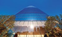
WilkinsonEyre took a different approach, translating the conditions of the Framework into a stepped profile. The building reads as a collection of stacked boxes, including one at the base clad in sandstone-faced precast panels to relate to nearby heritage buildings, and fully glazed volumes above. The blocks become more slender as they ascend, stepping back toward the north and 8 Bishopsgate’s much taller and heftier neighbor, PLP Architecture’s 2020 skyscraper, 22 Bishopsgate. As they rise, each of the blocks of 8 Bishopsgate is slightly rotated, with a modest cantilever, relative to the one below it. The result is a tower with a sympathetic scale and an assemblage that seems informed both by the mazelike street grid and by the variety of building heights and shapes nearby.

3
The lower volume is clad in sandstone (3), while upper ones, which cantilever (top of page) are fully glazed. The double-height reception area (4) has marble walls, terrazzo floors, and timber-slat ceilings. Photos © Dirk Linder

4
Critical to this expression is 8 Bishopsgate’s taut glass envelope, which Oliver Tyler, a WilkinsonEyre director, claims is the “crispest and flattest in the city.” And indeed the reflections seen on many of the skyscrapers in close proximity reveal that their facades ripple and bow, while there is little distortion evident on the skin of 8 Bishopsgate, which consists of a double curtain wall, about 8 inches deep, enclosing automated blinds. Tyler credits the precision of the cladding to a close collaboration with the Dutch fabricator that modified its usual assembly sequence to achieve the architect’s desired effect.
The attention to detail continues inside, in public spaces like the double-height entry hall, where visitors are greeted with Carrara-marble-clad walls, terrazzo floors that include the same marble in its aggregate, and elevator lobbies in expertly finished exposed concrete. Overhead, panels made of slats of sweet chestnut span the exposed steel ceiling structure. Curvaceous benches in oak, of Tyler’s design, are placed here and there. The overall feeling is sleek and inviting.
Eight Bishopsgate replaces two early 1980s buildings—one 20 stories and the other seven stories—which “were not maximizing the site nor were they fit for purpose,” says Kevin Darvishi, leasing director for Stanhope, the project’s development and asset manager. Their replacement has proved popular primarily with financial, insurance, and legal tenants. As of late January, of 560,000 square feet of office space at 8 Bishopsgate, about 85 percent is leased or under offer, according to Darvishi.
One of the tower’s main selling points, as companies try to lure employees back to the office, has been its amenities, such as outdoor space. Where the building steps back, at levels 9, 11, and 25, there are landscaped terraces for occupants of those floors. There are also shared amenities, including a tenants-only restaurant and bar on level 26, which opens out onto an especially capacious terrace, and on a mezzanine just above the lobby, a 200-person auditorium with an adjoining meeting space. Meanwhile, on the top floor, a viewing gallery with sweeping city vistas can be reserved for special events when not open to public. Below grade, there is parking for nearly 1,000 bikes—one of the largest such facilities in the city, according to the project team—and spa-like showers and locker rooms.

A top-floor viewing gallery offers sweeping vistas. Photo © Dirk Linder

A tenants-only restaurant opens onto a capacious terrace. Photo © Dirk Linder
The structure of 8 Bishopsgate consists of a steel frame and two reinforced-concrete cores—one to the south that serves the building’s low-rise portion and another to the north, which extends to the crown. Linking the two cores together, a braced box at the building’s midsection helps stabilize the tower and enables the projecting volumes without the excess steel usually associated with such cantilevers, explains Chris Edgington, an associate director at Arup, which served as the structural and mechanical engineer. Together with rationalizing the frame, the braced box helped reduce the use of steel by 25 percent, saving 5,000 metric tons of embodied CO2 when compared to a more conventional tower, according to the project team. Every steel member is “sized to do what it needs to do and is no bigger,” confirms Tyler.

The Cheesegrater, with its raked facade, sits just to the east of 8 Bishopsgate Photo © Dirk Linder
This “right-sizing” approach also extends underneath the tower, where, instead of relying on pile foundations typical of tall buildings, Arup designed a raft foundation with piles only under the taller north core. The hybrid solution, according to Edgington, resulted in the “leanest foundation possible,” avoiding the use of 4,000 cubic yards of concrete and saving another 680 metric tons of CO2.
Operationally, too, the building is designed with sustainability as a priority. Contributing to its BREEAM Outstanding designation (the green-building rating system’s highest certification possible) are its: on-floor air-handling units, which allow tenants control over their individual spaces and provide higher fresh-air and filtration rates than is typical; a water-to-water heat pump that recycles waste heat from air-conditioning; and systems that capture and treat water from sinks and showers and from roof runoff, reusing it for toilet flushing and irrigation. And, of course, there is the double-skin facade, with its interstitial blinds, that helps to reduce glare and cooling loads.
The flawlessly flat skin is, arguably, emblematic of the whole tower: a symbol of 8 Bishopsgate’s high environmental aspirations, but also of a commitment to detail and precision that is rare in such large speculative projects.
Click drawings to enlarge

Credits
Architect:
WilkinsonEyre — Oliver Tyler, director; Ayman El Hibri, associate director
Consultants:
Arup (structural, m/e/p, access, landscape), Alinea (cost), Andrew McMillan Associates (catering), Studio Sutherland with Whybrow Pedrola (wayfinding), EQ2 (lighting), Gerald Eve (planning), PFB Construction Management (construction design and management), Reef Associates (facade maintenance)
Construction Manager:
Lendlease
Client:
Mitsubishi Estate London + Stanhope
Size:
913,000 square feet (gross)
Cost:
$377 million (development)
Completion Date:
July 2023
Sources
Curtain Wall:
Scheldebouw
Precast Cladding:
Loveld
Glass:
Interpane
Timber Ceilings and Paneling:
BCL Timber Projects, Gustafs
Marble and Terrazzo:
InOpera
Locksets:
Assa Abloy
Closers:
Dorma
Exit Devices:
Zumtobel, Philip Payne
Lighting:
Osram, LED Linear, iGuzzini, Erco, Zumtobel, ACDC, Concord, Light Graphix, Light Lab
Vertical Transport:
Kone


