Memorializing horrific events with architecture is necessarily fraught. Should a building attempt to reflect the brutality and trauma experienced by the victims of unimaginable violence? Should it create a forbidding or unsettling environment? Some architects say yes—the best-known example being Daniel Libeskind and his 2001 Jewish Museum Berlin, with its zigzagging plan and slice-like, angled windows.
The designers of the Melbourne Holocaust Museum, in Elsternwick, one of the Australian city’s southeastern suburbs, decided to go in a different direction. “We struggled with what role the architecture should play,” says Kerstin Thompson, founder of Kerstin Thompson Architects (KTA). Ultimately, she decided that “the building was not the right medium to encounter discomfort.” Instead, “that should be the role of curation and the exhibits.”

A ground-floor courtyard is among the outdoor spaces at the rear. Photo © Leo Showell, click to enlarge.
With this philosophy in mind, Thompson—who won last year’s Australian Institute of Architects Gold Medal—has designed a welcoming and nuanced structure to house a collection of more than 20,000 historical artifacts and provide space for exhibitions and educational and outreach events. “It is a safe space to encounter difficult subjects,” says Jayne Josem, the museum’s former CEO.
Inaugurated in November, the museum’s opening marks a milestone in the evolution of an institution established four decades ago by survivors who had immigrated to Melbourne after the Second World War. In 1984, the founders acquired an early 20th-century brick and timber building that had once been a community pharmacy and hall and set about collecting and preserving survivors’ stories through testimonies, photographs, letters, documents, and other items. The museum, then known as the Melbourne Holocaust Centre, soon outgrew its two-story stucco-covered structure, and constructed an auditorium in 1990, and then added on again just nine years later. But, not long after, the organization was once again running out of space. The tight quarters meant that it could not mount temporary exhibitions or accommodate all the school groups who wanted to visit, says Josem. The institution’s leaders began to consider another expansion.
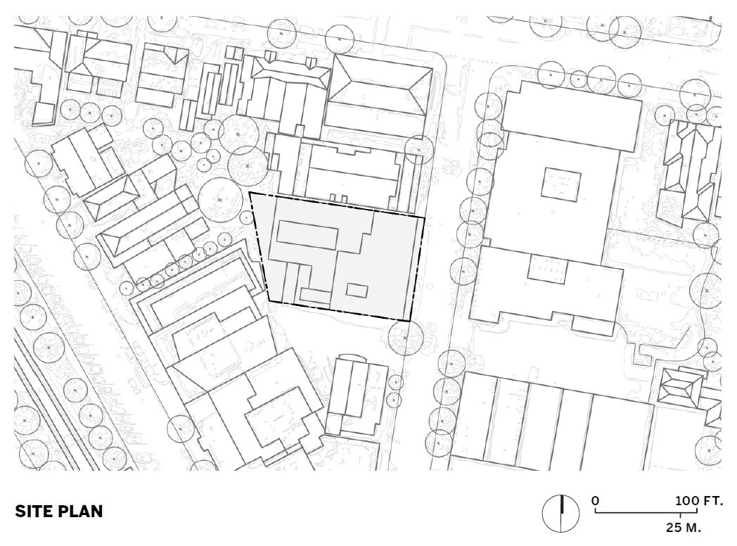
This time, however, they decided to rebuild entirely. The resulting four-story, 43,000-square-foot poured-in-place concrete structure is completely new, except for incorporating the front elevation of the old social hall and a tower at its southeast corner. “The facade is one of the original artifacts of the collection,” explains Thompson, selected by competition in 2014.
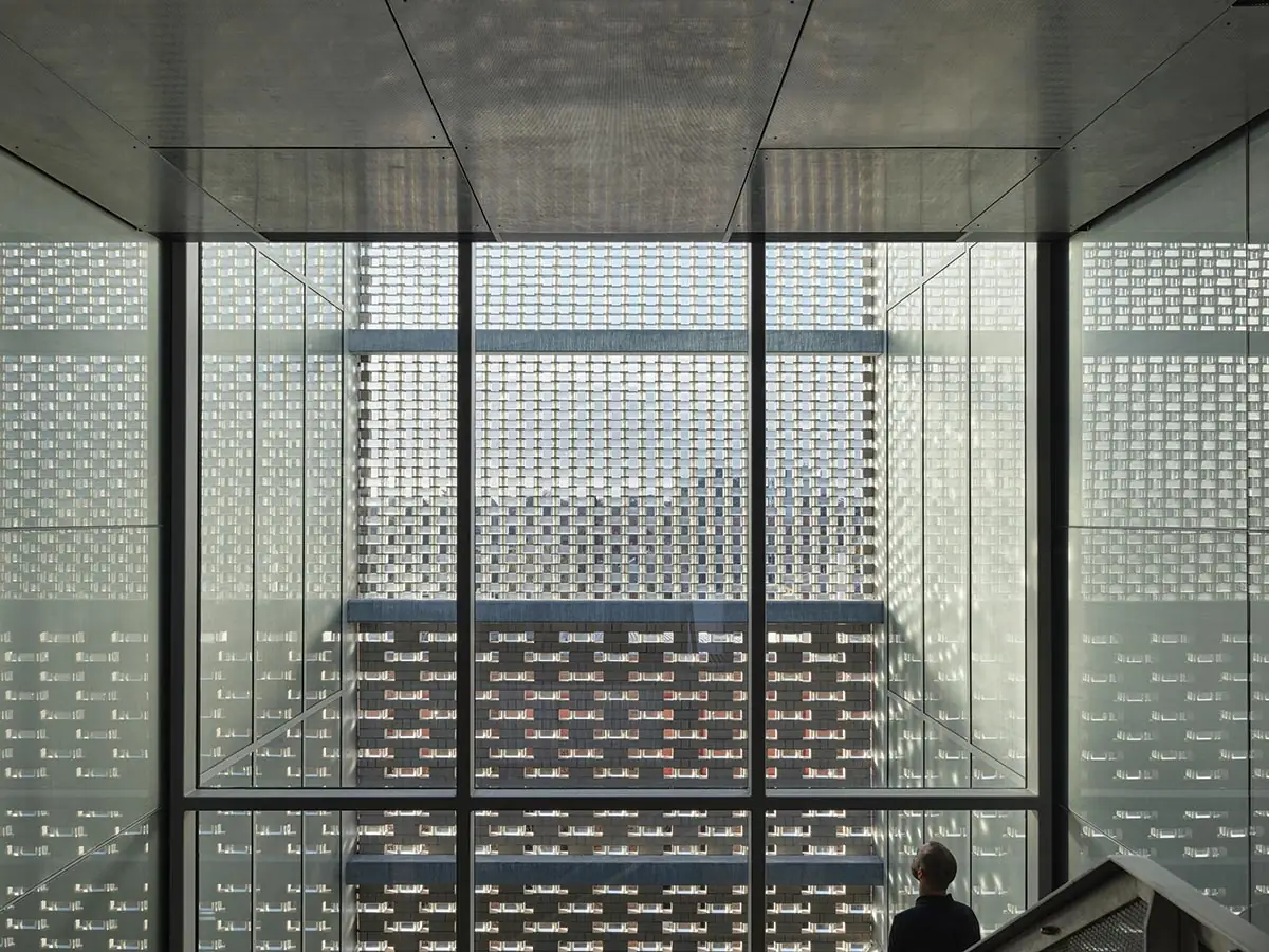
The existing masonry face, with the outline of the tower and the gabled roof clearly identifiable, is embedded within a taught new skin that extends upward and horizontally. It combines glass bricks with conventional ones of clay to create varying degrees of opacity and transparency. The result, resembling woven fabric, is one of lightness and delicacy but still endowed with gravitas, says Thompson. She also notes that the assemblage is robust, calling it blast-proof, but without making the building seem like a bunker.

1

2
The transparency of the front facade (1 & 2) is calibrated according to the nature of the spaces behind it. For instance, it is more transparent in front of a stair (3) and opaque where it encloses galleries. Photos © Leo Showell (1 & 2), Derek Swalwell (3)

3
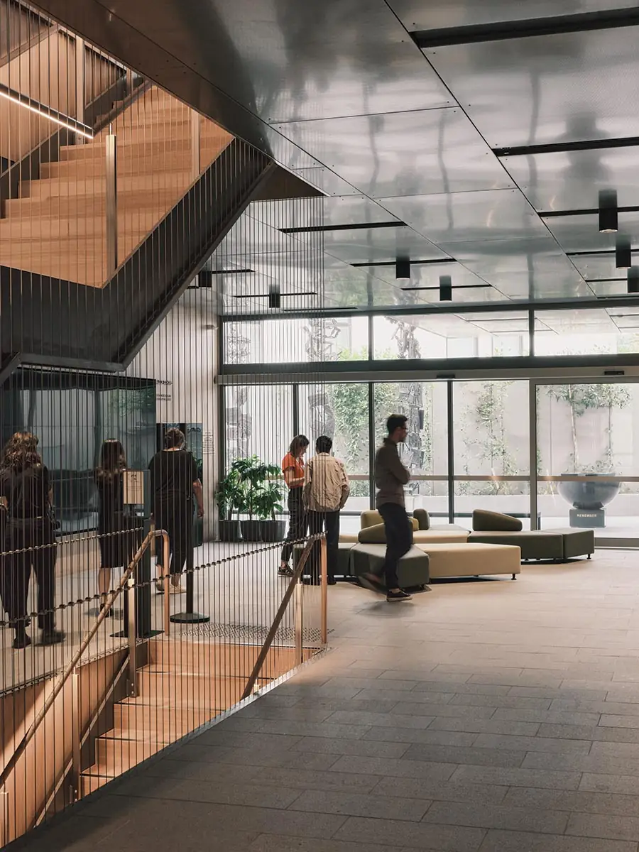
From the street, the museum appears to be shoebox shaped, but at the rear it terraces back to allow light and air to reach adjacent low-rise apartment buildings and create outdoor spaces on multiple levels. Within this volume, KTA has organized galleries, auditoria, and spaces for research, learning, and administration around a multi-level circulation spine that bisects the roughly rectangular footprint. Here, walls clad in Tasmanian oak and carefully considered details such as stairs defined by slender steel cables and subtly glowing handrails incorporating LEDs add elegance and warmth that helps counter the challenging content found inside the galleries. The central space also visually connects the rear outdoor spaces with a “forest” at the front. The latter is a small shaft, sandwiched between the main stair and the facade and planted with birch trees, a reference to the Auschwitz-Birkenau concentration camp (birke is “birch” in German). Daylight enters from above and through the textile-like skin, filtering through the foliage to create a dappled effect.

4

5
Slender steel cables define the central stair (4 & 5). Photos © Leo Showell
The birch forest is not the only instance of manipulation of daylight within the building. A series of skylights are strategically used to amplify the sense of space. One, at the top of the old building’s tower, helps illuminate a second-floor memorial room designed by Jolson Architects. Its glazed lites form a star of David—the only instance of explicit religious iconography incorporated within the architecture. The other skylights, mostly above the central spine, include mirrors to augment their luminosity and make the floor-to-floor heights feel more expansive than they are. In contrast, the galleries, by exhibition-designer Thylacine, have low light levels and a dense arrangement of displays.

6

7
Mirrored skylights (6 & 7) amplify the luminosity of the circulation spine. Photos © Derek Swalwell (6), Leo Showell (7)
The mirrored apertures also serve to reflect the sky, creating a sense of “release and hope” for visitors who have just immersed themselves in the history of deportations, pogroms, and concentration camps. Ultimately, the message of the museum and its architecture is a life-affirming one of resilience and optimism: a better understanding of difference can overcome anti-Semitism, racism, and prejudice, and help ensure a better future.
Click plan to enlarge

Click plans to enlarge

Credits
Architect:
Kerstin Thompson Architects — Kerstin Thompson, design director; Kelley Mackay, director of projects; Claire Humphreys, associate principal, Tobias Pond, principal; Anne-Claire Deville, project lead; Martin Allen, associate; Hilary Sleigh, Jasmine Placentino, Sophie Nicholaou, Karina Piper, Ben Pakulsky, Scott Diener, Lauren Garner, architects; Tamsin O’Reilly, visualization; Thomas Huntingford, architecture graduate; Leonard Meister, architecture student
Consultants:
Adams Engineers (structural, civil); Cundall (building services, ESD); Focused Fire Engineering (fire); Cundall (acoustics), Inhabit (facades); Thylacine (exhibition design); Jolson Architecture & Interiors (memorial); Bryce Raworth Conservation (heritage consultant); M.I.P. Security, Michelson Protech Security, CSG Security (security)
General Contractor:
McCorkell Constructions
Client:
Melbourne Holocaust Museum
Size:
43,000 square feet
Cost:
$12 million
Opening Date:
November 2023
Sources
Glass Brick:
Poesia Glass Studio
Clay Brick:
PGH Bricks
Glazing & Skylights:
Viridian Glass, Glassform, Glassworks
Doors:
Gunnebo Australia
Acoustical Ceilings:
USG, Armstrong
Paneling:
Britton Timbers


