In Portugal, Brandão Costa Arquitectos Tops a Bus Terminal With an Elevated Walkway
Porto, Portugal

Architects & Firms
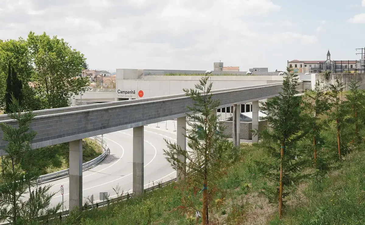
Behind the Campanhã railway station on the eastern edge of Porto, an elevated concrete walkway cuts north across the landscape, turning sharply where it meets a roundabout and then continuing on a viaduct over a hillside. From this vantage point, one looks out over a tangle of tracks and platforms on one side and an old, low-rise residential neighborhood, bitten into by an eight-lane highway, on the other. The rush of traffic, the clash in scales, the division of the city wrought by infrastructure: Campanhã represents a familiar landscape defined by conflicting ways of occupying and moving through space.

The terminal creates a large new park (top of page) on a site squeezed between a highway and railway tracks (above). Photo © Francisco Ascenção, click to enlarge.
Below the walkway, in a cavern built into the 35-foot-high hillside and topped with a green roof, is the new Campanhã Intermodal Terminal, a 200,000-square-foot bus station that is now one of the main gateways to Portugal’s second-largest city. Designed by architect and University of Porto professor Nuno Brandão Costa, who won a public competition for the project in 2016, the terminal stitches together the heterogeneous conditions on each side of the tracks, reconfiguring roadways to create new public green spaces and opening up access to two existing tunnels below the tracks for the first time. The interstitial slice of land where it sits was what “the urbanists of the ’80s and ’90s used to call the ‘non-place,’” says Brandão Costa, and in designing the terminal, which is organized on three levels around the gesture of the linear path—elevated walkway at the top, arcade below, and bus-access area underground—Brandão Costa undertook an “urban intervention,” as he puts it, giving new purpose to this disused piece of land.

A walkway on the terminal’s upper level continues north on an elevated viaduct adjacent to the railway embankment. Photo © Francisco Ascenção
The story of redemption that this calls to mind is nothing new: the forlorn or vacant site given value through the building of a good and stirring work of architecture. But such narratives carry with them a risk: that the uncomfortable realities of modernity are made palatable in the realm of aesthetics, where they are answered with “design solutions.” What Brandão Costa has done is to realize a design solution—a clever organization of spaces that benefits both its occupants and the adjacent neighborhood—but without a pat sense of redemption.
Like the works of Álvaro Siza, another central figure at the University of Porto, Brandão Costa’s building earnestly seeks to reconfigure the built world for the better while at the same time laying bare the realities of the society that produced it. Rather than tempering the harshness of the site, it makes the site—and the collision of infrastructure and neighborhood that defines it—its subject, so that as you arrive, buy tickets, descend into the cavern, and board your bus, you remain ever aware of the fragmented landscape, of the railway embankment as a brutal unyielding datum, of the industrial reality of modern infrastructure, and of the contemporary reality that public buildings must be built as cheaply and simply as possible.

The upper-level walkway offers a vantage point and a place to pass time. Photo © Rita Guedes
In total, the terminal stretches roughly 2,000 feet, beginning, on its southern end, at an existing passage to the railway station, and continuing alongside the tracks as a single-level covered walkway that then splits to two levels. After another hundred feet, where the site is finally wide enough to fit the bus infrastructure below, the lower arcade widens, station amenities (café, waiting room, restrooms, ticket office, and more) appear on its western side between the arcade and the tracks, and staircases, escalators, and elevators come into view. The arcade ends above an access road; this is where the upper walkway jogs back and continues north along a viaduct leading to a narrow green space between the embankment and the highway. There Brandão Costa has renovated and restored a 19th-century farm building, turning it into a public community space for the municipality.

Station amenities are located along an arcade. Photo © Francisco Ascenção
The below-grade level is dominated by a grand triangular space, lit through clerestory windows set between deep concrete beams that span eight bus-boarding bays and 30 storage bays; a second tunnel to the rail station is accessed from here. But, apart from the linear walkways and vehicle entrances, the only aboveground indication of this complex program is a circular portal in the landscape that floods a below-grade vehicular roundabout with light—and helps provide enough air to render mechanical ventilation unnecessary throughout the complex. The practical benefits of excavating into the hillside are self-evident: idling buses, parking, and even a drop-off area for passengers are removed from the surface, enabling the creation of some 300,000 square feet of park space, designed in collaboration with landscape architect Rita Guedes.

Natural light and ventilation are provided by a circular oculus. Photo © Francisco Ascenção
Like Siza’s, Brandão Costa’s material palette is spare to the point of asceticism. Most of the structure is framed in cast-in-place concrete infilled with concrete block and glazing. Corrugated-metal roofing covers two small service structures at the northern roadway portal as well as the restored community building. Ducts and conduits are exposed throughout. The only material luxury is the dark granite pavers used for the underground roadway surface, which lends the space the feel of a “covered street,” as Brandão Costa puts it, and a dignity not often accorded the most inexpensive form of intercity transportation.

1
Monumental concrete beams span the bus bays on the lower level (1 & 2). Concrete is the primary material throughout (3). Photos © Francisco Ascenção

2

3
There is one other element of architectural superfluity: the upper walkway itself, which in the provision of pedestrian access is largely redundant. “It has no utility,” Brandão Costa confirms, and was not included in his original competition scheme. It is simply a “space you visit to understand where you are”—it provides the only vantage point from which one can take in the vista of Campanhã in all its complexity and is that rarest of things, a space entirely free of program, for visitors to make their own. Within the context of what might be termed an “architecture povera,” an architecture that like the arte povera of postwar Italy insists on placing the cultural impoverishment of modernity on display, the generosity of this gesture is striking, and telling.
The severe early works of Siza that the terminal brings to mind have similar if smaller moments of indulgence, like the famous staircase leading nowhere at the Bouça housing complex just a few miles away. And though the reality that Siza addressed in the 1970s—the literal poverty of post-dictatorship Portugal—is hardly the same as that faced by Brandão Costa today, it’s notable that both architects find space for excess within austerity. In neither case is the excess trivial: it is essential to the way in which both architects make use of aesthetics. For, rather than proposing the usual redemption of experience through beauty, these buildings instead offer new ways to occupy, and thus new ways to think about, the quotidian, debased environments of modern life. This is true throughout the Campanhã terminal, but nowhere is it more true than the walkway, where one becomes aware of one’s own place within this chaotic landscape. And in this substitution of reckoning for redemption, the terminal illustrates a compelling method by which ethics is restored to architectural form-making.
Click plan to enlarge

Click plan to enlarge

Click plan to enlarge

Click section to enlarge

Click model to enlarge. Photo © Arménio Teixeira

Credits
Architect:
Brandão Costa Arquitectos — Nuno Brandão Costa, architect; Francisco Ascensão, project coordinator; Anna Kazimirko, Beatriz Ferreira, Damião Franco, José Pina, Luís Filipe Carreno, Rita Leite, Simon Ruey, team
Engineers:
AdF Consultores (structural); RS Associados (mechanical); GET (electrical)
Consultants:
Rita Guedes (landscape); Cacao (road design); United By (signage)
General Contractor:
ABB
Client:
Municipality of Porto
Size:
535,000 square feet
(gross, including landscape)
Cost:
$14 million (construction)
Completion Date:
July 2022
Sources
Green Roof:
LandLab
Windows:
Eme Singular (metal frame); Tria (fire-control windows)
Furnishings:
Gorka (chairs, tables)


