mwworks Designs a Private Lakeside Refuge in the Heart of Seattle

Architects & Firms
Just three miles east of downtown Seattle—and a handful of blocks up from Lake Washington—sits the idyllic Madrona neighborhood. With quiet, tree-lined sidewalks, an eclectic mix of architecture, and hilly topography that results in enviable water views, the tiny enclave has long been home to the city’s most sought-after real estate. For one local family—a marketing executive, his wife, and their two children—settling in Madrona had been an ambition for many years. They lived just south of the neighborhood, and the wife, an avid runner, would pass through as she clocked her weekly miles.

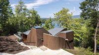
A two-story pavilion (top of page) provides views out to Lake Washington (above). Photo © Kevin Scott, click to enlarge.
“There was one particular lot that she had been eyeing,” says architect Steve Mongillo, cofounder and principal at the Seattle-based mwworks, who worked with the family to design their 3,480-square-foot residence. “They had periodically reached out to the residents who lived there, saying, ‘If you’re ever interested in selling, we’d love to talk.’”
When the lot—a spacious corner property on a gentle slope—finally went up for sale in 2016, the clients jumped on the opportunity, even though mwworks was designing a house for them elsewhere. “This was their dream location,” says Mongillo, “so they sold the other property, and we got to work on the Madrona site,” first by taking down the existing house.
Despite breathtaking views to the east, one of the primary challenges the design team encountered was car traffic on the abutting roads—headlights regularly shone across the property. Privacy was important to the clients, Mongillo says, adding that, “aside from wanting a house connected to the landscape, they asked for a peaceful retreat that felt calm and rejuvenating—a place to escape at the end of the day.”
Rather than install unwelcoming walls or tall fences—the clients hoped to keep the house in line with the surrounding neighborhood—Mongillo and his team creatively used slatted screens to shield the house from public streets on three sides and, on the fourth, from a nearby neighbor.

A breezeway connects the house’s two main volumes and doubles as an entrance. Photo © Kevin Scott
With screening solutions as the driving design force, Mongillo planned a four-bedroom house comprising simple, rectangular concrete masses connected by a glassed-in breezeway and two intimate courtyard gardens. Downhill, Mongillo opted to raise the grade and plant a row of hedges at the property line, a move that obscures views of the road and neighboring sheds and garages.
The house is divided into two main sections. The single-story public zone (kitchen, indoor, and outdoor dining areas, a living room, and a large deck) is the easternmost sited—it opens to the yard and has unobstructed lake views. The breezeway connects this part of the house with a two-story pavilion that holds an informal TV room, utility spaces, and a sauna on the first level, the bedrooms and a home office above. The single-story volume has a green roof that acts as a foreground to the sweeping views from the uppermost floor.
“Initially, we assumed the second story would be forward on the property, closer to the lake,” Mongillo says, “but we pushed it toward the back to avoid views that look directly down at the street.”

1

2
Raw concrete with gridded snap ties is used inside (1) and out (2). Photos © Kevin Scott
The two-volume layout creates unique spatial experiences; the positioning of the structures strategically hides and reveals specific spaces as one wanders through the house. “We choreographed a progression of views,” says Mongillo, “and it unfolds from the front door on.”

3
Garden courtyards and large windows bring light deep into the house (3 & 4). Photos © Kevin Scott

4
Nods to Pacific Northwest Modernism abound. The courtyard gardens—one at the entryway and another flanking the dining room—help bring daylight deep into the house and create a sense of calm through a connection to nature. The exterior material palette was chosen for its elegant simplicity and ability to weather well with little maintenance. The poured-in-place concrete forms (“We love the imperfections,” notes Mongillo) complement recycled, paper-based panel siding, and Alaskan yellow cedar slatted screens add depth and lighten the house’s street presence.
White oak, used for flooring, cabinetry, and casework, harmonizes the interiors and helps bring a sense of warmth, especially during the gray Pacific Northwest winters. “We used slightly different textures for the oak elements,” says Mongillo, “but we intentionally kept it simple to heighten spatial quality and the house’s connection to nature.”
Click drawings to enlarge

Credits
Architect:
mwworks — Steve Mongillo, Eric Walter, principals; Bradley Kinsey, Drew Shawver, Briony Walker, design team
Engineers:
PCS Structural Solutions (structural); J Welch Engineering (civil)
Consultant:
Wittman Estes (landscape)
General Contractor:
Dowbuilt
Size:
3,480 square feet
Cost:
Withheld
Completion Date:
May 2020
Sources
Cladding:
Alaskan Yellow Cedar (fins); Western Red Cedar (siding); Richlite (panels); Prosocco (moisture barrier)
Windows & Doors:
Quantum
Hardware:
Emtek
Interior Finishes:
Benjamin Moore (paint); Garrison Collection (flooring); Cathy Connor/Studio C (plasterwork)
Lighting:
Juno, Halo (downlights); B-K Lighting (exterior)
Plumbing:
Calazzo (shower); Zuchetti (fixtures)


