Design Processes Take Center Stage at a New Exhibition on Herzog & de Meuron
Review: 'Herzog & de Meuron,' at the Royal Academy of Arts

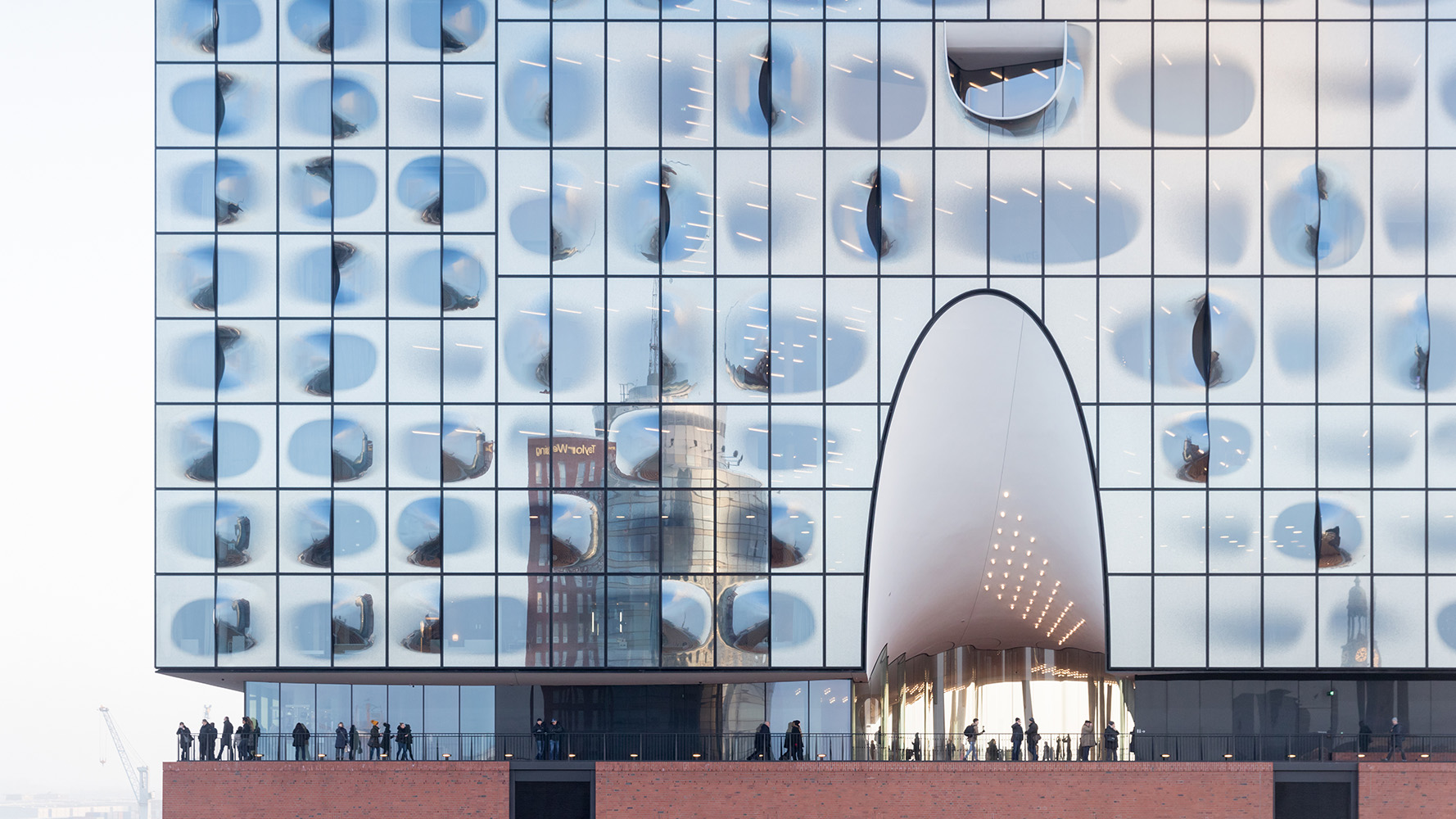
Herzog & de Meuron's Elbphilharmonie Hamburg (2001-16). Photo © Iwan Baan
Architects & Firms
Over 45 years, Herzog & de Meuron has ascended to the heights of architectural stardom without developing a signature style. Instead, the 600-strong Swiss firm has demonstrated a consistent commitment to experimenting with form and materials, producing notably diverse buildings that are often places of heightened sensation, evoking both the sublime and the uncanny. It’s an approach that has given the firm a “certain mystique,” says Vicky Richardson, head of architecture at London’s Royal Academy of Arts, where a major exhibition, Herzog & de Meuron, opened this month. “The aim is to let visitors in on the process,” she explains. “You can feel like part of the design team.”
The show, which runs until October 15 and was co-curated by the firm and the Royal Academy, occupies an enfilade of just three galleries, but packs in a huge quantity of material, supplemented by an augmented reality smartphone app developed by the architects. As might be expected, many of the conventions of architectural exhibitions are eschewed, with mixed results.

A model of Herzog & de Meuron's Elbphilharmonie Hamburg. Photo © Herzog & de Meuron
The first room is dominated by three timber-framed display cases stuffed with hundreds of models and material test pieces representing 80 of the firm’s nearly 600 projects. The vitrines are replicas of those at Kabinett, Herzog & de Meuron’s purpose-built archive-gallery in its home city of Basel, and the objects—the ‘waste’ products of the design process—are presented as evidence of its thinking. Arranged roughly chronologically, they illustrate a remarkable trajectory, from austere houses and factories in the Alps, to breakthrough projects such as London’s Tate Modern, to the crystalline form of the Elbphilharmonie concert hall in Hamburg.
For aficionados of the firm’s work, some of the humblest mementos are akin to holy relics. Here we find a model made of the Lego bricks that founders Jacques Herzog and Pierre de Meuron played with when they met as seven-year-old schoolchildren. Nearby, the conception of Beijing’s National Stadium, built for the 2008 Olympics, is captured in a series of quick-fire maquettes. Their scrappiness attests to the speed at which an idea develops. Shapes are tested in bent wire and taped cardboard, and later swathed in stringy bits of organic matter to develop the stadium’s distinctive ‘bird’s nest’ appearance.
Throughout, we get the clear sense of restlessly fertile imaginations at work, constantly improvising, reacting, exploring. Also apparent is the architects’ preoccupation with the evocative properties of matter. It’s there in the great quantity of test-pieces—punched copper, turned wood, and rammed earth—and in models of buildings, too. The weighty CaixaForum in Madrid is cast in great lumps of wax and resin, giving it the look of a Joseph Beuys sculpture. And just as the firm’s architecture adapts to advances in technology, so too do its processes. View the gallery through the app, and a 3D model of HVAC ducts appears to hover in the air between cabinets. It’s fun, if mildly distracting.
The app might more usefully have linked to the firm’s compendious website, though, because the exhibition itself provides almost no information about what is shown. We see the evolution of designs for a forthcoming Paris skyscraper, but cannot discover why it is triangular, or how its architects feel about the uproar it has caused. More frustrating still is the lack of representation of completed buildings, save for nine large-scale prints on the walls. These stunning images, by the Dusseldorf School photographers Thomas Ruff and Andreas Gursky, hint at Herzog & de Meuron’s long-held interest in how its work is documented, but are too few in number to give a general understanding of the firm’s oeuvre. How much will the ordinary visitor get from this avalanche of creative speculation without more appreciation of its results?

Andreas Gursky's Centre Pompidou (1995) depicts an earlier exhibition of Herzog & de Meuron's work. Photo © Andreas Gursky / DACS 2023
The second gallery offers an equally oblique perspective on the firm’s creative process, which includes the use of film to observe how its buildings are used. One gently paced montage comprises vignettes of life in 40 buildings, all recorded for this show. Crowds mill about. Someone pops outside for a smoke. Children improvise games. The gaze follows people, while architecture is relegated to the background.
An affecting 37-minute documentary by Ila Bêka and Louise Lemoine follows the stories of patients at REHAB, a Basel neurorehabilitation center completed in 2002. The low-rise timber building bathed in natural light is the antithesis of the strip-lit, antiseptic institutions familiar to most visitors. But while the beneficial effects of the environment are heavily implied, the building is only visible in glimpses. Nonetheless, giving center stage to the clinic highlights the firm’s long track record in care facilities—which is often overshadowed by its flashier cultural buildings. Recent statements by the architects suggest that they are keen to change perceptions of their priorities and to devote more of their energies to such socially impactful work.
That impression is underscored by the exhibition’s final room, which is dedicated to a 200-bed children’s hospital nearing completion in Zürich. Within the low-rise building, clinical facilities are arranged in 35 ‘neighborhoods’ linked by internal streets and courtyard gardens that lend an intimate scale and an air of calm. As with REHAB, there is an emphasis on the restorative power of daylight and natural materials. Children’s rooms have porthole windows and pitched wood ceilings like little cabins. It is clearly going to be a special place.

Herzog & de Meuron's REHAB Basel (1998-2002, 2018-19). Photo © Katalin Deér
The exhibition demonstrates that this outcome owes as much to determination and effective collaboration as to inspiration. Displays describe the difficulty of coordinating pipework and the merits of BIM. A video game sends players on a quest through a digital model used as a design tool. One gallery wall is entirely covered with a plan of the hospital—a real working drawing, covered with inscrutable numeric information and clouds of revisions—within which projections pick out various departments, illustrating the apparent simplicity that will be recovered from bewildering complexity. There is little of the glamor associated with ‘starchitects’ in the careful, laborious work of delivery on display.
Back in the app, visitors can toggle between navigable CGI renderings and 360-degree views of the construction site, with the usual puddles of water and trailing cables. The striking contrast between the dark, chaotic interior of today and what is to come could be a metaphor for the practice of design.
The app is also required to experience the centerpiece of the room, a full-size fragment of a child’s room, painted ghost-white. Aim your phone at it and a palette of natural materials appears overlaid on the structure, along with cushions on the pull-out bed for parents, and plants outside the window. Again, the technology is impressive, but its application seems ill-conceived. If the haptic, sensory qualities of the building are so important, why not use real materials?
Despite such misfires, it’s good to see a museum show experimenting with the presentation of architecture, which tells its own story about these architects’ propensity to challenge convention. This difficult exhibition demands time—particularly for audiences outside the world of architecture—but rewards patience, not least in revealing little-discussed realities of practice. As a portrait of the architect, it is in some ways unusually forthright, but it leaves much out. Like the buildings in the show, the firm’s motivations and personalities can only be glimpsed obliquely. In the end, Herzog & de Meuron remains something of a mystery.


