The Bruce Museum by EskewDumezRipple Integrates Spaces for Science and Art

Architects & Firms
For all its reputation as a bastion of Yankee wealth, Greenwich, Connecticut, has a more humble and gritty aspect to its 19th-century history: it was a place of rock quarries—quarries that provided granite for many local and New York structures.
This geological heritage was much on the mind of architect Steve Dumez, principal and design director at EskewDumezRipple (EDR), the firm that designed the stone-inspired $67 million expansion of the city’s Bruce Museum. “There was a vision for the project that it should powerfully connect to its place, that it grow from the site,” Dumez says. “We submitted two schemes, one called Quarry and the other called Lace,” he explains. In Quarry, textured stone evokes shade and shadow. By contrast, Lace was a configuration that was, in effect, a hanging curtain of stone with solids and voids, offering edited peeks from the inside and outside. “They liked aspects of both,” he continues, “so they asked us to combine them into one.”

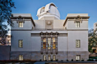
Precast-concrete panels mimic local stone on the facade of the Bruce Museum’s new addition (above and top of page). Photo © Timothy Hursley, click to enlarge.

Frosted glass backs the lacelike section of the facade. Photo © Timothy Hursley
Doing the facade in stone was found to be prohibitively expensive, so Dumez employed precast-concrete panels that mimic geological forms. “We textured the wall to create light and shadow in the way that would replicate a quarry,” he says. The design team then created the “lace” effect on the main facade with openings that let in light, which is then refracted by an internal wall of frosted glass. And, though a bit of a design ruse for purists, the faux stone has the depth and richness of the real thing.
The Bruce, as it is known locally, was once the home of Robert Moffat Bruce, a wealthy textile merchant, whose estate was surrounded by a pristine 100-acre wood. In 1912 he bequeathed both to the city of Greenwich on condition they be turned into a museum of art and science and a public oasis.
At 42,000 square feet, the new William L. Richter Art Wing transforms the existing 32,500-square-foot museum aesthetically and organizationally and more than doubles its size. Previously, the Bruce was mostly a venue for traveling exhibitions, and it now will be able to build its permanent collection. In addition to accommodating this anticipated influx, the museum’s main directive to EDR—a practice with offices in New Orleans and Washington, D.C.— was to create adjacent galleries for art and science that would for the first time allow visitors the opportunity to move easily from one to the other.

Ample glazing filters daylight through internal spaces. Photo © Timothy Hursley
“It’s a spatial arrangement that will enable curators to create synergy among art and science exhibitions that enhance understanding and learning,” says Robert Wolterstorff, executive director and museum CEO. An architectural historian by training, he feels this duality will make the Bruce a unique museum experience. For example, “in Washington, D.C.,” he explains, “you have to go to the Hirshhorn for art and then make your way to the Natural History Museum for science. Here you have them side by side.” At present, he continues, “we do not have a deep enough permanent collection to fill all of the new galleries, but the expansion will be an impetus for locals to donate art.” Indeed, this process has already begun—an important collection of European and American art, comprising more than 70 works including those of Mary Cassatt, Alberto Giacometti, Childe Hassam, and Winslow Homer, among others, has already been promised to the Bruce and will be the largest bequest in its 112-year history.
The heart of the newly expanded Bruce is an art gallery of 14,000-plus square feet on the addition’s third floor, which will accommodate both visiting and permanent collections. This is linked to the science wing via a luminous sculpture gallery on the south that has vistas of nearby Greenwich Harbor and Long Island Sound. Originally planned as an outdoor terrace, the architects enclosed this space with an expansive window wall at the behest of Wolterstorff, who felt it would tie the elements of art and science together. (The museum’s opening science exhibition is about penguins and their southern hemisphere habitats.)
The architecture of the Bruce has evolved over time. The original Second Empire–style residence underwent several expansions over the decades, including one that virtually “wrapped” the house and left only its upper portions showing. A Postmodern extension in the early 1990s put the front door of the museum along the cacophonous I-95 corridor (the main East Coast north–south interstate highway). One of EDR’s big moves was to reorient the entry to the more tranquil park side. Cambridge, Massachusetts–based landscape architecture firm Reed Hilderbrand collaborated with the architects to form this more serene entrance, which is located in the new addition—a U-shaped structure that navigates the site’s steep grade and stretches around the existing museum’s east elevation. Expansive and filled with daylight, this annex includes a museum store, auditorium, restaurant, and flexible spaces for public and private events. In the lobby, a main staircase transports visitors up through the museum’s various levels, where windows have been placed to assure the transfer of light and views throughout the interior, while an open-air light court landscaped by Reed Hilderbrand between the old and new buildings draws the park into the museum, looking like a diorama of the grounds.

1

2
The extension faces a park (1) and features a light court (2) and sculpture gallery (3) with views of the harbor. Photos © Timothy Hursley

3
With its open, airy atmosphere, the building is designed to handle an ambitious program for school visits as well as revenue-generating events such as weddings. Going forward, Wolterstorff will continue to encourage locals to donate their works and is keenly aware of the new space’s role in that. “Why would someone give a Picasso only to be told, ‘We promise to bring it out of storage when we have enough gallery space’?”
The museum director can barely contain his excitement about the expansion and compares it to a musical instrument: “You’ve been given a Stradivarius; now you need to learn how to play it.”
Click plans to enlarge

Credits
Architect:
EskewDumezRipple — Steve Dumez, principal in charge; Noah Marble, design principal; Shawn Preau, project manager; Javier Marcano, project architect
Engineers:
Guy Nordenson and Associates (structural); Altieri Sebor Wieber (m/e/p); Redniss & Mead (civil)
Consultants:
Reed Hilderbrand (landscape architect); Melick-Tully and Associates (geotechnical); Fisher Marantz Stone (lighting); Simpson Gumpertz & Heger (envelope); Stuart-Lynn (estimating); Bruce J. Spiewak (code); The Stone House Group (commissioning)
General Contractor:
Turner Construction
Client:
Bruce Museum
Size:
74,500 square feet
Cost:
$67 million
Completion Date:
April 2023
Sources
Precast Concrete:
BPDL
Curtain Wall:
Kawneer
Glass:
Viracon
Roofing:
Firestone
Tile:
Daltile
Ceilings:
CertainTeed


