The Frances M. Maguire Art Museum by DIGSAU Revives a Much Loved Home for Art
Lower Merion, Pennsylvania

Architects & Firms
Many assumed that the Barnes Foundation’s move from Lower Merion, Pennsylvania, outside Philadelphia, to the Benjamin Franklin Parkway within the city, was misbegotten. It meant stripping the vaunted collection of Picassos, Van Goghs, Matisses, and all those Renoirs from the sedately classical museum setting that Paul Cret had created for Albert Barnes in 1925. How could a new modern home, designed by Tod Williams Billie Tsien Architects in 2012, possibly accommodate the artwork without a sense of rupture—especially considering Barnes’s vehement mandate about keeping it all intact? Yet, the Williams Tsien solution has been greeted surprisingly well, in terms of response from critics and the public. The lingering question, however, has been: what would happen to Cret’s building in Lower Merion? And who would keep up the arboretum on its 12-acre property, which Barnes’s wife, Laura, had tended to for so long? The Barnes Foundation said it planned to adapt its galleries for an archive and library. But the Barnes decided it was more expedient to have those functions located with the galleries in central Philadelphia.

Paul Philippe Cret designed the museum for Albert Barnes in 1925. DIGSAU restored the exterior, adding a black steel-framed ramp for accessibility (above), and additional stairs (top of page). Photo © Halkin Mason, click to enlarge.
Then in 2017, the Barnes Foundation forged an agreement with St. Joseph’s University allowing the school to take over the arboretum and the gallery building for the school’s own educational programs. St. Joseph’s did not have any ties to Albert Barnes (as did Lincoln University in Chester County, the historic African American school that Barnes had long supported). Nevertheless, St. Joe’s 114-acre campus sat at the back of Barnes’s Merion site, where the institution, founded by Jesuits in 1851, had been located since the 1920s. The educational affiliation and lease requires that St. Joe’s pay maintenance and upkeep and a nominal rent for 30 years, with 20-year renewals possible. As part of the agreement, the conservation lab in the basement would be updated for continued use by the Barnes.
Opportunely, also in 2017, an alumnus of St. Joseph’s, James Maguire, along with his wife, Frances, a painter, donated $50 million to the university, part of which helped restore and turn the Cret-designed galleries into display spaces for the university’s collection of colonial Latin American and Hispano-Philippine art, along with African, Asian, 20th-century European, and American pieces. Certain galleries were reserved for temporary exhibitions, including some art created by the students. In appreciation for James Maguire’s support, the university named the revamped building after Frances, who died in 2020.
In selecting an architect, St. Joseph’s turned to a 43-person Philadelphia firm, DIGSAU, founded in 2007, which was then rehabilitating the Tyler School of Art and Architecture at Temple University in that city. As DIGSAU principal in charge Jamie Unkefer says, “The Tyler project had some of the same needs for its galleries and educational mission. However, our focus on the Merion building’s historic context and how it could be reinvented, plus our alliance with Arup engineers, further distinguished our firm.” A previous updating of the building’s security, fire protection, and climate-control systems, as well as lighting, in 1996, had been carried out by Venturi Scott Brown & Associates (VSBA). However, times had changed, and new sophisticated technologies needed to be put in place, while more explicit ADA requirements had to be addressed.
The irony is that removing the collection of Impressionist, Postimpressionist, and early Modern art arranged by Barnes in his dense, idiosyncratic, but thematically connected installation—replete with farm instruments, African sculpture, and American furniture—lets visitors see Cret’s architectural contribution more clearly. This aspect is particularly noticeable now that the tan burlap-covered walls no longer form the background to the hang.
Cret, referred to as a “rational classicist” or “Modernist with the touch of the classic,” was originally from Lyon and trained at Paris’s École des Beaux-Arts before coming to Philadelphia. The architect and planner designed the Rodin Museum (1929) on the Parkway (now next door to the new Barnes), the Detroit Institute of Arts (1927), and the Folger Shakespeare Library in Washington, D.C. (1932), along with bridges and other civic works. Cret’s role as a professor at the University of Pennsylvania, where he taught Louis Kahn, further burnished his reputation.

Clerestories distinguish the upper level. Photo © Halkin Mason
Writing in Architecture magazine in 1926, Cret explained that, for this Italian Renaissance–inspired building, he selected a stone imported from France to properly allude to the place of origin for the art within the Barnes. He preferred a limestone from Coutarnoux for the ashlar walls because it was “much warmer in tone than our Indiana limestone.” The exterior trim is a rosy Pouillenay limestone and the roof is edged in red tiles. Barnes commissioned Jacques Lipchitz to create modern decorative bas reliefs that Cret positioned on the exterior, while the iron grillwork and the figurative patterns of mosaic tile on the concave walls of the entrance portico borrowed from African art motifs that Barnes favored. On the east, a bridge connects the museum to the two adjoining blocks that are angled around the northeast corner, which Barnes used for administration offices and his home. For the actual structure of the complex, Cret relied on steel framing, infilled with a then new material known as Pyrobar Gypsum Tile.
Within the museum, Cret eschewed top-lighted galleries because of leaks, heat, and the “gloomy aspect,” as he put it, the illumination gave the upper walls. Instead, he preferred daylight to enter from the side through the large windows or clerestories around rooftop monitors.
Cret’s aesthetic intentions—architectonic more than decorative—were “secured mostly by the shape, proportion, and ceiling or vault.” He arranged the building’s two levels of galleries in a classically symmetrical plan around a central double-height open room on axis with the entrance, now known as the Great Hall.

1
The renovated lobby (1) opens onto two bronze-clad passages (2) and the Great Hall (3). Photos © Halkin Mason

2

3
DIGSAU’s restoration of the exterior involved such obligatory moves as deep cleaning the stone and replacing the Pouillenay trim as needed, with stone ordered from the same French quarry. The Coutarnoux limestone walls only required selective repair. Other items on the list included refurbishing the decorative metal and replacing red tile in the parapet edges. To meet current ADA codes, the architects installed a black-steel ramp leading up to the entrance portico and pulled the marble stairs away from the columns to make room for the landing.
During the process, the Barnes Foundation reviewed drawings, and the Historical Commission of Lower Merion oversaw changes to the exterior—designated a Class 1 Historic Resource. The only major change involved enlarging one of the three expansive windows in the Great Hall facing the arboretum. Here the architects designed a glazed door of a height that allowed larger artworks to be brought into the space, replicating steel casement where necessary. DIGSAU preserved the plaster frieze as required in the lease with the Barnes, but the lunettes Cret had designed above these three apertures for Matisse’s murals, The Dance, are currently blank. However, St. Joseph’s plans to fill them with temporary artwork in the future.
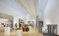
DIGSAU wanted to make the museum circulation more flexible, as well as create light and airy volumetric galleries, with reduced emphasis on wall planes previously encrusted with the Barnes assemblage. “The new collection would better hold its own against smooth, lighter, less textured surfaces,” says the Maguire Museum’s director, Emily Hage. On the main floor, the architects formed three larger galleries by removing several walls that had divided spaces into six domestically scaled rooms, and, upstairs, they tore down another to increase the size of a classroom. In extracting a wall on the ground floor for a more spacious gallery, DIGSAU had to join a barrel-vaulted ceiling with a groin vault. This was not easy, but it looks today as if Cret might even have done it that way.
The most noticeable change occurs on the east and west sides of the museum’s entrance vestibule. The architects opened two 10-foot-long passages through a former coat room and office to connect directly to the side galleries, and then clad their walls and ceilings with oil-rubbed bronze panels. The existing oak parquet floors, typically finished in clear polyurethane, were given ebony tones in the passageways to match the bronze cladding. (One arched door, carved out of a gallery wall on the main floor, is surfaced in bronze, with the floor beneath also ebonized.) For the most part, DIGSAU kept the cornice moldings and baseboards, although the oak trim, once a dark brown to frame the burlap walls, is now painted shades of white, off-white, and light gray, as are the plaster walls. In a gallery devoted to robust white classical casts once owned by the Metropolitan Museum, the architects chose a reddish shade called “Sweet Rosy Brown,” to assure that the statuary would stand out.

4

5

6
On the main floor, the architects added an arched doorway (4), joined groin and barrel vaults in a gallery (5), and kept the burlap for another (6). Photos © Halkin Mason
Incidentally, the tan burlap is intact—but is hidden under drywall and a plaster finish. One exception is the Architectural History Gallery, where the original burlap and trim remain on view. Currently an exhibition of Paul Cret’s drawings for the Barnes and for the Rodin Museum is mounted there, curated by architectural historian David Brownlee. The exhibit includes intriguing correspondence showing that Cret’s dealings with his obstreperous client tempted him to resign. Nothing is easy.

An upper gallery is deep red. Photos © Halkin Mason
While DIGSAU collaborated with Arup on various engineering and acoustical matters, the obvious contribution by the latter is the new lighting. Previously VSBA had installed fixtures with a brighter illumination than Cret’s original, but they couldn’t be controlled as easily as today’s technologies allow. Brian Stacy, Arup principal, devised an aircraft-cable-hung system featuring both toplighting and downlighting in many of the galleries. For the most part, he specified LEDs with a remote phosphor-coating technology that yields a better color separation and more uniform stability than before. The lighting, which includes original pendant chandeliers, bathes the galleries in a soft, ethereal glow that still emphasizes the contoured ceilings.
In the larger debate about how to keep in balance the contents of the museum vis à vis the container, the displayed work generally prevails, as the Barnes collection obviously dominated Cret’s architecture. Your attention was focused on the paintings, the farm tools, the burlap, long before you looked at the volumetric enclosure. However, if the art on display now has less drama or renown, it is reassuring—and a happy discovery—that Cret’s architecture, refurbished and reinvented by DIGSAU, quietly provides a sensitive setting for the works on view. The container does not overwhelm the contents, but it makes a strong point about the advantage of a having an architecture of distinction that can be appreciated as a framework, and even on its own.
Click plans to enlarge

Credits
Architect:
DIGSAU — Jamie Unkefer, principal in charge; Jeff Goldstein, principal; Aaron Jezzi, associate/project manager; Jamie Ferello, project architect; Ethan Feuer, Lindy Foltz, Roshelle Pfeifer, Kristy Kimball, Ksenia Kudinova, design team
Engineers:
CVM (structural); Bruce E. Brooks & Associates (m/e/p); Langan (civil)
Consultants:
Robinson Anderson, Summers (landscape); Arup (lighting, acoustics)
General Contractor:
HSC
Client:
St. Joseph’s University
Size:
45,000 square feet
Cost:
Withheld
Completion Date:
May 2023
Sources
Limestone:
ROCOMAT, Technoprofil, Vickery Stone
Glazing:
Glass Enterprises
Track Lighting:
Litelab
Interior Ambient Lighting:
Lumenpulse, Ecosense
Downlights:
Lumenwerx, iGuzzini, Lumenpulse
Paints and stains:
Sherwin-Williams


