Studio Gang and SCAPE Integrate Old and New, Building and Nature, at the Arkansas Museum of Fine Arts
Little Rock


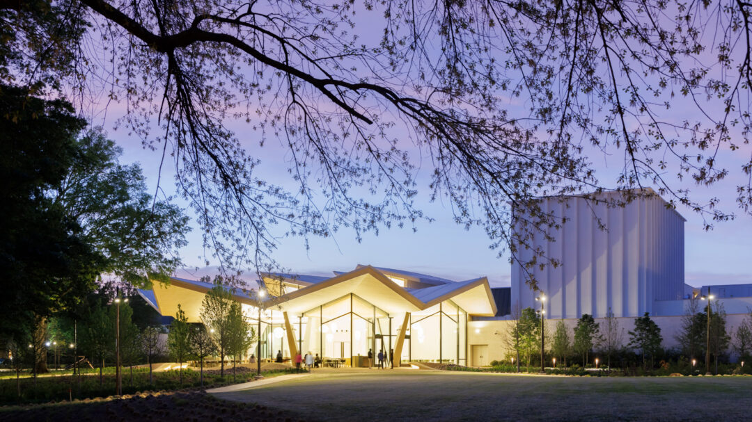
After nearly 80 years of piecemeal growth encompassing eight additions and a multitude of styles, the Arkansas Arts Center had become an architectural jigsaw puzzle that was hard for visitors to navigate and disconnected from its setting in Little Rock’s MacArthur Park. So in 2016, it began a process of reimagining itself for the 21st century, hiring Studio Gang to expand its building once again, and taking a new name—the Arkansas Museum of Fine Arts (AMFA). The challenge for Jeanne Gang and the team at her eponymous Chicago firm was to add yet another piece to this beloved institution while making sense of it all and reaching out to its leafy surroundings and the city beyond. Eventually, Gang decided that the right approach was to crack open the structure and graft a sinuous, light-filled atrium onto it.
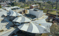
The organically shaped insertion, which Gang calls the Blossom, provides a dramatic counterpoint to the existing museum’s orthogonal architecture. It runs from the front on the north, ripples through the torso of the building, and then fans out like a giant gingko leaf as it emerges on the south to face MacArthur Park. A curving concrete structure topped by a pleated roof, the Blossom negotiates the sloping terrain, stepping down six feet from north to south. To reconnect the museum to the city and Crescent Drive on the north, the design team—including Little Rock–based Polk Stanley Wilcox Architects—removed a set of additions built in the 1980s and early 2000s, revealing the 1937 Art Deco front facade and returning it to its role as the main entrance.
Welcoming visitors now is a glass-fronted pavilion raised one story above an entry courtyard paved with a honey-color granite that complements the white-oak-clad roof soffit of the new building. The pavilion houses what the museum calls the Cultural Living Room, a 5,960-square-foot space furnished with sofas, comfortable chairs, tables, and a bar that serves coffee in the morning and cocktails in the evening. It’s a casual space flowing directly to the galleries on the same floor and then down to the atrium, which provides access to the Windgate Art School, a 350-seat performing arts theater, a 153-seat lecture hall, a museum store, and a restaurant with both indoor seating and a covered outdoor terrace looking onto MacArthur Park. Clerestory windows under the central spine’s snaking roof bring daylight into the heart of the building and make navigating the museum clear and intuitive. Individually suspended from the roof are more than 6,000 plywood strips that diffuse light and sound and add to the dynamic quality of the spine.

Aerial view of the new Arkansas Museum of Fine Arts.
Photo © Iwan Baan
“We needed to provide the connective tissue for the museum,” says Gang of the new spine and flowing spaces. Sustainability was an important strategy driving the 133,000-square-foot project, so the architects kept as much of the old building as possible—refurbishing spaces like the theater, lecture hall, and art school, and adding new galleries on top of what had been galleries, a restaurant, and a variety of support areas. “We edited and excavated old elements to create a new, more connected museum,” says Gang. Deep, cantilevered eaves on the front and back of the Blossom protect the outdoor spaces underneath and the ones inside from the full impact of the sun, while a radiant heating and cooling system in the concrete floor slabs reduces energy use. Juliane Wolf, a design principal and partner at Studio Gang, likens the daylit spine to a crack in a sidewalk where plants emerge from the soil below.
Inheriting a hodgepodge of brick, stone, precast-concrete and metal structures ranging in color and texture, Gang unified them by painting them all with a common palette of hues that reads as a blue-grey-white. Creating a new, cohesive identity for the museum was a top goal, but so was making key parts—such as the Cultural Living Room, the arts school, and restaurant—visible to the public. “Enhancing and clarifying the public experience was important,” says Wolf, especially since admission to the museum is free. With its performing arts facilities and its school offering workshops in ceramics, drawing, painting, woodworking, glass, and printmaking, the institution brings together a multi-disciplinary mix of programs. “We want the museum to be a place of education and gathering,” states Victoria Ramirez, the museum’s executive director.
From the start of the project, Gang collaborated with Kate Orff and her New York-based landscape architecture firm SCAPE to address key siting and sustainability issues and to integrate indoors and out. On the north side of the site, Orff’s team designed Crescent Lawn to draw people to the main entrance, while on the south it created a series of outdoor spaces flowing from the museum’s dining terrace to an Event Lawn and finally to paths and plantings blending seamlessly with the rest of MacArthur Park. Building and landscape work together, for example, on the south end with “petal” gardens capturing rainwater from the museum’s roof and absorbing it into the soil. Curving concrete benches offer sculptural seating around these gardens and echo the lines of the Blossom inside the building. Much of this area had been parking; moving that to the west and adding trees to shade idle cars was a critical planning decision made by Orff and Gang.

Interior of the museum, featuring Passage by Anne Lindberg. Photo © Iwan Baan
The galleries occupy the northwest quadrant of the complex, offering 20,000 square feet of space for the museum’s collection of 14,000 objects ranging from 14th-century European paintings to works on paper, contemporary crafts, and pieces by living artists such as Oliver Lee Jackson and Ryan RedCorn. With their white-oak floors and 15-foot-six-inch-high ceilings, the galleries are comfortable and understated. Two design moves, though, add punch: an angled pathway slicing through the rectangular rooms and an Art Perch at one end that provides a deep seating ledge in front of a large window (the only source of daylight in the galleries). From the north, passersby can look into the Perch and get a peek inside, especially at night when the space is lit. Right now, an installation by Natasha Bowdoin called Spring Song explodes with enormous, colorful flowers and grabs attention even from moving cars on Ninth Street.
Gang and Orff carefully orchestrated a sequence of spatial experiences drawing you inside and through the museum. It starts with the angled glazing on the Cultural Living Room reflecting images of the lawn behind you as you walk under the elevated pavilion toward the entry courtyard. A tall Henry Moore sculpture, Standing Figure: Knife Edge, anchors one corner of the outdoor space, but a dearth of landscaping here seems like a lost opportunity. The two-story lobby behind the 1937 facade is also underwhelming with its dark walnut paneling reminiscent of a corporate board room. As soon as you step into the soaring atrium, though, you’re pulled into a thrilling space that flows down a grand staircase and out to MacArthur Park. If you turn around, you can take a different stair up to the galleries and the Cultural Living Room on the upper level. The spacious lounge is gracious and alluring with views in three directions. If you look to the entry courtyard, you find yourself at eye level with the museum’s name carved into the Deco-era limestone wall now revealed for the first time in decades. Gang says she loves this perspective because it reminds her of riding Chicago’s elevated trains and looking into nearby buildings as you move along.
Gang’s chief accomplishment with the Arkansas Museum of Fine Arts was crafting a 21st-century institution that reads as a palimpsest with layers of history emerging and syncing with the contemporary. While reaching backward and forward, it engages its surroundings in a way that welcomes people and nature.


