Sou Fujimoto's Multifaceted Cultural Center Puts a Japanese Town on the Road to Recovery
Ishinomaki, Japan

Architects & Firms
Facing the Pacific Ocean, Ishinomaki was one of many towns devastated by the earthquake and tidal wave that struck northern Japan on March 11, 2011. On that fateful day, more than 3,000 townspeople died, blocks of buildings were demolished, and life as it was known in this tight-knit fishing community was literally washed away. Over time, the detritus was cleared, and rebuilding begun. But revitalization remains an ongoing process. Completed 10 years after the disaster, Sou Fujimoto’s Ishinomaki Cultural Center is an important step in this direction.
The project began with a government-sponsored competition to remake Ishinomaki’s destroyed museum and theater centers. Originally the two buildings stood close to the sea, but a more secure site, far from the water and about two miles from the town center, was chosen for the new, combined facility. Like most post-2011 public works in Japan, it will double as a disaster emergency shelter center. Prior to the competition, temporary housing occupied the designated land, which faces athletic fields to the south, the Toyakemori Mountains to the north, and recently developed timber-framed two-story houses to the west.

1
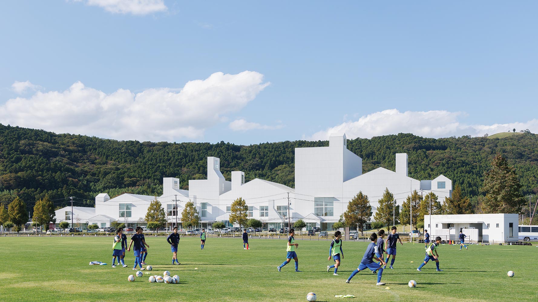
The community center’s many volumes (2 & top of page) mimic the shapes of the town’s wood-framed houses (1). Photos © Iwan Baan, click to enlarge.

2
Fujimoto addressed this challenge with a white 140,000-square-foot monolith that contrasts with the tree-studded slopes and can be seen from a distance without seeming imposing. “From far away, it appears as a friendly gathering place where many different things are going on,” explains the architect. He achieved this with an amalgam of discrete but connected volumes, a strategy he employed previously at both the 2006 Children’s Center for Psychiatric Rehabilitation, in Hokkaido, where house-like boxes adjoin horizontally, and the 2010 Tokyo Apartment, where they stack vertically. This time, he aligned 20 blocks, some pitch-roofed and others rectangular, in a row. “I like to use the site’s length to create identity,” explains Fujimoto.
Since most people arrive by car, a parking lot abuts the 558-foot-long facade, with the main entrance at the building center and a secondary access door at the west end for those walking from the homes next door. Out of deference to these neighbors, the center’s individual components—each contains a different function—step up in size. They range from the single-story permanent exhibition hall at one end to the four-story, 1,254-seat Grand Hall with its 99-foot-tall fly tower and foyer at the other. Varying in height, the volumes in between contain temporary galleries, a 300-seat hall, and a cluster of smaller spaces, such as a shop, and a kids’ area, plus theater-related storage and dressing rooms accessible from both performance venues. Cross-mullioned windows, and chimneys, which serve as both skylights and smoke vents, help diminish the overall mass and create an informal feeling. “Especially for kids, we wanted to make the building feel familiar,” explains the architect.

Hanging signage lends the lobby an urban feel. Photo © Iwan Baan
Reminiscent of the warehouses which once lined the Kitakami River nearby, the corrugated metal-clad building elements are perpendicular to and unified by the streetlike lobby. Opposite, small seminar rooms and studios jutting out toward the parking area break up the long elevation. The lobby’s linearity is also relieved by varying ceiling heights, angled interior walls, suspended strings of bulbs inspired by outdoor harbor lighting, and hanging signage that contributes to its urban atmosphere. But built-in elements, such as shelving, columns, and a café, bring the space down to human scale.


The building’s two theaters each have their own entry foyer. Photos © Masaki Iwata+Sou Fujimoto Architects
While construction of the gabled forms was easily achieved with reinforced concrete, supporting the airy, light-filled lobby was not so straightforward. Here Fujimoto used a steel frame to open the space, and create transparency with lengths of glass at grade. Thickened and reinforced with concealed beams, the facade’s solid upper wall acts like a truss. While windows were positioned between the steel elements, canopies mounted outside act as additional stiffeners, helping resist deflection. From afar, the galvanized-steel walls and roofs read as pure white, but close inspection reveals three different shades, chosen to further articulate the individual volumes.
As in his earlier projects, Fujimoto used house-shaped pieces of various sizes to build big. Sliced and diced differently each time, this compositional method not only addresses the disparate needs of individual building programs, it also paves the way for future projects. “By showing diverse elements, it is possible to create a new form of cultural complex,” he says. Making the building flexible as well as approachable, this strategy has broad applications for public projects anywhere.
Click plan to enlarge

Click drawing to enlarge


