Sou Fujimoto Piles Up Glass Boxes for a Flexible Learning Space in Switzerland
St. Gallen, Switzerland
Architects & Firms
Nestled in a verdant valley between the mighty Alps and the calm of Lake Constance, St. Gallen is famed for its abbey—now a UNESCO World Heritage site—around which the town grew up. During the Reformation, there was a split, the townsfolk turning Protestant while the monks remained Catholic. Later, St. Gallen became an important center for textiles—indeed, it was to ensure the future of its machine-embroidery industry that, in the 1890s, the town council founded an “academy of commerce, transportation, and administration” that afterward became the University of St. Gallen (USG). Though embroidery declined after World War I, the university flourished and is today considered the most prestigious business school in Germanophone Europe. In 2015, with a growing number of students, it was feeling the squeeze on its existing campuses (it has three: two in town and the main one on the slopes above), and began thinking about a new building. But this wouldn’t be your usual classroom block—rather, a “space for our future leaders, where new forms of learning and teaching can be developed and implemented,” as Charlotte Strohm, USG’s communications officer, explains.
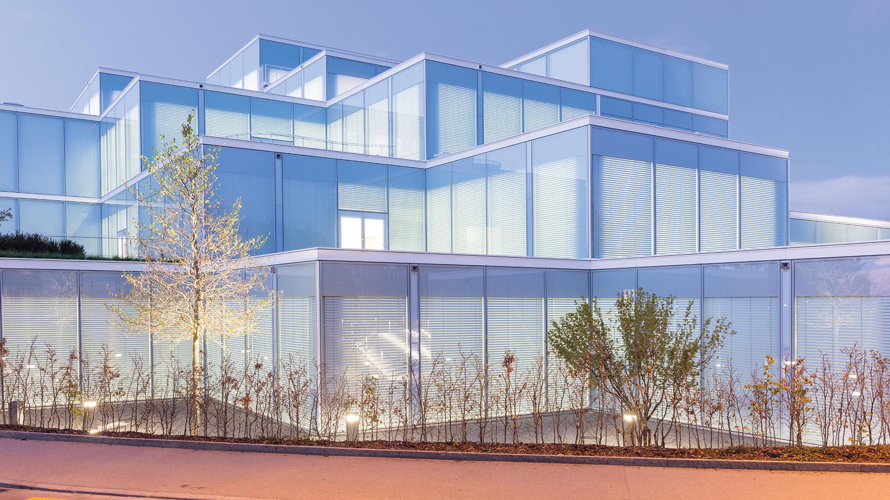
“At the time of the design competition, in 2017, the program was relatively vague,” says Marie de France, head of Japanese architect Sou Fujimoto’s Paris office (it beat seven other firms for the job, among them Grafton, Lacaton & Vassal, and Christ & Gantenbein). “Instead of the usual super-detailed Swiss specifications, we were given three concepts: the railroad station—the idea you can walk in and immediately orient yourself; the workshop—open, flexible spaces; and the cloister—a place of promenade for thinking aloud.” Located on the crest of a hill at one end of USG’s main campus, close to Bruno Gerosa’s introverted library (1986–89) and Förderer and Otto’s splendidly Brutalist building (1957–63), the greenfield site faced early 20th-century brick houses out front and a community garden at the back. But it was not from these that Fujimoto took his cues, instead seeking a design that would stand out from the existing university structures while adhering to their spatial lineage. In contrast to their brooding stone and concrete, he chose the “lightness” of glass: using a generous 33- by 33-foot module—“a grid of open interpretation from which an organic growth may emerge,” as his competition blurb tree-huggingly spun it—he built up a small three-story hill of slick vitreous boxes that manages to appear at once banal and rather startling in its heterogeneous context.

The architects created a hill of vitreous boxes (top) that starts with the one-story main entrance (above). Photo © Iwan Baan, click to enlarge.
Just one-story high at the entrance, in deference to the houses opposite, the $53 million, 104,000-square-foot learning center, now baptized SQUARE, allows you to get its full railroad station measure the minute you enter: once past the outer lobby, you look diagonally up toward the airy full-height atrium, around which the whole building is articulated (an agora feature borrowed from the historic USG buildings). Though all is hustle and bustle, SQUARE enjoys remarkably comfortable acoustics, even when filled with 600 braying students, a feat achieved by placing sound-absorbent materials wherever possible, such as the perforated ceilings that mimic Swiss embroidery. Apart from this little local touch, the mood is international laid-back corporate—USG clearly had Norman Foster research labs and Google/Apple/Facebook campuses in mind—as you make your way past the café, the donors’ lounge, and various unprogrammed “workshop” spaces (all square, they avoid the blackboard hierarchy of traditional shoebox classrooms) toward the light-flooded atrium.

1

2
The concrete structure offers an open grid for flexible spaces in the central atrium (1) and adjoining areas (2). Photos © Roland Halbe
If you’re lazy, you’ll take the elevator. Otherwise, you can climb one of the snaking stairs that curl up through the atrium’s exposed concrete frame (nothing like the odd curve to underline the grid). The structure, in deference to environmental concerns, and in contrast to Förderer and Otto’s board-marked masses, is as slender and economical as possible, made of partially recycled concrete with high-strength voided slabs comprising bubble-shaped forms. Extremely generous landings run round the atrium at the second and third levels—“cloisters,” ripe for spontaneous activities—accessing yet further peripheral “workshops” and seminar rooms. As you rise toward the light, the indoor floor area decreases but is supplemented outside with planted, furniture-filled roof terraces for outdoor brainstorming. Transparency reigns supreme—“easy to see, easy to find, and easy to reach,” burbles the competition text—to which, as the architects half admit, there is a less agreeable corollary: “a place with no hiding,” they declare, since in SQUARE you are constantly, relentlessly exposed, with no reprieve possible, barring a flight to the bathroom.

3

4
Located on the main campus (3), the building has eclectic neighbors, including a community garden in the back (4). Photos © Iwan Baan

The stepped design offers plenty of outdoor terraces. Photo © Iwan Baan
Fujimoto has made his name with idiosyncratic and often spectacular designs such as Arbre Blanc in Montpellier, France, and Budapest’s House of Music. In comparison, SQUARE appears remarkably, well, square. This was perhaps a reaction to the sober Swiss context, as well as to a brief that essentially called for pure, unadorned space. But what appears simple was, of course, complex to achieve—it’s a challenge to hide all that HVAC in a grid with a hole in the middle. Indeed, at the top, pipes poke out—but, rather than spoil the purity, they only highlight SQUARE’s resemblance to a converted industrial cathedral you can fill with whatever you like. Which is precisely what USG has done, buying up heaps of hotel-lobby furniture that, though far from what Fujimoto desired, doesn’t spoil the effect either, since the architecture is strong enough to take it. With its subtle je ne sais quoi, SQUARE sidesteps cold, corporate vacuity. On the one hand, there’s the detailing: the way, for example, the play of solid and void has been manipulated with an artful mix of transparent, opaque, and fritted glass, and also the way empty half volumes surmount some parts to balance the composition. And then there’s the subliminal, for what do we see when we look at the section? A church, with narthex, nave, side aisles, crossing, and choir. If, as Churchill declared when rebuilding the bombed-out House of Commons, “We shape our buildings and afterwards our buildings shape us,” what kind of “future leaders” will SQUARE shape? Dare we hope they’ll be touched by a dash of divine grace?
Click image to enlarge

Credits
Architect:
Sou Fujimoto Atelier Paris — Sou Fujimoto, principal director; Marie de France, director; Andy Yu, project lead; Piotr Mieszkowski, project lead
Associate Architect:
Burckhardt+Partner
Engineers:
Schnetzer Puskas (structural); Hefti Hess Martignoni (electrical); Vadea (m/e/p)
General Contractor:
HRS
Consultants:
Evolution Design (interiors); Enea (landscape); Emmer Pfenniger Partner (facade); Kopitsis Bauphysik (acoustics and sustainability)
Client:
University of St. Gallen/HSG Foundation
Size:
104,000 square feet
Cost:
$53 million (total); $36.8 million (construction)
Completion Date:
February 2022
Sources
Concrete:
Holcim
Elevators:
Kone
Exterior Doors:
Aepli Metallbau
Ceilings:
Durlum
Floor and Wall Tile:
Mosa, Lenzlinger
Acoustic Panels:
Kvadrat


