Oslo’s New Central Library, Opened During the Pandemic, Does a Subtle Dance with Snøhetta’s Opera House
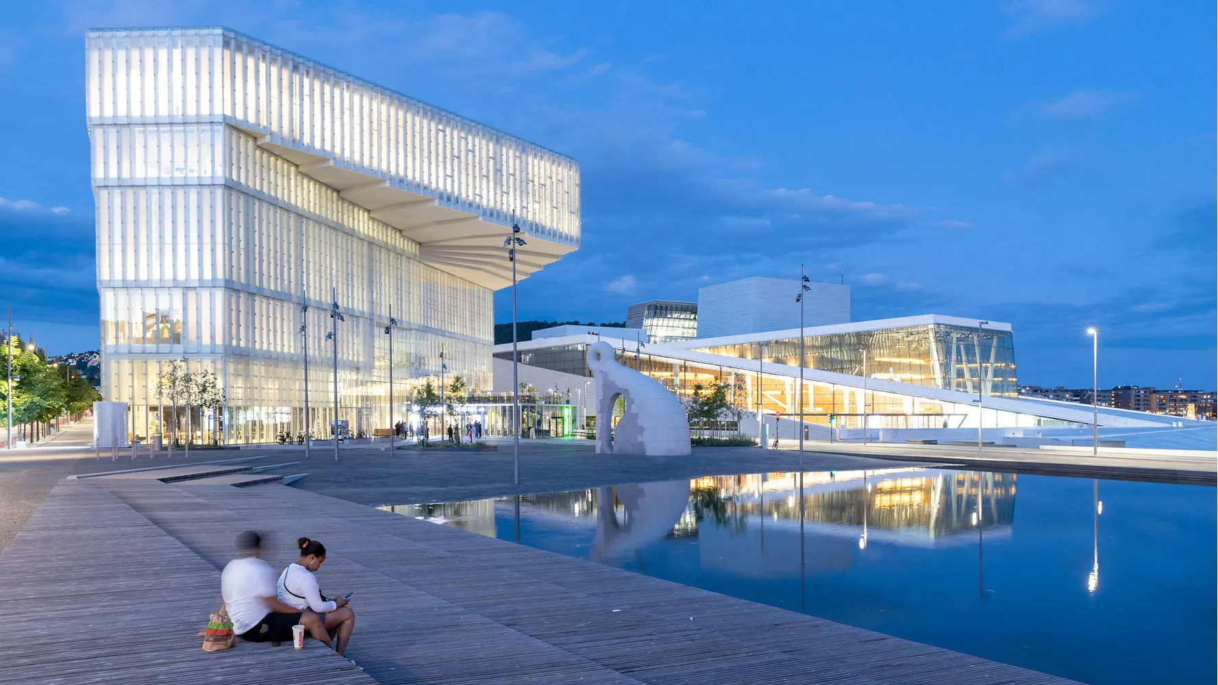




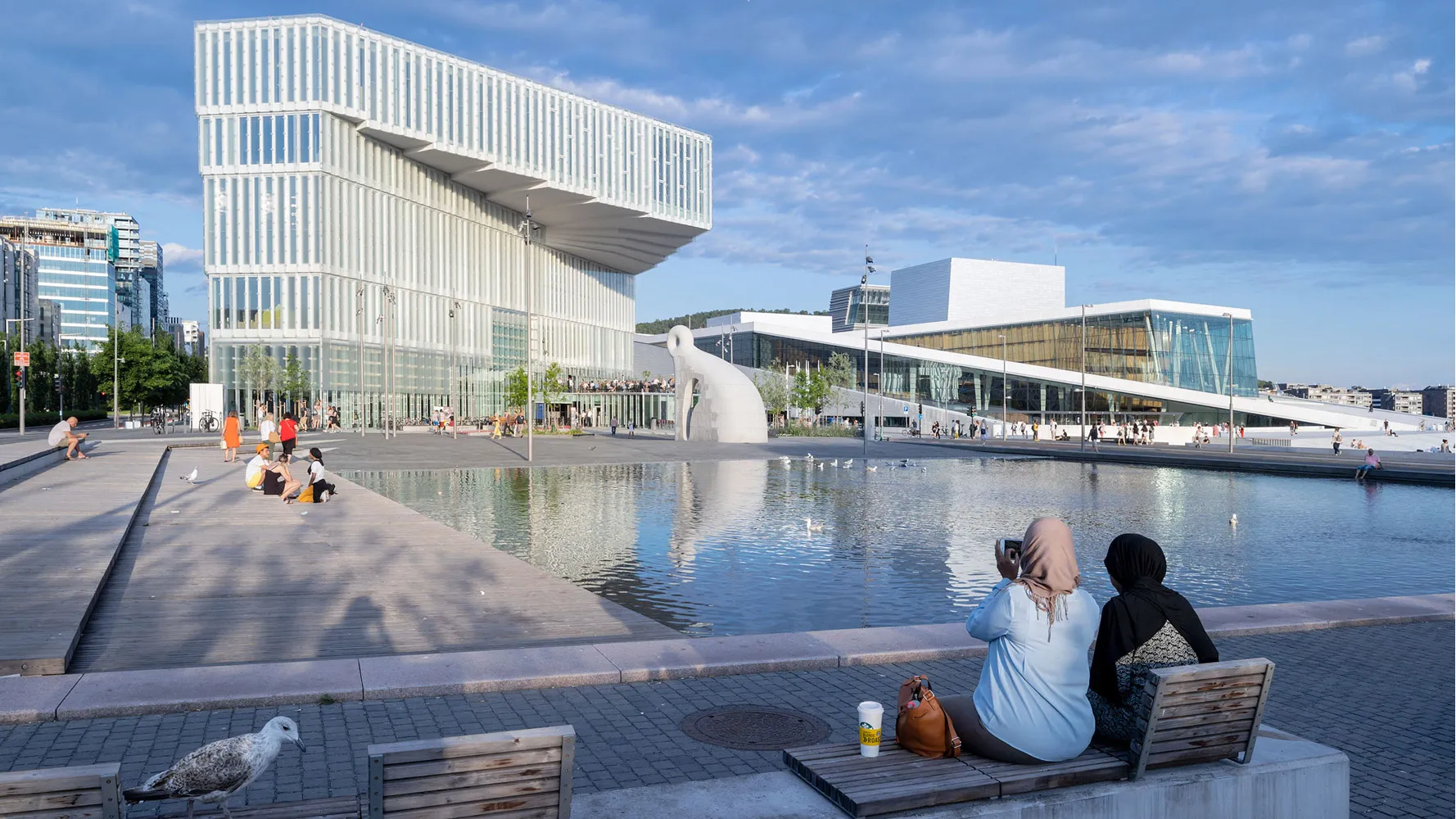


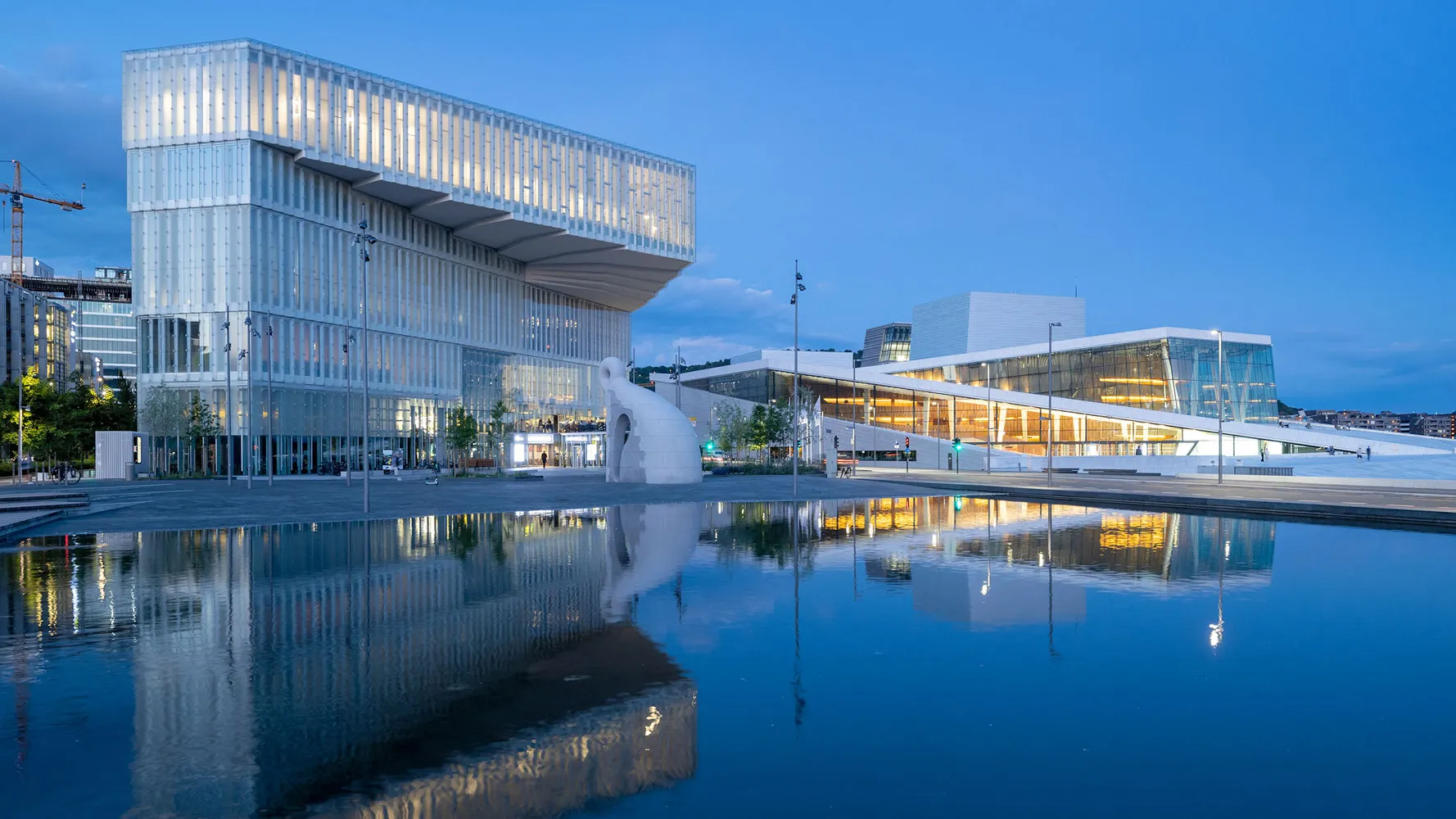


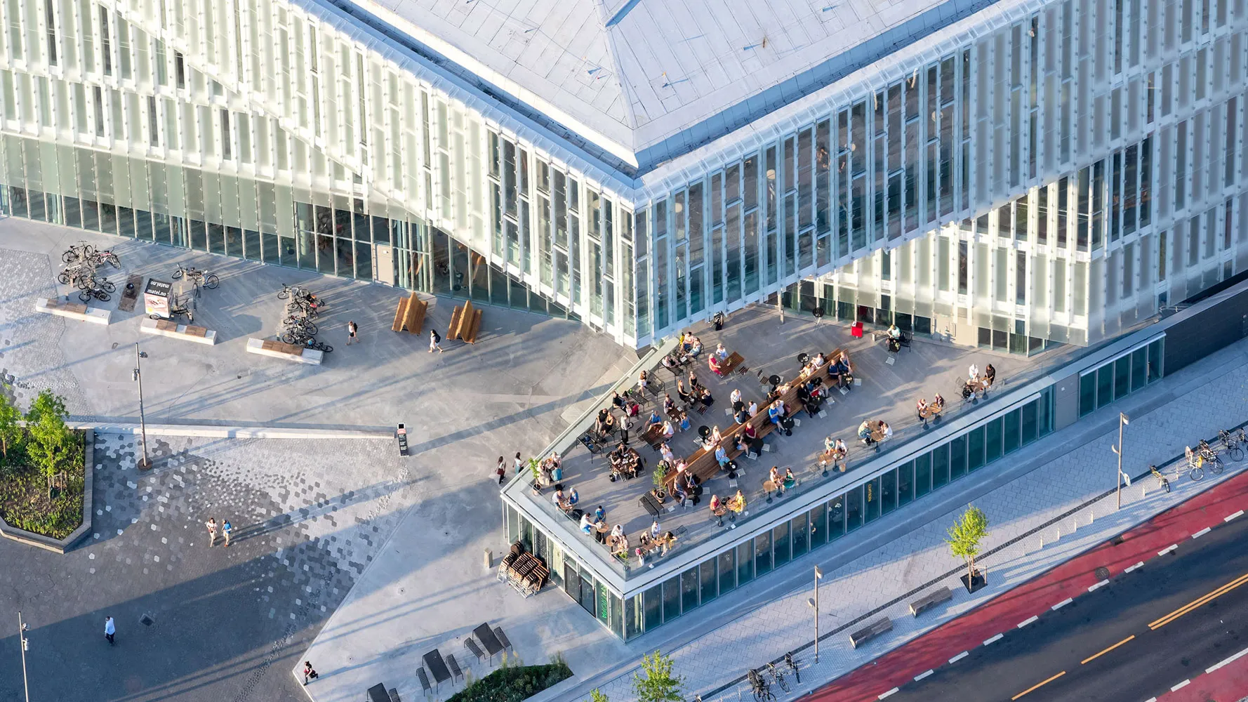
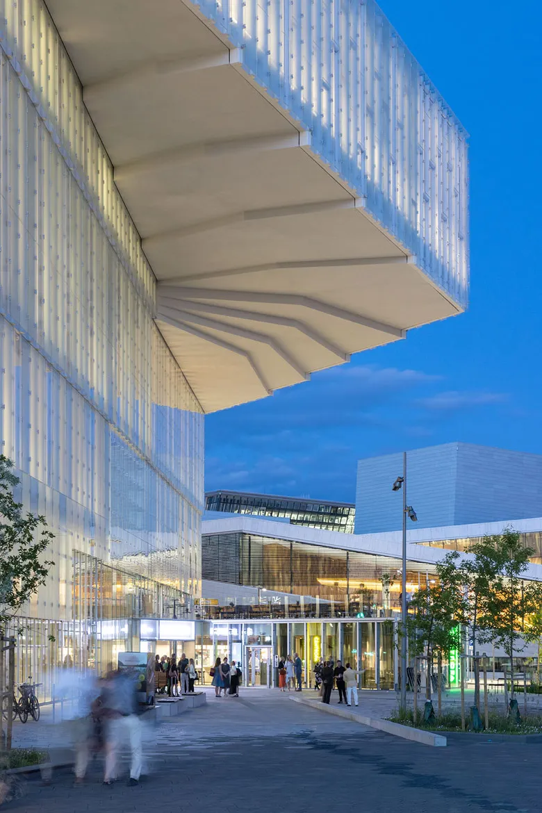
For 14 years, Snøhetta’s gleaming Oslo Opera House, with its walkable roofs of white Carrara marble, has dominated the cultural district where Oslo meets its namesake fjord. The architects of the city’s new central library, immediately inland from the opera, might have created a self-effacing building, rather than risk upstaging an icon. Instead, they turned a competition stricture meant to permanently protect views of the opera from the city’s central train station into a source of inspiration. The partnership of Atelier Oslo and Lundhagem angled their building away from the opera, leaving the sightlines from the station undisturbed, until it reaches about 60 feet in elevation, too high to block Snøhetta’s low-lying structure. At that point, the library’s 24-foot-high top floor cantilevers dramatically into the viewshed, from some angles appearing to fill a void created by the opera’s irregular roofline.
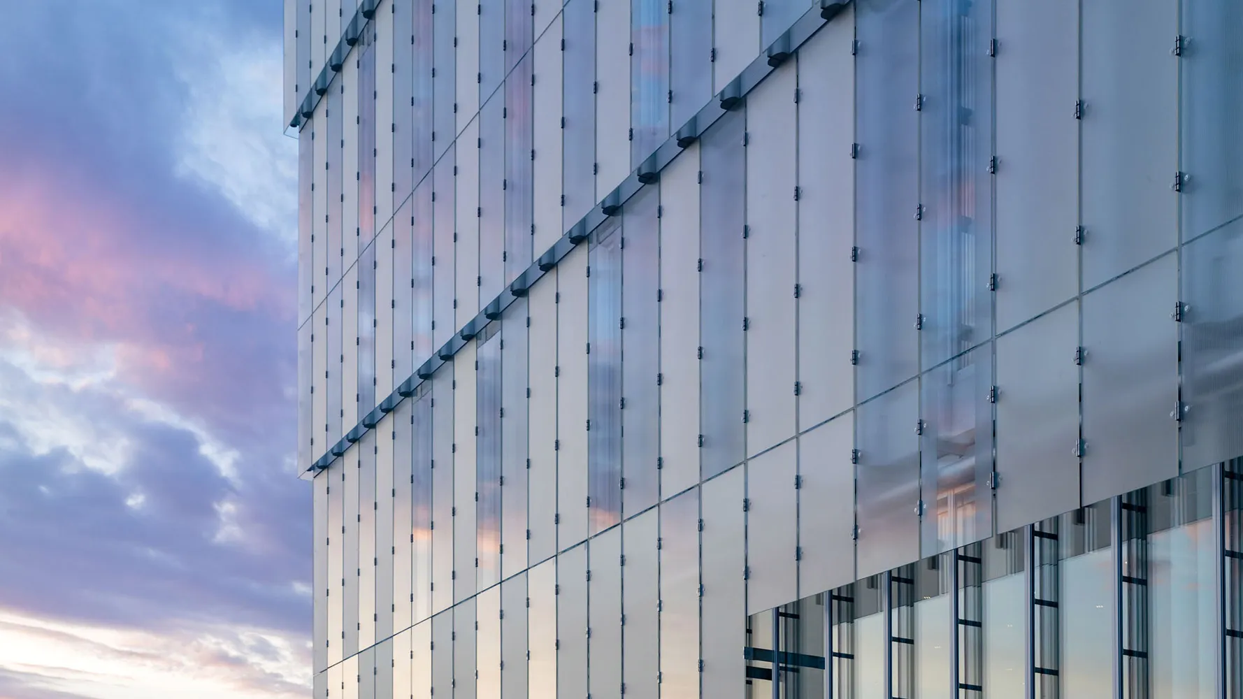
In addition to protecting views, the city required that buildings abutting the opera form a “uniform and neutral backdrop.” Oslo officials tried to persuade the library’s architects to make much of its exterior opaque, but “we were very convinced that the library should have a lot of daylight,” says Marius Mowe, a founder of Atelier Oslo. “So we argued for glass as the dominant material.” (The mosaic of clear, fritted, and textured glass, attached to GFRP columns filled with rock wool insulation, meets passive house standards.)

1
2
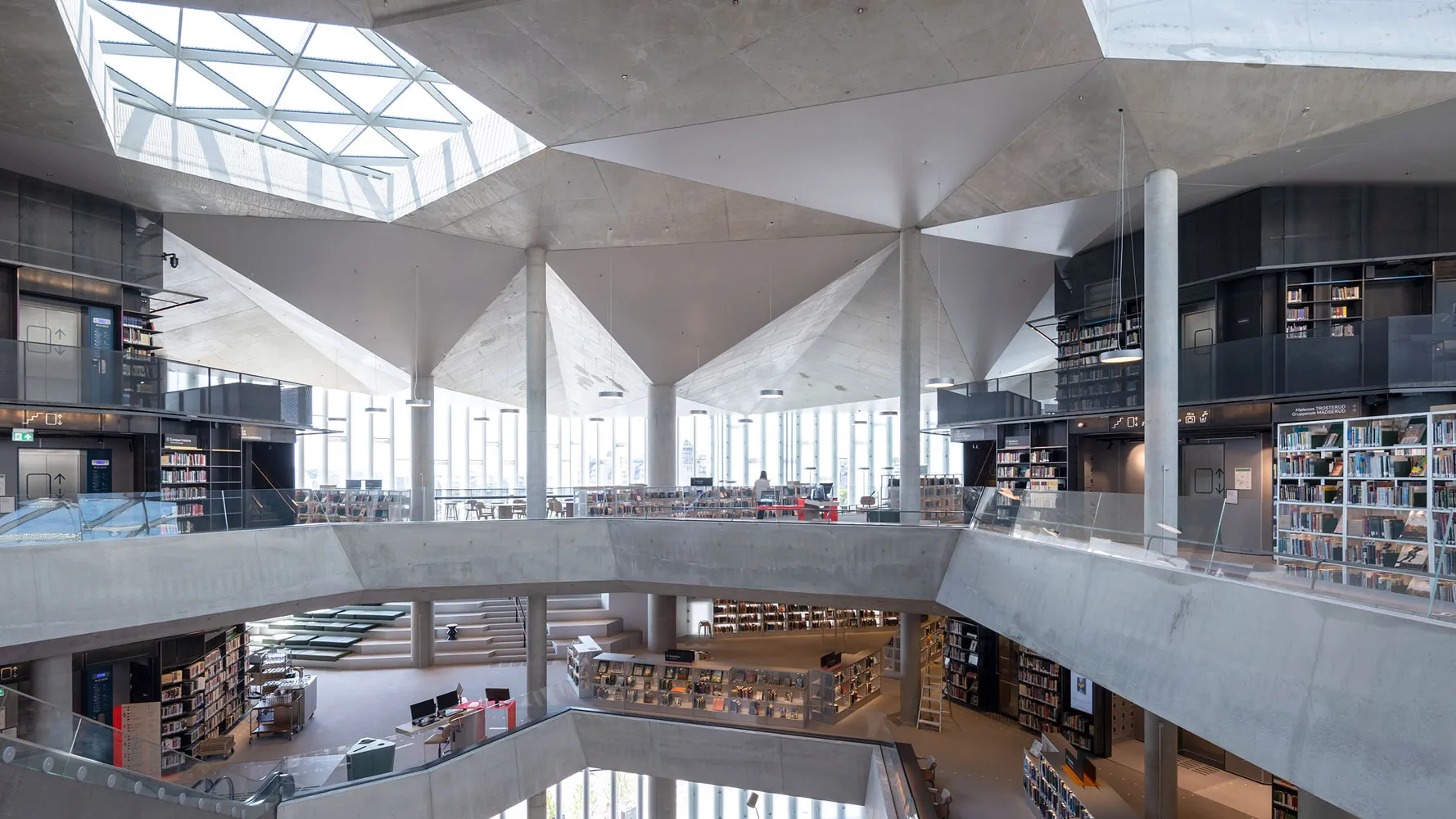
The building has three corner entrances, which lead to three interior zones, each with its own lightwell (1), and consists of five floors (many of which are double height), the top most of which cantilevers out. Photo © Iwan Baan
The library, known as Deichman Bjørvika (Deichman is the name of Oslo’s library system, and Bjørvika is the location) opened in June 2020 and remained open through the pandemic, with the number of visitors capped and other infection control measures in place. Since the restrictions were lifted, attendance has averaged 6,500 a day, nearly ten times as many people as visited the previous central library, according to library spokesman Lars Schwed Nygård.
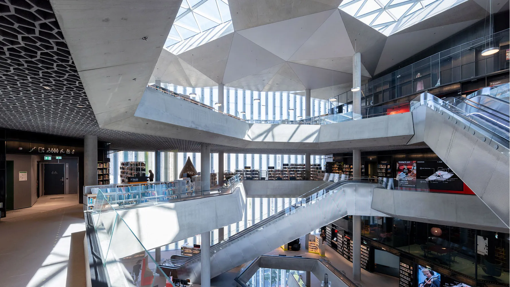
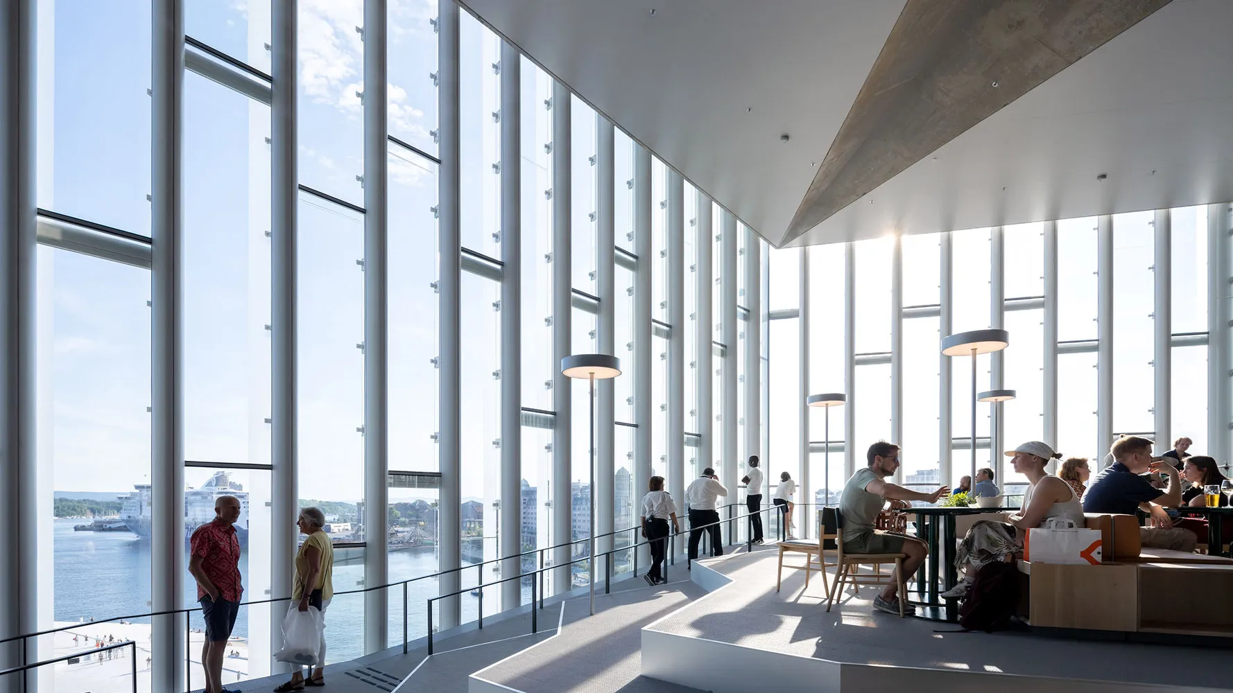
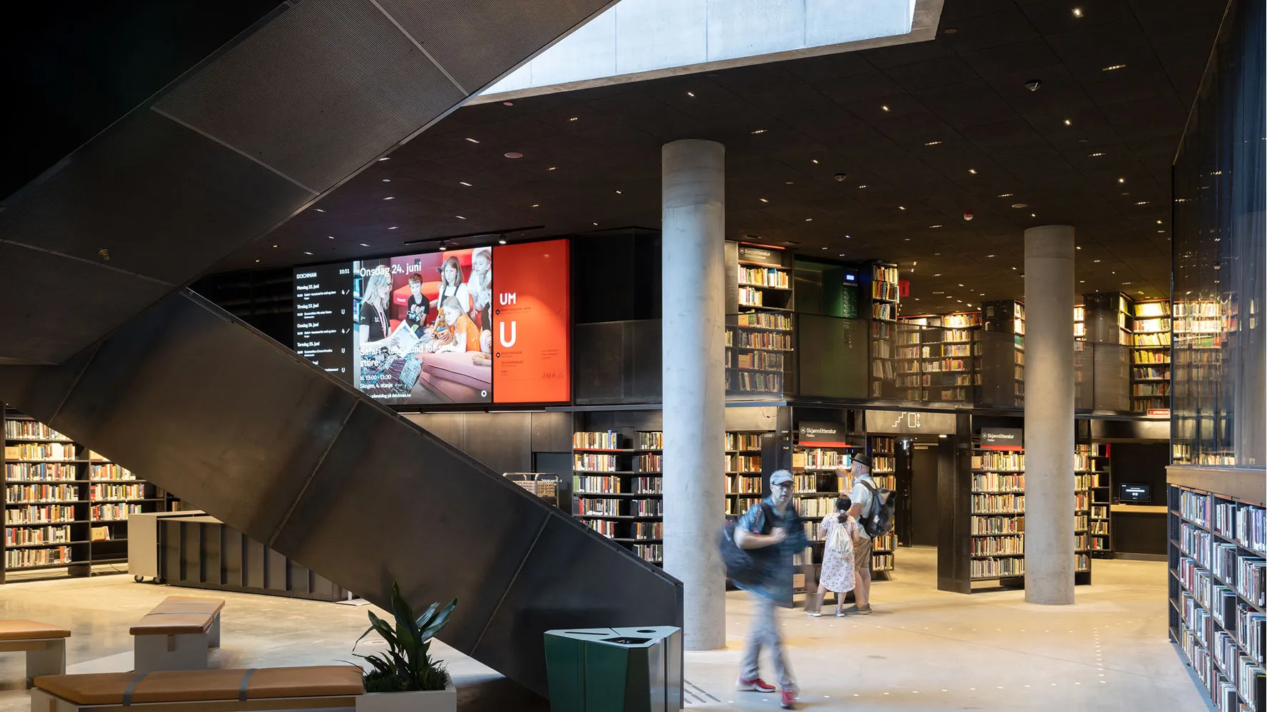
The building’s plan is relatively simple: three corner entrances open onto three interior zones, each with a lightwell that gives visitors a sense of the verticality of the building. Alongside the three lightwells, which gradually morph into a large, skylit central atrium, are three service/support cores. But that straightforward parti gives way to an astonishing variety of spaces, in keeping with the library’s mandate to serve the city’s population in myriad ways. Moving through the 200,000-square-foot interior—mostly on escalators that zigzag through the atrium—feels like spelunking, as if there’s always something new to discover above, below, or around the next corner. The stalactites of this cave would be the artworks hanging from the ceilings, which are themselves ingeniously designed. Keeping noise levels down while allowing many activities to occur at once, required that a great deal of acoustical foam be attached to the concrete ceilings. Yet those ceilings needed to be 50 percent exposed, so that the slabs could serve as thermal masses, helping to reduce heating and cooling loads. To address those seemingly conflicting demands, the architects created expanses of acoustical foam made entirely of vertical surfaces that hang from the ceilings. The foam surfaces form hexagons, which continue across the building as a vast tessellation. The choice of hexagons, Mowe says, is “a result of the ambition to create a pattern without direction.” Elements of the building go off at so many different angles, he explained, that having a ceiling with a single orientation would have produced “visually annoying” intersections.

3

4
The library's cavernous interior includes zigzaging escalators and intricate hexagonal shapes also seen in the exposed ceiling's acoustal foam. Photo © Iwan Baan
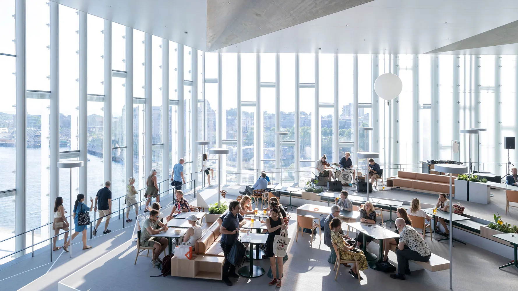
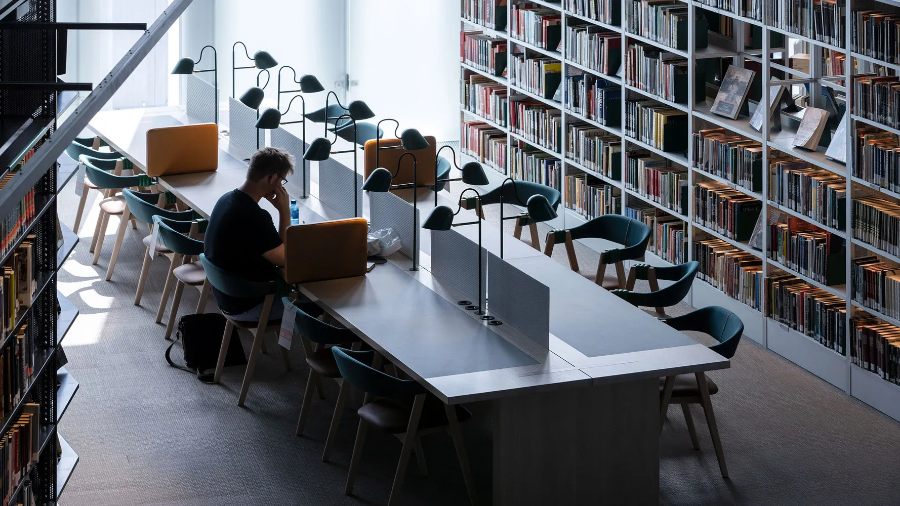
The building is ostensibly five floors high, but the first, third, and fifth levels are double height, making room for mezzanines around each core. The basement contains a cinema and auditorium. A restaurant and periodical reading area take up much of the ground floor. Starting on the next level, the books get more scholarly as one ascends, from Dr. Seuss on two (a floor that seems to double as a stroller parking lot), to Kierkegard on five. Right now, the library houses some 450,000 books, but it’s hard to see how that’s possible, given the plethora of spaces for reading, socializing, snacking, watching films, attending lectures or just staring out the windows. (The Oslo-based firm Scenario did the lively interiors.) During recent weekday and weekend visits, the library was full, with virtually every seat (there are some 1,200 overall—many with USB ports) taken by students, while groups of older Norwegians followed tour guides through the building, a successful symbol of their country’s wealth and civic-mindedness.
Deichman Bjørvika is hardly the first new library to serve as a kind of town square and community center. One of the best such examples is Oodi, Helsinki’s central library, by ALA Architects, which opened two years earlier in 2018 and is a similar (if slightly sober-er) landmark near that city’s waterfront. True, Oodi is curvaceous, while Deichman is angular, but both have similarly eclectic programs; both make extensive use of glass to maximize daylight and frame views of important cultural buildings; and both have massive overhangs to shelter outdoor plazas in inclement weather. And both are descendants of OMA’s Seattle Public Library (2004), with its long escalators puncturing cavernous spaces. But both are as inviting as OMA’s is intimidating.

The 'vertical village' encompasses various open, semi-open, and closed spaces arranged around three vertical cores. Photo © Iwan Baan
In 2009, a team consisting of Lundhagem, already an established firm, and the younger Atelier Oslo won an international competition to design the library (beating out Snøhetta, David Chipperfield, Toyo Ito, Schmidt Hammer Lassen, Lacaton & Vassal, Wiel Arets, ALA, and Sou Fujimoto, among others). The firm’s submission was largely conceptual, says Mowe, so that the next few years were spent working with librarians to develop a specific program. Yet, the library is also amenable to rearrangement. “We see the building as a ‘vertical village’ where the open spaces are the streets and plazas, and the closed rooms and semi-open niches surrounding the three vertical cores are like shops that will change over time,” says Einar Hagem, a founder of Lundhagem, referring to small areas with rotating collections of books and videos.
That the building took more than a decade to complete was the result of at least one engineering snafu (in 2014, the foundation sprung a leak, delaying construction by a year) and politicians’ efforts to reduce the cost. (The eventual budget was about $230 million.) But it was worth waiting for. Deichman Bjørvika is no neutral backdrop for the opera, but an important cultural building in its own right.

