Health care in the Netherlands is generally delivered by independently employed doctors and privately owned nonprofit hospitals. It is not a system that is particularly innovative or different compared to other nations, yet it allows the creation of facilities such as this gorgeous new hospital in the Dutch town of Meppel, designed by Vakwerk, a practice set up in Delft by three former employees of Mecanoo: Ellen van der Wal, Francesco Veenstra, and Paul Ketelaars. The quality of the Isala Meppel hospital—everything from its considered placement in the wider landscape to the thick oak frames of its doorways—indicates that the Netherlands has a competitive health-care system whereby attractive, well-managed clinical environments can serve as a key draw for potential patients.
It is easier perhaps to design a hospital that is not foreboding if it is small, and this facility in Meppel is modest in size, with just 180 beds. (Isala, the client, runs a group of hospitals operating around a single large hub facility in the city of Zwolle, in the northeast of the country, providing specialist care.) The building is able to be the first all-electric hospital in the country, largely because it is extremely well insulated, uses both heat and cold storage in the earth, and is augmented by arrays of solar panels on the highest roofs.

The aluminum clad building is mainly one story (top), but is punctuated by three- and four-story blocks whose roofs feature solar panels that augment electrical supply (above). Photo © Egbert de Boer, click to enlarge.
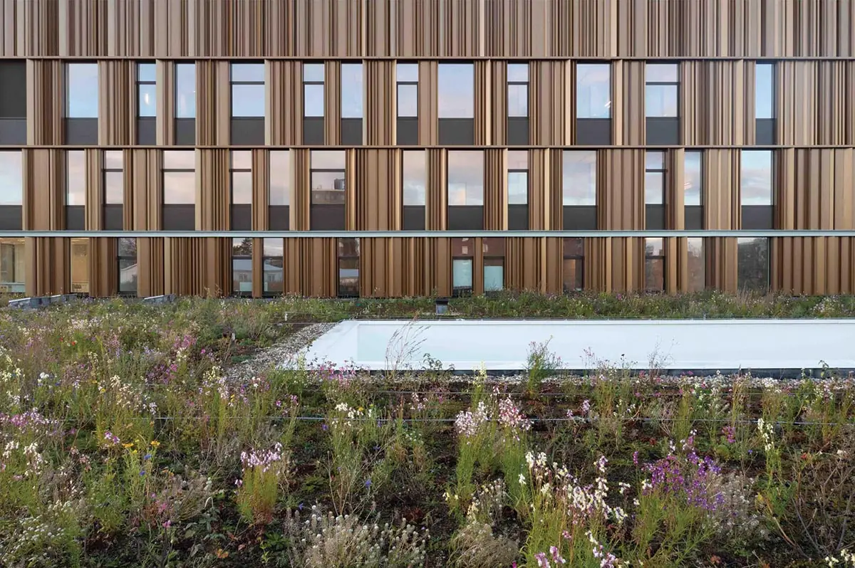
It looks green as well as operates green. Situated at the very edge of town, on the parking lot of a now defunct hospital from the 1970s that is awaiting conversion into senior supportive housing, the site backs on to trees and low-lying fields—a particularly charming slice of Dutch countryside that the plan of the building makes use of. Vakwerk’s main design concept was to bring the landscape into the patient experience as much as possible. It begins with the “landscape” effect of the facade: aluminum cladding with a serrated profile blends with the landscape. In the morning, the aluminum looks quite dark, but in the afternoon, it can be silvery. The “landscape” effect is carried into the design of the building in a number of other ways.
In the preindustrial era, Dutch farms were built on mounds of raised land to mitigate flooding. The mainly one-story Isala Meppel hospital evokes these landforms, with an impressive 13,000-square-foot roof, planted with sedum, indigenous herbs, and grasses, covering the sprawling ground floor. That horizontal expanse is punctuated by two squarish blocks that rise from it. Entry points are denoted by cutbacks in the roof. The main one, to the south, and accentuated by a long canopy, is for walk-in patients. The other, to the east, is where emergency patients, staff, and equipment-delivery entrances are grouped together. To allow daylight to penetrate the deep plan, the architects made six incisions (occasionally in pairs) in the roof to create glazed courtyards, around which the waiting spaces are arranged.

In additon to glazed courtyards, the ground floor features several large skylights. Photo © Leon van der Velden
It’s based, as all good health-care design is, on a pragmatic concept of patient flow. The separation between the ground floor and the raised components of the concrete-framed building creates a clear division between outpatient care and residential wards, which are placed on floors 3 and 4 of the taller block and floor 3 of the shorter one. (Floors 2 in both are reserved for back-of-house administration, with space for extra outpatient rooms if needed.) Each floor in each block holds 60 beds, configured around the perimeter of the square, with triple-bed rooms alternating with singles.
Wayfinding has been humanized so that patients have a clear sense of where and how to move. Corridors in the wards have a floor-to-ceiling window with views to the landscape at each end, constantly reinforcing the relationship. In the center of these plans are shared facilities, such as kitchens, storage, and a communal living/TV room. Each floor is identical to the others in terms of rooms and equipment, so nursing staff are able to work efficiently wherever they are stationed.

1

2

3
The wood paneling of the interiors (1 & 2) recalls the serrated aluminum exterior cladding (3). Photos © Egbert de Boer (1 & 3), Leon van der Velden (2)
The arrival setup is unusual but well organized. On the ground level, one is greeted by a reception area. There is no desk, just a wide entrance lobby, transected by a long corridor or internal “street.” The discreet wayfinding system uses inlays in the terrazzo floor—brass cutouts of leaves of common local trees—guiding the arriving patient to computerized check-in points and on to the correct waiting area. A staff member standing at a raised table is on hand to help, but the whole process is designed to be as uncluttered as possible. Staff are obliged to use the second-floor offices for all administration. Hans Sieders, one of the managers of the hospital, says, “It isn’t a popular move, but it means that we are more efficient and the entrance is clearer and more welcoming.”
The client has used a couple of design ideas to maneuver staff into behaving in certain ways. In addition to enforcing the use of second-floor office space for administration, patient circulation is kept free from the functional movement of hospital work by limiting elevators that can be used for the transfer of beds. However, the staff were generally given wide scope to help determine the design. Vakwerk led a consultation in which staff explained which departments they needed close to others, such as the placement of facilities like radiology, CAT, and MRI scanning together at the southeast corner of the hospital.

Patient rooms alternate between one and three beds. Photo © Melanie Samat
Other decisions were more obvious: operating rooms are situated at the rear of the building, on the ground floor, while post-op physiotherapy is at the northwest corner, in the area of the hospital surrounded most by greenery, creating a bucolic, almost idyllic environment for recovery. Although the hospital is intended to offer general service, because of the advanced age of the local clientele, a lot of physiotherapy is required, and a different, specialized health-care provider, Zorggroep Noorderboog Rehabilitation, offers this, occupying the single floor of wards in the lower of the two towers.
The building is one clinical environment for the patient, however, and had to be designed as such. Before construction, Vakwerk tested the staff and patient journeys through the plan by building a 1:1 model of the ground floor in a huge shed. This process proved the plan worked, although the architects afterward did introduce curves to corners to allow hospital beds to be maneuvered more easily.

The hospital is built at the periphery of a small town, amid the Dutch countryside. Photo © Egbert de Boer
Vakwerk’s faith in an open design process, working cooperatively with the contractor, client, and user group, appears to make the difference in creating such a special health-care building. Admittedly, the hospital’s size and location on the periphery of a small town has made it easier to design well than if, say, it had been a large urban facility. Still, the thoughtful decisions made by Vakwerk aid the delivery of quality care. Those decisions constantly ennoble the lives of any patient or family member who visits the hospital.
Click drawing to enlarge

Credits
Architect:
Vakwerk Architecten
Engineer:
Deerns
Consultants:
Kragten (landscape); Basalt (cost)
General Contractor:
Trebbe, Dura Vermeer & ENGIE
Client:
Isala Klinieken & Zorggroep Noorderboog
Size:
248,000 square feet
Cost:
$58 million (construction)
Completion Date:
December 2021
Sources
Aluminum Cladding:
Aluforms
Curtain Wall:
Kawneer
Skylights:
Lamilux, Licotec
Doors:
Metaflex (sliding); Record (entrances); Assa Abloy (overhead)
Lighting:
Fagerhult
Elevators:
Thyssenkrupp
Plumbing:
Villeroy & Boch
Green Roof:
Optigrün
Cold & Heat Storage:
IF Technologie and Haitjema WKO


