Retirement homes, especially those for dependent residents requiring medical care, have received rather bad press in France recently. In January, journalist Victor Castanet published Les Fossoyeurs (The Gravediggers), a shock exposé that accused elder-care group Orpea of wide-ranging abuse and neglect due to relentless cost-cutting in pursuit of maximum profit. But, even before the scandal broke, établissements d’hébergement pour personnes dépendantes (EHPADs), as they’re known here, were feared as grim, depressing places you’d do better to avoid. At the 94-bed Résidence Sara Weill-Raynal in Paris’s 20th arrondissement, which was built and run by the city, local architects Avenier Cornejo did everything they could to buck the trend.
Located in a formerly working-class neighborhood of fin-de-siècle brick buildings and Modernist slab blocks, the site was already home to a 1970s EHPAD that fell far short of modern standards and regulations. Rather than demolish or refurbish, the city opted for a drastic transformation that saw Avenier Cornejo strip the building back to its concrete frame and bring the street facade forward 6 feet (gaining much-needed extra floor space) to line up with a neighboring building. The care bestowed on the project is made immediately clear in both the choice of cladding—the same long, dark bricks that Peter Zumthor specified for his Kolumba Museum in Cologne, which was hardly the cheapest option—and the generous windows with their golden-oak frames. “We put a lot of money into the fenestration,” says Christelle Avenier, “because old people spend so much time in bed either watching TV or looking out the window.” Much larger than those of the original EHPAD, the new windows come without balconies, as requested by the city. “They told us no one ever used the old balconies,” explains Miguel Cornejo, “which just filled up with pigeon droppings.”

1

2
In the makeover, an existing building’s concrete frame was kept and a new facade pushed to the street (1). The long, dark brick (2) is the same as that used in Cologne’s Kolumba Museum. Photos © Simone Bossi (1), Charly Broyez (2), click to enlarge.
Thinking about residents’ needs and behavior also helped organize the program: the restaurant, lobby, and administrative offices are on the ground floor; Alzheimer’s patients live on the second level; standard rooms occupy the floors above, except at the top, where the architects installed accommodation for obese residents. “They never move,” says Cornejo, “so we gave them the view of the Eiffel Tower.” The hair salon and other shared facilities are also up top (so everyone has a chance to enjoy the view) as are the doctors’ and psychologists’ offices—medical personnel, including nursing staff, are present on-site around the clock.
There may no longer be balconies, but there is still the garden, a 4,300-square-foot tree-filled haven that is very welcome in this dense neighborhood. The architects placed the restaurant next to it, with floor-to-ceiling glazing that opens, and also landscaped the sloping site, giving it a low-gradient hairpin-bend path that provides an exercise climb for reduced-mobility residents. Built-in benches border the restaurant terrace and the two rest areas on the path.

3

4
The subtle colors and linear, minimal design of the stairs (3) and rooms (4) imparts a sense of serenity. Photos © Simone Bossi

The brick screen shields groundfloor spaces from the street. Photo © Simone Bossi
Inside, the same care for detailing prevails. “As part of the design process, we visited several EHPADs,” recalls Avenier. “They were horrible—the colors were too violent, the atmosphere too medical, the artificial light too stark and bright. It made people anxious and aggressive. We tried to do something softer and more domestic.” Natural light floods each floor of the building, including the entrance level, whose street-side glazing is hidden behind brick mucharabis for privacy and discretion. The tiled treatment rooms also enjoy abundant daylight, and even the stairwell is out front, with windows, “to encourage people to use it,” says Cornejo (French fire stairs are generally encased in concrete at the center of the plan). To compensate for the fact that most of the street-side bedrooms enjoy a less agreeable view than those in the rear, they are larger (226 square feet, versus 194 square feet), while the central access corridors open up midway to form a social area on every floor.

Photo © Simone Bossi
“When we visited my grandmother at the hospital, there was never anywhere to sit,” remembers Avenier. “So, we designed a storage-unit-cum-bench that forms a window seat in each bedroom.” The architects also fought to include details such as industrial-style cylindrical-fin radiators and wiring that runs through exposed piping. Among the battles lost was the hardwood flooring, which gave way to vinyl, supposedly closer to hospital standards. But the architects did get their way with the electrical lighting. “We specified high-design models you never find in an institution like this,” explains Avenier. “We have Louis Poulsen in the dining area and Charlotte Perriand in the bedrooms.” As Cornejo explains, “There are strict specifications you have to follow with respect to lighting levels—the inspectors will be on top of you about the number of lumens. But nobody ever considers the number of kelvins. We made the artificial light warmer, and also less direct, so you’re not plunged into a white hospital glare. A city employee afterward thanked us, saying it was the first time she’d entered an EHPAD that didn’t feel like an operating theater.”
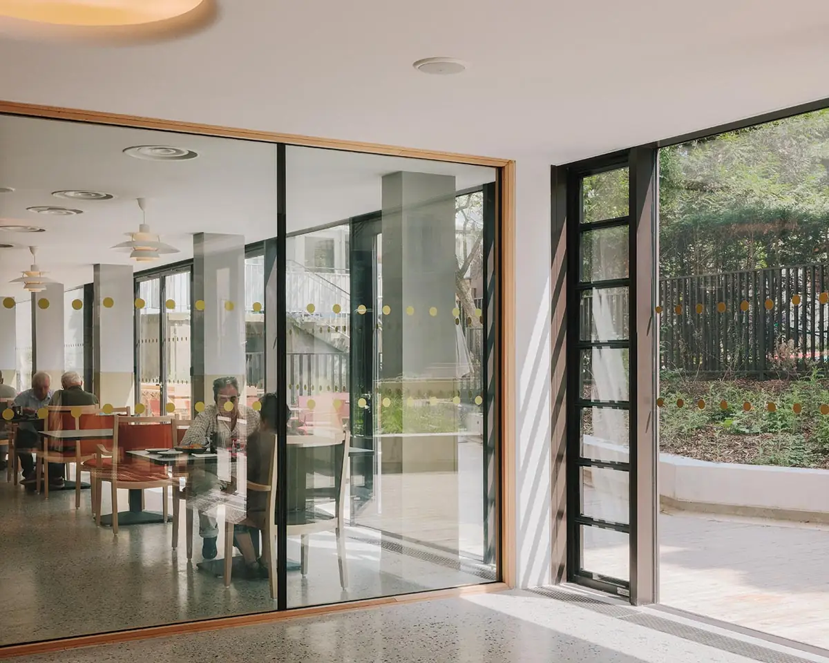
The dining area overlooks the landscaped garden at the back (above), as do other public rooms (top). Photo © Charly Broyez
Despite such appreciation, the Résidence Sara Weill-Raynal can appear daunting to the uninitiated. For safety/insurance reasons, residents are essentially locked in, and even visitors cannot leave unless the porter opens the main door. Once admitted, occupants are there till the end—life expectancy averages three years, except for certain obese and Alzheimer residents, who are younger and so remain longer. Avenier Cornejo hoped to temper the isolation this can induce by deliberately configuring the restaurant and garden so they could be used as a neighborhood facility, while the garden fire escape they were required to install, which leads to an adjacent daycare center, provides an “intergenerational gate” they feel could be put to good use. At the moment, this is not how the Résidence Sara Weill-Raynal is being run, but an EHPAD in Marseille gives reason for hope: Les Jardins d’Haïti has opened up to the community, bringing in students, children, coworking, and even a dance school to use its spaces. Were this example followed, Avenier Cornejo’s attempt to deinstitutionalize the medicalized retirement home might one day fulfill all its potential.
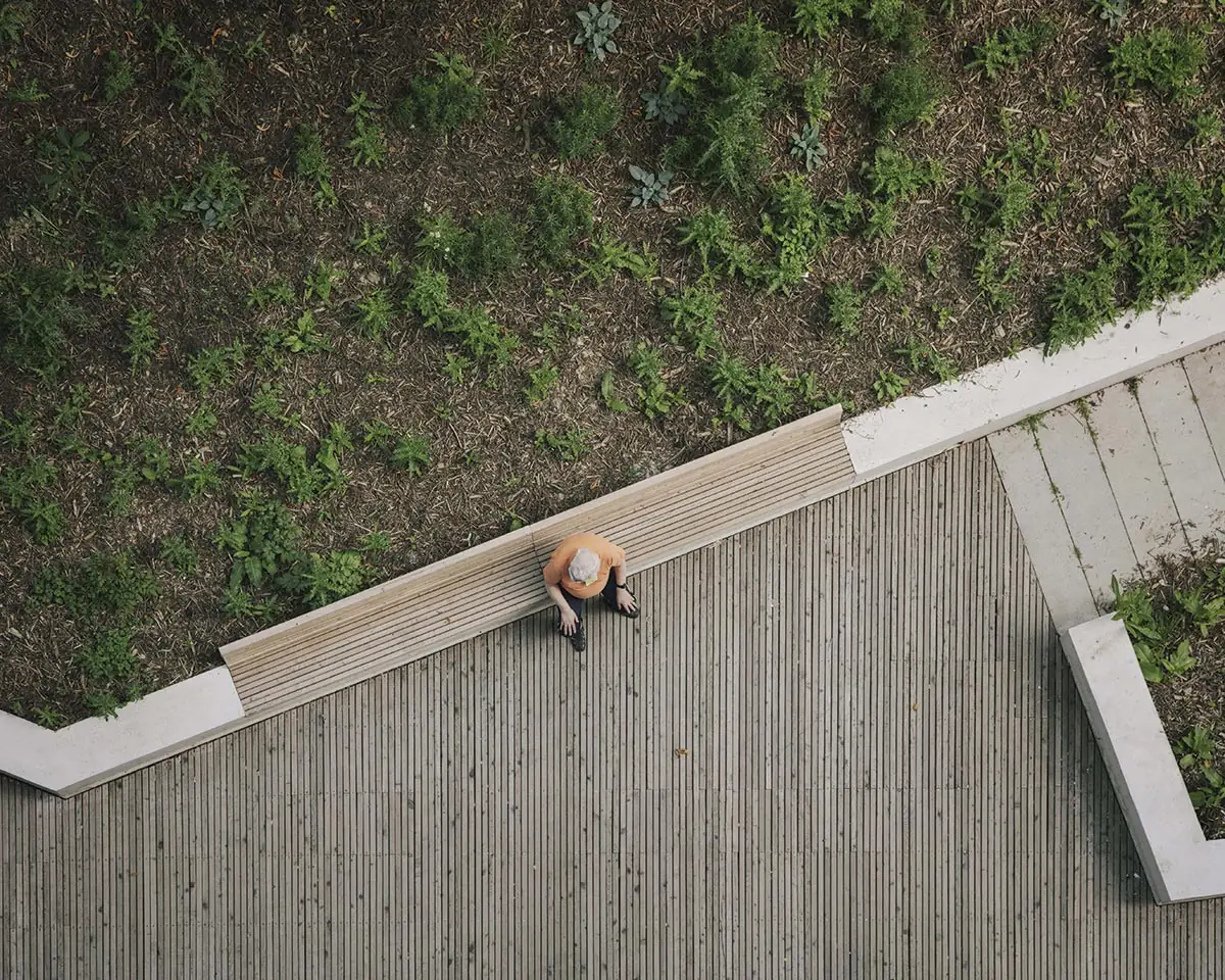
The garden’s angular paths and benches afford residents contact with the outdoors. Photo © Charly Broyez
Click plans to enlarge

Click drawing to enlarge

Credits
Architect:
Avenier Cornejo Architects — Miguel Cornejo, Christelle Avenier, Pierre-Nicolas Georgeton, Jean-Remy Turot, Pierre Szmul, Olivier Saramito, team
Engineers:
EVP Ingénierie (structural); B52 (m/e/p); IDDEA (asbestos engineer)
Consultants:
BASE (landscape); Acoustibel (acoustics)
Client:
Centre d’Action Sociale de la Ville de Paris
Size:
4,300 square feet
Cost:
$10.8 million
Completion Date:
July 2021
Sources
Brick Masonry:
Petersen Tegl (Kolumba)
Metal/Glass Curtain Wall:
Schüco
Sunshade:
Griesser
Doors:
Manusa, Polytech, Argenta
Acoustical Ceilings:
Rockfon Mono Acoustic
Wood-Laminate Wall Covering:
Egger
Solid Surface:
Surfatek
Floor and Wall Tile:
Villeroy & Boch
Lighting:
Flos, Louis Poulsen, Bega


