Stone-Clad Monotony at Norway’s National Museum
Kleihues + Schuwerk design a home for five collections telling the story of a nation

The National Museum of Norway seen at dusk. Photo by Borre Hostland

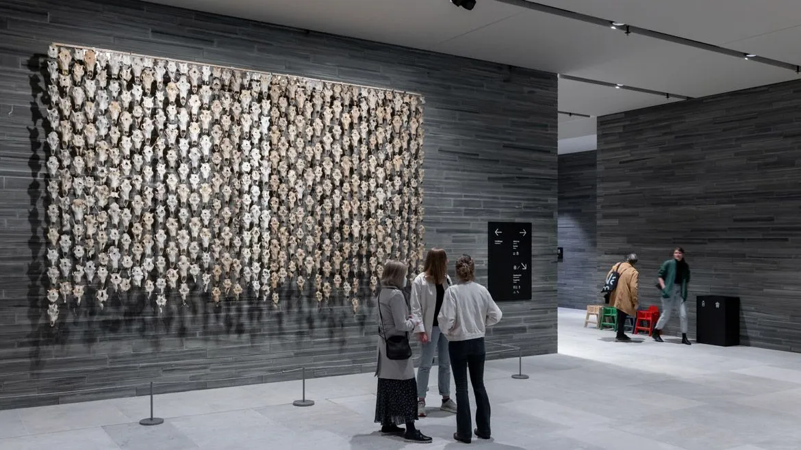
The museum's entry vestibule. Photo © Iwan Baan

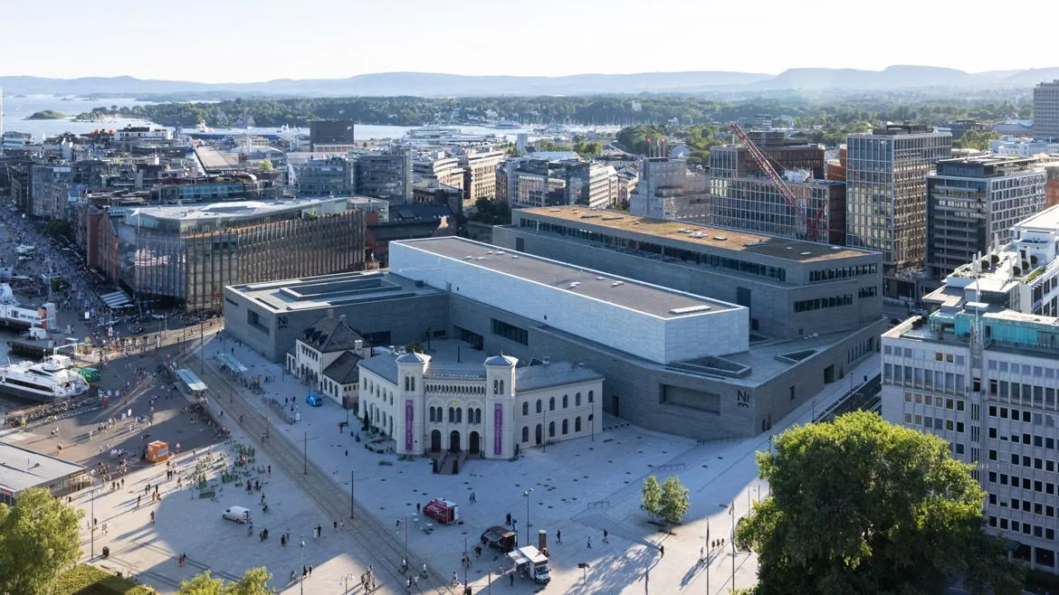
The museum exterior showing a preserved former railway station. Photo © Iwan Baan

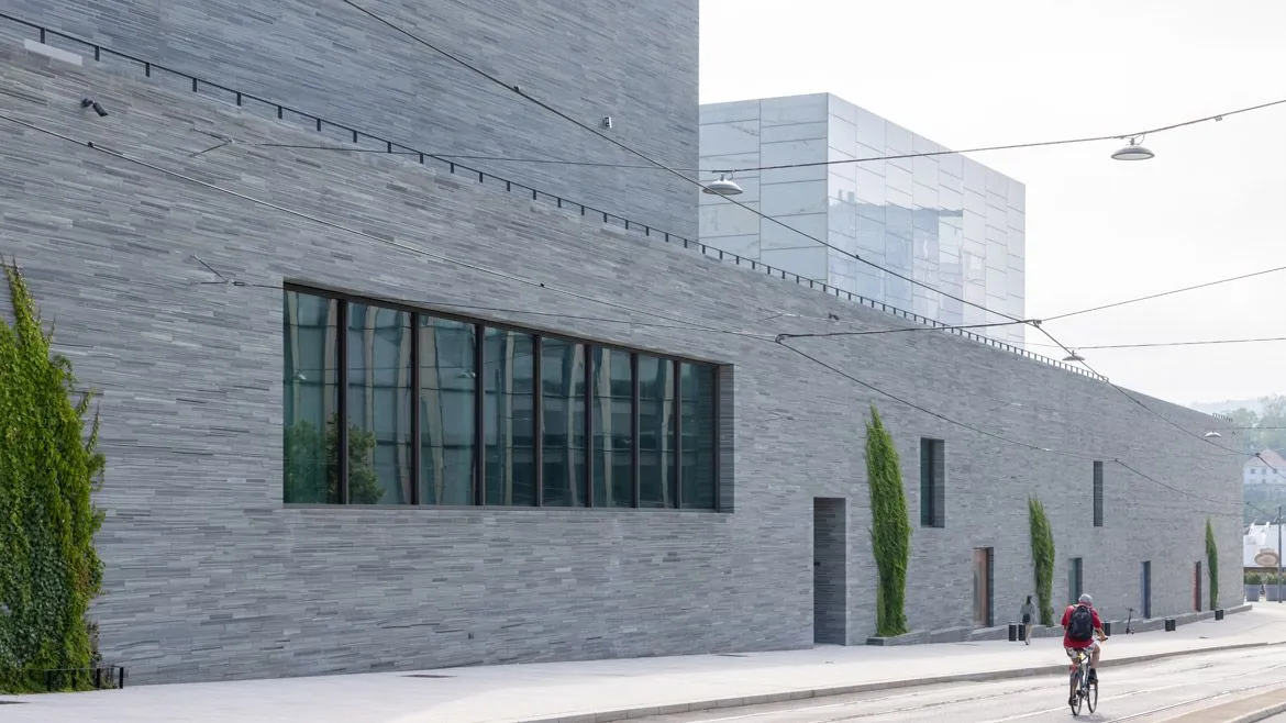
The museum exterior. Photo © Iwan Baan

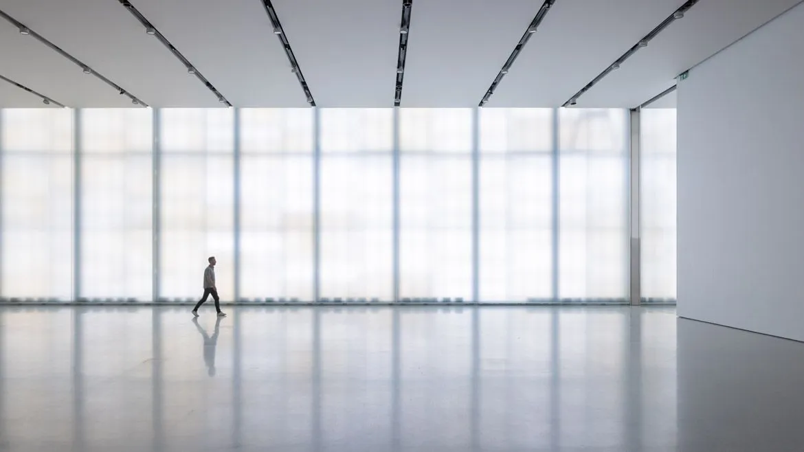
The interior of the museum's "Light Hall." Photo © Iwan Baan


Architects & Firms
At the opening of the new Kleihues + Schuwerk-designed National Museum of Norway, Karin Hindsbo, the institution’s first director, proclaimed that “with this new building, Norway has a world-class museum.” In one regard, she is right: the curators, together with exhibition designers Guicciardini & Magni Architetti, have woven together a compelling story of a nation’s material life across more than 80 rooms and a mighty 3.2 acres of exhibition space on three floors. The permanent hang, particularly of pre-industrial artifacts, is ingenious, vital, and creative. Eastern Orthodox icons that ended up in Norway following a schism with the western church in the 11th century hang on steel-strung frames; the exciting world of the early-19th-century post-independence salon is conjured out of simple furniture and soundscapes. In this, the museum is a clear success. Whether it is a world-class work of architecture is another matter.
In many ways, a new national museum is an anachronism. Most European countries have one, and those that don’t (e.g. Austria) boast a range of impressive museums that collectively tell the nation's material story. The Norwegians found themselves in just such a situation, but were not happy with it. In 2003, the country set out to combine five existing institutions—the National Gallery, the Museum of Decorative Arts and Design, the Museum of Architecture, the Museum of Contemporary Art, and the state program for traveling exhibitions—into one immense facility.

The National Museum of Norway, exterior and street. Photo © Ina Wesenberg
Each of these buildings was an integral piece of Oslo architecture that generally kept to the modest urban scale of three- to five-story blocks sloping down from residential suburbs to the harbor. (Mercifully, the charming architecture museum—a pleasant neo-classical building with a Sverre Fehn pavilion—is being retained as a museum; the fates of the others remain undecided.) Hindsbo suggested in her opening speech that the new building will help the museum care for and exhibit the collection better than the previous buildings. And at a cost of $732 million, one would certainly hope that it would.
On the positive side, Kleihues + Schuwerk’s building works well urbanistically. Leaving space for a large courtyard, the building wraps around the back of an old dockside railway station. From the dock, the museum is legible as a two-story stone plinth topped by a two-story marble-clad pavilion, both tucked behind the old station. From the northwest it appears as a four-story block appropriate in scale to nearby office blocks. But from thereon in, problems begin to arise.

The marble-clad "Light Hall" sits atop the building. Photo © Annar Bjorgli
Since the museum was first planned, a major urban renewal project promoted by various public agencies has rolled out across the waterside districts of Bjørvika and Tjuvholmen that the museum overlooks. The project’s key building is Snøhetta’s celebrated National Opera (2008), which sits, ingeniously, within the dock rather than on its bank, and offers the city a new marble-clad public space on its sloping rooftop. Unfortunately, the rest of the new development lacks the National Opera’s originality and material quality.
Atelier Oslo and Lund Hagem’s Deichmann Library (2021) has a gorgeous interior oriented around three public circulation cores, but its glass-and-steel exterior cannot reconcile with the quasi-brutalist geometries of the adjacent National Opera. And it is hard to imagine a museum that communicates as little of its content as the estudio Herreros-designed Munch Museum (2021), which looks like the kind of luxury hotel one might see in Seoul or Singapore rather than a home to portraits of 19th-century bourgeois anxiety. Taken together, the dockland developments lack not just the architectural variety of the rest of the city but also, and perhaps more importantly, its material variety: this is a city of brick; all manner of stone; wood; stucco in the baroque mode; and, given Oslo’s collection of superb brutalist buildings, concrete.
The National Museum, conceived and built in parallel with the growing harbor neighborhood, is intended as a counterpoint. Whereas nearby developments are novelties, the low, minimalist National Museum is supposed to speak of the ages. Architect Klaus Schuwerk certainly described it as such at the opening. Sadly, the critical design move employed to achieve this effect—cladding most of the building’s exterior in schist stone cut across its grain—is a failure. Up close, the gray-and-white varieties used here provide visual interest and layered texture. Viewed from further afield, however, all nuance is lost. Kleihues + Schuwerk have used the stone cladding as a shorthand for the values of durability, immutability, even seriousness, but the effect—over 260,000 square feet of the building is covered in it—is monotonous.

The museum's entry courtyard. Photo © Iwan Baan
Nor is the stone particularly attractive or versatile: shades of grey on shades of grey. Klaus Schuwerk is clearly a keen student of history, but he might pause and ask himself why, given that schist is so common in Norway, the stone has not been used in this way before. Seen from the west, the four-story block, punctuated with four lines of aluminum-framed glazing, is astonishingly drab, and the southwest facade is little better. Arriving from the city, one walks around two long facades of the stone, only to then be greeted by two more facades facing onto the courtyard where the main entrance is located. Only the "Light Hall," the marble-clad pavilion atop the stone-clad plinth, offers relief: at night, its translucent facade, lit from within, becomes a glowing slab of warm light with a similar effect to that of the Opera House’s open deck across the dock.
It’s a further disappointment to enter the building and find a lobby that is well-proportioned with 15-foot-high ceilings and wide doorways but is lined with the same endless swathes of veiny schist. The desired effect of the interior generally seems to be that of an oversized Barcelona Pavilion, but while the National Museum’s sheer mass of dark stone apes the luxurious modernism of that building, it ultimately fails to achieve the same tonal and material lightness. (Lining the walls down to the basement toilets and cloakrooms, the stone has the dreary menace of a Hamburg nightclub entrance.) And in a manner unlike that of Mies, partitions of stone pointlessly block views to the galley entrances and staircases to the upper level. Nor are things much better upstairs. So determined have the architects been not to make a Guggenheim—that is, to erase all traces of sculpture from their work—that what they’ve made instead is a very expensive box.

Galleries in the museum. Photo © Iwan Baan
Upstairs, the division between the second-floor galleries and two central lounges is overly stark. The latter are large and uninviting and the curated spaces are again the only real attraction. It is a mercy to be back in these spaces. Less rich in color than the galleries on the lower floor, they are arrayed in the same way: in a grid, which can be explored along the rows or across them; providing an opportunity for visitors to choose their own paths. The spaces are again well-designed and gently lit from above by large panels of low-lux LEDs that cover almost the entirety of the ceiling, and create the effect of natural light. The “Light Hall,” by contrast, may have the appropriate floor space for a visiting exhibition (26,000 square feet), but it feels tall and barn-like with a 23-foot ceiling. The museum’s opening exhibition of contemporary Norwegian art struggled to address its vastness.
Can a world class museum be hosted in an underwhelming building? This reviewer would previously have said no. However, at the National Museum, it is quite possible to spend a full day immersed in vibrant medieval tapestries, remarkable collections of glass and silverware, or the more recent story of a nation told through its modern art, architecture, and design, and not think about the building in which they are housed. Content, mercifully, can still be everything.


