“This is really a very simple project,” says Franco Ghilardi, founder (with Ellen Hellsten) of Oslo-based Ghilardi+Hellsten, about their Quality Hotel Hasle Linie in the Hasle district of Norway’s capital. Over the past decade, the firm’s client, developer Höegh Eiendom, has been transforming this formerly industrial area into a mixed-use neighborhood of offices and housing. “The developer thought the hotel would be an interesting addition, to bring some life to a bedroom community and office park,” says Ghilardi about a part of town that, though 45 minutes’ walk from the center, is considered a far-flung suburb by residents of the city. “There’s an increasing effort to inject some urbanity and city life into these peripheral neighborhoods, where rents are far cheaper,” continues Ghilardi. “They’re trying to make them attractive, which means bringing in cafés, restaurants, etcetera.”

The hotel features an inviting entrance and tall daylit lobby. Photo © Roland Halbe, click to enlarge.
Ghilardi is very clear that this is a budget chain hotel, aimed primarily at domestic business travelers—but “budget” in Norway buys you something rather grander than elsewhere. The program also includes an office component, realized as a discrete though connected wing at the far end of the site, next to tracks for freight trains that still cross here. The railroad is one remnant of the area’s industrial past; another is a former power station (currently awaiting conversion into a wine bar), whose lofty brick tower punctuates the public plaza that Ghilardi+Hellsten created in front of the hotel’s main entrance, at the other end of the site.
The architects initially imagined a small street separating the office building from the hotel, but Norway’s long, hard winters made them think again. Covered with a factory-style sawtooth roof (a nod to Hasle’s industrial past, realized as a self-supporting structure in steel), the “street” links directly to the hotel’s generous spinal lobby, the two together forming a triple-height T-shaped atrium with three entrances. The hospitality wing of the complex rises seven levels from grade, with bedrooms stacked around the perimeter (some overlooking the lobby), so that light can enter the wide structure via the central atrium. A 16-foot change in level from the northwest of the site to the southeast allowed for the inclusion of a public fitness center on the lower ground floor, while level seven is entirely given over to HVAC and other mechanical equipment.

1

2
One of three entrances (1) straddles hotel and office wings with a passage and stair— topped by a glazed sawtooth roof—that exit on the lower street (2). Photos © Roland Halbe
Since time and budget were of the essence, the building’s carcass was entirely prefabricated, as is now common in Norway—factory-cast concrete columns, beams, and floor decks for the structure, and factory-assembled cladding for the facades (glass and black metal for the hotel, wood-veneered panels for the office wing). Ghilardi+Hellsten did everything they could to break up the hotel’s rather boxy bulk, with shallow recesses on the long lateral elevations and four types of facade treatment. They also fought hard to have taller-than-standard slab-to-slab heights at every level—12½ feet where many hotels make do with just 10—even though this meant dipping slightly under the 200-room count requested by the operator. “With these more generous floor heights, the structure can easily be converted into offices or other uses at a future date,” explains Ghilardi. “We consider this very important in terms of sustainability.”
3

4

5
6
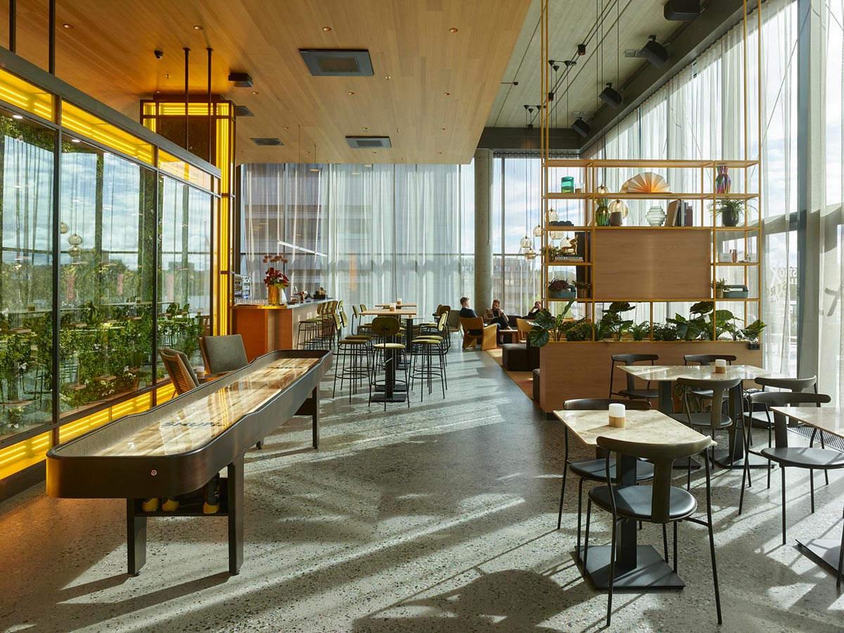
Several guest rooms and corridors (3 & 4) overlook the lobby’s atrium, which is also borderd by a restaurant and lounge (5) and a plaza bar (6). Photos © Roland Halbe
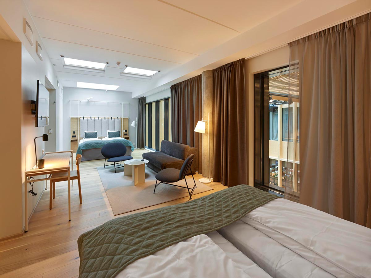
Budget restrictions also meant that Ghilardi+Hellsten had no say in how the bedroom floors were handled—that part of the program was farmed out to a company selling standardized solutions—though the architects did ensure natural lighting for the corridors. “Where the client and the operator realized they perhaps ought to spend some money was on the ground-floor public areas,” says Ghilardi. “The idea was that the T-shaped atrium would become a bit of a shortcut—you can walk in and out and use it as an indoor street.” Lobby facilities include a large restaurant and a generous bar on either side of the main entrance, both of which open up in summer on to an outdoor terrace on the plaza—“only really useable one month of the year,” jokes Ghilardi—as well as a “ballroom” for functions, and a business center beneath the office block.

7

8
The lobby (7 & 8) bisects the hotel to the glass-topped passage, where guests can either relax and view the offices opposite or exit the building. Photos © Roland Halbe
Unlike the case in warmer climes, where the outdoor appearance might receive the most attention, here it is the indoor spaces that constitute the real public realm, and the architects went to considerable lengths to create an attractive, hospitable ambience. Two types of cladding break up the lobby’s 158-foot length—birch-veneer panels and folded, perforated-steel cladding—while the concrete floor has been polished to reveal a terrazzo-like aggregate. Solid-wood floorboards provide a variation on the industrial theme in the restaurant and business center, while shards of colored glass brighten up the concrete flooring in the bar. Furnishings, in streamlined Scandinavian style, were designed or customized by Ghilardi+Hellsten, who chose a soothing forest color palette for the dining space and enlivened the bar with jazzy LED lighting features.
The design team also took great care when creating the plaza in front of the hotel, giving the board-formed retaining wall to the side of the outdoor stairs a sensuous kink worthy of Oscar Niemeyer, and extending the Norwegian-granite paving—loose-jointed for permeability—into the upper roadway, where it is textured for tire adhesion. Even so, with the limited means at their disposal, there was no chance of altering the “anywheresville” ambience that pervades Hasle’s bland, orderly streets.
This is a simple project, yes, but one that Ghilardi+Hellsten did their best to enrich through attention to detail and to render urbane through their handling of space and layout.
Click plans to enlarge

Click section to enlarge

Click diagram to enlarge

Credits
Architect:
Ghilardi+Hellsten Arkitekter — Franco Ghilardi, partner in charge; Henrik Poulsson, project architect; Heleri Nommik, Federico Iannarone, Anna Maria Grossi, architects
Engineers:
Rambøll (structural); Lysteknikk (electrical); Gupex (ventilation); AF EMT (plumbing)
General Contractor:
AF Bygg Oslo
Consultants:
Scenario Interiørarkitekter (interior design); Grindaker (landscape architecture); Fagehult/Ateljè Lyktan (lighting design); Oslo Brannsikring (fire)
Client:
Nordic Choice Hotels; Nordic Entertainment Group; Sterk Helse Fitness
Owner:
Höegh Eiendom; AF Eiendom
Size:
226,000 square feet
Cost:
$41 million
Completion Date:
August 2021
Sources
Cladding:
Stacbond, Parklex Prodema, Rimex Metals
Curtain Wall:
Schüco, PressGlass
Skylights:
Bolseth Glass
Elevators/escalators:
Schindler


