Bruges Meeting & Convention Center by Eduardo Souto de Moura & META architectuurbureau
Bruges, Belgium

Bruges Meeting & Convention Center. Photo © Filip Dujardin
To build a new conference center near the heart of a UNESCO World Heritage site is a difficult enough proposition, but on a budget of just $44 million, it is an even tougher one. Yet Antwerp-based META and the office of the Portuguese Pritzker Prize–winner Eduardo Souto de Moura have pulled this off, creating a conference center and exhibition hall just yards away from one of the major squares in the historic town of Bruges in Belgium. Their classic brick-clad building—which rises to 82 feet on the west-facing front facade but generally keeps to 50 feet—feels instantly integral to the place.
Although the city has a year-round tourist season, authorities noted that hotels were relatively quiet during the week compared to the weekend. Understanding that the beauty of the town itself would always be the major draw, they aimed for more business visitors by building a conference facility for around 500 people. Intelligently, they decided to replace a 1960s single-story concrete convention center in the old town rather than build outside it. A design-build consortium of contractor MBG, with META and Souto de Moura, won the competition, the latter two having met and formed a creative partnership following Souto de Moura’s work on a crematorium in nearby Kortrijk (2011).

1
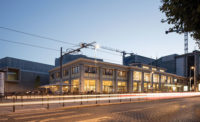
The exhibition hall on the ground floor is heavily glazed, allowing passersby to see inside. The architects have proposed that it be used for public events as well (1 & 2). Photos © Filip Dujardin, click to enlarge.

2
The result of their collaboration is a simple, elegant four-story conference facility, which stands on a single block between the moat that circles the old town and its largest public square, t’Zand. The area is younger than the rest of the historic center, but still full of beautifully preserved streets of 19th-century row houses in Flemish brick of different reds and browns. These might be thought of as the wider context for the new building, which is Souto de Moura’s first major one in brick after 42 years in practice. He is sanguine about the novelty: “The architect is an expert in nothing. For example, I knew nothing about football when I designed a football stadium…An architect must discuss, inquire, talk; and I had very good partners [at META] working with me on this.”
Although their building is clad in a locally made brick, which fits perfectly within the palette range used in the surrounding area, Souta de Moura and META understood that the building’s most immediate context was the 40 mature beech trees that had been planted around the previous expo center. The building is thoroughly inserted into this existing condition, to the degree that the basement parking could not extend beyond the building’s aboveground footprint, in order to accommodate root systems. The decision is inspired. Although the building, with a 56,500-square-foot ground level, is effectively a closed box on three sides, it feels immediately part of the neighborhood. The juxtaposition of the branch pattern of the beeches and the rectilinear brick animates those facades. The trees also create a colonnade around the structure, which opens out into a shaded landscaped seating area at the front.

The impressive cantilever at the building’s front, featuring a colonnade of brick, adds heft to the public square. Photo © Filip Dujardin
A second decision that has enabled the building to be inserted relatively seamlessly into this predominantly residential district is the location of the exhibition hall, on the ground floor. Glazed on the three sides, the hall can be viewed by passersby. Even when it is empty, it is legible as part of a public square, and indeed the architects have proposed that it occasionally be used for public events. (Whether or not this is accepted by the private management company that operates the building on behalf of the city is another matter.) However, architecturally, it works. At the front, this effect is heightened by a nearly 10-foot-long cantilevered section which protrudes into the public square. Rising to the fourth floor, it houses a terrace, screened by brick-clad steel fins.
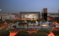
Inside, one gets the immediate sense that the simplicity is deceptive. The low ceiling of the entrance lobby is continued into the exhibition hall for around 15 feet, but then opens up into a large double-height exhibition space, which, unlike most such spaces, has the quality of feeling linked to the world outside. The structural work is done by six large columns, in a rectangular layout, leaving the space relatively clear for different configurations of exhibition and live performances.

3
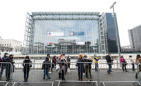
Spaces throughout the building, including the auditorium (3) and upper-level dining areas (4 & 5) offer views of the historic city. Photos © Filip Dujardin

4

5
On top of these columns, a grid of trusses—two bigger ones running north–south and four smaller running east–west—create space for two lateral sections of the ceiling to be lifted from 28½ feet to 45½ feet. These raised sections have clerestory windows on either side, allowing natural light to fall obliquely into the hall below. Acoustic paneling can be added to the double-glazed windows, meaning the space can theoretically host concerts as well as commercial shows. Its scale, 246 feet by 196 feet, in such a tight street grid is remarkable.
More squashed is the conference hall above. The low ceiling of the first 15 feet of the hall and the lobby are not simply an act of compression to make the double-height space feel all the more dramatic. It’s to accommodate the conference room above. And when one goes up to the second floor, although the cantilevered foyer provides a good entrance, the hall itself is shallow. It fits an impressive 520 visitors on retractable seating and can be easily divided in half, but there is no stage, just floor. The architects have mitigated this by insisting that there should be two large supporting columns between the hall and the foyer rather than the three slender ones the engineers wanted, giving a greater sense of space. However, although flexibility is a great virtue in the current economic climate, the lack of depth to the room compares unfavorably with the expansiveness below.
It is perhaps not the fault of the architects that the stack of spaces at the front of the building—main conference room, breakout rooms, and dining space—had to be squeezed in tightly to allow independent access to an exhibition hall. Although the stairs and circulation are bare concrete and rather narrow, the smaller aluminum-framed breakout rooms on the third floor are generous and daylit, with stunning views out onto the red-tiled roofs of the medieval city. Even more spectacular are the views from the dining area and terrace on the floor above. The decisions the team made on where to spend are generally faultless.
To fit all this program into an old town block, the architects excelled at a game of 3-D Tetris. The way in which this large facility not only complies with a heritage district’s planning rules, but also captures its spirit, and on a limited budget, makes it more than a success on its own terms—an example to cities around the world.
Click drawing to enlarge

Credits
Architects:
Eduardo Souto de Moura; META architectuurbureau
Engineers:
Mouton (structural); HP Engineers (m/e/p)
Consultants:
Daidalos Peutz (acoustics); FESG (fire safety); Vectris (mobility); Ingenieursbureau France and Laninzicht Landschapsarchitecten (landscape); Philip Aguirre y Otegui (integrated art project)
General Contractor:
MBG
Client:
City of Bruges
Owner:
BMCC
Size:
226,000 square feet
Cost:
$44 million (total); $37 million (construction)
Completion Date:
December 2021
Sources
Masonry:
Vande Moortel
Curtain Wall:
Hermans
Roofing:
Soprema
Green Roof:
Optigrün
Hardware:
Lecot, Dorma
Suspension Grid:
Hunter Douglas
Demountable Partitions:
Panisol
Fixed Seating:
Master Industrie
Lighting:
Bega, Trilux
Elevators:
Schindler


