Henry Hill House by Studio Schicketanz
Carmel-by-the-Sea, California

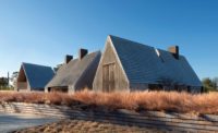
Henry Hill House. Photo © Tim Griffith
Architects & Firms
When renovating a building by a deceased architect, a practitioner likes to think that the original designer would approve—applaud, even—the upgrade. It’s a form of license, neatly incontestable. And, in fact, if Henry Hill (1913–84)—avid woodworker, practiced scavenger, endless tinkerer—could have envisioned his own 1961 house in Carmel-by-the-Sea, California, as recently revamped by local firm Studio Schicketanz, he would, inarguably, see a masterful tweaking that optimizes and gently refines his design.

The renovation (above and top) maintains the house’s footprint, which had been added onto over decades by Henry Hill, its original owner and architect. Photo © Tim Griffith, click to enlarge.
Born in England to American parents, Hill grew up in Berkeley, studied architecture at UC Berkeley and Harvard’s Graduate School of Design under Walter Gropius, and eventually partnered with Erich Mendelsohn in a San Francisco firm. With William Wurster, among others, he was part of the Second Bay Tradition, whose architecture melded the International School with the vernacular of woodsy, Japanese-influenced California coastal design. As is evident in his Carmel house, Hill didn’t hew to the norms, but brought a particularly whimsical take to an insistently geometric style, where texture and crafted details form a continuum with the weathered landscape.
Hill built the house—one of an eventual volumetrically dissimilar trio sited side by side, each now with a Carmel landmark designation—as a weekend retreat. It later became his family’s full-time residence. Everywhere were indications of his playfulness; indeed, his daughter, who sold the house to its current owners, called it her father’s “toy.” There were the programmatic enhancements over time to what was initially a 780-square-foot (including decks) rectilinear beach cottage, elevated for ocean views. A cylindrical addition provided a dedicated dining area; later, two bedrooms and a study further grew the structure to its present 2,200 square feet. And there were the quirky accretions. Even when not expanding, Hill kept adding. Pieces of leather and assorted materials, found objects and things left over from other projects—all were just randomly tacked onto the walls: it was a house as collage.
Mary Ann Schicketanz came to the project with regional-modernist bona fides (she had lived for a time in nearby Big Sur, an almost mythical piece of the California coastline where anti-slickness is an ethos) and a strong sense of what should be respectfully retained and what had to go—like a cramped window seat that looked onto cupboards instead of the sea. “We wanted a memory of the house but reinterpreted,” Schicketanz says, noting that “significant editing” was required.

The continuation of teak from the decks to interior floors reinforces the connection between indoors and out. Photo © Tim Griffith
Mostly absent amid the idiosyncrasies were up-to-date mechanical systems and code compliance, which the architect resolved. Working within the building’s footprint on the sloped lot, her biggest intervention, beyond taking it from period-funky to livable-cool, was opening up the dark interiors for functionality and a more fluid relationship to the outside. She removed some minor walls to combine and enlarge spaces, and repurposed previously wasted square footage, primarily on the lower level, for a workshop and home gym. She leveled the floors, using reclaimed teak (engineered for the interior) to match the decks, with the same plank width. And she restored most of the interior woodwork and reintroduced colors from the early 1960s scheme that had been buried under decades of layered paint.
The house had never been insulated. Schicketanz took the enclosure down to the studs at nearly every non-paneled wall and inserted insulation; a foam layer was also applied to the roof. Critical to the overall effort was keeping the envelope of vertical rough-sawn cedar siding intact. Instead of staying with forced-air heating, which would mean additional vents, she installed radiant heating—more energy-efficient, comfortable and controllable—avoiding exterior perforations. No cooling system is needed in this temperate climate.
Architect and clients were of the same mind on the question of replacing some of the existing glazing with double panes: not at the expense of the aesthetic, they determined—even for insulation. So, while the hugely inefficient jalousies in a few of the rooms are now double-glazed casements, the living room’s fixed windows, which Hill had made flush with the cladding, remain, so as not to compromise his intent (outer and inner trim pieces hold the single panes in place; double panes would project a fraction of an inch). The building’s landmark status allowed for relaxed energy-code conformity, but also required the close involvement of the Carmel Historic Resources Board, which oversaw all window modifications, including the as-close-as-possible match to the old, cross-reeded glass.
Schicketanz and her clients, for whom the kitchen was a priority, gave much consideration to the space, which had one entrance and a low ceiling, “a claustrophobic dead end,” in the architect’s description. The solution was not to move or expand it, but to establish an opening to the living room that also makes a visual connection with the adjacent deck; put in a skylight; and continue the counter top as a swirled table within the rounded dining room, creating more of a whole out of the two spaces.

1
A circular motif repeats throughout, in such elements as the main living area’s fireplace (1), the dining room (2), and the projecting bay of a den (3). Photos © Tim Griffith

2

3
In the main living area, the circular motif predominates. A large suspended canopy, which repeats on the exterior, was cleared of Hill’s glued-on plans of the great buildings of the world and is again pure Modernist form. A great example of its era, the fireplace of Roman brick and verdigris copper anchors the volume, while the spiral stair leading to the primary bedroom level wraps around it. More curves: Schicketanz put back the gold leaf in the reveals of the mahogany-framed arched windows where, at one point, gilded deer heads had hung (seriously).
Stripped of the flourishes, the house’s first iteration—and Hill’s elemental vision—can again be appreciated. Schicketanz achieved the “memory” of his work through various means. One example: while she removed the odd leather patches from the ceiling, she didn’t forswear the material altogether. In two of the private spaces, she faced custom built-in drawers with deep brown leather—an unexpectedly rich, and ultimately familiar, detail. As she acknowledges, “There’s a bit of Henry Hill in that.”
Click plans to enlarge

Credits
Architect:
Studio Schicketanz — Mary Ann Schicketanz, founding principal architect; Jacobus Swarts, job captain; Lorena Akin, architect graduate; Nicole Clapman, interior design principal
Consultants:
Duckbrew (structural), Monterey Energy Group (mechanical), Light Ideas (lighting), SV Landscape (landscape)
General Contractor:
Masterwork Builders
Client:
David DiGirolamo and Diana Morshead
Size:
2,200 square feet
Cost:
Withheld
Completion Date:
November 2020
Sources
Wood Refinishing:
Handcrafted Finishes by Friday
Custom Millwork:
Mellors Fine Woodworking
Windows:
Architectural Ironworks
Wall Coverings:
Phillip Jeffries


