Malibu House in California by Michael Maltzan Architecture
Malibu, California

The Malibu House. Photo © Iwan Baan
Architects & Firms
The Malibu Beach House’s broad, buff-colored facade is such an understated, unembellished plane that even its garage door is barely discernible. The only tip-off to the complexity within emerges at the wall’s entryway opening. It frames an outdoor vestibule, where black-and-white diagonal-striped murals flank mirror-polished steel doors, replicating the banded patterns deep into imaginary space. These paired murals, by artist Sol Lewitt, took inspiration from “dazzle” painting, an Op Art–like technique that rendered military ships optically inscrutable, beginning in World War I. Once over the threshold—or behind the “looking glass”—it becomes apparent that playful manipulation of perception permeates the entire place, as do multiple perspective-altering murals by the same artist.
“I think of a house both in terms of its architectural and its domestic concept, or program,” says architect Michael Maltzan, who designed this beachfront retreat for art collector and Creative Artists Agency cofounder Michael Ovitz, whose main residence, elsewhere in Los Angeles, Maltzan’s firm had completed in 2009. At 10,700 square feet, the Malibu house, for Ovitz and his fiancée, Jimmy Choo cofounder Tamara Mellon, is hardly a beach shack, yet this two-bedroom home—plus guest quarters, where children and grandchildren are welcome—opens itself almost casually to sand and surf. But its conceptual underlay is more elaborate, casting the building as an optical instrument, through which the artwork and seascape are viewed.

The minimalist street facade (above and top) includes an understated garage door and a large mirror-glass window, fronting a staff office. Entry doors are polished steel. Photo © Iwan Baan, click to enlarge.
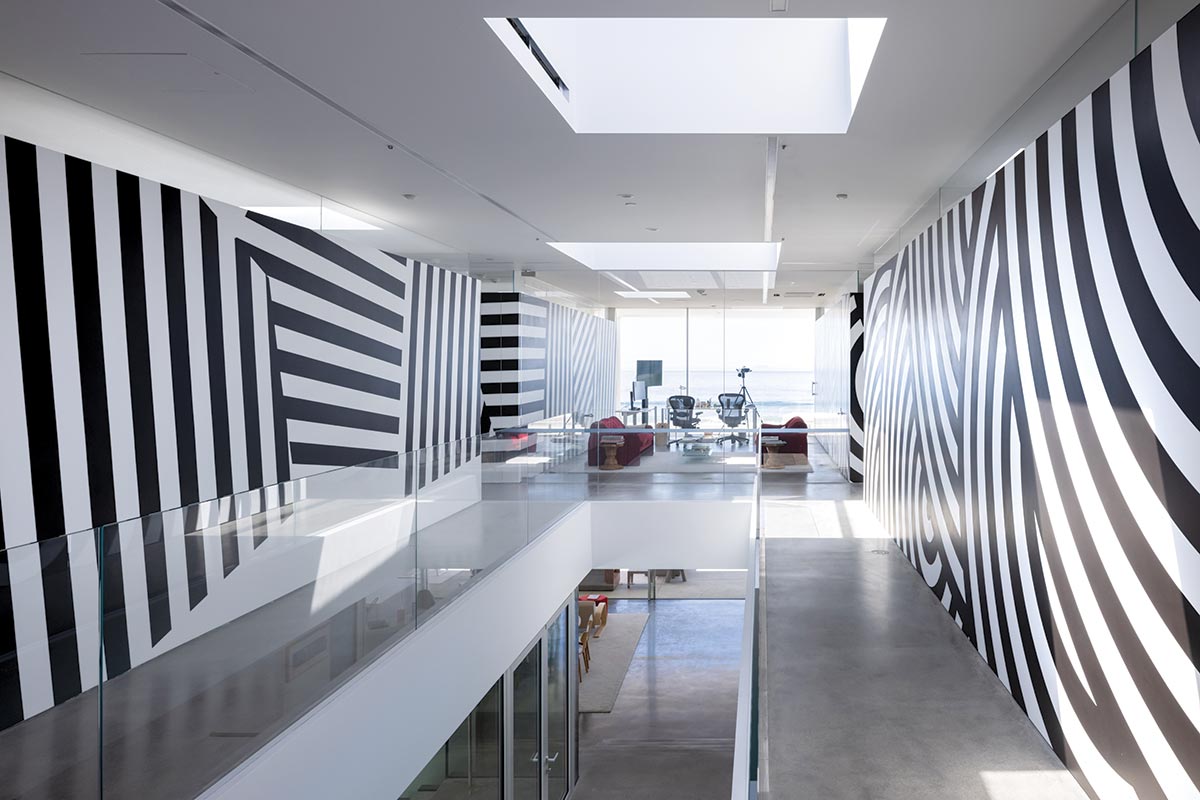
Just beyond the entry area, the plan begins to triangulate, diverging like a telescope, trained—through transparent layers, or lenses, of glass-walled space—on the ocean and horizon straight ahead. Along this broad, skylit passageway, more black-and-white Lewitt murals, almost kaleidoscopic in their dynamism, animate the flanking walls. Underfoot, polished-concrete floors, smooth as beach stone, morph into a wide stair, right on axis, leading down to the main living-dining level, where the sweeping ocean panorama reveals itself. This single expansive space—with its dining table for 20, full bar, and counter-ringed kitchen—has glass exterior walls that slide completely open to the sand. “I wanted Philip Johnson’s Glass House on the beach,” says Ovitz, who asked for abundant daylight and unobstructed views throughout the interiors.

Underfoot, polished concrete extends down to the living/dining area, opening to beach and pool. Photo © Iwan Baan
Though California mandates public access to all ocean beaches, a berm—created in this coastal zone to prevent erosion and devastation by rogue waves—gives the house remarkable privacy. The sandy area outside the main living/dining space forms a shallow bowl, from which the ocean is visible, but views of people down at the surf are not entirely blocked by the berm.
“Topography also played a key role in the house’s section” says Maltzan of the downward slope that extends from the Pacific Coast Highway, several yards away, to the quieter parallel street, from which the building steps down to the beach below. The unusual massing reinterprets a courtyard configuration. Here, the house’s triangular midsection—floating like a massive canopy over protected outdoor space—bridges between two barlike volumes, one street-side and the other along the beach. On the entry level, the foremost volume contains mostly service areas—garage, staff rooms, plus a home gym—whereas the triangle includes two spacious bedroom-bathroom suites, to either side of the stairway, extending over the living/dining area, with full-frontal ocean views. On the lower level, the entrance volume has four guest rooms, opening to the courtyard, with glimpses across the glassy living/dining space to the waves.
Near a playfully leaning column, the main stair (1) descends into the central outdoor space, between the pool and basketball areas (2). Photos © Iwan Baan

1

2
Like the street elevation, the white, neo-Corbusian beach facade is crisply orthogonal—but the courtyard geometries arc and swoop. There fat, round, white columns—one leaning and another partially sheared off on one side—support the triangle overhead, which meets the house’s front section with a great curve. Maltzan says he canted the pillar to harmonize with the court’s dynamism and cleaved another to acknowledge the intersection of orthogonal and diagonal ordering systems. Sculpturally expressive, the stairway descends from the triangle’s underbelly, with a basketball court to one side and a pool to the other. The entire idiosyncratic composition is playful and stylized, with the ball court’s resilient blue surface swerving toward the pool area, as if it were itself a body of water, bordered by a dense, highly graphic carpet of artificial turf.
Inside the bedrooms and home gym, the program of Lewitt murals switches from black-and-white to color. Integrating valued artwork into a beach house, with its exposure to salt, humidity, and sunlight, initially seemed challenging. But Lewitt “wall drawings”—which are always executed by a team, according to the artist’s written instructions—offered the solution. Ovitz, a longtime MoMA board member who had known Lewitt personally before his death in 2007, already had works by the artist in his main home. And the collection assembled for Malibu had the advantage of robust paint (which, in a worst-case scenario, could be reapplied). After participating in the selection process, Maltzan orchestrated a dialogue between the art and architecture that becomes particularly striking where, for example, the rhythm of spiraling steps, up to the rooftop, echoes Lewitt’s adjacent wall pattern; or where cubelike, axonometric murals fill the back walls of the glass-faced guest rooms, altering the reading of depth.

3
Sol Lewitt murals permeate the house, black-and-white flanking the entry-level stair hall (3) and vivid color along the guest room back walls (4). Photos © Iwan Baan

4
The house reached completion in 2020, midpandemic, providing a welcome refuge for Ovitz, Mellon, and family. With its clean, open Modernist lines—spanning a triple lot—the building stands out amid the surrounding, stylistically eclectic hodgepodge. “So far, reactions to the house have been overwhelmingly positive,” Ovitz reports. “That said, does anyone really ever know what others think? Doubtful, but we love it, so that’s good enough for us.”
Click plans to enlarge


