JKMM Reveals a Brick-Clad Addition to Helsinki’s Academy of Fine Arts
Helsinki

Photo © Tuomas Uusheimo

Photo © Tuomas Uusheimo

Photo © Tuomas Uusheimo

Photo © Hannu Rytky

Photo © Marc Goodwin


Architects & Firms
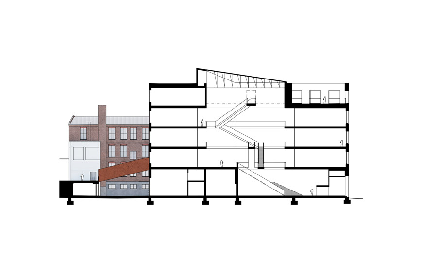
The interior of the new Academy of Fine Arts building in Helsinki by Finnish practice JKMM is not a neutral space in which to learn art, but a challenge to its students in terms of scale and drama. The main feature of the five-story, 140,000-square-foot building is a central top-lit triangular atrium defined by a dramatic steel staircase that cuts diagonally from one level to the next. This dynamic space is ostensibly functional, enabling the visitor to take in the structure’s organization in one glance and 300 students to move between studios, lecture halls, and other types of learning spaces. It is heroic in scale, though, and intention: a call to creativity.

Photo © Asmo Jaaksi

Photo © Marc Goodwin
This almost sculptural space is wrought from steel, concrete, and glass and is at least in terms of its color palette, neutral. “It is better for architects to be minimalistic with the use of materials, in general,” says Juha Mäki-Jyllilä partner of JKMM, a 2002 Design Vanguard firm. The building’s frame is in situ poured concrete which internally is left largely exposed or painted black. That palette of grey and black is augmented by little more than the steelwork of the staircases and balustrades. This severe color scheme adds to the drama of the central space which must be daunting to say, a young first year student who arrives from northern Finland to study illustration.

Image Courtesy of JKMM Architects
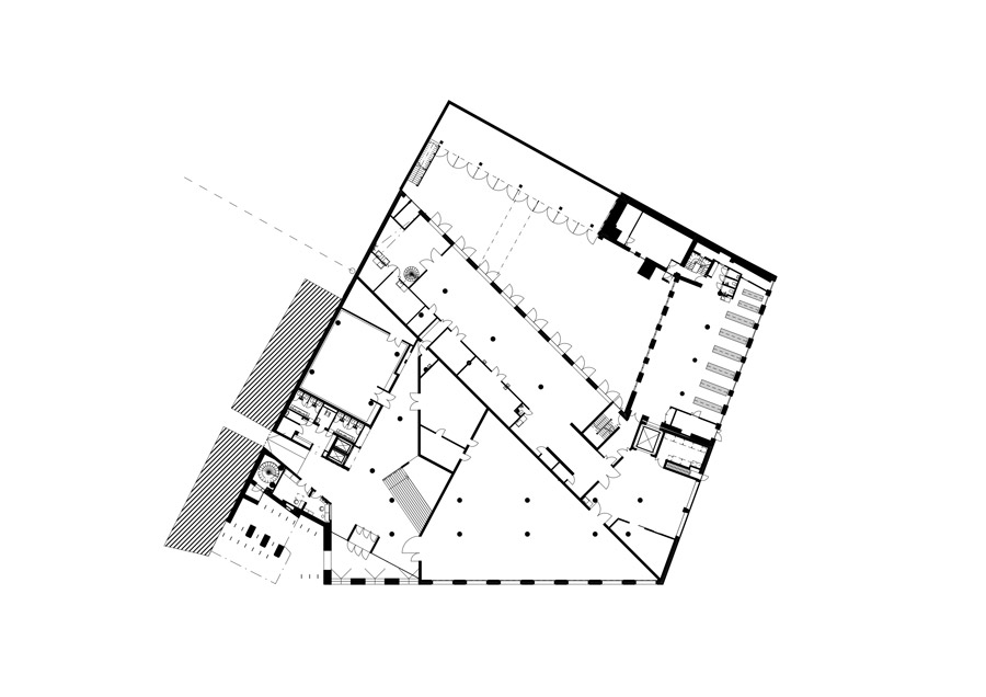
Still the atelier and study spaces provide ample opportunity for students to arrange things as they’d like. The large ateliers are generally on the street side of the triangle that runs north-to-south; first year drawing room is on the second floor, general studio space on third floor, and printmaking on the fourth floor. These spaces have been quickly co-opted by the students. The fine art studios now house individual timber-framed spaces: small nests in the wider room. On the side of the triangular plan running to the northwest, the more technologically demanding, smaller workspaces are stacked. CAD classrooms on the second floor, darkroom and printing lab on the fourth floor, for example.


Image Courtesy of JKMM Architects
The sculpture workshops and studios are by necessity on the ground floor of the rear wing, to the southeast. There is direct access to the sculpture courtyard there and a rear entrance through which materials can be brought straight into the studios. Elsewhere the building is much more flexible. One of the other purposes of the central atrium is to prevent departments from becoming silos; whole departments can be moved between floors. Textured glass on the partitions between the ateliers and the central space is a rare gesture towards privacy. As part of the extensive workshop with the end users of the building that was part of the competition process, students stated they preferred not to work in fishbowls.

Photo © Hannu Rytky
The aesthetic of JKMM’s interior is not just about neutrality and adaptability of course. It matches the scale and material quality of Sörnäinen, the neighborhood in which the academy sits. Sörnäinen is full of former factory and warehouse buildings and is still dominated by the huge Hanasaari coal-fired power station. The predominantly new-build Academy was constructed on the site of a former flour mill and presents its polite, brick-faced main facade to the key route which connects Helsinki to its eastern suburbs. Rising to an exterior terrace, or outdoor sculpture garden, and dominated by deep-set windows, the brick elevation, more subtly than the interior, evokes the textures of the surrounding industrial architecture well.

Photo © Marc Goodwin
From the exterior, the building is much more restrained. On the ground level, its street side is dominated by a huge gallery space—literally providing the Academy with a shop window to the street. Acting at an urban scale as a hinge point between the city center and a neighborhood in which the industrial buildings are slowly being converted for other uses, the Academy connects to the south to an existing Modernist silo building and the Theater Academy beyond. It also links to the east with an early 20th-century factory that has been renovated, to provide extra studio space to the rear of the building.
The Academy of Fine Arts will become a much more layered building, in the future. Every surface will have work pinned up and taken down from it; pin holes and pockmarks will be the norm. Yet its palette of industrial materials and the scale of the main atrium will never be erased. This is an inspirational building and the students who use it will be quietly compelled by it to make big, assertive art.

Image Courtesy of JKMM Architects
Architecture and Interiors: JKMM Architects; Film: Tapio Snellman


