UCSF Joan & Sanford I. Weill Neurosciences Building by SmithGroup with Mark Cavagnero Associates
San Francisco

The main entrance of the UCSF Joan & Sanford I. Weill Neurosciences Building faces Koret Quad, across the street. Photo © Tim Griffith
The first thing you notice is the light: a skylit six-story central atrium, sunbathed patient-treatment rooms, rows of daylit lab benches, and a broad, sunset-facing rooftop terrace. The 283,000-square-foot Joan and Sanford I. Weill Neurosciences Building at the University of California, San Francisco (UCSF) Mission Bay campus is crazy for light, even by California standards. For this atypical facility that integrates the research and treatment of neuroscience and psychiatry, SmithGroup and Mark Cavagnero Associates (MCA) took an unconventional approach, disregarding sterile institutional precedents in favor of a more natural environment. “I was trying to use this one idea of designing with light as opposed to a material—not steel, not concrete,” says design architect Mark Cavagnero. “Everything else is subordinate.”

Social areas and terraces occupy the center of the upper levels. Photo © Tim Griffith, click to enlarge.
Daylight is what Cavagnero used to organize the two-way flat-slab structure’s plan. The main, west entrance faces Koret Quad, a park at the center of the UCSF campus. With some encouragement from the MCA team, a dense line of trees was removed at the park’s eastern edge, opposite the entry, allowing the architects to take advantage of more sunshine and views to the quad. They established open terraces, social spaces, waiting rooms, and an infusion suite—where patients may spend hours receiving treatments—on this west end and located workspaces along the building’s glazed northern and southern expanses. The east side—which is clad with metal panels, has a few small windows and faces a parking garage with the Chase Center arena by Snøhetta just beyond it—holds mechanical rooms, circulation, and other spaces less dependent on natural light.
The north, south, and west elevations enable this strategy with a recessed glass curtain wall at the two lower clinic levels and a procession of white aluminum louvers that defines the four upper research floors. These fixed shading devices activate the glazed facade during the course of a day, as the sun’s ever-changing patterns of light and shadow wash over them. At the same time, they maintain daylit interiors (supplemented by LED task fixtures and overhead luminaires with occupancy sensors and manual overrides) open to vistas beyond, obstruct glare, and virtually eliminate the need for shades during summer months. They also reduce the building’s heat load, allowing for a lighter low-E coating on the glass. Weill Hall recently achieved LEED Gold certification, higher than the UC-required LEED Silver.

Openings in north-facing louvers soften the building’s mass and allow views in. Photo © Tim Griffith
The louver design—which was developed using virtual-reality simulations as well as quarter-scale and full-scale models—needed to address the sunny and windy Mission Bay conditions, attach to the curtain wall structure, and project far enough from the glass for window washing. As a bonus, this projection gives occupants of the university-mandated 75-square-foot perimeter offices the impression of having greater space. Large patches of glazing were left exposed within this screen for several reasons. These typically coincide with shared spaces, such as waiting areas and open-plan offices, where there is no seating near the glass, explains MCA senior associate Paul Davison. Contextually, he adds, the openings respond to bay windows in an adjacent building and help to soften the building’s mass while allowing passersby to see into the building. After studies showed that the adjacent Mission Hall would help protect the south facade from heat gain and glare, “we felt comfortable with the larger openings, to admit more daylight and allow greater transparency,” he says.

The skylit atrium is clad with sycamore and oak. Photo © Kyle Jeffers
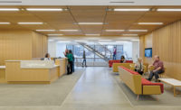
For Cavagnero, daylight is an abstraction, or representation, of nature, which he sees as essential to the well-being of occupants. The interior material palette—sycamore-veneer wall panels, oak flooring, gray broadloom carpets, and a mix of olive green, slate blue, and dark brown furniture—is intentionally more natural, even residential, than what one might expect in an institutional building. The architect had a personal incentive for this scheme. As he was beginning work on the project, his mother was diagnosed with dementia—a condition to be studied at Weill Hall—and he wanted the facility to be calming to visitors like her, rather than complex and disorienting. “Her connection to liking this space would have to be something natural. It wouldn’t be Mark’s stupid concrete!” he quips. “She could walk in and say, ‘This is comfortable; this is beautiful.’”

1

2

3

4
Sunlit spaces include a clinic waiting room at the entrance (1) and third-floor infusion suite (2), plus sixth-floor meeting room (3), and “town center” (4). Photos © Kyle Jeffers (1, 2 & 4), Tim Griffith (3)
MCA was equally concerned for the neuroscientists and psychiatrists, who will spend long hours working here. Davison notes the firm’s intention to “create a great environment, connected to nature, because ultimately that is what they’re studying.” The building’s aesthetic does not translate as raw or unrefined, however. “We worked hard on how every piece is assembled, attached, crafted,” says Cavagnero. “The scientists love the fact that there’s a precision in the building.” Such exactitude is derived from the lab benches themselves, which have a standard 10-foot 6-inch spacing between them. This measure and divisions of it are used throughout the structure, from the column grid and width of the wall panels to the 7-inch spacing between the louvers.

Overlooking Koret Quad to the west, a comfortable fifth-floor terrace is shaded by a more expansive terrace above it. Photo © Kyle Jeffers
Despite its simple organization and palette, this building was not designed to disappear into its surroundings. With its central position on the UCSF Mission Bay campus—across Koret Quad from Ricardo Legorreta’s imposing William J. Rutter Center—it is meant to be seen. Its glass-and-louver facade is decidedly different from the many travertine-clad buildings on campus. This not only brings daylight to its occupants but also makes the building glow at night—a beacon of activity as researchers work on their next breakthrough. Cavagnero says the university understood that a unique building could attract scientists by offering an environment that was unlike any other. According to Dr. Stephen L. Hauser, director of the UCSF Weill Institute for Neurosciences, “The building has to be a place that radiates hope—that is luminous.”
Click plan to enlarge

Click plans to enlarge

Click section to enlarge

Credits
Design Architect:
Mark Cavagnero Associates — Mark Cavagnero, design principal; Kang Kiang, principal in charge; Paul Davison, project director; Federica Carrara, lead interior designer; Joan Young Park, senior architect
Architect of Record:
SmithGroup – Suzanne Napier, architect of record; Jon Riddle, project manager; Robert Colyer, project architect; Sally Whiteley, clinical planner; Alex Munoz, Lab Planner
Engineers:
Degenkolb (structural); Critchfield Mechanical (mechanical); Freyer and Laureta (civil); Walters & Wolf (facade)
General Contractor:
DPR
Consultants:
Jacobs Lab Planning Group (lab programmer); Loisos + Ubbelohde (lighting); Atelier 10 (sustainability); Arup (acoustics/vibrations/code); CPP (wind engineering); Office of Cheryl Barton (landscape)
Client:
Univeristy of California, San Francisco
Size:
283,000 square feet
Cost:
Withheld
Completion Date:
June 2021
Sources
Glazing:
Viracon; Metcoe Skylight
Metal Panels:
Elward; USG
Wood:
9Wood; AML Limited; Mission Bell USA Millwork
Tile:
ASN NaturalStone; Eurowest


