Gensler Renovates Lobby of New York’s First Postmodern Skyscraper, 550 Madison Avenue


As these things go, the uproar that began in 2017 over the proposed transformation of Philip Johnson’s infamous “Chippendale” tower in Manhattan, the first Postmodern skyscraper, has now died down to a whimper, if anything can be heard at all. The initial protests against Snøhetta’s scheme to replace the pink granite facade at the lower levels with a diaphanous glass curtain wall eventually led to the building—designed with John Burgee and completed in 1984—becoming the youngest to receive landmark designation. Over the last three years (and after a hiccup or two), Olayan Group, the current owner of the tower, now known as 550 Madison Avenue, has proceeded to completely reimagine the interiors.

Johnson's pink granite of the original walls are crushed into the terrazzo floor.
Photo © Fred Charles
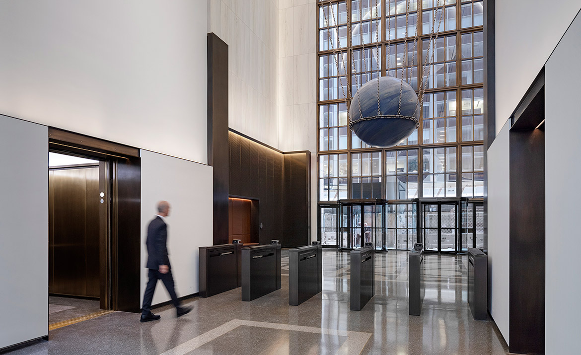
Following the landmark designation in 2018, Snøhetta switched its scheme for the lobby to one that was purely preservation. But in 2019, Olayan announced that Gensler, who had been retained for work on the building’s upper levels, would be redesigning the lobby. And Gensler has done what Gensler does best. Unveiled on Wednesday, the new ground floor entrance space is a soaring corporate interior for the 21st century, well-executed and wrapped in a golden metal mesh at eye level and slick white marble overhead. There are nods to some of Johnson’s design inspirations—the pink granite of the original walls were crushed into the terrazzo floor, in a pattern taken from the Pantheon—but no trace of the building’s Postmodern past. A new elevator bank services the now multi-tenant building, originally home to AT&T, then Sony. (Pre-Covid, tenant numbers were expected to triple, from just under a thousand to 3,000, but that remains to be seen. The building is currently 45-percent leased.)

The new lobby is clad in both white marble and dark metal mesh.
Photo © Fred Charles
At the center of the lobby is a bold artwork that replaces the Spirit of Communication, also known as the Golden Boy, a statue that had been the symbol of AT&T. Suspended by thick chains from the 70-foot high ceiling, artist Alicja Kwade’s Solid Sky is a 24-ton piece of quartzite stone resembling the earth, whose spherical shape also references the rounded center of the building’s Chippendale pediment.
Other aspects of the redesign, including amenity spaces on the upper floors and a landscaped public area at ground level, designed by Snøhetta, are expected to roll out over the next year or so. In the meantime, visitors to the building can take their chances beneath the weight of the world.


