Continuing Education: Experiential Graphic Design
Immaterial Material

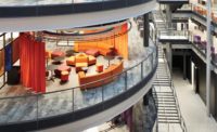
The lobby of 88 Kearny. Photo © Jason O’Rear
As a visitor passes through an office-building lobby, images that are partially glimpsed in one wall—raindrops, time-lapse clouds, a school of fish—subtly respond: the rain softly falls; the fish swim alongside. In the curtain wall of a campus biology building, patterns based on fundamental principles of nature morph from one to another as visitors create and upload designs of their own. In the facade of a science gallery, over 200 handmade glass bricks become miniature projection booths playing a kaleidoscopic preview of the exhibition inside. Architecture and experiential graphic design (EGD, or XGD) are converging; in the process, digital media have become dynamic new construction materials.
Imagine a Venn diagram showing the place-making arts and the communication arts as two intersecting circles: the area of overlap is the interdisciplinary practice of EGD. Spanning the spectrum from information to art, EGD orchestrates such elements as typography, imagery, color, form, and, increasingly, technology to create environments that communicate, according to Cybelle Jones, CEO of the Society for Experiential Graphic Design (SEGD). “Silos of design are breaking down,” she says. “Architects are doing digital, and experiential designers are creating places and spaces.” Jones, who trained as an architect before embarking on her career in EGD, personifies this convergence. What’s accelerating it, she suggests, is the contemporary pace of change, whether in response to the pandemic, the climate crisis, social inequities, economic disparities, or these factors in combination: “Architecture is stable, secure, and solid, but our world is rapidly changing. Digital materials provide a layer that enables buildings to become more agile and responsive to changing needs.”

In San Francisco, Gensler has created a responsive gallery (above and top) from an awkwardly proportioned office-building lobby. Photo © Jason O’Rear, click to enlarge.
The impact of the pandemic in emptying out America’s office buildings reinforces the business case for the use of digital media in the renovation, recently completed, of the lobby of 88 Kearny, a 22-story mid-1980s tower in San Francisco. “Now that people have grown used to working from home, there’s a much greater burden on buildings to provide a reason—something delightful and different—to come to the office,” says Doug Zucker, a principal in the local office of Gensler, the renovation’s architect. A 120-foot-long corridor, 10 feet wide and 23 feet high, leads from the multi-tenant building’s street door to its elevator bay. “Everyone had to experience this tunnel,” says Zucker. “It was terrible, and we needed to figure out how to make the experience magical.”
Video © Gensler
The solution makes a virtue of the corridor’s awkward proportions by turning it into a responsive digital gallery. Viewed axially from the entrance, the long wall of the lobby presents a segmented image—a black-and-white landscape, almost-abstract textures, microscopic nature, or maybe something seasonal. As the visitor proceeds along the gallery, the image is revealed to consist of 25 slices stepped 40 inches apart, each slice an 8-inch-wide by 23-foot-high LED screen integrated into the corridor wall. Sensors in the ceiling detect the visitor’s arrival, group size, speed, and proximity to the screens, and signal the images to respond—rain splashes in response to footfalls; dandelion fluff floats as if on a breeze stirred by the visitor’s passing. “It will just be fun and you’ll smile,” says Zucker. In the elevator foyer, the image reappears on the end wall, now whole and responding in real time to other visitors as they move along the corridor.
The digital component of the project is more complex in its programming and design than in its hardware. Big screens are expensive—and they put out a lot of heat, among other issues—so covering the entire wall wasn’t an option. Instead, the display consists of smaller, not especially high-resolution screens (a deliberate strategy to prevent the technology’s rapidly dating), covered with a diffusing tensile fabric. As well as helping to protect the screens and extending their useful life, the fabric (which is commonly used for stretch ceilings) softens the appearance of the LEDs and presents as an architectural rather than technological surface.
About a third of the cost of the lobby is digital—including equipment, programming, and the purchase of assets, such as specially commissioned photography—with funds from the building’s operations budget ear-marked for check-ins and upkeep to software and hardware. “Normally with architecture, it’s exciting and fresh on the day it opens, and as time goes by it becomes less and less so, until in 15 years, you renovate,” says Zucker. “With a digital experience, we can continually update.” A person could come to work here every day and never see the same display twice. And instead of sticking a Christmas tree in the corner for the winter holidays, says Zucker, “we can have it snow.”
Engaging building users with architecture-integrated interactive media is a key EGD strategy at the Anne T. and Robert M. Bass Biology Research Building at Stanford University. The five-story, 132,000-square-foot structure—designed by New York–based Ennead Architects (base building) and the San Francisco office of Flad Architects (interior architecture), and completed in 2019—consolidates the university’s biology department and serves as a gateway to a new science precinct. To contrast with the literal narratives on signage along the campus path to the precinct, the university asked the design team to express Bass Biology’s identity and function in innovative, non-literal ways. “Integrating digital technologies architecturally requires an intention and a purpose, but more importantly an advocate,” says Ian Grossman, Flad’s project architect. “The client was committed to incorporating digital media into the project in a manner that hadn’t previously been done on campus.”
Responsiveness and change are distinguishing characteristics of life, so the ability of digital methods to convey those qualities makes them especially relevant for a biology building, says Michael Yun, a principal at Knot, experiential graphic designers for the project. The design takes “patterns in nature” as its theme, and uses such pattern types as fractals, spirals, waves, moiré, and spots and stripes to inspire a variety of animated and interactive elements.
Above the building’s main entrance, an installation called Morphogenesis displays a potentially infinite series of passerby-generated Turing patterns (named after Alan Turing, who identified the mathematical equations that explain spots and stripes in nature). Working with Australian artist Jonathan McCabe, who first coded the Turing equations into the basis for a digital display, the building’s EGD team figured out how to make the equations interactive. The team teased out the variables, and connected them to a system (basically a video synthesizer) that passersby could manipulate with sliders on a touch screen integrated into the ground-level curtain wall glazing. When they have something they like, they press a button to upload it to the permanent database, and head around front to watch the display morph into their pattern on a media mesh screen 32 feet tall before it slowly transitions to the next one.

1

2

3
Passersby can manipulate Morphogenesis, an installation on Stanford University’s Bass Biology Building (1 & 2) by using a touch screen (3). Photos © Tim Griffith/Courtesy Flad Architects (1 & 2), Gabe Border (3)
The Bass mesh screen is a standard architectural product commonly used for sports stadium signage, with high-output, low-energy LED pixels integrated into the outward facing side. From the inside, it’s like looking through the mesh of a solar shade—and in fact the screen serves that function for a glass bridge that links the building’s two wings. The material may be common, but using it interactively is a first, according to the manufacturer.
Another of the building-integrated installations is a 60-foot-long image based on waves, by local artist Gail Wight, which covers a series of glass panels enclosing a conference room. The work consists of more than 2,000 inverted-color photographs of waves digitally collaged together so tightly that the source images become indiscernible, and the composite resembles an ink drawing of a roiling, near-abstract landscape. Backing the image, which is still, a window film applied to the panels turns opaque or transparent in response to electrical currents that are tied to the tide levels at Stanford’s marine biology research station in Monterey Bay, 90 miles away.

Digitally collaged images of waves have been integrated into conference-room doors within Bass (above). The glass turns opaque or transparent in response to electrical currents synched with the tides in Monterey Bay. Photo © Tim Griffith
“Interactive digital tools have been around for a long time,” says Yun, “but putting them into spaces and using more thoughtfully developed systems to help integrate with the architecture is a new and rapidly developing area. Over the last couple of decades, the ubiquity of this technology and these tools has skyrocketed.” Technology is no longer the limiting factor, he says—it’s now only a matter of imagination.
As at Stanford, innovating with architecturally integrated digital media was an aspiration for Science Gallery Melbourne, where exhibitions aimed specifically at 15- to 25-year-olds explore the confluence of science and art. Located between the University of Melbourne, Australia, and the city’s central business district, the gallery forms part of Melbourne Connect, a three-building, 800,000-square-foot innovation hub designed by the local office of Woods Bagot and completed this year.
Video © Arup

4

5
Venetian glass bricks incorporating touch-sensitive screens are integrated into the entry portal of Woods Bagot’s Science Gallery Melbourne (4-6). Photos © Trevor Mein

6

Click drawing to enlarge. Courtesy Arup
The 12-story building’s street-front podium is executed in brick, with upper stories consisting of prismatic glass panels and colored-glass shading hoods. At the gallery entrance, the red brick transitions from a contextual running-bond pattern to form a pixelated complex-geometry portal that incorporates 226 hand-cast Venetian-glass bricks. Backing each brick is a touch-responsive high-resolution screen (1280x720px), which can be programmed individually or in concert with others. The touch-responsiveness can enable nearly the same interactivity as a tablet computer or smartphone: when glass bricks are tapped, new layers of content unfold—on the tapped screen itself, and perhaps on adjacent bricks as well, or even the entire facade. All 226 screens together create a resolution of over 200 megapixels—the equivalent of about 70 iPhone 12s. Content is generated at over 800 megapixels (a requirement because the digital bricks are dispersed among clay bricks), forming what for now is the world’s highest-resolution interactive display. The combination of the digital content and the optical distortions of the hand-made glass generates an effect that’s both dramatic and intimate, and invites visitors to peer in for a closer look.
Research and development for the digital bricks took three years and brought together an interdisciplinary team that included the architects, construction professionals, electronics and lighting engineers, and graphic designers. They worked out how to support the tech-integrated bricks structurally, developed a mortar mix to bond the glass bricks with clay ones, identified a particular black to paint behind them so that the screens wouldn’t be affected by the color of adjacent bricks, and coordinated access openings in the large precast-concrete panels that back them. They also ensured that the screens would be able to detect finger taps through the solid glass, resolved the project’s unprecedented demand on computer graphics cards, and designed (and continue to design) the content. “The wow factor as you pass through this overscaled brick entrance portal sets up the experience of the gallery inside,” says Hazel Porter, a principal at Woods Bagot, “and offers a dynamic and engaging experience in its own right.”
As media architecture increasingly transforms public spaces by embedding digital technologies in the built environment, current examples worldwide are too often doing so to the detriment of the architecture, say the gallery’s head of research and emerging practice, Niels Wouters, and its digital experiences manager, Susie Anderson, in an article they coauthored for the University of Melbourne’s magazine. The design for Melbourne Connect, however, “lets the architecture speak for itself—even when screens are switched off,” they say.
The seamless integration of architecture with experience design is a major strength of each of these three examples—88 Kearny, the Bass Biology Building, and Melbourne Connect—making them more agile and responsive while intensifying their identity and meaning. “The more integral the dialogue between architects and experience designers, the better the project serves its audience,” says SEGD’s Jones. She expects to see more such partnerships as the potential of digital materials to transform the experience of architecture becomes more widely understood. “Architects have a new tool set at their disposal,” she says, “one that lets buildings do things that maybe they haven’t been able to do before.”
Continuing Education

: To earn one AIA learning unit (LU), read the article above, watch the videos within, and read The Business Case for Media Architecture: Modelling Project Benefits to Justify Investment, Niels Wouters, Franz Wohlgezogen, Kim Halskov; May 2021 (PDF).
Then complete the quiz. Upon passing the test, you will receive a certificate of completion, and your credit will be automatically reported to the AIA. Additional information regarding credit-reporting and continuing-education requirements can be found at continuingeducation.bnpmedia.com.
Learning Objectives
- Define the term “experiential graphic design.”
- Outline the professional disciplines involved in creating environments that incorporate experiential graphic design.
- Describe some of the hardware typically involved in environments shaped by experiential graphic design.
- Describe various ways experiential graphic design installations can respond to their surroundings and engage building occupants.
AIA/CES Course #K2110A


