Mantel Ortho by Johnsen Schmaling
Cedarburg, Wisconsin

Mantel Ortho. Photo © John J. MacAulay
Architects & Firms
Anyone who has endured the pain and annoyance of a mouthful of metal to achieve a perfect smile has also probably experienced the typical orthodontist’s office, with its insular, maze-like hallways and windowless treatment rooms. It certainly doesn’t make the experience any more fun.
Architects Brian Johnsen and Sebastian Schmaling set out to change that paradigm for an orthodontist with a growing practice on the outskirts of Cedarburg, Wisconsin, a rural town 30 miles north of Milwaukee.

The building’s largely opaque street-facing side is animated by an artificial green wall. Photo © John J. MacAulay, click to enlarge.
For Mantel Ortho, the architects conceived a one-story linear volume set on an empty lot that bridges the divide between the sprawling town and adjacent agricultural land. While the building’s west elevation, which fronts a busy county road, needed to be windowless to conceal lab and sterilization rooms, the east-facing facade is entirely glazed, flooding open treatment bays with daylight and offering views out to a tranquil meadow. “This changed the entire experience for the patients, because they’re not in a little cubicle with fluorescent light,” says Schmaling. “It’s now a spa experience, where they’re overlooking nature rather than sterile equipment.”
Johnsen and Schmaling, who founded their eponymous Milwaukee-based firm in 2003, have accrued national accolades for high-end residential design and boutique commercial projects. A medical office isn’t entirely outside their wheelhouse—the nine-person studio completed a daylit dentist’s office in Milwaukee in 2017, and it’s what brought Dr. Alison Mantel to their door. “One thing that surprised us was how easy it was to integrate the technical requirements into the architectural framework we had envisioned,” says Schmaling. “We thought they’d prevent us from doing things visually and aesthetically, but they were easy to resolve and didn’t have an impact on what we wanted to achieve.”

A trellised entry procession (top) leads patients to the open-bay treatment area (above). Photo © John J. MacAulay
For Mantel, the architects organized the clinic’s programmatic requirements on either side of a central circulation spine that runs north-south through the bar building. (A window at each end helps orient occupants and connects them to the outdoors.) After guests enter the building under a trellised forecourt and covered entry walk, they are guided by a wood-slatted ceiling to a reception desk and light-filled waiting area. The design team turned to clever and economical touches where possible, such as using simple drawer pulls—painted the office’s signature green—as wall hooks for coats and bags. Polished concrete floors round out the mostly neutral palette, while a bright green wall in the treatment bay adds a lively touch.

1

2
A wood-slatted ceiling guides patients to reception (1) and the waiting room (2). Photos © John J. MacAulay
The circulation spine continues to the six open treatment bays, where the exposed wood-beam ceiling extends to 14-feet high. Each patient chair is angled for optimal views through the aluminum-framed glass curtain wall. The wall, which is angled slightly to embrace the prairie beyond, rests atop a built-in bench that offers parents and caregivers a place to sit during treatments.

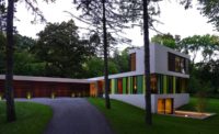
Extensive glazing on the back elevation brings light and views into the treatment areas. Photo © John J. MacAulay
Opposite the treatment bay, a sleek service island appears to float within the wall separating the lab from the public areas. An open shelving system on either side of the island allows staff to pass tools between the lab and the treatment bay, keeping the patient areas free of clutter.
Johnsen and Schmaling also gave Mantel a family treatment room, which can accommodate a group of patients, as well as a consultation room with a one-way mirror to allow parents to keep an eye on kids in the waiting room. But packing all of this program into one story yielded a street-facing facade that was quite long and uniform.
To articulate the bar volume on the exterior, the architects “pulled” and “subtracted” certain areas from the mass. For example, the base bar is clad in low-maintenance, durable poly-ash board in dark gray, while the lab and treatment areas are contained in a light gray stucco box that appears to “clip on” over the base volume.
The box, in turn, frames a green wall composed of artificial plants that serves as both a striking billboard and a palimpsest: The willfully manmade material alludes to a bird’s-eye view of farmland. “The path of so-called progress is changing the landscape here rapidly. The wall is like a vestige of memory, a reminder of the area that we are occupying,” says Schmaling.

The clinic embraces the adjacent pastoral view. Photo © John J. MacAulay
Mantel says that her practice is on track to grow about 30 percent more this year than in the previous two years, which she credits, in part, to the new building. “What was notable was a much higher percentage of patients’ scheduling to start treatment after their initial consultation, rather than shopping around or starting someplace else,” she says. “The building function has been ideal. We have patients frequently remark about the beauty of the space. Many feel relaxed with the outdoor views. When we were able to open the clinic back up [after Covid], it filled my heart to watch parents reconnect with their friends on the treatment-bay bench.”
For Schmaling, the clinic’s success is a testament to the power of a small architectural practice’s stepping into territory typically reserved for a handful of specialized firms. “You don’t have to be a health-care-design specialist to do something that has architectural merit,” he says.
Click drawing to enlarge

Credits
Architect:
Johnsen Schmaling Architects — Brian Johnsen, Sebastian Schmaling, principals in charge; Matt Wendorf, project manager; P.J. Murrill, Ben Penlesky, Angelina Torbica, project team
Engineers:
Core 4 Engineering (structural); M Squared Engineering (civil)
General Contractor:
Peridot Construction Management
Client:
Dr. Alison Mantel
Size:
3,800 square feet
Cost:
$1.3 million
Completion Date:
July 2020
Sources
Rainscreen:
TruExterior
Stucco System:
Dryvit
Membrane Roofing:
Johns Manville
Fluid-Applied Roofing:
Coelan
Windows/Entrances:
Tubelite
Interior Doors:
Jeld-Wen
Hardware:
Corbin Russwin
Interior Finishes:
Acoustical Surfaces, Armstrong, Sherwin-Williams, LG Hausys, Mohawk
Furnishings:
Herman Miller
Lighting:
Halo, WAC Lighting
Lighting Controls:
Lutron
Plumbing:
Blanco, American Standard, Kohler
Green Wall:
Vertical Greenwalls


