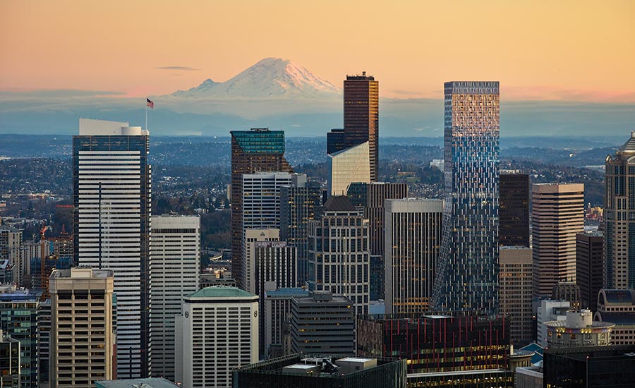
Rainier Square by NBBJ
Seattle

Rainier Square. Photo © Moris Moreno
Architects & Firms
Humility is not a word often associated with skyscrapers, but scale need not override context in architecture. When the site is a downtown Seattle block anchored on one corner by Minoru Yamasaki’s Rainier Tower—a beloved local icon with a white, flared concave base supporting 41 stories—context is everything. Even Yamasaki, a native of Seattle, approached the design for his 1977 building in response to his own earlier work, diagonally opposite Rainier Tower, for the 1964 IBM Building, a 20-story high-rise generally considered the precursor to his 1973 World Trade Center in New York.

The carved base of Minoru Yamasaki’s Rainier Tower informed Rainier Square’s gentle slope. Photo © Moris Moreno, click to enlarge.
Adding to this high-Modernist mix, NBBJ Architects has gingerly inserted its new 1.3 million-square-foot Rainier Square—a 59-story mixed-use skyscraper completed in September 2020—on the block’s northwest corner, with a gentle upward slope that performs almost like the architectural equivalent of a bow down to the older landmark. The geometry of Rainier Tower’s inward-curving base informed the swoop of Rainier Square as it transitions from a four-story retail podium on Fifth Avenue to the 33 stories of office floors that diminish in size as they rise, topped by the even skinnier 20 stories of residential tower. Mechanical floors at levels 38 and 59 complete the building.
Mindy Levine-Archer, a partner with NBBJ, describes the new high-rise’s combination of vertical and angled flat glass curtain wall panels as an “accordion” in the way it arcs upward without employing curved elements. NBBJ adopted this geometrical strategy as a way to transition from the larger floor plates for the offices to the smaller floor plates for the dwellings higher up. “In Seattle, residential buildings have a limited floor plate size, whereas offices do not, so we had to think how we were going to go from one to the other in an elegant way,” says Levine-Archer. Seattle’s Municipal Code regulates residential floor plate sizes as a ratio to the block size when buildings exceed minimum heights, a threshold Rainier Square, at 850 feet high, easily surpassed.

1
Vertical and angled flat glass curtain wall panels act as an “accordion,” arcing upward without employing curved elements (1). A glazed scoop adds definition to street-level retail (2). Photos © Moris Moreno

2
The project’s original brief, selected through a call for proposals by the site’s landowner, the University of Washington, envisioned six levels of subterranean parking, plus the retail podium, tenant office space, market-rate rental housing, and a separate 12-story hotel tower, as well as common areas and amenity space. In 2019, the hotel tower design was changed to tenant office floors to meet evolving market conditions. The tower’s office block includes a garden deck, with a landscape designed by Seattle-based GGN, as part of the lobby and amenity areas on floors two and three, which sit within the retail podium. A residential sky lobby at levels 39 and 40 contains a separate elevator bank for accessing the apartments above and has space for luxury amenities.
Greg Johnson—CEO of Seattle-based developer Wright Runstad & Company, which controls the 80-year ground lease for the project—found the diversity of uses in the stacked program presented flexibility in vertical organization during the design stage. And the development team appreciated the University’s interest in maintaining views and daylight access to Yamasaki’s tower, which the institution also owns. “We weighed those considerations with the expectations for dramatic design, and the need to attract office tenants and residents to premium apartments,” Johnson says. Amazon leased the entire office space early on but, while considering a reduction in its workforce in Seattle, is now opting to sublease rather than occupy it, despite the tough commercial market.

The design team wanted to ensure that the building—Seattle’s second-tallest—works both as part of the skyline and as part of the street. Photo © Moris Moreno
Levine-Archer and her team were sensitive to the fact that the building—Seattle’s second-tallest—would need to work at several scales: as viewed from a distance and by pedestrians engaging with it at ground level. The podium incorporates wide expanses of glazing along the street, connecting retail tenants, like a food cooperative, to passersby who would be potential customers. Taking cues from Yamasaki’s metal-and-glass curtain wall, NBBJ developed the tower’s glass curtain wall system, interspersed with 2-foot-wide insulated aluminum panels finished with a shimmery mica paint, which protrude from the facade. The panels provide a repeating element that glimmers across the tower’s mass from afar, while defining a scale and texture to those at street level. The same panels enclose the mechanical floors at the top of the building, creating a “cuff” element also found in the two adjacent Yamasaki buildings.

The office tower’s main entrance level connects to a larger public lobby via escalators, elevators, and stairs. Photo © Moris Moreno
The design team employed shadow studies and curtain wall mock-ups to refine the geometry of the panels, so they could act as prisms, creating shadows on each elevation. Each of three types of panels were also rotated 180 degrees to ultimately result in six unique geometries. To create the building’s signature swoop, glazed panels connect at the level of the ceiling of one floor and step back in an angle to the sill of the floor above—in effect, a sloped spandrel condition. The residential curtain wall matches that of the office floors but incorporates operable windows, for natural ventilation. At one corner of the site, the architects carved out a glazed scoop to add definition to the street-level retail.
The tower’s structure consists of steel, with an innovative core design that integrates prefabricated steel panels with on-site concrete work. Developed by Magnusson Klemencic Associates (MKA), the project’s structural engineers, the so-called “SpeedCore” design reduced construction time significantly (see sidebar, opposite). Given the tower’s height, wind load played a bigger part in the structural criteria than the site’s seismic hazard.

The SpeedCore’s protruding steel rods form a textured surface in the office tower’s elevator lobby. Photo © Moris Moreno
Ron Klemencic, chairman and CEO of MKA, and his team addressed wind loads by installing tuned liquid mass dampers at the top floor mechanical room, which consist of two 36,000- gallon water tanks in concrete vaults. As the building sways in the wind, the water sloshes back and forth against baffles in each tank as a directional countermotion, effectively balancing the movement to achieve a range acceptable for human comfort. MKA addressed the majority of the wind loads with steel outrigger trusses, which extend 40 feet from the core at the 38th-level mechanical floor and connect to three outrigger box columns at both the north and south elevations. “The columns act like ski poles, and the outrigger trusses are like the arms of the skier,” says Klemencic. For now, the only thing skiing down the slopes of the building is its maintenance unit, which extends 155 feet from the roof for window washing.
Rainier Square represents a leap in skyscraper evolution for Seattle, fulfilling the varied programmatic demands in an aesthetically unified and elegant tower that celebrates the rich architectural heritage of Yamasaki’s nearby originals.
Radical at its Core
Demands to reduce the budget and expedite construction are two imperatives at top of mind for most private developers. Rainier Square’s SpeedCore design solves a problem that plagues tall building construction everywhere: how to minimize a schedule lag when building a concrete core that leads the erection of the surrounding steel structure. Choreographing separate trades, which are simultaneously adding floors in their respective materials, only exacerbates the issue.

3

4
A diagram shows the tower’s overall structure (3), and a construction shot depicts the SpeedCore being erected as decking rises around it (4).
Click diagram to enlarge

Ron Klemencic, chairman and CEO of Magnusson Klemencic Associates, the project’s structural engineer, had never implemented his idea for a composite-plate shear wall core—or what is now called the “SpeedCore”—on a high-rise before. Originally conceived in 2009 as a collaborative research project with Purdue University and subjected to years of testing, the SpeedCore at Rainier Square consists of eight concrete-filled steel box columns at the core’s corners, each one the thickness of the core wall. Steel sandwich blocks (ranging from 21 to 45 inches thick) formed with two 14-foot-high steel plates (varying in thickness from ½ inch to ¾ inches) and tied together with protruding steel rods 12 inches on center, were craned into place between each set of columns. The 536 core panels on the tower range in length from 30 to 40 feet, in line with the building’s structural bays, with some unique geometries to account for core openings.
Once set, the panels were field-welded to the box columns to seal the corners. The panels perform double duty in construction—they deliver strength to support the ongoing erection of the primary steel structure of the floor plates while acting as formwork for the concrete infill that provides the final strength to the core system.
“We could erect steel as much as eight floors ahead of where concrete was going into the core panels and as much as 12 floors ahead of where concrete was going in on the floor decks,” says Klemencic. This efficiency shaved nearly 10 months from the construction schedule but put other demands on NBBJ’s architects for coordination. A full-scale mock-up of the system in Seattle helped the team resolve issues well ahead of construction. “Working out the core penetrations in advance was a high priority,” Klemencic says, admitting the SpeedCore does not readily allow for field changes such as a surprise pipe or conduit routing.
Given that the core is also the central life-safety egress feature of a high-rise, fire performance was a critical issue. Instead of arguing the case against added fireproofing to the exposed steel plates on the outer face of the core, the architects concealed a sprayed fireproofing material within a conventional furred gyp-board wall. This also hid the protruding rods from the panels, so the architects provided a furred gyp-board wall finish inside the core too. Subsequent testing at Purdue has demonstrated that the SpeedCore performs safely without added fireproofing, a strategy that Klemencic is now implementing on a new project in development in California.
Click plan to enlarge

Click plan to enlarge

Click plan to enlarge

Click section to enlarge

Credits
Architect:
NBBJ — Mindy Levine-Archer, partner in charge; John Thomas, principal/project manager; Jay Siebenmorgen, principal, concept design team; John Lemr, Peter Alderson, project architects; Brian Domini, project architect/designer
Consultants:
Magnusson Klemencic Associates (structural/civil); MacDonald-Miller Facility Solutions (mechanical/plumbing); Prime Electric, Gerber Engineering (electrical); Gustafson Guthrie Nichol (landscape)
General Contractor:
Lease Crutcher Lewis, Turner Construction (apartments)
Client:
Wright Runstad & Company
Owner:
RSQ Tower
Size:
1.3 million square feet
Cost:
Withheld
Completion Date:
2021
Sources
Podium Metal Panels:
Custom Metal Contracting
Curtain Wall:
Walters & Wolf
Structural Glass System:
Sentech Architectural Systems
Podium Storefront System:
Herzog Glass
Glazing:
Viracon, Guardian, DeaMor (canopies)
Interior Finishes:
Armstrong, Sherwin-Williams, Benjamin Moore, Daltile, Casa Dolce Casa, United Tile
Conveyance:
Otis


