Vancouver House by Bjarke Ingels Group
Vancouver, Canada

The approaches to Granville Street Bridge cut through the Vancouver House site. Photo © Ema Peter
Architects & Firms
Downtown Vancouver’s location on a small peninsula on the Pacific coast comes with all-natural non-negotiable boundaries to urban growth. Combined with the public priorities of view corridors to the North Shore Mountains and a pedestrian scale at street level, these constraints have given rise to a distinctive form of urbanism. “Vancouverism” (an internationally recognized term in planning circles) refers both to the integration of dense mixed-use development with accessible natural amenities and to the city’s characteristic building type: the point tower on a retail or townhouse podium.

The tower’s incremental setbacks give the east facade a pixilated appearance. Photo © Ema Peter, click to enlarge.
Highly successful as a model for urban livability, the typology from an architectural perspective is now arguably formulaic. Vancouver House—a 515-foot, 53-story mixed-use development designed by Bjarke Ingels Group (BIG) and completed in 2020 (it sold out in 2014)—reinterprets the tower on a podium in response to a uniquely challenging site. “We thought maybe there was a way to inject new life into the building type,” says Bjarke Ingels, “for the tower to escape the typology of the extruded universal plan in favor of one that reproportions as it grows.”

A spinning chandelier by local artist Rodney Graham activates the space under the elevated roadway. Photo © Ema Peter
Located at the foot of the eight-lane Granville Street Bridge, one of three main gateways to the city center, the site is trisected by the fork of the bridge’s elevated ramps. A mandatory 98-foot setback from the traffic pares even the largest parcel down to a triangular footprint that’s too small for the money to work. “Those difficult places are really the ones that have the greatest potential to force creativity and invention,” says Ingels. In a solution negotiated with the city, the design interprets the setback requirement not straight-up, but as a radius. As the stainless-steel-and-glass-clad tower clears the redefined setback, pixel-like units begin corbeling from the hypotenuse of the triangle until the plan becomes orthogonal, doubling the floor area of the upper levels.

1

2
The lobby includes copper-clad walls (1). The material is echoed in the kitchen backsplashes and the copper-toned balcony soffits (2). The kitchen island resembles the tower’s profile, but turned 90 degrees. Photos © Ema Peter
From some vantage points, the resulting form presents as a slender rectangle, from others as a curtain drawing aside to open the way out of the city, and from others, suggests Ingels, “it looks almost like a genie coming out of a bottle.”
A genie, however, is not inherently structurally stable. “The overturning due to self-weight is as much as that from an earthquake, and Vancouver is prone to large ones,” says Derrick Roorda, a principal in the San Francisco office of Buro Happold, structural engineer for the project with Vancouver-based Glotman Simpson. Post-tensioned high-strength steel cables inside the 2- to 3-foot-thick walls of the reinforced-concrete building’s core hold down the side opposite to the cantilever. They also keep the concrete under compression, preventing it from cracking, and thus significantly reducing the walls’ potential to deflect.

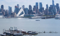
From some vantage points, the building presents as a slender rectangle, from others it resembles a curtain being drawn aside. Photo © Ema Peter
Each facade of the tower is different: the north and east because of the incremental cantilever, and the south and west in response to solar conditions. South-facing loggias and west-facing balconies are boxed with thick frames for shade and privacy; and where the facade elements of neighboring towers are mostly light and delicate, the scale of Vancouver House’s facade pattern holds up to that of the bridge and its steel-truss substructure and constant flow of traffic. In fact, the proportions of solid and void in the building’s elevations resemble those in some of the struts helping to keep the roadway aloft.
The tower’s distinctive silhouette and prominent site have made it the focus of public attention, but the project’s great surprise is the urban contribution made by the angular six-story “podium” buildings that are part of the complex. Three glassy prisms inserted between the tines of the bridge’s fork comprise residential rental units, commercial space that has been leased to a private university, and street-level retail. Formally, the wedge-shaped buildings respond to the constraints of the raised roadway, the need to get light to the public spaces beneath it, the sloping topography, and the dense and intense urban context.

Courtyards, including one for the swimming pool, are carved out of the triangular podium buildings. Photo © Ema Peter
For the streets between the lower levels of these buildings, the bridge with its monumental concrete bents and piers forms a sheltering hypostyle. The buildings’ upper levels create a street wall for the elevated ramps, domesticating them and defining a threshold to the downtown. Green roofs tilting toward the traffic offer a moment of refreshment for people driving past. Carved out of the buildings’ cores, multi-level, wood-lined courtyards—accessible to occupants and, potentially, the public—provide sheltered outdoor space. Those courts, and the steps and paths that thread through them, introduce an almost European, village-scale experience, completing the project’s span of scales from urban to intimate.
Ingels describes the solution for the tower as a hole in one, a simple meeting of requirements; the lower buildings, by contrast, represent most of the detailed design work. “Even though I knew that 80 percent of the effort had gone into this realm between the bridges,” he says, “I was happily surprised at what a Euclidean, Piranesian, three-dimensional urban space it has actually become.”
With a Twist?
RECORD asked BIG’s Bjarke Ingels how Vancouver House relates to the firm’s other towers, such as Telus Sky in Calgary, the fraternal- twin towers of the Grove at Grand Bay in Miami, and the dancing pair at The XI in New York, which all appear to twist as they rise.

3

4
Telus Sky, Calgary (3), The Grove at Grand Bay, Miami (4). Photos © Ema Peter (3), Rasmus Hjortshøj (4)
Bjarke Ingels: First of all, neither Vancouver House nor Telus Sky is twisting, actually. I would say that the correct term for Vancouver House would be expanding—expanding from a triangular floor plan to a rectangle, which gives rise to the illusion or perception that the tower is twisting.
Similarly, or almost inversely, Telus Sky has a different prerequisite, in that the bottom half of the tower is work spaces. For work space, you want a floor plate that is as large as possible, but once the program transitions to living space, you want a shallower floor depth. So the tower has to become more slender. In neither case is there an actual twist.
In the Grove, there is an actual twist going on. The pair of towers are facing front and back on the lower levels, and then they turn as they rise to become side by side on the higher levels, reorienting the apartments toward the more desirable views of downtown Miami and the bay.

The XI, New York Image © DBOX
Lastly, in New York, the two towers of The XI are reproportioning. On the lower levels, where you are surrounded by the urban context of Chelsea and the Meatpacking District, the river-facing tower is opening up a framed view toward the river for the High Line tower. And then, once they clear the rooftops of the neighboring warehouses, they change in proportion so that the river-facing tower takes up the entire elevation of the Hudson River, and the High Line–facing tower expands, with large north-facing and south-facing elevations looking uptown and downtown.
What unites all four projects is that they reject the more typical approach in which you choose a single floor plan that you repeat infinitely—or until you’re done with the building. In all four cases we realize that, as you rise up through the city, the demands, the requirements, the concerns, and the considerations for the context and for the neighbors—access to daylight, capturing views, etcetera—change. That means that the best or the right answer at the ground floor may be very different from the best or the right answer in the middle or at the top. That’s why you get these vertical buildings that change, or shift, or grow, or turn as they rise.
Credits
Architect:
Bjarke Ingels Group — Bjarke Ingels, Thomas Christoffersen, Beat Schenk, partners in charge; Agustín Pérez-Torres, project leader; Carl MacDonald, Melissa Bauld, project managers/designers
Architect of Record:
DIALOG
General Contractor:
ICON West Construction
Consultants:
Buro Happold (structure); Glotman Simpson (executive engineer); Nemetz & Associates (electrical); Integral Group (mechanical); Brook Vandalen Group (facades); Morrison Hershfield (envelope); PFS Studio (landscape); HLB Lighting Design (lighting); James KM Cheng Architects (urban design)
Client:
Westbank Projects
Size:
650,000 square feet
Cost:
$278 million
Completion Date:
November 2020
Sources
Curtain Wall:
Iljin, Glastech
Solid Surfacing:
Avonite
Lighting:
iGuzzini, Artemide, Ocean Pacific, Lutron
Elevators:
TK Elevator, CEI


