“I very much wanted the memory of industrial use to remain,” says Dominique Perrault about his transformation of Paris’s imposing central post office, a 344,500-square-foot mastodon built by Julien Guadet in 1878–88, which occupies an entire city block in the heart of the French capital. Now completed in its raw state, and set to open early next year once its occupants have moved in, the reconfigured complex will contain shops, offices, cafés, a hotel, a child-daycare center, a police station, social housing, a parcel-delivery platform and a postal bureau. “I was determined to avoid anything that smacked of the corporate,” continues Perrault, who won the 2011–12 design competition. “What we’ve done here has absolutely nothing generic about it—the whole thing is entirely individual.”
As professor of theory at the prestigious École des Beaux-Arts, Guadet was extremely influential, his pupils including Tony Garnier and Auguste Perret. An advocate of Rational Classicism, with its emphasis on construction, he championed an “elementarist” approach to design in which typified architectural forms were logically combined in axial compositions. His one major building, the Poste du Louvre demonstrates his precepts, with its central courtyard and cast-iron structure—used to achieve the wide spans needed for the now defunct sorting offices and garages for 100 horse-drawn vehicles—and its structurally independent ashlar curtain wall, which presents a face of sober solidity to the world at large. “The conversion was first and foremost a question of urbanism,” says Perrault. “How do you open up this city block, which was like a fortress really, to the surrounding neighborhood?”
The answer was five passages at street level that allow the building and its courtyard to be traversed by pedestrians. Then there was the question of how to divide it up between all the different activities. “To me, the idea of chopping the building up vertically, so that it became a series of units like a typical Parisian street, seemed to go completely against its history,” says Perrault. “I felt very strongly that there should be a single activity on each level, the way the building had historically been conceived and used.” The only candidate to propose this approach, he has placed all the public functions at street level, apart from the hotel, which enjoys views and a roof terrace in the two new upper stories, while the offices occupy the floors in between. The parcel platform and parking can be found in the two basement levels, the lower of which is also new. The one exception to Perrault’s rule is the social housing, which he has piled up vertically in the outer corner of the thickest part of the plan.
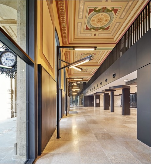
Photo © Michel Denancé
“It was a complex construction process,” says Perrault of an operation that has come in almost two years late. Besides digging an extra basement and adding the hotel where the building’s original mansard roof, lost to fire in the 1970s, used to rise, it was a question of stripping the structure back to its essence and bringing in as much daylight as possible. Rising five main stories above grade, the building has been reconfigured from within to adapt it to its new uses.
At ground level, some of the original courtyard facades have been pulled back to create open galleries—“lost” square footage that was recovered by inserting mezzanines in other parts of the building—while step-backs in some of the courtyard elevations (all of which were entirely replaced by Perrault) allow for new glass roofs that flood the offices below with light. Within the stone curtain wall, the usual Perrault ticks are all present: industrial metal mesh, soigné detailing that seems at once sensuous and Brutalist, and elaborate lighting—standard lamps outside, chandeliers and industrial tubes within—designed or chosen by Perrault’s partner at Dominique Perrault Architecture (DPA), Gaëlle Lauriot-Prévost.
Then there is the color black, which dominates throughout. “Some would say that black is emblematic of a certain Parisian chic,” says Perrault. “We used it here in order to unite all sorts of disparate elements and materials: Guadet’s cast-iron beams and supports, new windows and skylights in aluminum, steel panels, etc.” Establishing a strong contrast between inside and out—the dry, solemn curtain wall versus a sensuously strict interior—black was also a way of making manifest the daylight that has been brought into the heart of the building. “As [the painter Pierre] Soulages says, black is the color that most catches light,” explains Perrault.
“A central post office, however important it may be, is by definition a provisory edifice, at any rate transformable,” wrote Guadet in 1888. The group La Poste, whose core activities have radically changed in our email age, must be thanking his prescience, and also Perrault, who has made a hard-to-like building sharp, chic and beguiling.


