Qingpu Pinghe International School by OPEN Architecture
Shangahi

Architects & Firms
Across China, a school-construction boom is showing all the trappings of how architecture might facilitate openness, interaction, and creative thinking in the learning process. Fueled by a demand for alternatives to what many see as a stultifying state education system, a spate of new schools has sparked a proliferation of rooftop gardens, meandering ramps, and, as pretty much everywhere these days, stepped seating. Lots and lots of stepped seating.
Designed by Li Hu and HUANG Wenjing of Beijing-based OPEN Architecture, the Qingpu Pinghe International School in Shanghai checks all these boxes, but goes one further. If the privately owned and operated pre-K to 12 facility, located about a 45-minute drive from the city center, stands out, it’s because it has cleverly broken the rules (and has tuition-paying students whose families can afford it). “Most schools in China are a big building plus a field,” says Li, referring to regulatory requirements that almost inevitably produce that typology. “However, we wanted to make a campus.”

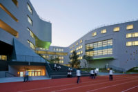
Students gather opposite the “learning cubes”. Photo © Wu Qingshan, click to enlarge.
Indeed, for Li and HUANG, it seemed unimaginable to squeeze the school’s eventual 2,280 3- to 18-year-olds into a single structure—some of them, theoretically, for up to 15 years. Instead, they wanted to create what they call a “school as a village” by spreading the facilities across 13 buildings on the site’s more than 12 acres, now landscaped with trees, bamboo stands, and a retaining pond. Among these buildings are seven five-story “learning cubes” clad in bamboo paneling, with perimeters that are gently rounded (indicating classrooms for primary-level students) or folded (for junior high). A gymnasium, swimming pool, and cafeteria complex reveals itself with white stretched membrane and perforated metal facades.


The Arts Center at Shanghai’s Qingpu Pinghe International School is one of a group of buildings on the campus, which was designed by OPEN Architecture. Photos © Wu Qingshan

Click to enlarge
A faceted gray-granite arts center anchors the site at its core with two “horizontal atria” that intersect with a vertical one to create light-filled spaces for exhibitions and performances. Equally distinctive, a combined theater and library that Li describes as a “blue whale” is situated at the edge of the campus, easily accessible to the surrounding community (or, rather, the future community: the area is still a thicket of construction cranes) when not in use by the school. Dubbed the Bibliotheater, this hybrid building houses a fly tower shared by a 500-seat theater and 150-seat black box. Then there’s the library, with a soaring reading room ringing a space-age, Kubrick-worthy oculus.
The crux of the argument for building a campus instead of the typical school was the desire to more efficiently utilize a component that would otherwise often be idle. Normally, a Chinese school might have a 400-meter running track circling a sprawling lawn whose size, according to Li, can only be justified once a week when the entire student body gathers there for a mandatory flag-raising ceremony. However, at the Qingpu school, the architects managed to convince local authorities to allow just a 200-meter track—still large enough to accommodate a soccer pitch—but with a smaller footprint that unlocked plenty of square footage for the rest of the campus.

Click to enlarge
A 550-METER track circles the campus, passing by the school’s 13 eclectic structures: the gray-granite art center and, beyond, a cluster of bamboo-clad “learning cubes,” a luminous gym/cafeteria, and the whale-shaped blue Bibliotheater. Photo © Chen Hao
“We wanted to make the impractical practical, while breaking up the scale of both the buildings and open space,” Li says. The student body is now split between the track and gymnasium for its weekly dose of patriotism (a small price to pay), while an additional 550-meter running trail winds more bucolically throughout the grounds.

1

2
Overlooking a retaining pond, the kindergarten (1 & 2) is clad with vibrant fins and wraps around three courtyards linked by ramps.

Click to enlarge
The kindergarten required its own, autonomous building, which Li and HUANG wrapped around three circular courtyards connected by ramps. Fins striating the facades are painted a spectrum of yellows and reds on one side and cooler blues and grays on the other. With its figure-eight plan, an 880-bed dormitory for primary and middle school students rounds out the campus, alongside a combined administration and laboratory building—so management can “experiment with administration,” Li winks, in a half-joking jab at bureaucracies—of precast concrete.

3

4

5
Described as a “blue whale” by the architects, the Bibliotheater (3) is a hybrid library (4) and performing-arts center, with a main stage (5) and black-box theater. Photos © Wu Qingshan (3 & 4); Jonathan Leijonhufvud (5)

Click to enlarge
The project took only three years from design to completion. Because the kindergarten and Bibliotheater opened this September, and the rest of the school only a year before that, it’s probably too early to know what influence the architecture might have on the students’ education. However, school officials say that already the configuration of facilities is not just enabling but encouraging new programs and uses. That was the effect the architects sought: “We wanted each building to have its own identity because their contents and meanings are different,” Li says.

6

7

8
A second complex, with a gymnasium (6), swimming pool (7), and cafeteria (not pictured) reveals its interior, with white stretched membrane on one side and perforated metal facades on the other (8). Photos © Jonathan Leijonhufvud (6); Wu Qingshan (7); Chen Hao (8)

Click to enlarge
At the same time, the architects wanted the campus to feel as though it had developed organically, counting on the diversity of designs and the fact that their variations in materials might mean the structures will age differently. Perhaps this will turn out to be the case. But for now, the totality feels less like a repartee of sharpened architectural voices—whether in friction or in conversation—than a more ambient juxtaposition of forms, volumes, and finishes. That is to say, while the range of architectural treatments shows an impressive repertoire, it’s difficult not to see the campus as being by a single hand or studio. It’s almost as if an architect had been asked to design a set of building blocks for children—which is, in fact, what Li and HUANG took it upon themselves to do. And if first impressions of kids gliding along the school’s running trails and bouncing among its buildings are any guide, the students will no doubt benefit.
Credits
Architect:
OPEN Architecture — Li Hu, HUANG Wenjing (partners in charge)
Architect of Record:
Shanghai Yuangou Design and Consultants
Engineers:
CABR Technology (m/e/p and structural)
General Contractor:
Shanghai Shenying Construction
Consultants:
Z+T Studio (landscape); Shanghai Net Culture Development (theater/acoustic)
Client:
Shanghai Tixue Education and Technology
Size:
624,000 square feet
Cost:
Withheld
Completion Date:
September 2019
Sources
Glazing:
Velux; BK Glass
Bamboo:
Dasso
Curtain Wall:
XHC; Jiangyin Yuhua Aluminium; JNA Aluminium
Track Paving:
BASF
Casework:
Red Star Macalline
Surfaces:
Eternit; Corian; HARO; TOLI; Instyle
Furnishings:
KI; Trespa; Dafeng; Shenzhen Avant; Gabriel
Hardware:
Kin Long
HVAC:
Daikin; Trane
Conveyence:
Hitachi
Photovoltaics:
Shanghai Yohtec

