Elegant Bathrooms at Swatch and Omega Headquarters Bring Views and Daylighting to Utilitarian Spaces
Biel/Bienne, Switzerland

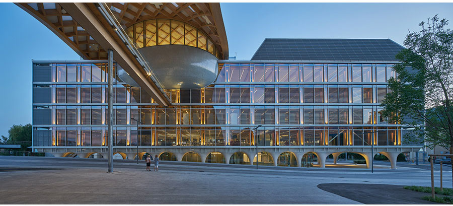
The largest restroom, which features an abundance of natural light and exposed timber beams, is located along the south-facing wall, opposite the main facade (shown).
Photo © Didier Boy de la Tour

The largest restroom, which features an abundance of natural light and exposed timber beams, is located along the south-facing wall, opposite the main facade (shown).
Photo © Didier Boy de la Tour

The largest restroom (shown), which features an abundance of natural light and exposed timber beams, is located along the south-facing wall, opposite the main facade.
Photo © Didier Boy de la Tour

Image courtesy Shigeru Ban Architects


Architects & Firms
Public restrooms are usually designed with such goals as reducing long lines and lowering maintenance costs. But those in one of a trio of buildings at the Swatch and Omega Headquarters, designed by the firm of Pritzker Prize laureate Shigeru Ban in Biel/Bienne, Switzerland, also feature views, elegant exposed-timber elements, and daylighting—architectural highlights seldom lavished on such utilitarian spaces.
Additional Content:
Jump to credits & specifications
These are located in the complex’s 174,000-square-foot Swatch and Omega Museum and Conference Hall (also known as the Cité du Temps), which was completed last fall. Of 16 restrooms on five levels, seven occupy a privileged place along its south-facing glazed wall. The architect kept the main glass facade—the north side, which faces a plaza and his new Swatch headquarters—as open and unobscured as possible. In light of that plan, and the fact that most visitors to the mass timber building eventually pass through its restrooms, Yoshie Narimatsu, senior associate and project chief for Shigeru Ban Architects, says the team made the effort to extend the design aesthetic there too. “It’s refreshing to see views from some of the public restrooms,” she says.
The largest—a 344-square-foot women’s room outside the top-floor assembly hall—features all of the building’s benefits, including daylighting, a view (frosted window film was applied to the inside from floor to shoulder height for privacy), and even an island vanity that enables better circulation through the space. Because the domed event hall can accommodate up to 400 people, this location experiences the most traffic. Taking that into consideration, it has eight sinks on its central vanity (four on each side) under a double-sided mirror suspended from the 10-foot ceiling, to give visitors “the choice of multiple paths to the seven stalls,” Narimatsu says. To further streamline the design, waste bins and soap dispensers are built into the solid-surface countertop, and paper towel dispensers are incorporated into the mirror. Even users on the stall-facing side can see the view through the high-quality triple-glazed window, which, combined with a radiant system under the floor, makes for highly efficient heating.
Restroom signage echoes the style of the larger complex; it features the same bold and playful stick figures as those guiding visitors throughout the building and within the connecting Swatch HQ to the north. For these, Ban enlisted graphic designer Kenya Hana, principal of Nippon Design Center and a frequent collaborator.
But the project’s most unusual detail (save for the views) is the exposed, locally sourced timber structure, with its grouping of four 11-inch-square glulam columns. Exposed timber is featured throughout Ban’s buildings at the complex, including the Swatch headquarters and a factory for Omega. “Spruce is an important feature, and we wanted to amplify it—even inside the restrooms,” Narimatsu says, explaining that this detail provides continuity.
CreditsArchitect: Shigeru Ban Architects Europe
Architect of record: Itten+Brechbühl
Engineering: Création Holz, SJB Kempter Fitze (structural); Gruner Roschi, Roschi+Partner, Gruner Kiwi (HVAC, sanitary, building automation); HKG Engineering (electrical); Leicht (facade); Reflexion (lighting); Commins Acoustics Workshop, Kuster + Partner (acoustic)
Project manager: Hayek Engineering
Size: 60,200 square feet
Cost: withheld
Completion date: October 2019 |
SpecificationsWood Blumer-Lehmann
Floor & wall tile Bisazza
Sinks & counter Du Pont
Mirror unit Talsee |


