The Heights Building by BIG with Leo A Daly
Arlington, Virginia

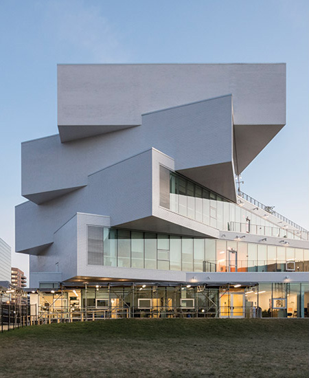
Classroom bars fan out from an elongated base.
Photo © Laurian Ghinitoiu

The white brick rainscreen emphasizes the volumetric play of light and shadow.
Photo © Laurian Ghinitoiu

The main entrance faces Wilson Boulevard.
Photo © Laurian Ghinitoiu

Inside, a stair/bleacher of precast concrete tapers up to the second level.
Photo © Laurian Ghinitoiu

Another slopes down to a gym on the lower level.
Photo © Laurian Ghinitoiu

From the fifth-level terrace, students can take stairs down to ones cascading below.
Photo © Laurian Ghinitoiu

From the fifth-level terrace, students can take stairs down to ones cascading below.
Photo © Laurian Ghinitoiu

Inside the school, each classroom bar is saturated in a different color.
Photo © Laurian Ghinitoiu

From the first-level lobby, students can gaze upon activities taking place in the gym.
Photo © Laurian Ghinitoiu

Image courtesy BIG

Image courtesy BIG

Image courtesy BIG

Image courtesy BIG

Image courtesy BIG

Image courtesy BIG

Image courtesy BIG


You don’t necessarily expect the design of an American public school to be bold and energetic: perfunctory modern masonry boxes—usually one or two stories—seem to be a national default solution for this building type. Schools funded by taxpayer dollars are often too cautious about taking risks. But, in this case, the Arlington, Virginia, school system was willing to bet on BIG (Bjarke Ingels Group), a Copenhagen firm that embraces architectural restrictions with a brazen optimism.
Additional Content:
Jump to credits & specifications
Over the last decade or so, BIG’s New York office has created a number of dashing projects in the U.S. such as the apartment buildings Via 57 West in New York and the Grove at Grand Bay in Miami. If developers expect a lot from architects in return for their investment, so too did the Arlington Public Schools (APS). School authorities wanted an energy-efficient, state-of-the-art facility, with distinctive architecture for two secondary schools totaling 775 students from the sixth to 12th grades, in a dense neighborhood near the downtown. The much larger one, H-B Woodlawn, has a strong visual and performing-arts curriculum, with a lottery-based admissions system; the other, for about 50 pupils, is part of the Eunice Kennedy Shriver Program for special education.
BIG was asked by Leo A Daly, based in Washington, D.C., to join in responding to the RFP as the design architect. Partner in charge Bjarke Ingels liked the challenge. “For a public school with modest means, you make choices about getting something extraordinary out of ordinary materials,” he says.
The architects came up with a scheme consisting of five rectilinear bars of double-loaded classrooms, four of which fan out acrobatically from the northeast corner above an elongated base that houses classrooms a well as such common spaces as the lobby and cafeteria, plus the administrative offices.
Brick—featured in the old school building that was on the site, as well as in much of Arlington’s historic architecture—is the prominent material here, albeit in white, not red. White brick, says Ingels, “better expresses the volumes through the play of light and shadow.” Deployed as a rainscreen system, thin glazed brick crisply covers the walls and soffits, which terminate in projecting corners. Using this technique also reduces the weight of the material and minimizes the steel needed for cantilevered spaces and glass walls.
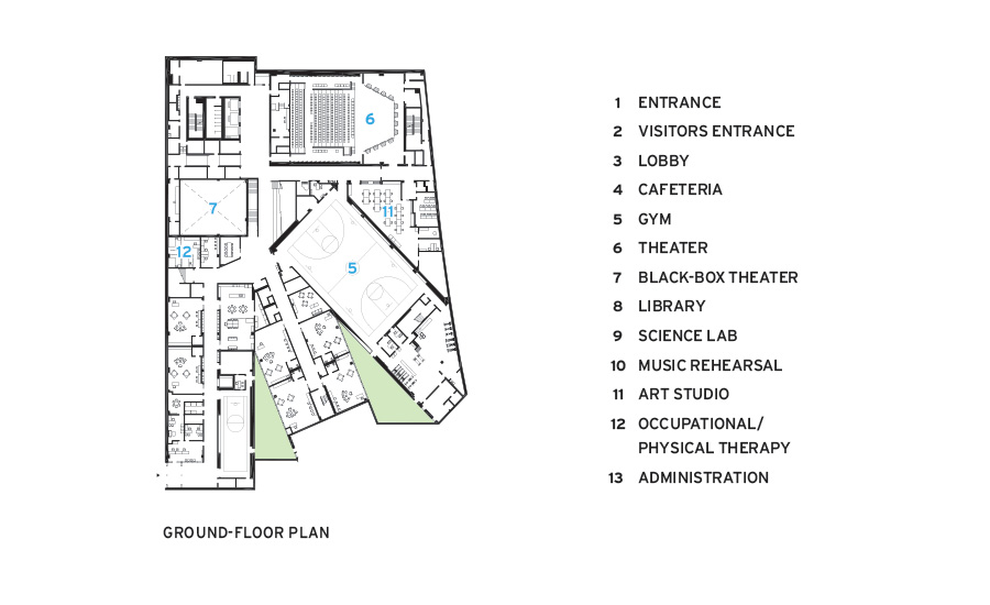
At the main entrance on Wilson Boulevard, students enter the arresting assemblage to find an expansive three-story atrium. Inside, steps and bleachers angle up to the second-floor library on the southwest corner; if you walk north to the rear of the lobby, you see another step-and-bleacher triangle headed down to the gym on a lower floor that is mostly below grade.
Stand in one spot of this main public space and you can see students walking, sitting, even playing basketball down in the gym—or clustered in the cafeteria ahead. You may also catch a glimpse of the plywood-lined library above. The multiple sight lines, the reverberant sounds, and the amount of daylight admitted through expanses of glass give the atrium an exuberant spirit in keeping with the unbridled thrust of the architecture. This is no monastery.
On the lower floor, next to the gym, is a 400-seat auditorium with an array of performing arts support spaces. Nearby are occupational/ physical therapy rooms and related spaces for the special education classes.
On the upper levels, each of the four classroom bars pivots away from the one above, allowing the architects to convert the roofs to landscaped terraces for outdoor gatherings. Two main stairways, one threading from the exterior terraces to the inside, the other angling steeply (it keeps you alert) within the halls, are precast concrete, each supported on a steel frame.
Every classroom hallway is memorable, thanks to the vibrant color scheme (yellow, orange, red, violet, and blue). The classrooms themselves, which accommodate 18 to 24 students each, are straightforward, though many open to the roof terraces.
The volumetric parti seems simple, but the cantilevering bars of classrooms and the weight of the soil for the terraces’ planting called for a complex structure. Steel framing supports concrete slabs on metal decks; steel trusses behind the exterior brick rainscreen transfer loads through vertical columns and diagonal members from each classroom bar to the one below. Because of the rotated floors, smaller mechanical rooms are placed on each level, amplifying the number of horizontal ducts and reducing vertical ones.
Besides structural solutions and the utilities’ placement, other challenges included fire protection for these open, lofty spaces. Among many measures taken to comply with the code, the team has relied on operable fire shutters, hidden in the walls, which slide across stair openings. To further prevent smoke from rapidly rising up the stairs, they installed glass baffles at the ceiling, which are 18 inches deep and extend across the width of the staircase.
The school, with such measures as the building envelope’s enhanced roof and wall insulation and LED lighting, is on track for a LEED Gold rating. While a standard IGU assembly is used for the glazing, it comes with a low-E interlayer. In addition, about 20,000 square feet of vegetated roof mitigate solar gain and runoff. And one rainwater cistern is used for plants and flushing; a stormwater-detention tank can be siphoned by the fire station next door and also deployed by a nearby development.
The collaboration between BIG and Leo A Daly has created an 180,000-square-foot showstopper for a little over $100 million (including fixtures, finishes, and equipment), or just over $550 per square foot. Aptly called the Heights Building for its verticality, sense of openness, and permeability, it embraces the neighborhood, the outdoors, and a variety of programs. Most important, it acts, notes Ingels, as “a canvas for the expression of life of children.”
CreditsDesign architect: BIG (Bjarke Ingels Group) — Bjarke Ingels, Daniel Sundlin, Beat Schenk, Thomas Christoffersen, partners in charge; Aran Coakley, Sean Franklin, project managers; Tony-Saba Shiber, Ji-young Yoon, Adam Sheraden, project leaders
Executive architect: Leo A Daly —William Kline, principal in charge; Timothy Duffy, project manager/senior technical director; Alicia Goldberg, senior architect; Andrew Graham, project architect/ BIM manager
Engineering: Silman (structural); Interface Engineering (m/e/p); Gordon (civil)
General contractor: Gilbane Building
Size: 180,000 square feet (not including terraces)
Cost: $101 million
Completion date: September 2019 |
SpecificationsBrick rainscreen Telling Architectural Systems (Corium)
Metal panels Vitrabond
Insulated laminated glass Viracon
Precast concrete American Stone Virginia
Metal/Glass curtain wall YKK, Innovation Glass, Construction Specialties
Moisture barrier Grace
Green roof assembly Furbish
Terrace roof pavers Wausau Tile
Downlights Axis Lighting (linear fixtures); Louis Poulsen
Exterior lighting Bega
Elevator Otis
Bathroom toilet/urinal Sloan, American Standard
|


