Leeza SOHO Tower by Zaha Hadid Architects
Beijing

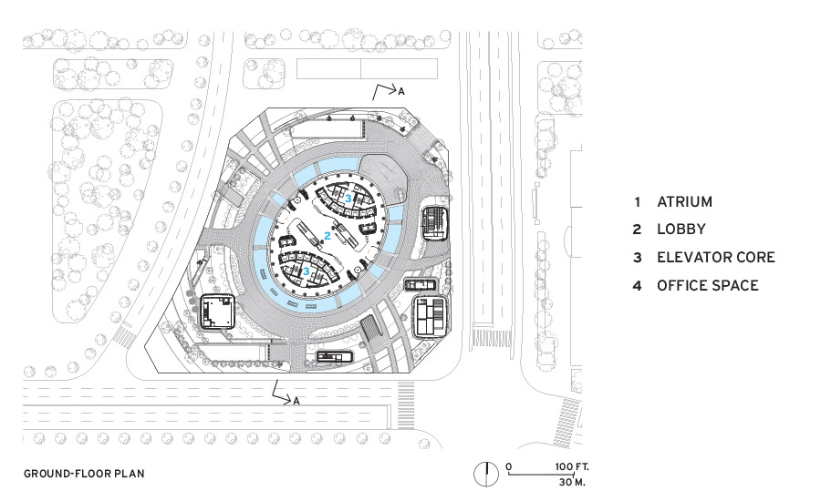
The vertical cut through the tower creates two sides of the structure, each with its own core.
Photo © Hufton + Crow

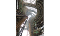
Inside the soaring atrium, the open void spirals up between the two dynamic interior facades as they bulge out and recede.
Photo © Hufton + Crow

The exterior curtain wall’s glass modules are staggered like fish scales.
Photo © Hufton + Crow

The exterior curtain wall’s glass modules are staggered like fish scales.
Photo © Hufton + Crow

The lobby is a public space.
Photo © Hufton + Crow

From an upper-floor elevator core, tenants can look out across the atrium.
Photo © Hufton + Crow

The dramatic 45-story atrium descends to the ground level.
Photo © Hufton + Crow

Image courtesy Zaha Hadid Architects

Image courtesy Zaha Hadid Architects

Image courtesy Zaha Hadid Architects


Architects & Firms
Commercial high-rises may pack cities with people, but most towers are largely antisocial. Empty lobbies blank out street life, and elevators silence and isolate individuals. Thick concrete service cores relegate occupants to the perimeter, keeping people on one side of the building from people on the other. Floors stacked like pancakes stop communication between levels. Divided, striated, and contained, high-rises squeeze out the great architectural subject of modern architecture—space—eliminating the medium of social connectivity.
Additional Content:
Jump to credits & specifications

The design of the Leeza SOHO Tower by Zaha Hadid Architects (ZHA), which opened in Beijing in November with a galactic light show in the atrium, reinvents the typology of the office high-rise. Spiraling 45 stories around the tallest atrium in the world—637 feet high—and bowed with the entasis of an elegant Greek column, it may earn fame for its lithe profile on the skyline and for an architectural wit not seen since the Chrysler Building. But it is unique because it centers on an open volume rather than an opaque core, fostering community within a space as compressed and intimate as a New York City street. Each half of the building is serviced by its own core so that the two sides basically operate as independent towers, belted together by steel trusses ringing them into a stable structural unit. Each side is designed with a glazed interior facade, facing its twin opposite. On any floor, you can see the color of the neckties across the way.
One of the last designs by Zaha Hadid before her death in 2016, the tower has roots in her early career, when she started cultivating public space as a way of stoking life and community in her architecture—in Cincinnati, for example, she brought the sidewalk into the lobby of the Rosenthal Center for Contemporary Art as an urban carpet. Patrik Schumacher, her partner, now the head of the London-based firm and a leading exponent of parametricism, maintains that the social web of digital platforms does not replace the need for public space—as old and fundamental as the Greek agora and the Roman forum—but can complement, reinforce, and extend it.
To open up Leeza, Hadid and Schumacher made a simple surgical cut down the middle of an elliptical cylinder, slicing it top to bottom, and pushing each of two banks of elevators to the sides, opening the core to form a chimney of space soaring up to a roof of skylights.
The form of the tower is basically an irregularly shaped double helix that turns around a point centered in the atrium. The facing facades spiral in a gyrational turbulence, twisting with the same athletic torque that ancient artists sculpted in statues like the Belvedere Torso and the Laocoön, both in the Vatican. The atrium is not a static void but a vectorial form that leads the eye up as the facades bulge and recede with the push and pull of varied configurations of office space, depending on the floor. Outside, the architects stepped and staggered the curtain wall’s glass modules like scales on a fish to achieve the tower’s continuously curving shape.
While exemplifying Vitruvius’s rule about buildings’ embodying firmness and commodity, here the third element—delight—triumphs. As the tower was completed, folks from the neighborhood rode their bikes over for a closer look at their spectacular new neighbor. Seen at night, the glazing of the tall seam between the two towers twists up its full height like a flame.
Satoshi Ohashi, head of ZHA’s Beijing office and the project director, explains the twist. The axis of the atrium at its base aligns with a subway line that crosses the site at a diagonal, but the architects turned the tower 45 degrees as it rises so that the top aligns with the urban grid of the surrounding avenues. The base responds to the below-grade infrastructure, which will be developed with four stories of shopping and services.
Turning the building created tortional stresses inside that are reflected on the interior facades: the architects trace the turns and eruptions with leaning columns and fanning floor plates that document the vertical topography of forces.
The barrel-like silhouette responded to the desire of the developer, SOHO China, to vary square footage on each of the 45 floors, which total 1.86 million square feet of commercial space. The client stipulated a minimum core-to-perimeter dimension of 27 feet, varying to a maximum of 47 feet. Constraints for fire lanes determined the narrow dimension at the tower’s base; the widest floor plates occur mid-rise.
In his remarks at the packed opening, Schumacher acknowledged that the high-rise atrium has been hiding in plain sight for decades in the hotels John Portman designed in the United States, beginning in the late 1960s. The architects simply transposed the idea to a commercial office building, though clearly the concept has evolved far beyond its original form—Portman’s orthogonal atria were cold glaciers of space.
Parametric tools that integrated the building’s systems with exacting precision, as well as generating the dazzling helical form, made it all feasible. The tower is designed to LEED Gold standards, including such features as photovoltaics and green swaths on the roof, with its advanced environmental efficiencies governed by those systems. Schumacher, the parametricist, says simply, “It’s a fully digitally controlled design and digitally controlled building.”
For him, the project is proof of the theory that a totally integrated building of seamless complexity can be commercially competitive, even within Beijing’s overbuilt office marketplace. SOHO China, who have completed four projects with ZHA since Hadid’s 2004 Pritzker prize, were not acting credits as permissive art patrons but as knowledgeable, aggressive developers who understood that an exalted object would stand out and give their building the competitive advantage of prestige, desirability, and uniqueness.
In the crowded context of an emerging new business district in southwest Beijing, where the surrounding high-rises are respectable, conservative, and pinstriped—and predictably extruded up from a base—Leeza is an intelligent, charismatically idiosyncratic tower—a super-high-tech building that looks organic rather than mechanical: it expresses the soul of the new machine. Its emblematic daring reveals the cultural and entrepreneurial ambitions of a country willing to take smart risks. In China, with the depth of a great past, the building points to the depth of its future.
CreditsArchitect: Zaha Hadid Architects
Executive architect: Beijing Institute of Architectural Design
Consultants: Bollinger + Grohmann, China Academy of Building Research (structure); Konstruct West Partners, Knighton Facade, Yuanda (facade); Parsons Brinkerhoff (m/e/p); J+B Studios Architectural Design, Light Design, Leuchte (lighting)
General contractor: China State Construction Engineering Corporation
Size: 1.86 million square feet
Cost: withheld
Completion date: November 2019
|
SpecificationsGlass Tianjin Yaopi
Stainless steel Beijing Huaxin Ocean
Elevators Hitachi
Fixtures Kohler |

